Space Needed
Space needed is a project I started in my 3rd year of college; it was born out of a data visualization class. For the class we were tasked with finding a social cause or topic that merits a lot of data and can easily be turned into interesting info graphics. I’ve always been fascinated with space, so I decided to make my topic about the various aspects of the U.S.’s involvement in the exploration of space. The first part of this project is the branding and objective of this campaign. Once that is established the aspects of the data visualizations, or infographics start to take shape. The infographics are the backbone of the campaign that lay the foundation for the rest of the project. Next are the educational materials that aim to better help the American public better understand space in a general sense and provide further context to the infographics. Lastly is the ad campaign for Space Needed, the way the space exploration campaign could get the word out about the need for space exploration.
OBJECTIVE & BRANDING
Introduction
Objective
Color Pallete

Logo Guidelines
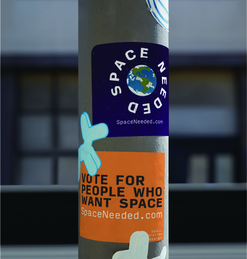
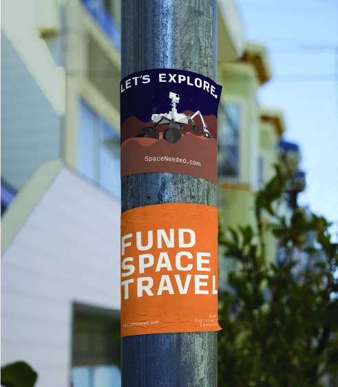
The main colors for this campaign are a deep purple that makes the viewers think about the vast deepness of space. The primary orange color contrasts with the purple perfectly. It has a bright vibrancy that sticks out like a star in the sea of blackness in space.
When developing the logo, I used the black version of the Input typeface and I made sure to space out all of the letters evenly. This helps put a simple subliminal message into the logo that reinforces the emphasis on “space”. Also in the logo is a black circle that can be left black to represent a planet or can be replaced by an illustration of a planet in our solar system. Below the logo is the interchangeable tagline: “Space Exploration Campaign”. The alternate version of the logo has the name “Space Needed” orbiting around the planet.
Primary Logo


Secondary Logo


INFOGRAPHICS
Data Blocks
Objective
Research
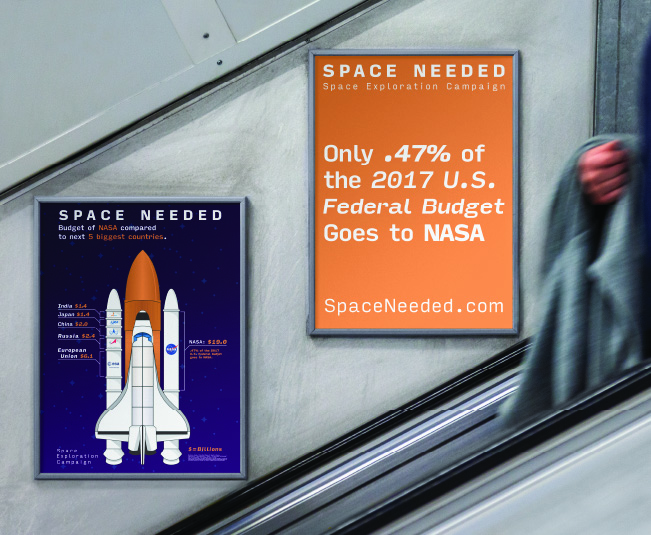
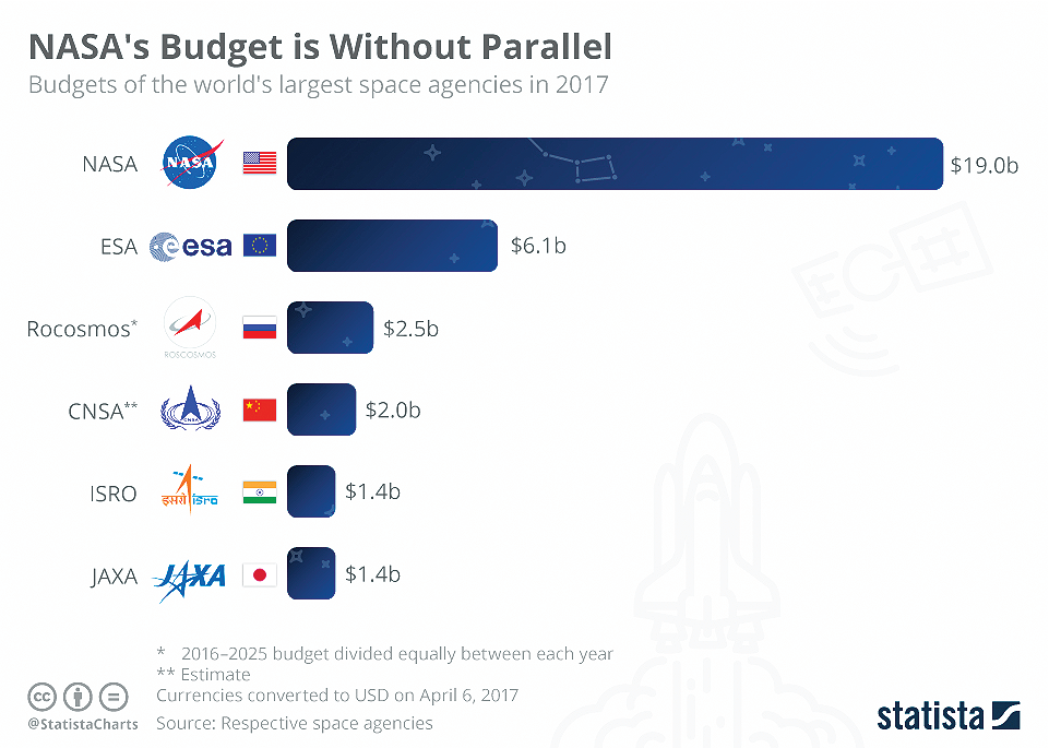
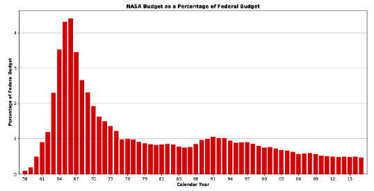
Space Programs
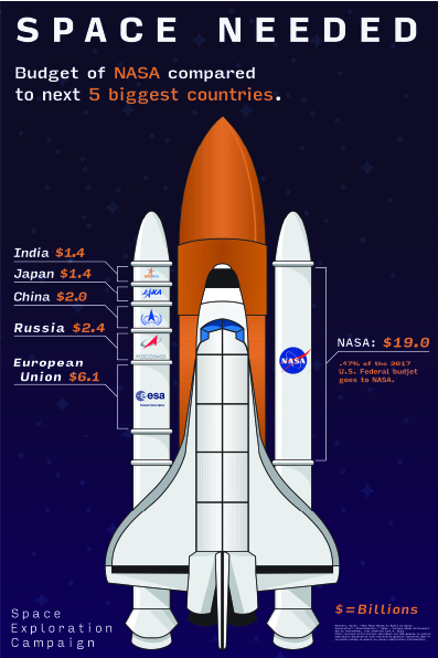
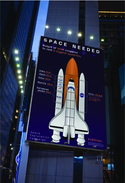
- NASA Budget $19.0b
- ESA Budget $6.1b
- Russia Budget $2.5b
- China Budget $2.0b
- India Budget $1.4b
- Japan Budget $1.4b
Background
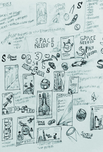
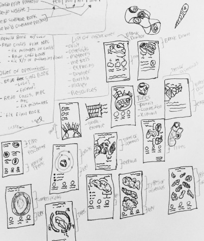
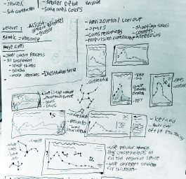
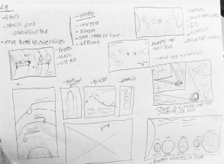
Sketches
Iterations


Final Design
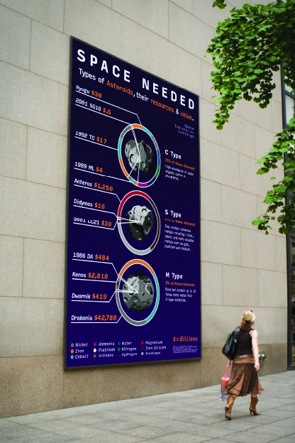
Data Circles
Objective
Research
Space Programs
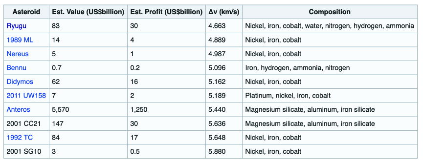
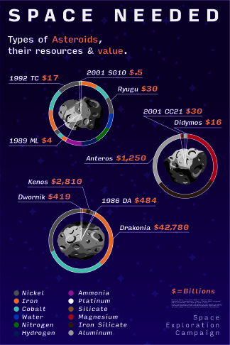
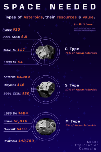
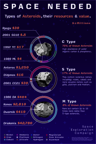
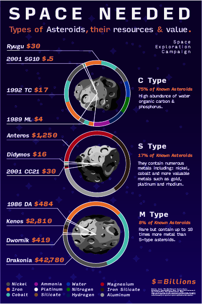
- C-Type
75% of Known Asteroids
High abundance of water, organic carbon & phosphorus. - S-Type
17% of Known Asteroids
Little water, they contain numerous metals including: nickel, cobalt and more valuable metals such as gold, platinum and rhodium. - M-Type
8% of Known Asteroids
Rare but contain up to 10 times more metal than S-types.
Background
Sketches
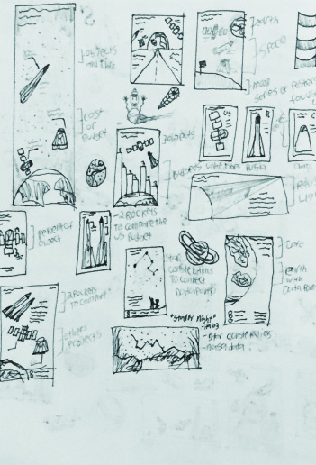
I think it is important to also include secondary information about the cost of other projects that the various agencies did. Personally, my favorite design so far is the use of 2 different rockets to show the difference in the budgets of the various countries. This also works in the sense that the NASA budget nearly adds up to all of the other budgets combined. I also messed around with the idea of projects floating in space that could visualize the budgets of the countries.
Iterations
Final Design
Data Waves
Objective
Research
Background
Sketches
Iterations
Final Design
Data Maps
Objective
Research
Background
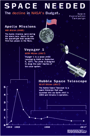
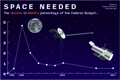
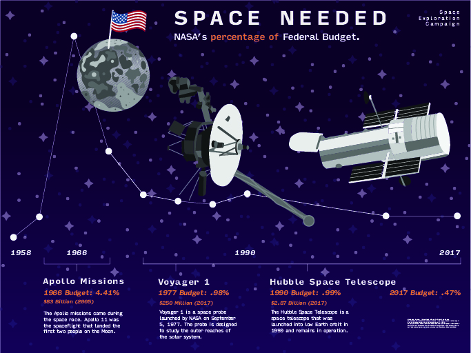
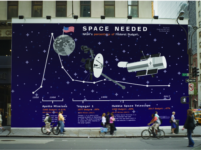
“Humanity’s interest in the heavens has been universal and enduring. Humans are driven to explore the unknown, discover new worlds, push the boundaries of our scientific and technical limits, and then push further. The intangible desire to explore and challenge the boundaries of what we know and where we have been has provided benefits to our society for centuries.” - NASA
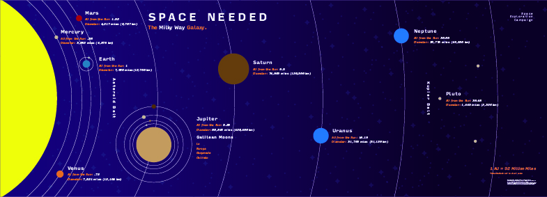
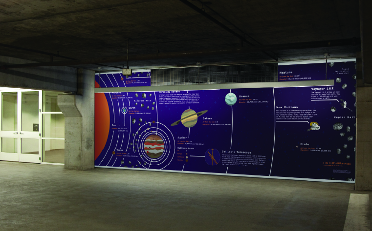
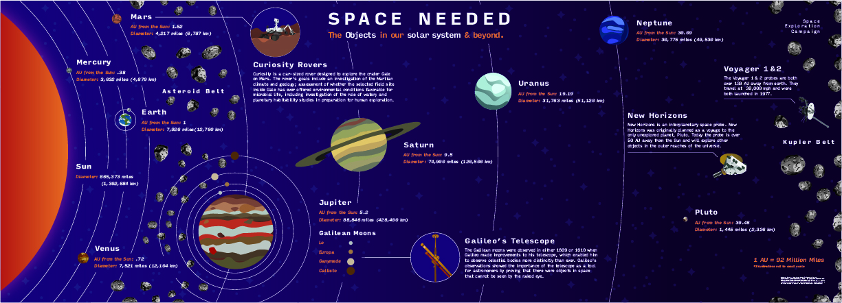
For this design I intend to use this as an option to illustrate the distance between space objects and the time it would take to get there and the size of the planets in our solar system.
Object's Distance from the sun (AU)
1 AU = 92,955,807 miles- Mercury .38
- Venus .72
- Earth 1
- Mars 1.52
- Jupiter 5.2
- Saturn 9.5
- Uranus 19.19
- Neptune 30.09
- Pluto 39.48
- Voyager 1&2 120
- New Horizons 60
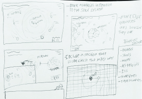
Sketches
Iterations
Final Design
EDUCATIONAL MATERIAL
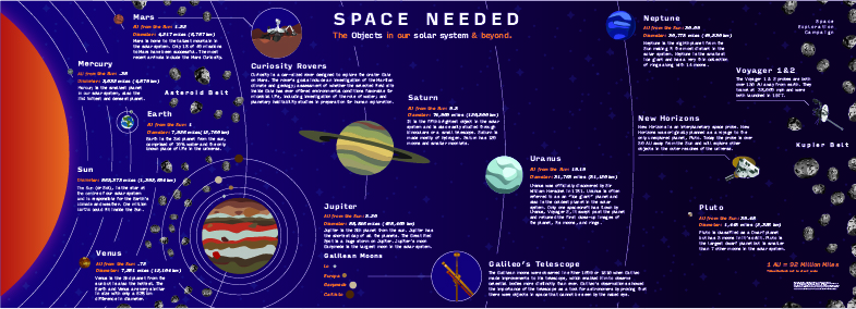
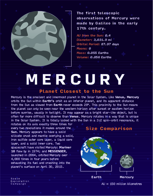
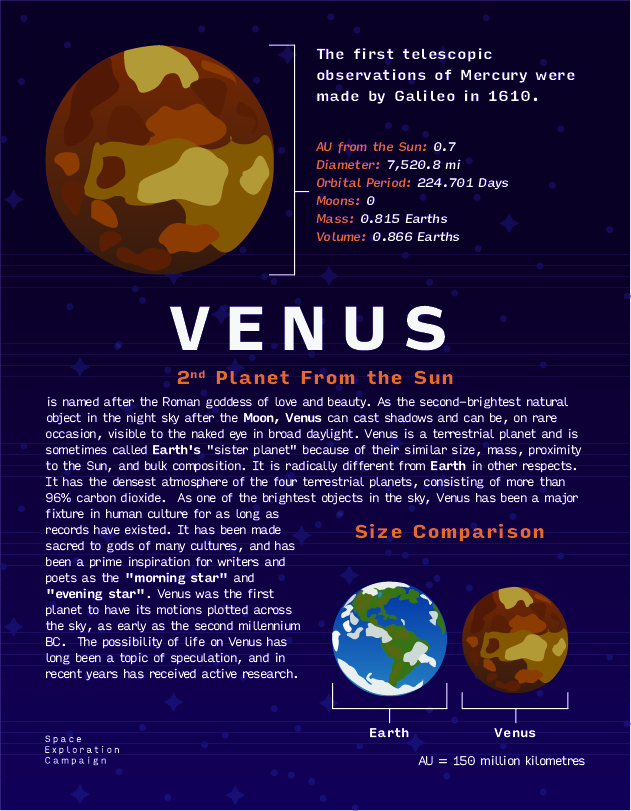
Planet Posters
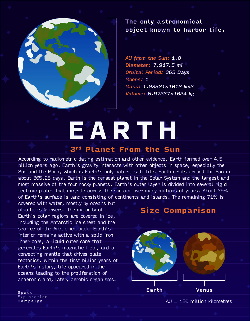
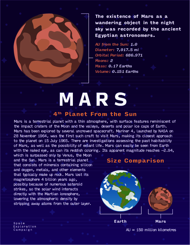
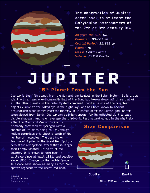
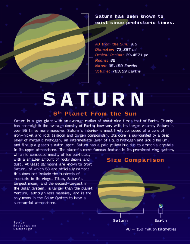
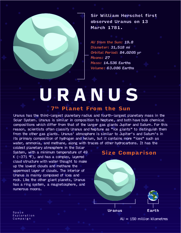
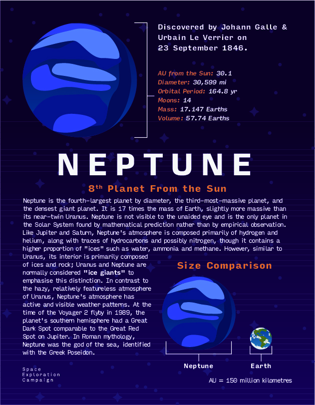
These posters can serve as a way to get a base amount of knowledge of our universe and provide further context to some of the previously shown infographics. They can be a little dense if you know next to nothing about space or our place in the universe.
To also benefit the public a series of posters could be made that go over other aspects of space. Things like important figures in the field of space and the discoveries they made. Other posters could go over some of the famous inventions that help us better understand our universe.
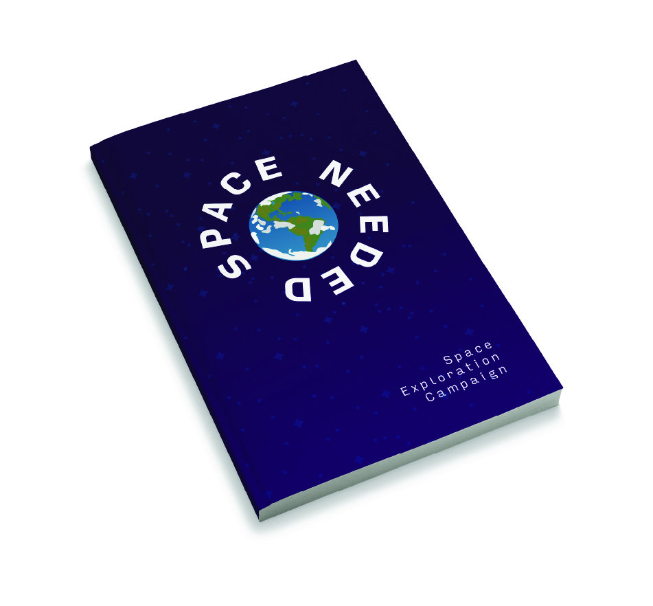
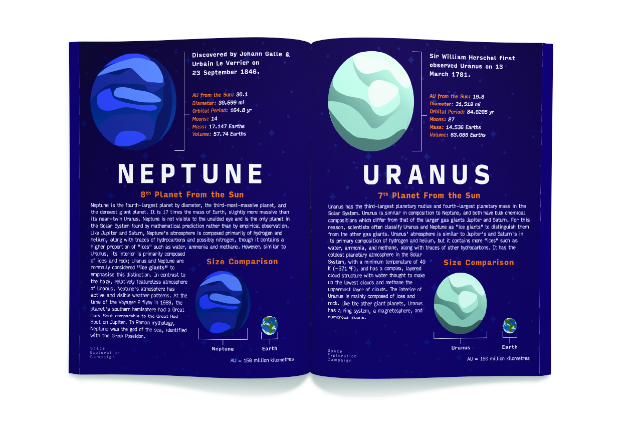
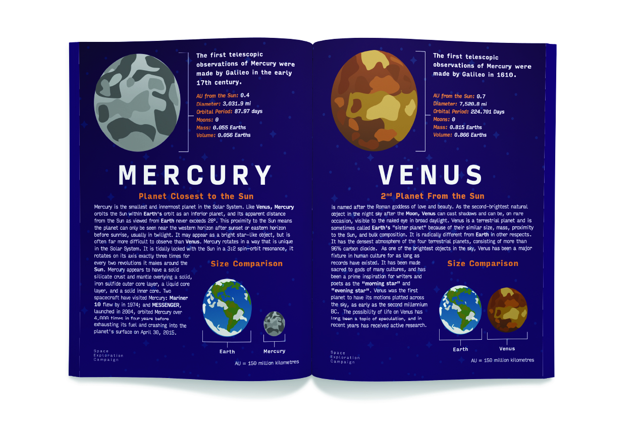
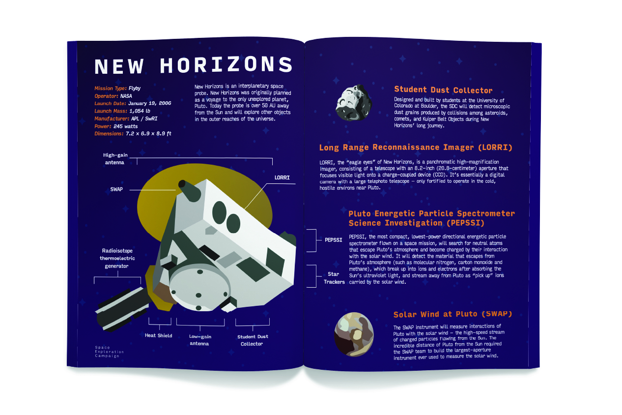
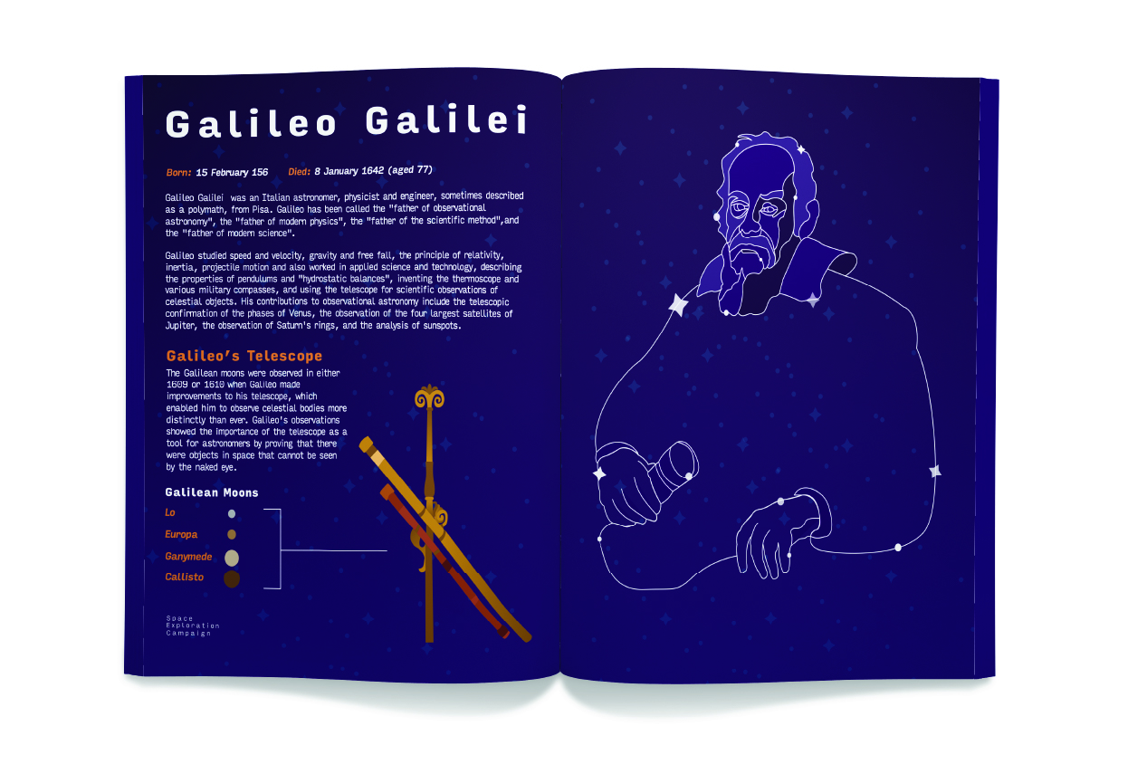
Informational Book
The book also covers world famous astronomers and their achievements they’ve made to advance the study of space. The book would serve as a space history book as well as an encyclopedia about the known universe. Education is the main focus of these two pieces. A smart public would make smart choices.
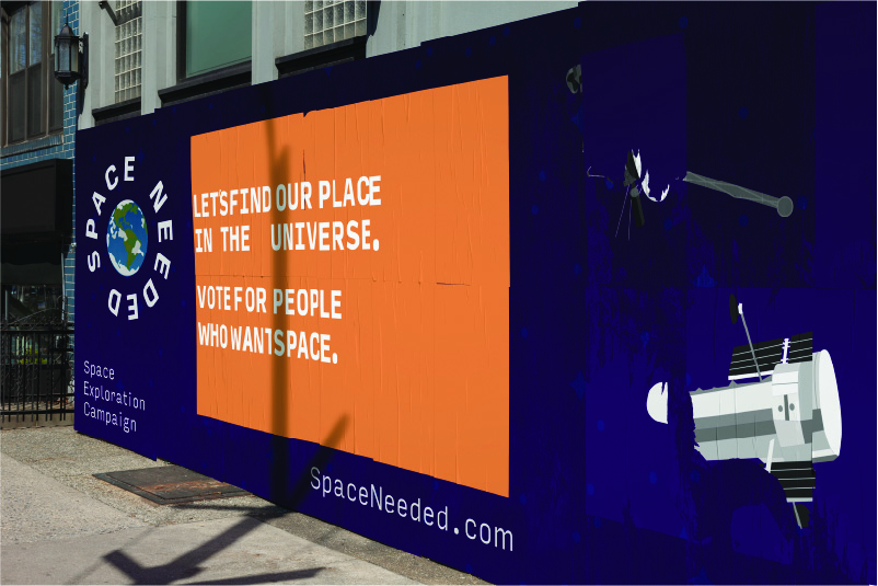
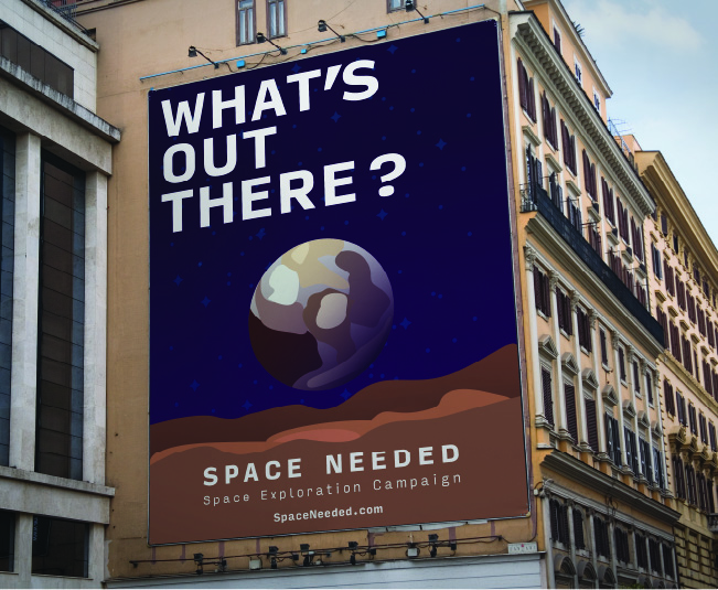
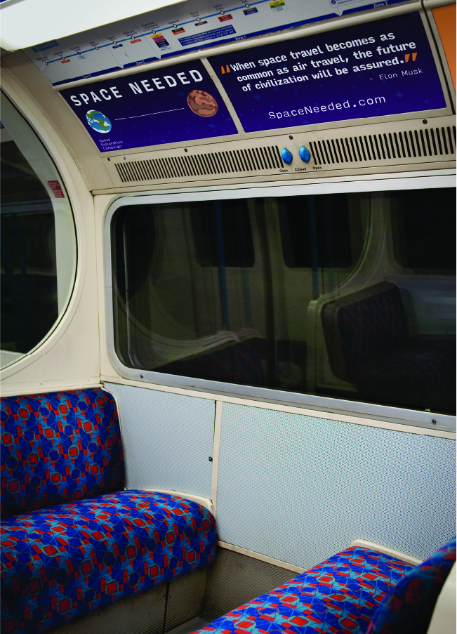
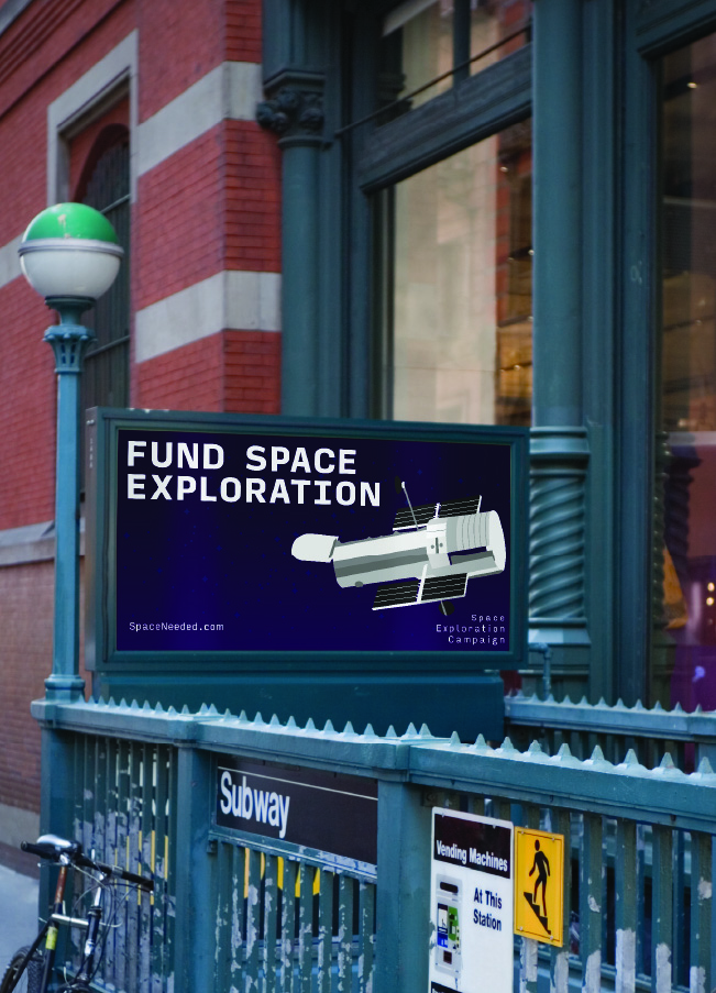
AD CAMPAIGN
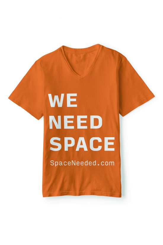
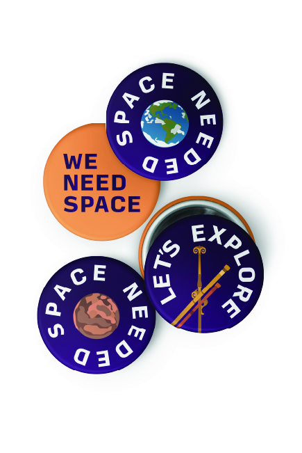
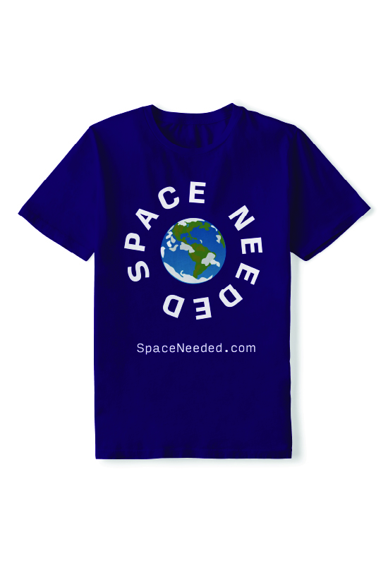
Buttons & Shirts
The parts of the campaign feature bold, contrasting purple and orange colors. They use the same typefaces as the posters and infographics, bold fonts that catch lots of eyes. The buttons have the different versions of the Space Needed logo, short quotes about space travel and fun bold colors. The shirts feature the same types of things as the buttons. Also working as walking advertisements for the Space Needed website that could give people further information about the
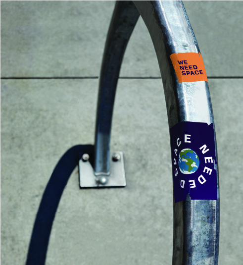
Stickers
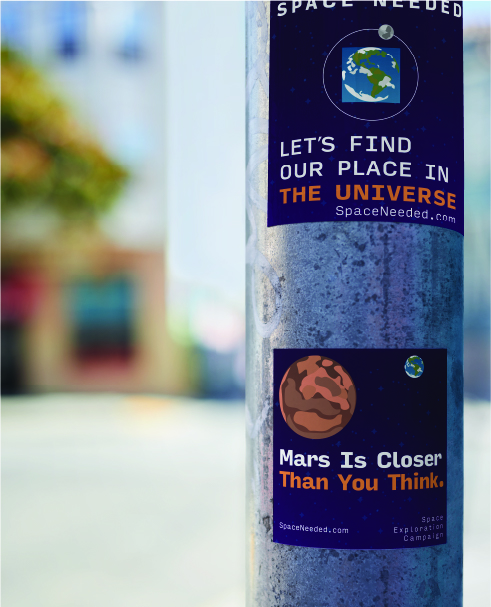
Adverts