Penrose
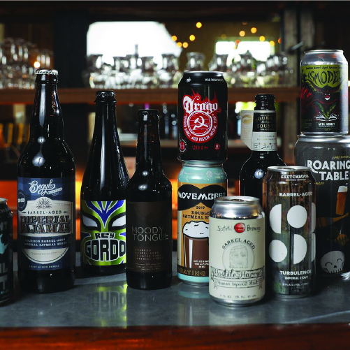
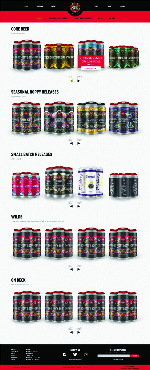
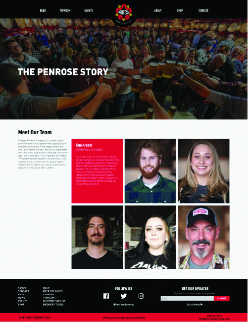
Penrose Brewing Company is a small, locally owned Brewery and Taproom that specializes in small batch brewing, fresh hoppy flavors and wild / sour fermentations. They experiment with new styles and feature a rotating selection of great beers available in their Taproom from Hazy IPAs and American Lagers to Fruited Sours and Imperial Stouts. While working at BFC I did a considerable amount of work for Penrose, this involved designing labels for upcoming beer releases, developing new lines of labels, creating visuals for social media and Doing front end development for their website.
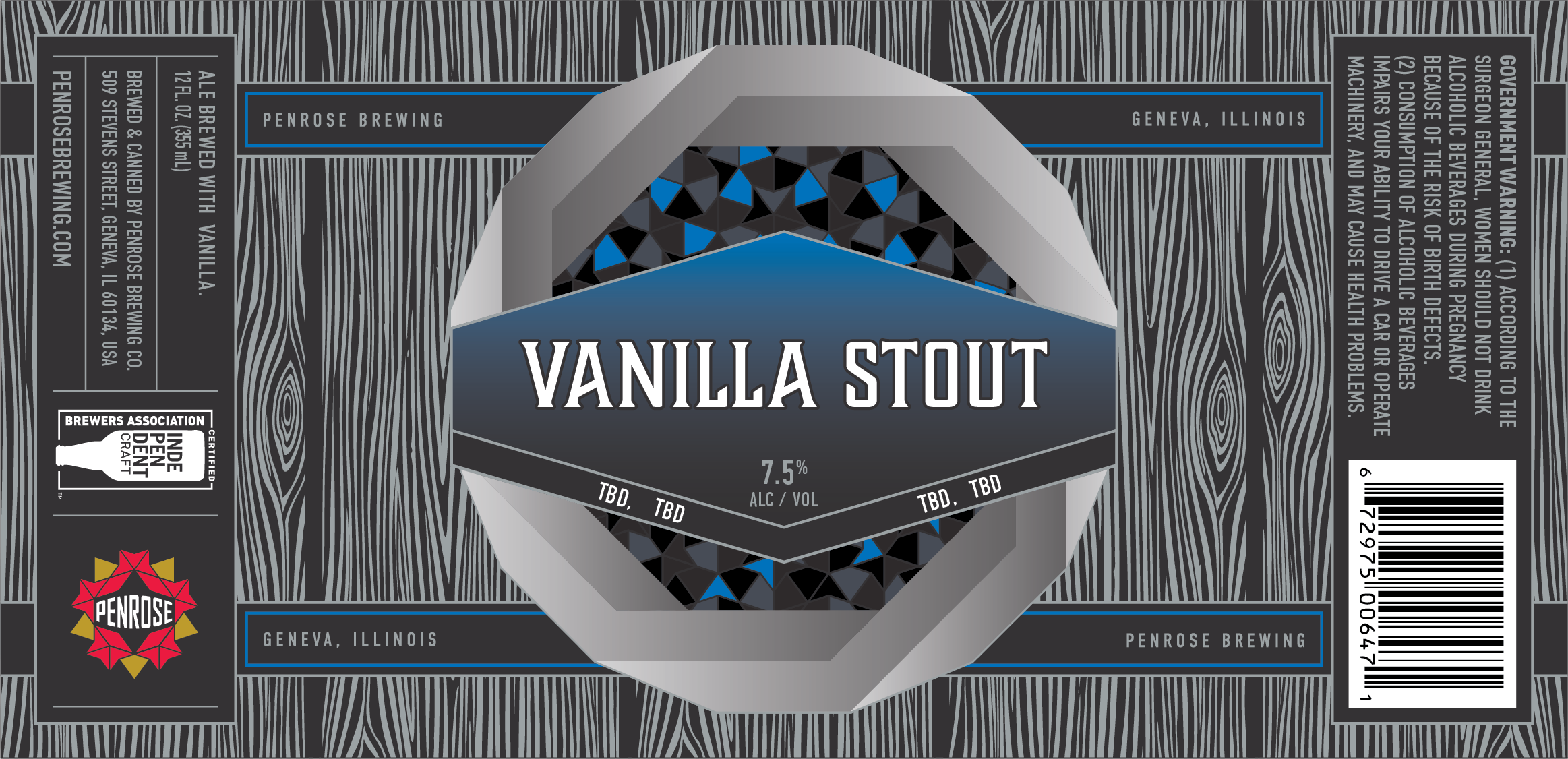
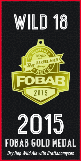
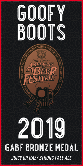
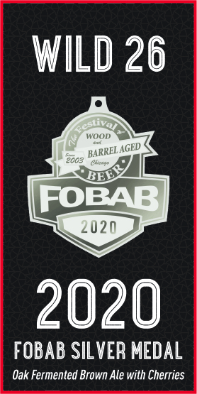
The design work on the seasonal labels required working from a templated format. I would talk with them to figure out what elements needed to change based on the name and style of the brew. In most cases I would just change the colors and copy on labels but the seasonal labels included in this section I made many creative designs for. I would create custom designs for the backgrounds of these labels to make them stand out from the more traditional Penrose labels. After seeing my proficiency in making the seasonal labels they asked me to work with them in developing the labels for their sour line of beers. This involved doing a fair amount of research and brainstorming to find the perfect solution to this problem. Similar to the sour labels, I worked with Penrose to develop a standard design for their “Cavern” line of beers.
In between doing the design work on all of these labels I would occasionally work on creating social media posts that would advertise new beer releases and upcoming events. In 2021 Penrose ask me to help re-design their site. Working with Penrose I developed the design for their front-end look and worked with back-end developers to make sure the designs were faithfully implemented.
Penrose Seasonal Labels
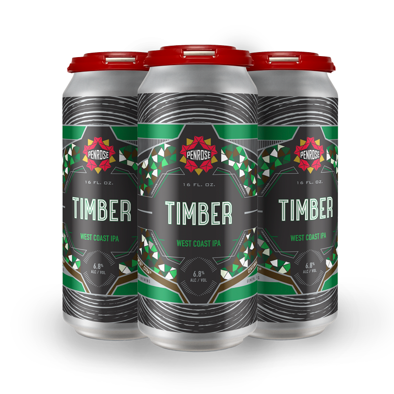
Timber
August 2020
- Beer Type: West Coast IPA
- Can Size: 16 FL oz.
- ALC%: 6.8%

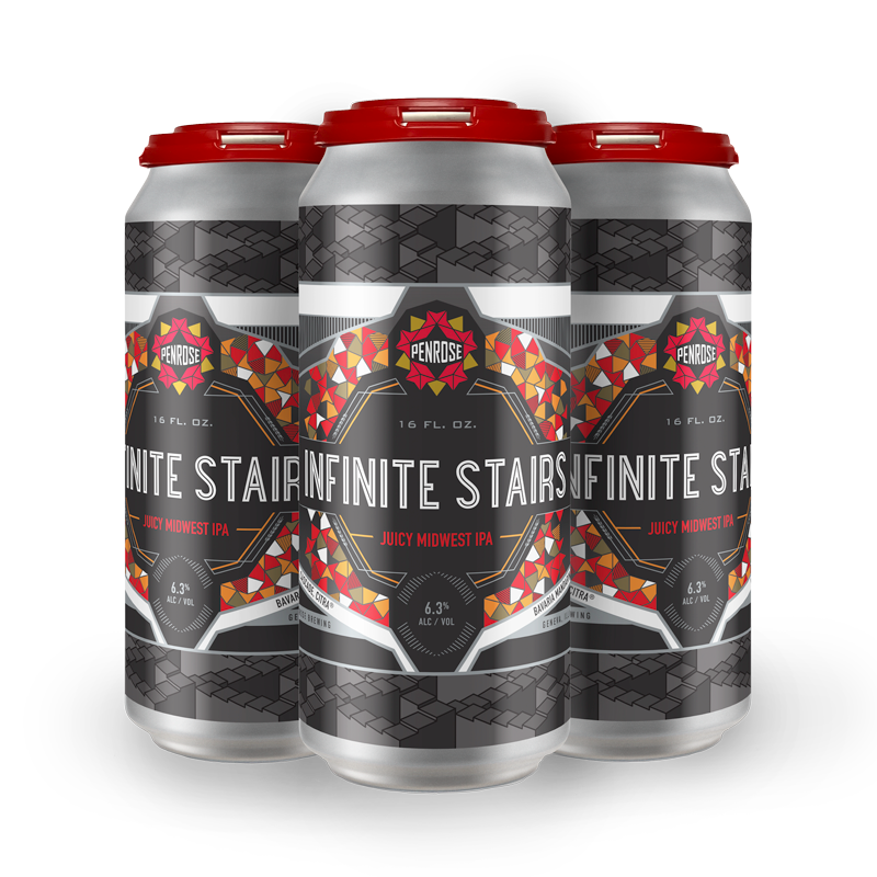
Infinite Stairs
October 2020
- Beer Type: Juicy Midwest IPA
- Can Size: 16 FL oz.
- ALC%: 6.3%

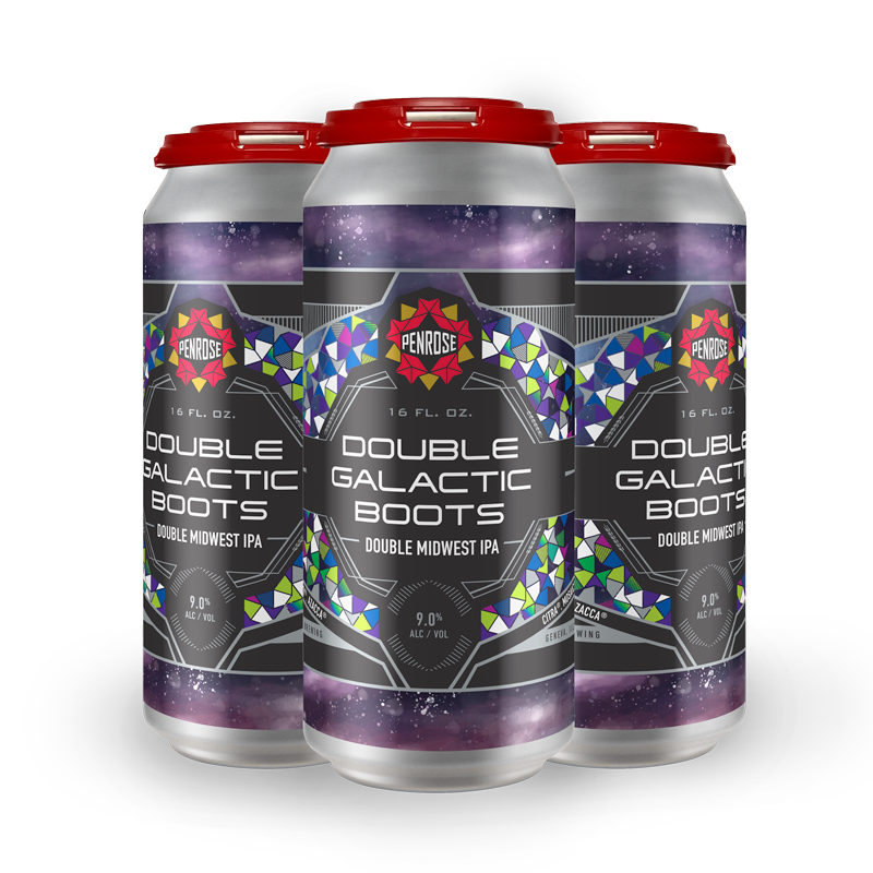
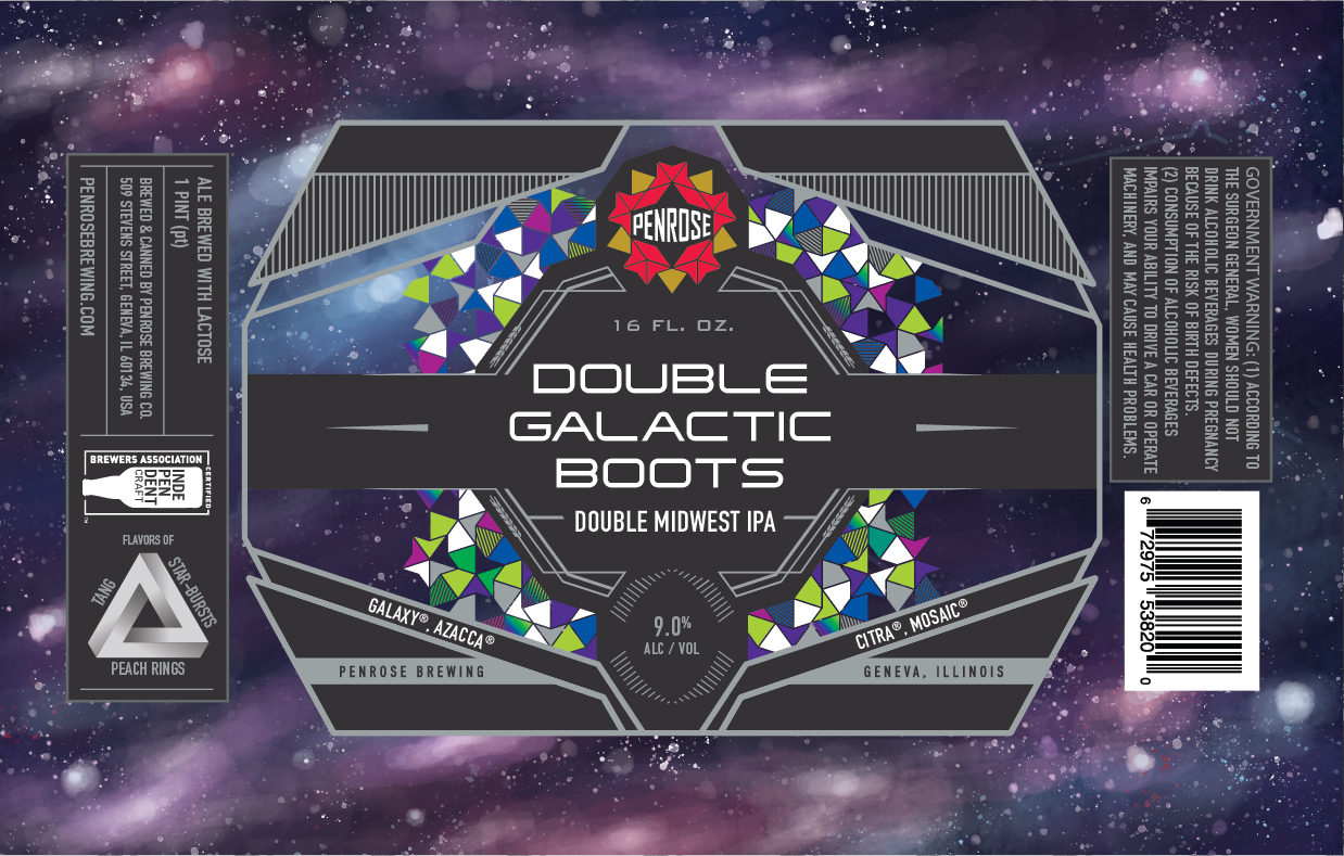
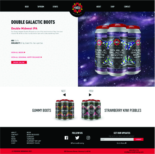
Double Galactic Boots
October 2020
- Beer Type: Double Midwest IPA
- Can Size: 16 FL oz.
- ALC%: 9.0%
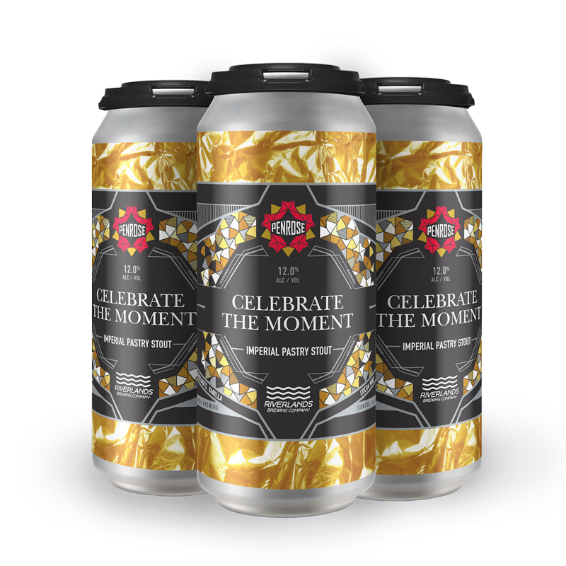
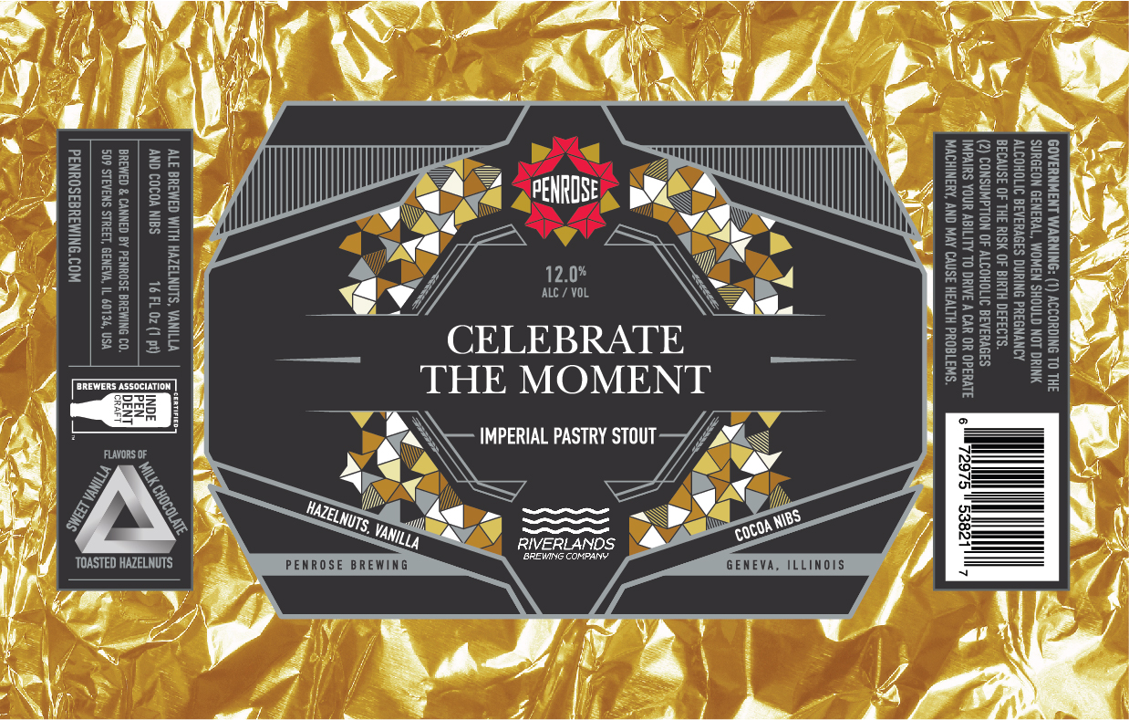
Celebrate The Moment
November 2020
- Beer Type: Imperial Pastry Stout
- Can Size: 16 FL oz.
- ALC%: 12.0%
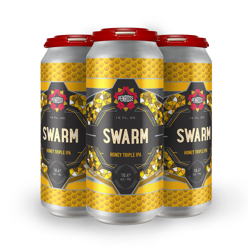
Swarm
November 2020
- Beer Type: Honey Triple IPA
- Can Size: 16 FL oz.
- ALC%: 10.4%

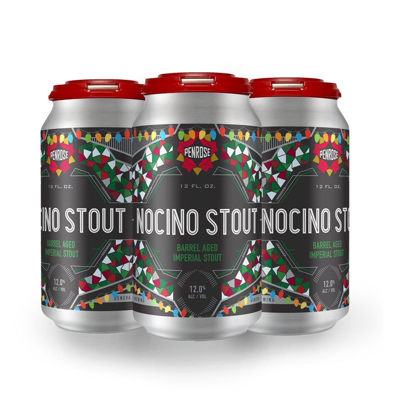
Nocino Stout
December 2020
- Beer Type: Barrel Aged Imperial Stout
- Can Size: 12 FL oz.
- ALC%: 12.0%

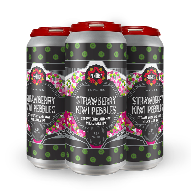
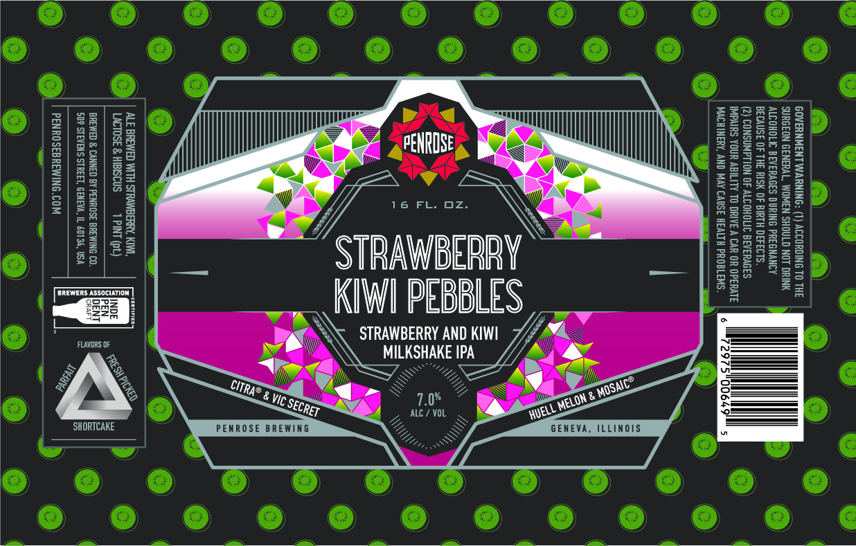
Strawberry Kiwi Pebbles
January 2021
- Beer Type: Milkshake IPA
- Can Size: 12 FL oz.
- ALC%: 7.0%
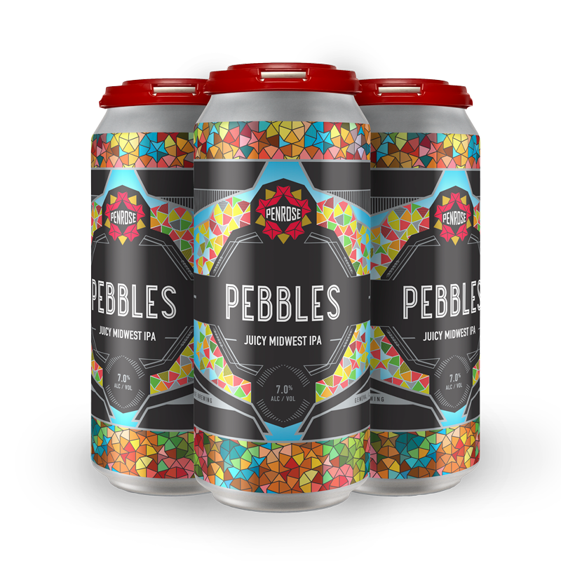
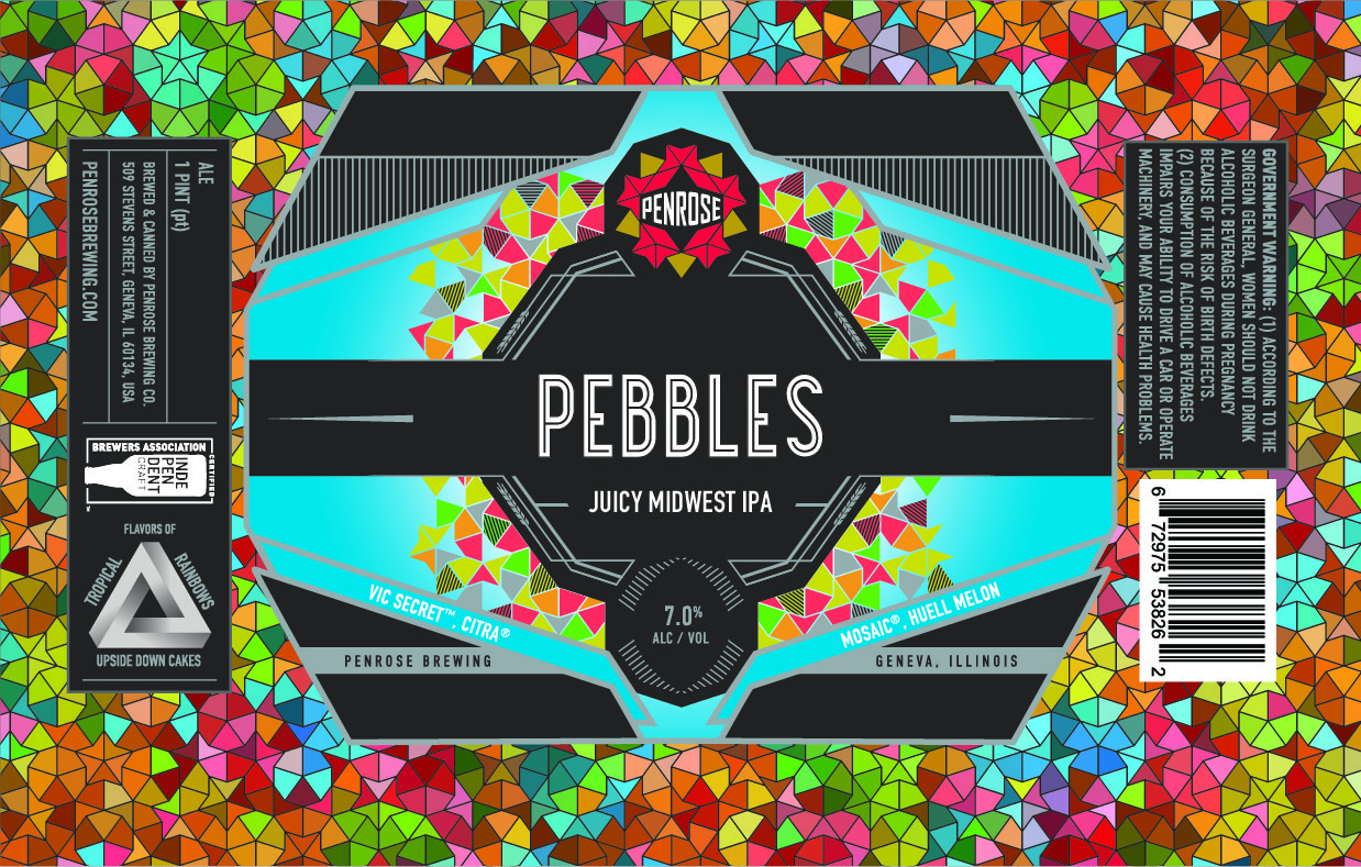
Pebbles
February 2021
- Beer Type: Juicy Midwest IPA
- Can Size: 12 FL oz.
- ALC%: 7.0%
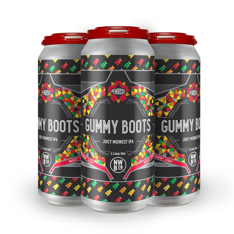
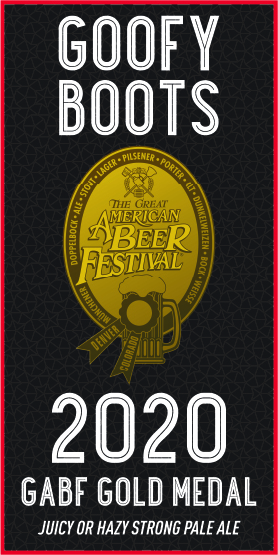
Gummy Boots
February 2021
- Beer Type: Juicy Midwest IPA
- Can Size: 12 FL oz.
- ALC%: 7.0%

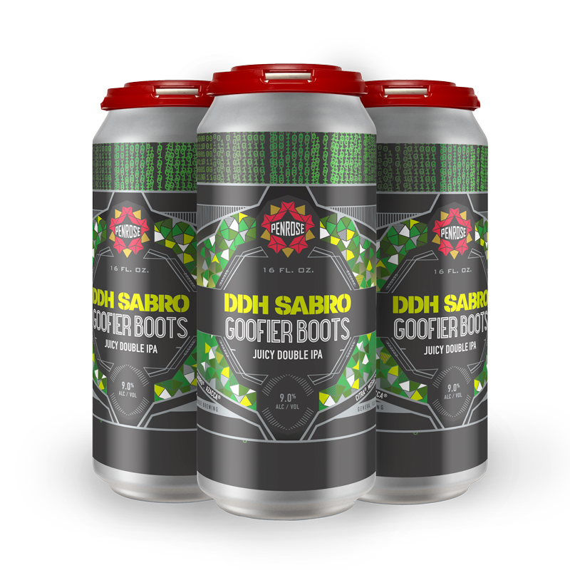
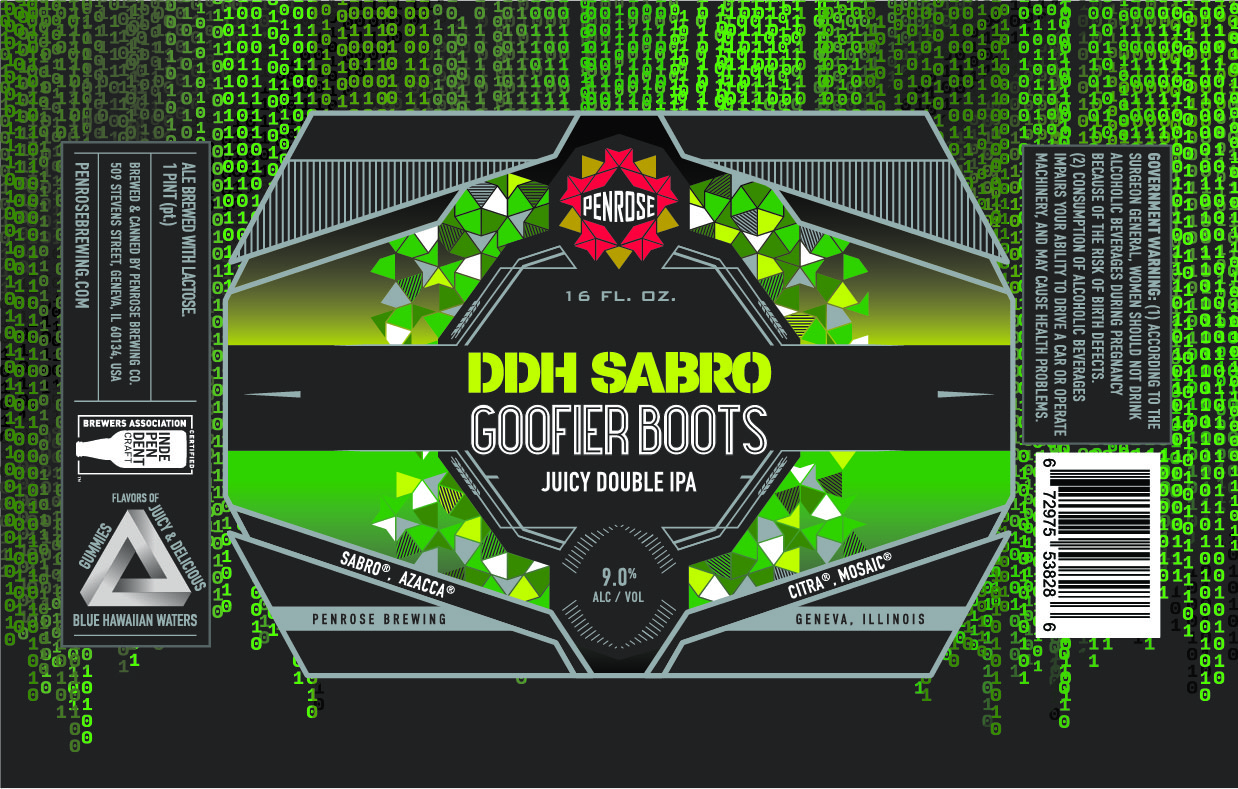
Goofier Boots
February 2021
- Beer Type: JuicyDouble IPA
- Can Size: 12 FL oz.
- ALC%: 9.0%
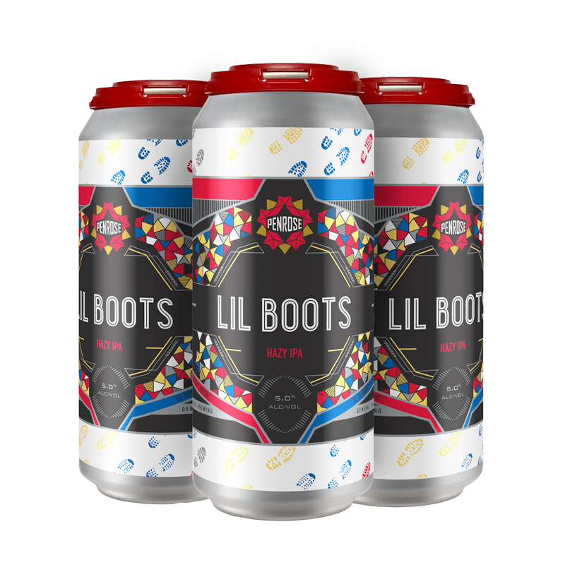
Lil Boots
March 2021
- Beer Type: Hazy IPA
- Can Size: 12 FL oz.
- ALC%: 5.0%

SOUR LABEL DEVELOPMENT
Research


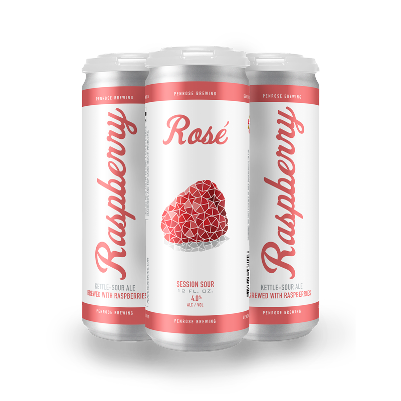
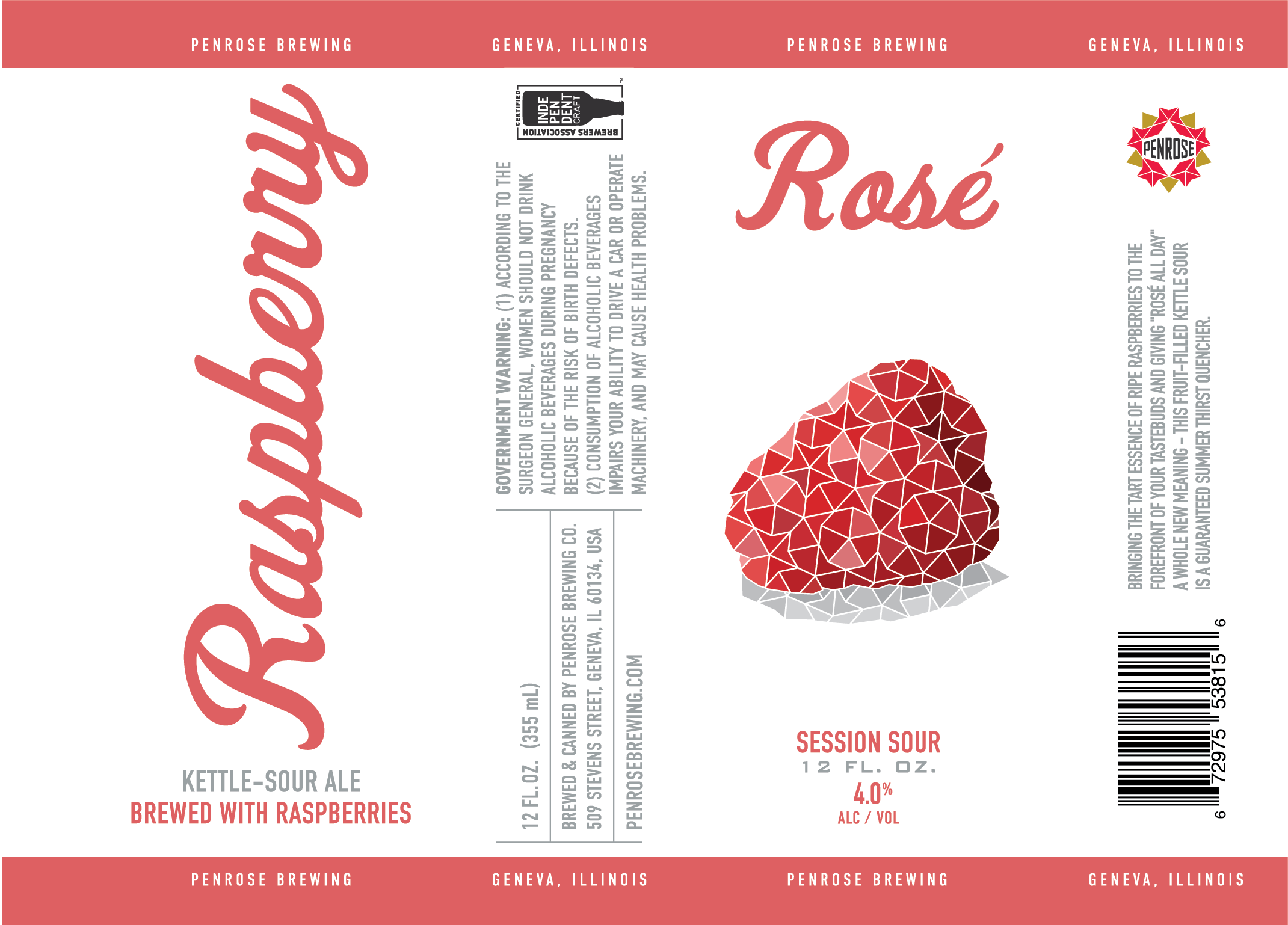
Raspberry Rosé
September 2020
- Beer Type: Session Sour
- Can Size: 12 FL oz.
- ALC%: 4.0%
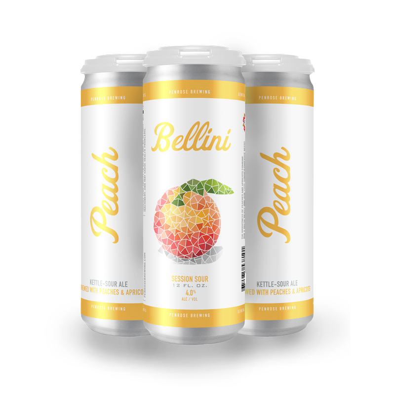
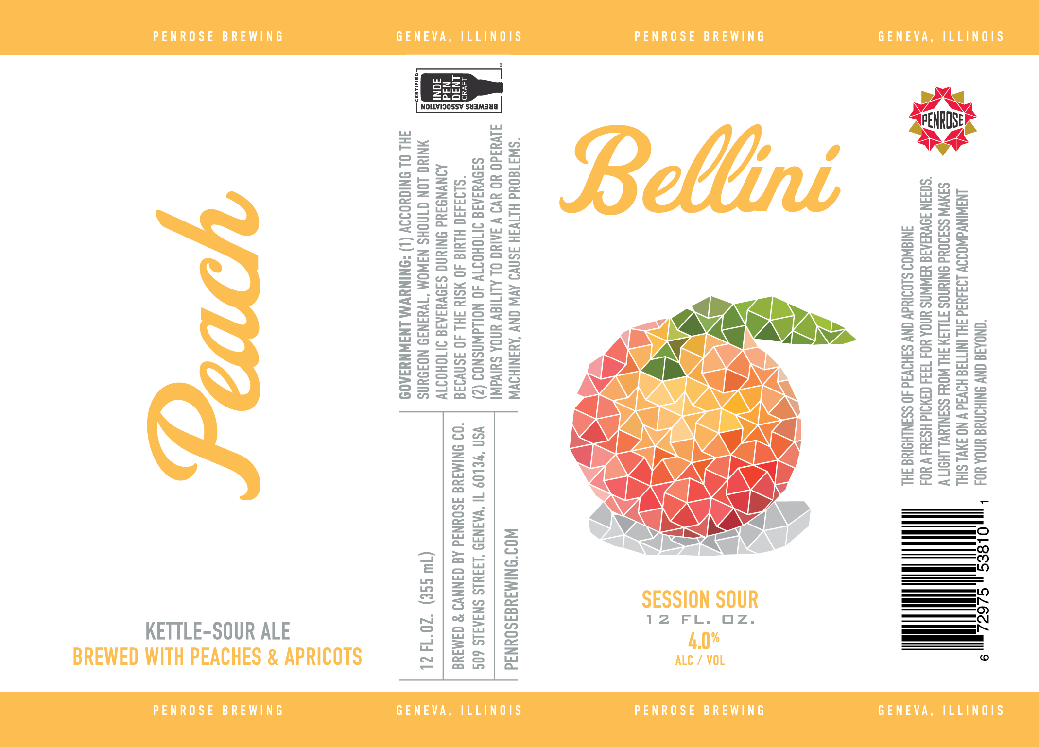
Peach Bellini
September 2020
- Beer Type: Session Sour
- Can Size: 12 FL oz.
- ALC%: 4.0%
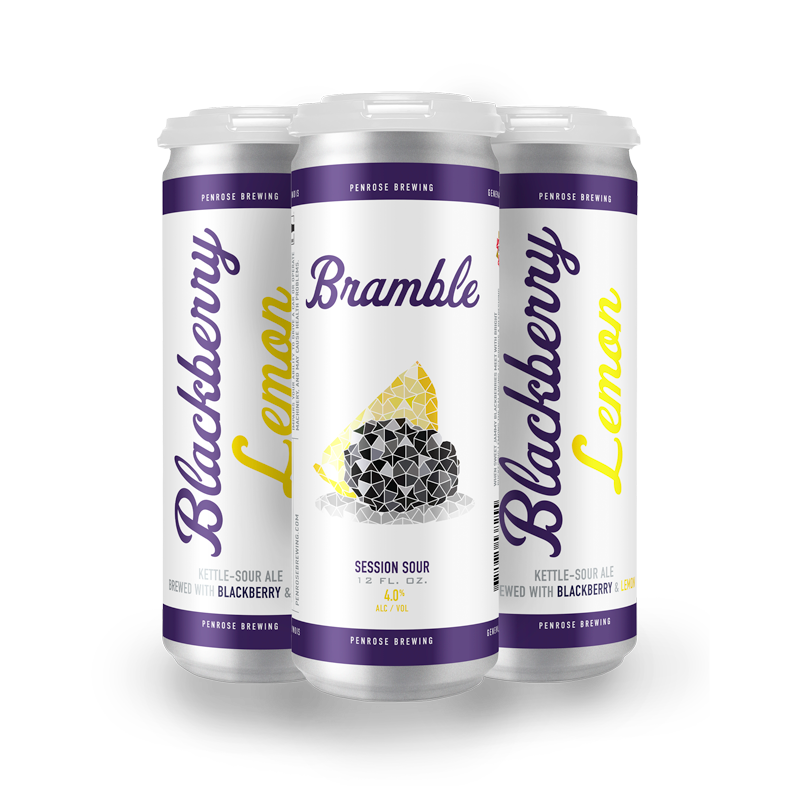
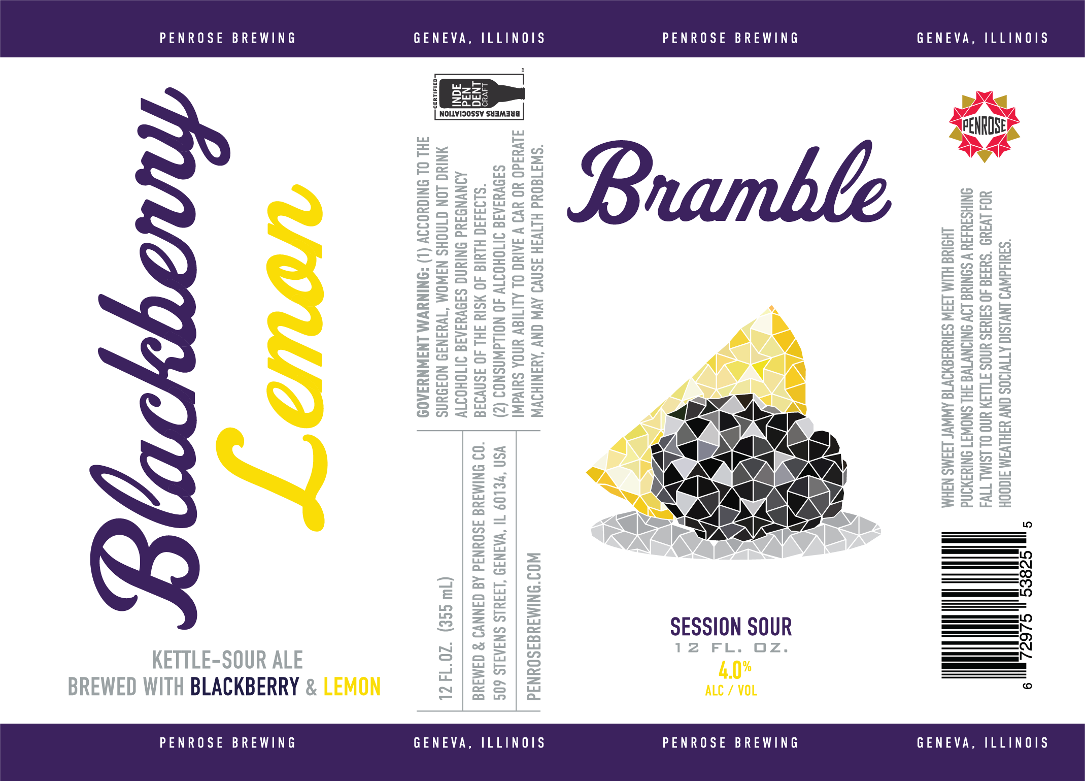
Blackberry Lemon Bramble
October 2020
- Beer Type: Session Sour
- Can Size: 12 FL oz.
- ALC%: 4.0%
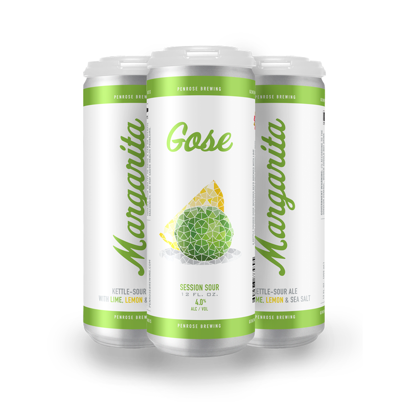
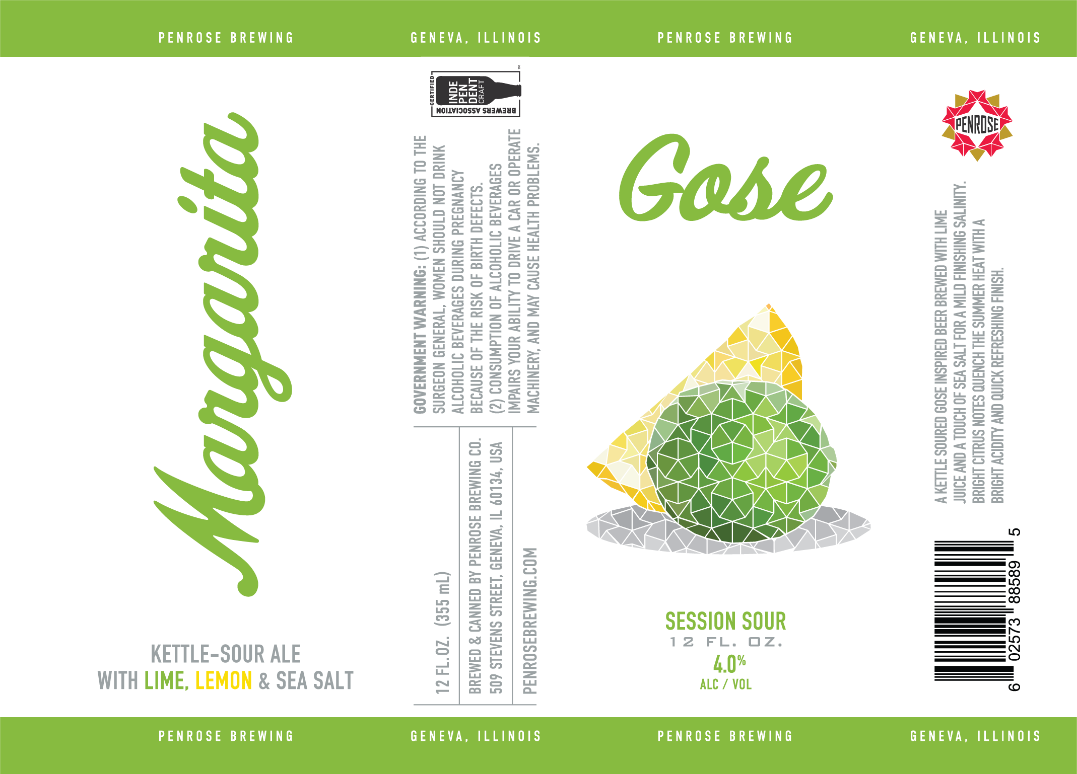
Margarita Gose
January 2021
- Beer Type: Session Sour
- Can Size: 12 FL oz.
- ALC%: 4.0%
CAVERN LABEL DEVELOPMENT
Research
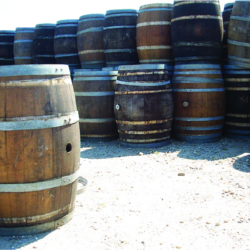
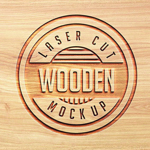
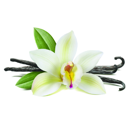
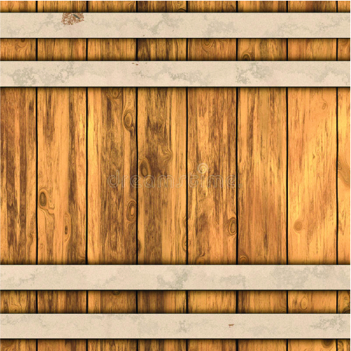
During my research I didn’t come across any real through lines between other beers. So, I decided to look further into the things that would make this beer unique from the others that Penrose has. The biggest difference being the whiskey barrels its aged in. Another noticeable thing is the ingredients, vanilla and chocolate is not your everyday beer ingredient. I also thought it would be interesting to explore the textures of the barrels. An interesting pattern can be established from one of the things that sets this beer apart. There were also many different wood treatments I looked into that could provide an interesting visual, like laser cuts and wood burning.
This label would also be for a 12oz can, so the area to work with would be considerably smaller than the normal 16oz cans I was used to. Space is limited on these labels so establishing a unique look with little space would be a challenge.
After thorough research I thought it would be interesting to go down a road that makes use of a wooden texture and has a grittier feeling. The idea of wooden barrels and whiskey just screams americana western to me. In this spirit I tried to include some western features in my initial mockups. I also looked into other typefaces that can enhance this gritty feeling. I looked at typeface that have easily useable shades built into them; this would make creating some type of embedded into wood idea easier to do. I came across one typeface that has a more serif look that has lots of hanging sharp edges that can reinforce the strength and classiness of the beer. The other typeface a more traditional san serif that looks like it can easily be imprinted on the label.


Label Iterations
The left and right-side panels with the health info mostly stayed the same throughout. One noticeable change is the evolution of the “Flavor Triangle”. While in discussions about the label I mentioned there were so many different flavors going into the brew that you would need more than just a flavor triangle. So, we decided to create the flavor circle, based on another famous “Impossible shape”. On the first iteration I used this circle on the front of the label, acting kind of like an opening in the barrel.
As the iterations continued, I found myself subtracting elements in the label like the shapes and lines. I tried to keep it as simple as possible. There was a fight to keep some color or keep it scarce. It began to feel like each iteration lost more and more color until the labels were dark.
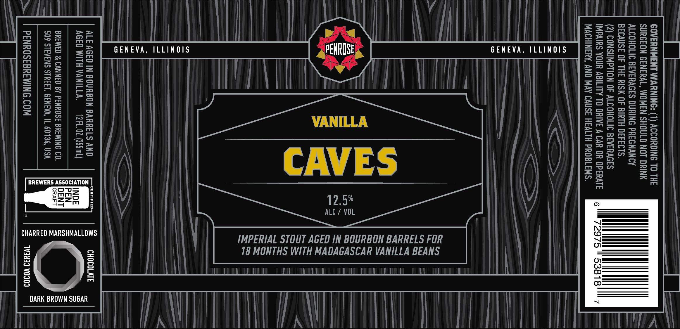
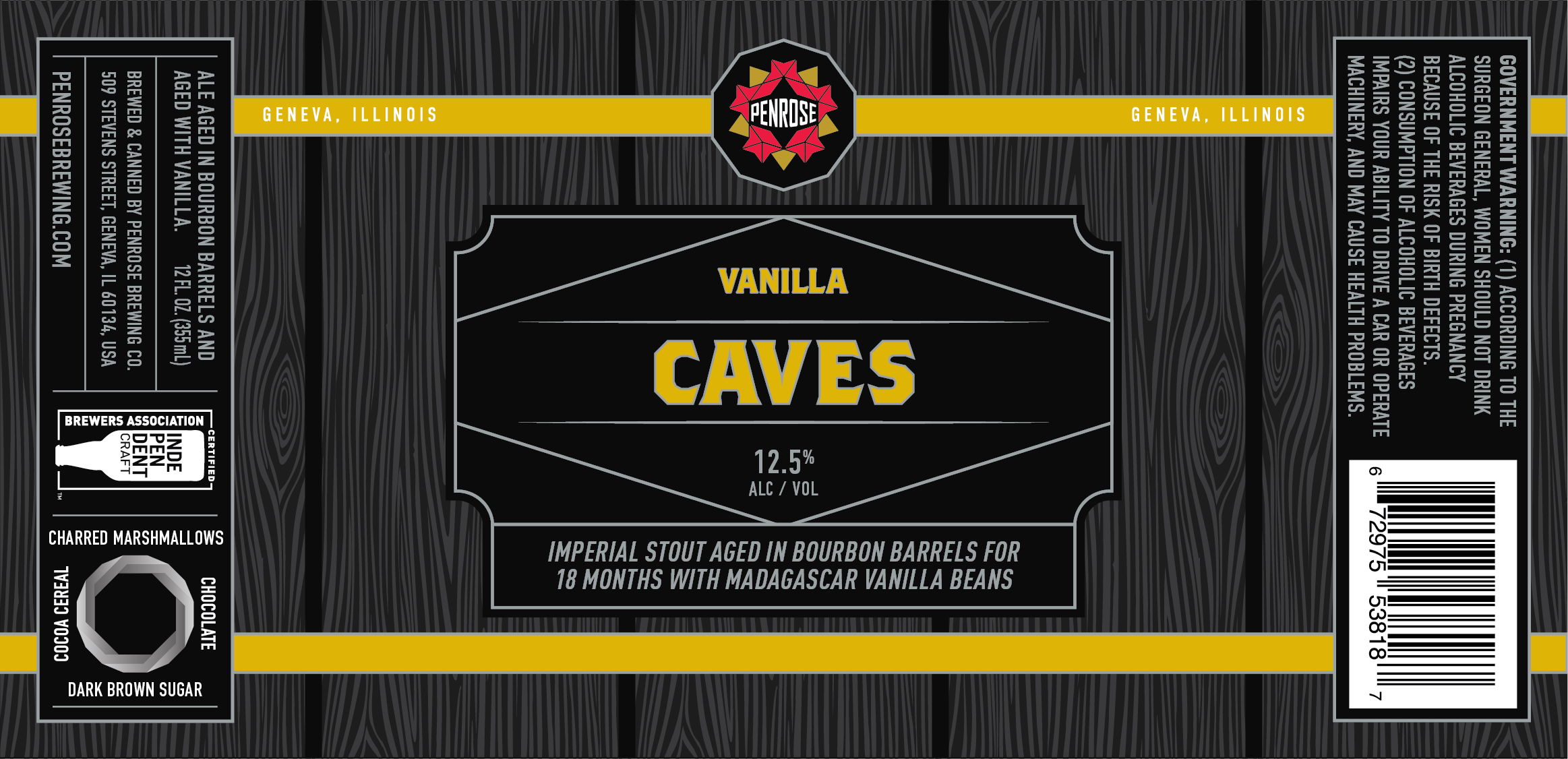
Final Label
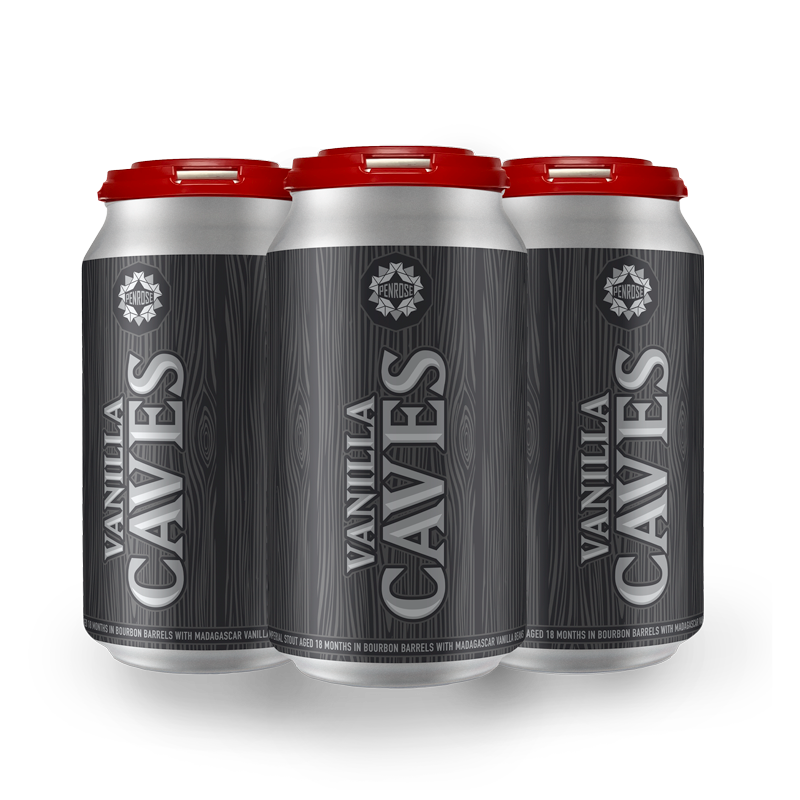
Vanilla Caves
November 2020
- Beer Type: Barrel Aged Imperial Stout
- Can Size: 12 FL oz.
- ALC%: 12.0%

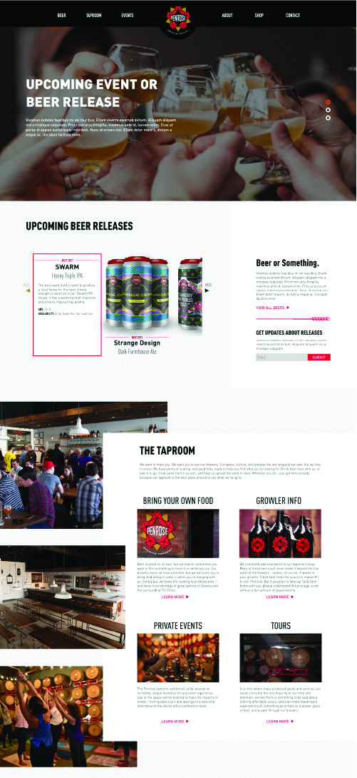
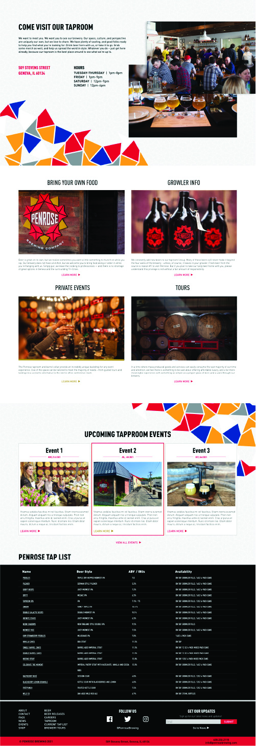
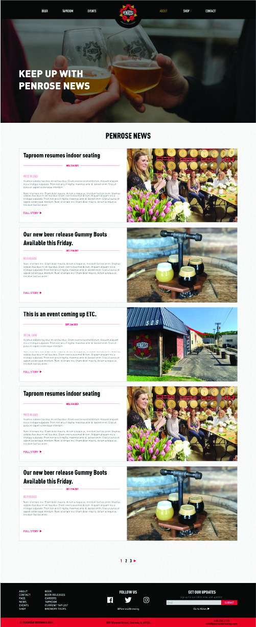
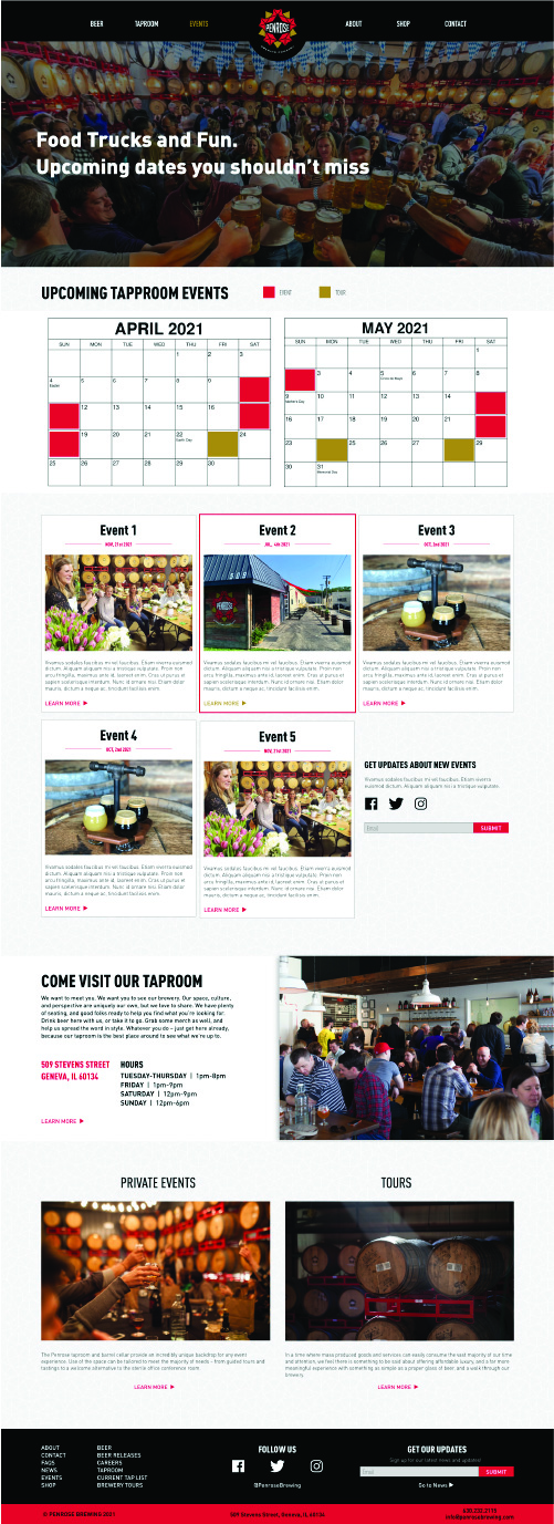
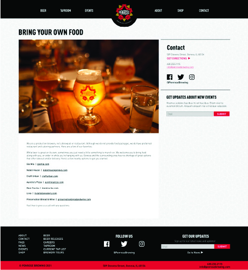
PENROSE WEBSITE DESIGN
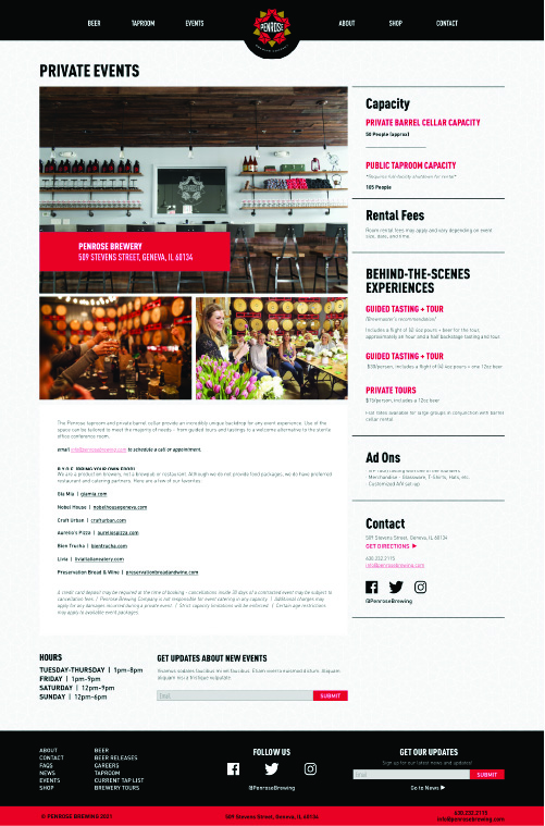
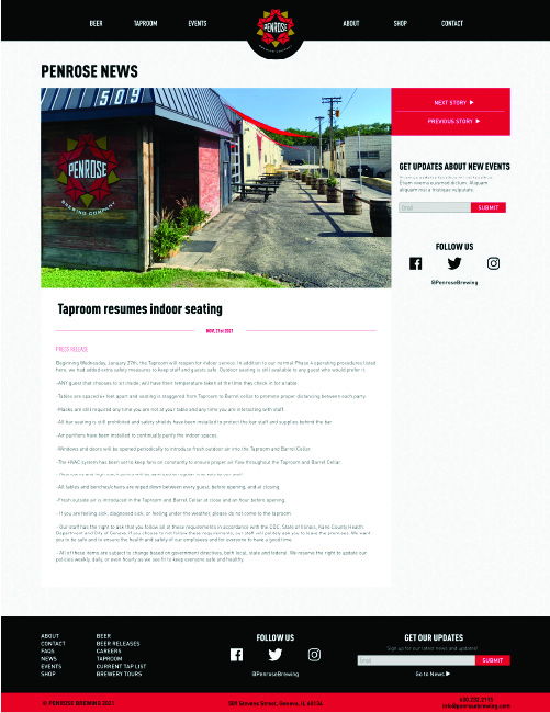
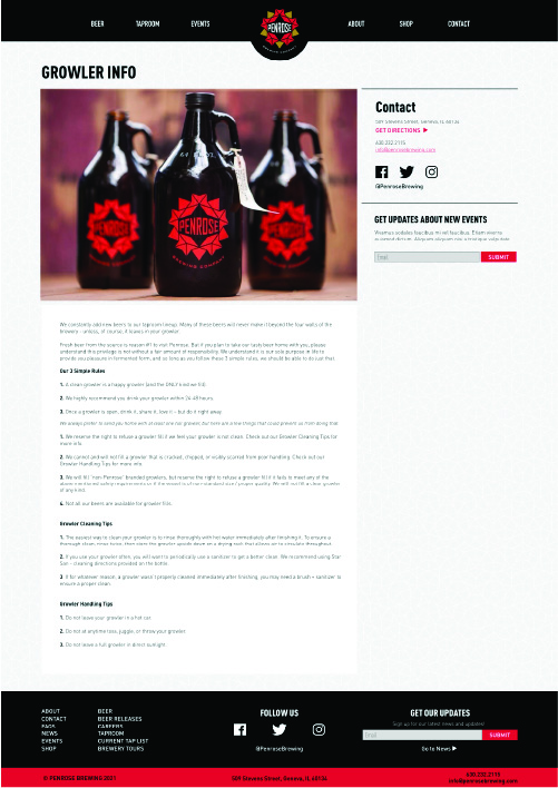
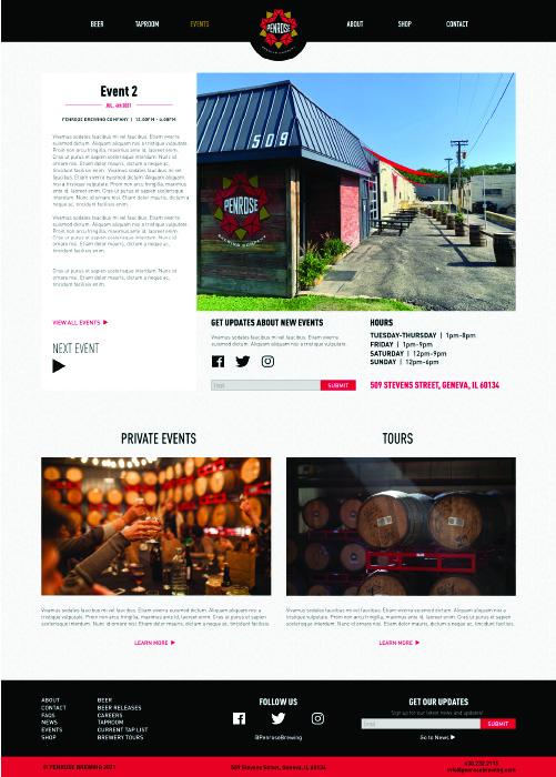
One of the biggest things that I ended up changing was the typography. Before, their site had a mess of different sizes of types. In my new design we standardized heading sizes and hierarchies. I made the headings a heavier weight and gave them more consistent placement that would help the user along the way. One of the biggest things to change was the layout of the main events and news page. Penrose wanted to put a larger emphasis on these aspects of their site. To draw more attention to these I created references to them on many of the pages so people would constantly be reminded of new events taking place at Penrose. I used Adobe XD to easily mockup all the pages, this choice streamlined the overall review process of the web design. This made the designs easier to share and view in basic forms. Once all the designs were approved, I sent them off to the back-end developer to bring the website to life.
MISCELLANEOUS WORK
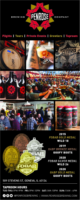
Banners
Sell Sheets & Ad
Graphics
The other graphic is mainly used to advertise the curbside pick-up and beer delivery services that Penrose offers. It’s an illustration I made of a can on wheels speeding away. It’s also used to advertise the times the taproom is open.

