Wanderer
Wanderer is a company I created in my final year of college during a capstone class. This project was near and dear to my heart for many reasons, first being the concept behind the company is unique and my own. Secondly, I love playing cards. From playing card games at family functions to seeing the beautiful designs on the back of each cards, I love it all.
Wanderer is an entertainment company that specializes in making playing cards and material intended to educate consumers on a certain topic. The idea behind it is creating a learning experience through playing cards. Each deck has a different theme that contains 52 different illustrations, one for each card. A book or educational component comes with each deck explaining the history or significance of each card. The decks of cards could range from animals in the rain forest to the most important planes made throughout history. Each deck aims to establish a different illustration style that accents each new topic. The name Wanderer comes from the nature of the variety of topics that are covered in each deck. We tend to wander from one subject to another, not knowing what’s further down the road.
LOGO DEVELOPMENT
Research


Sketches
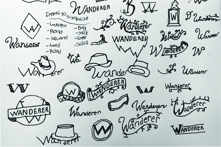
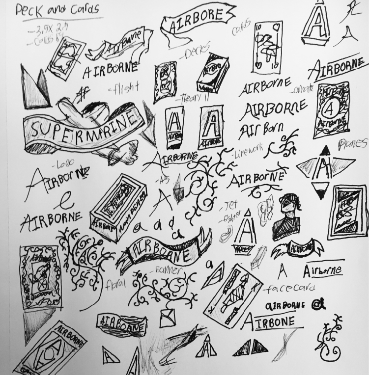
Doing the sketches for this company I tried to keep them slightly ornate but cut down on the frills. I mostly enjoyed the sketches that were simple uses of the name and the letter W.
Iterations


Final Logo
Color Pallete
Typography


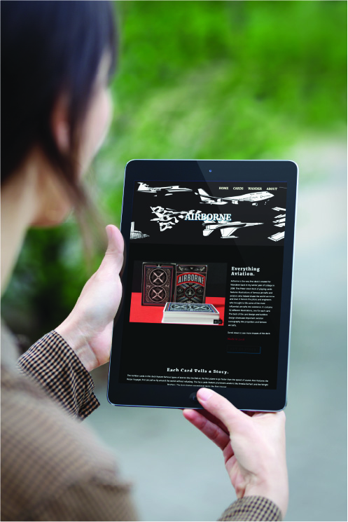
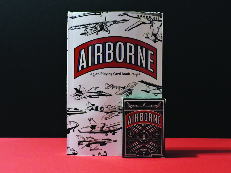
AIRBORNE
Playing Cards
Research
Sketches
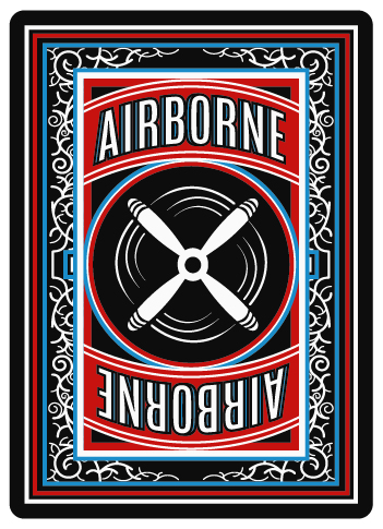
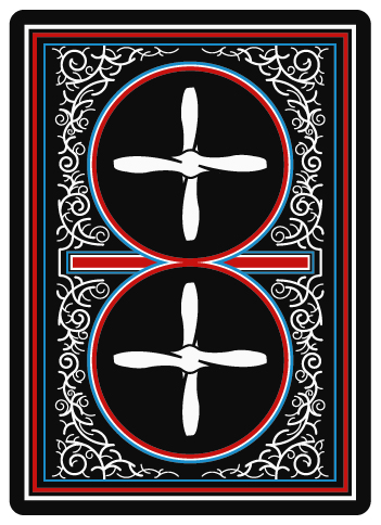
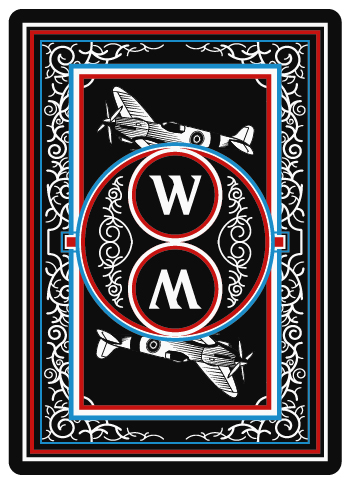
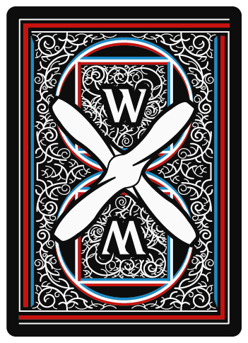
Back Interations
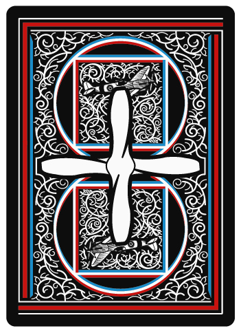
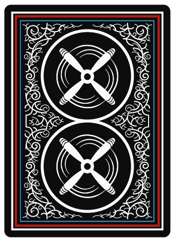
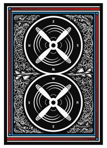
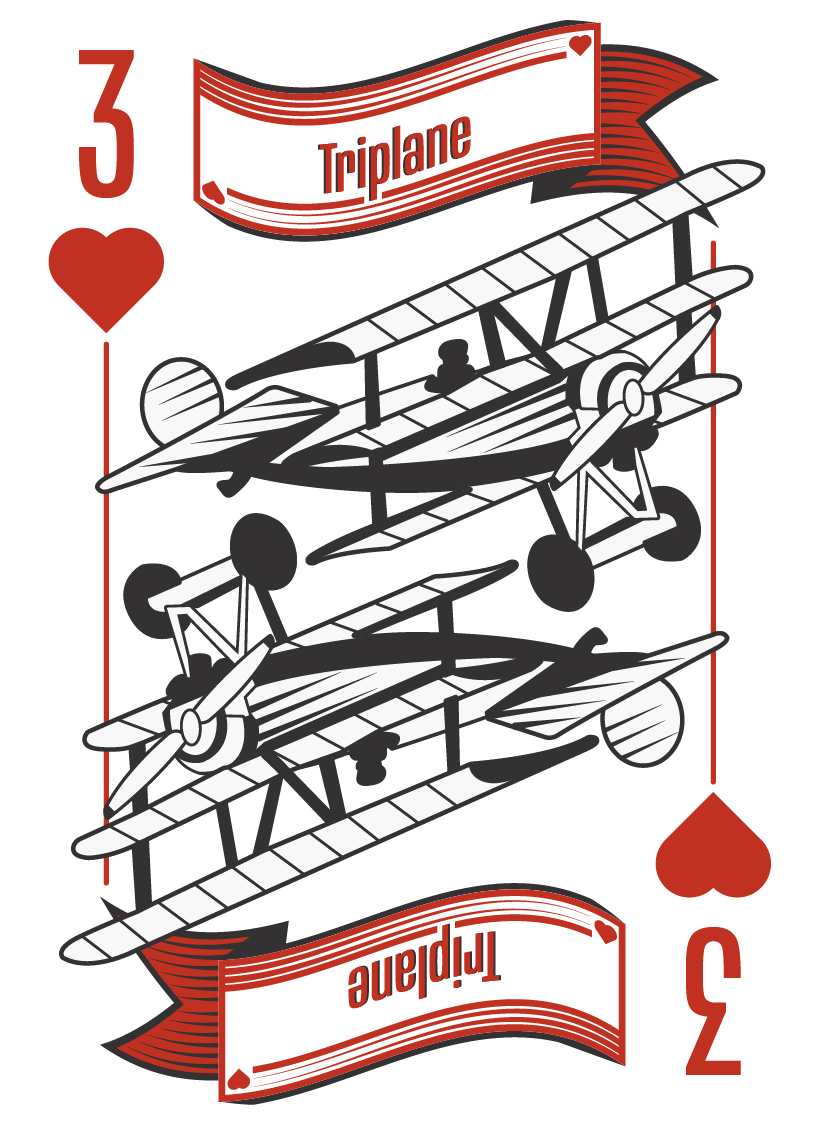
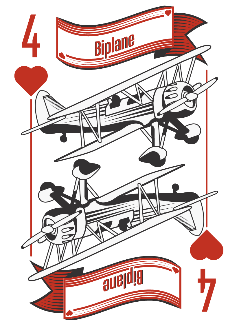
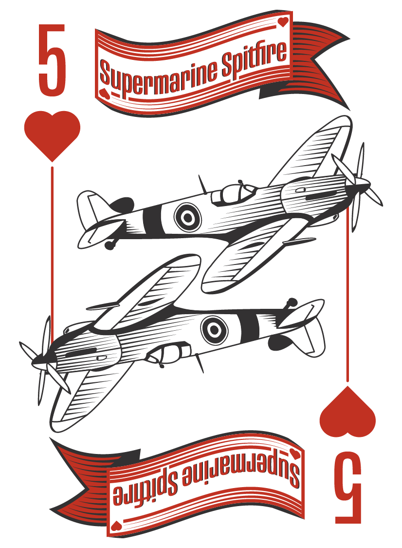
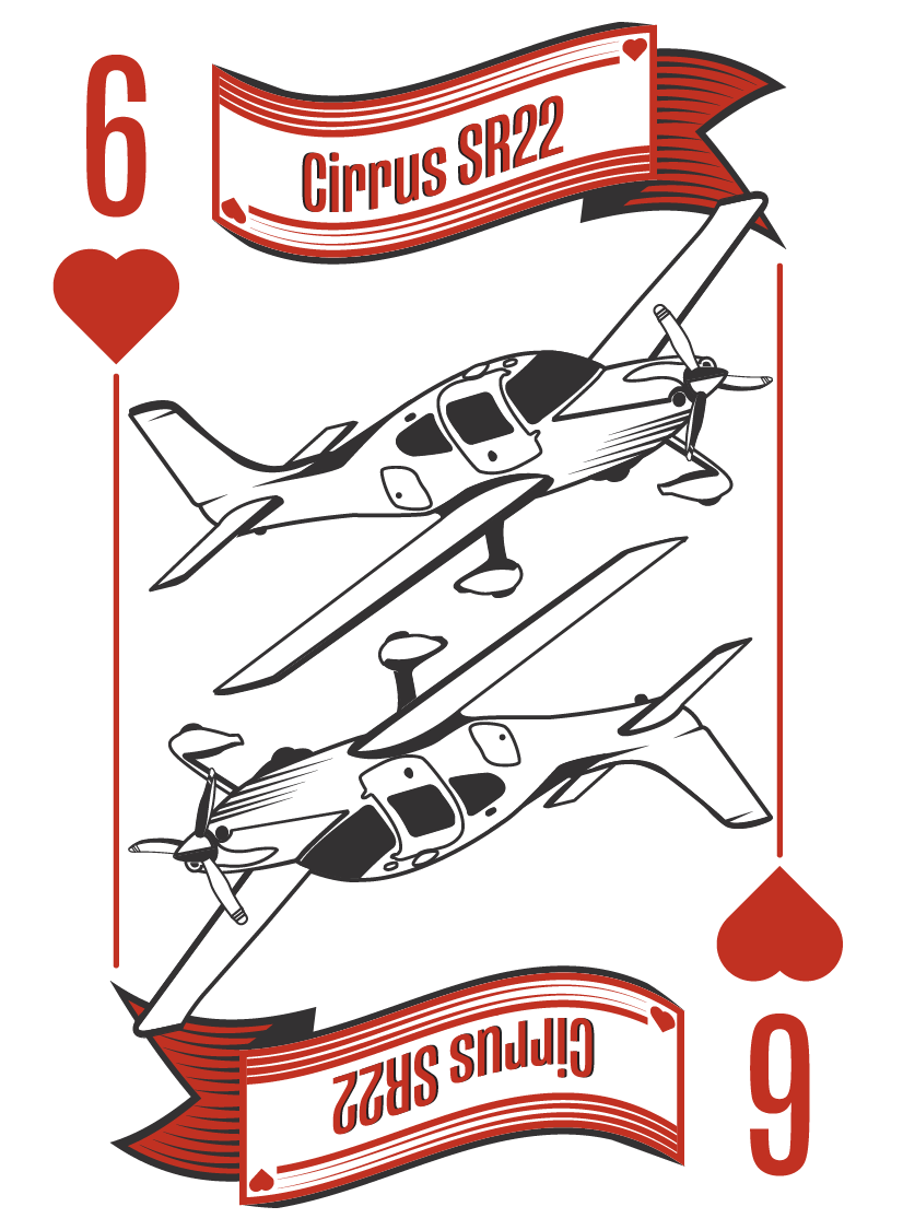
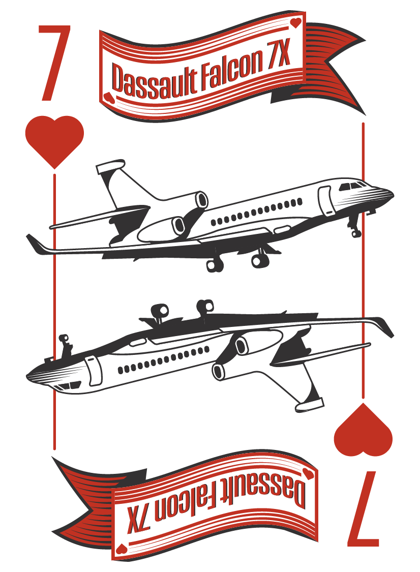
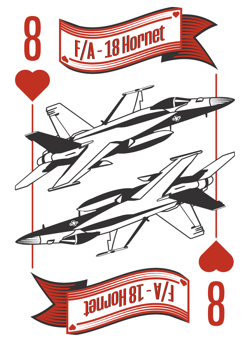
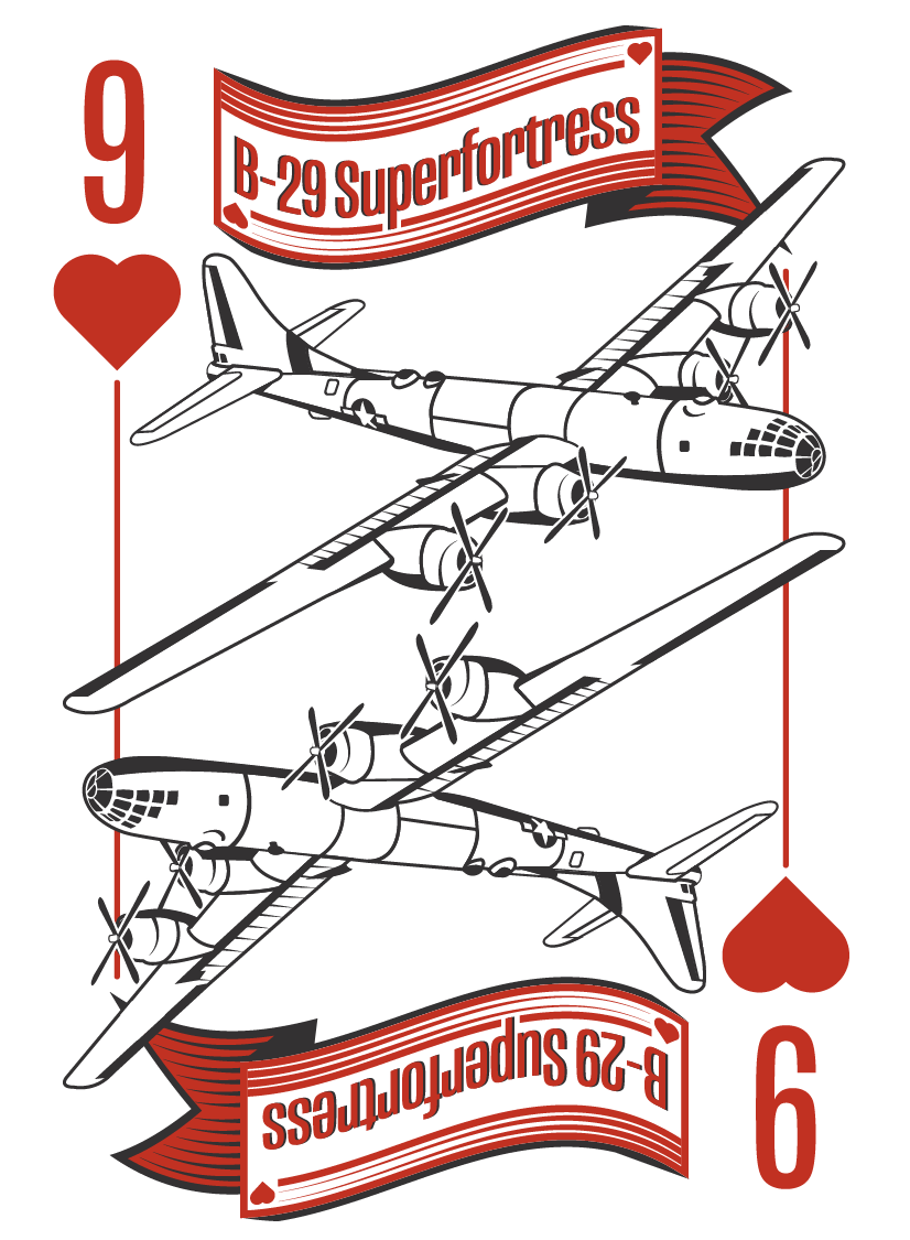
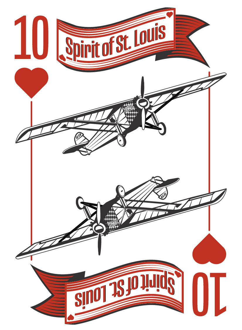
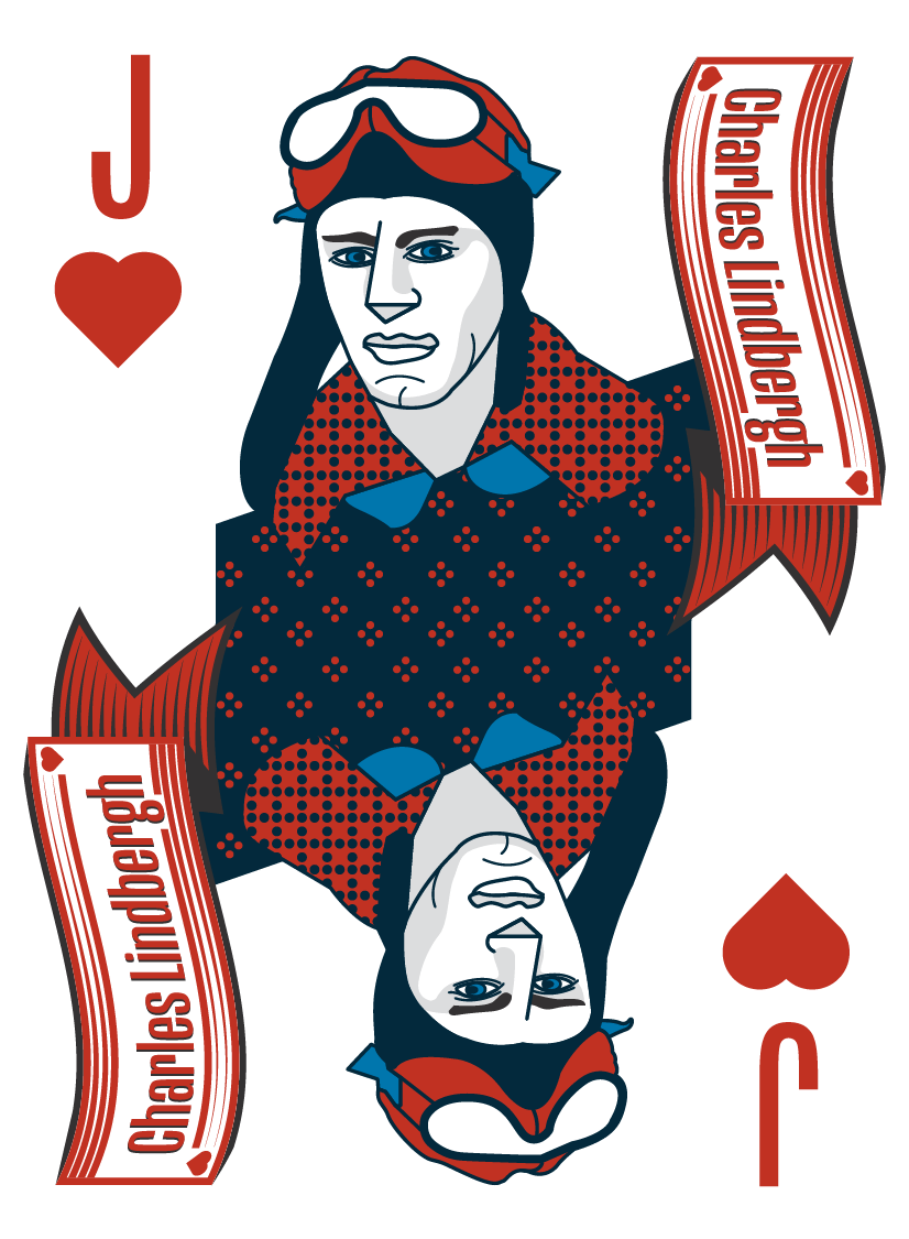
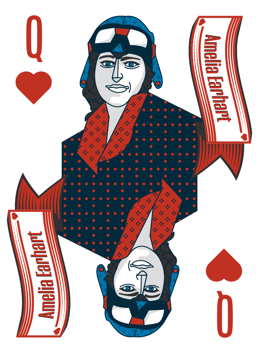
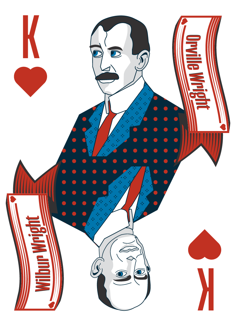
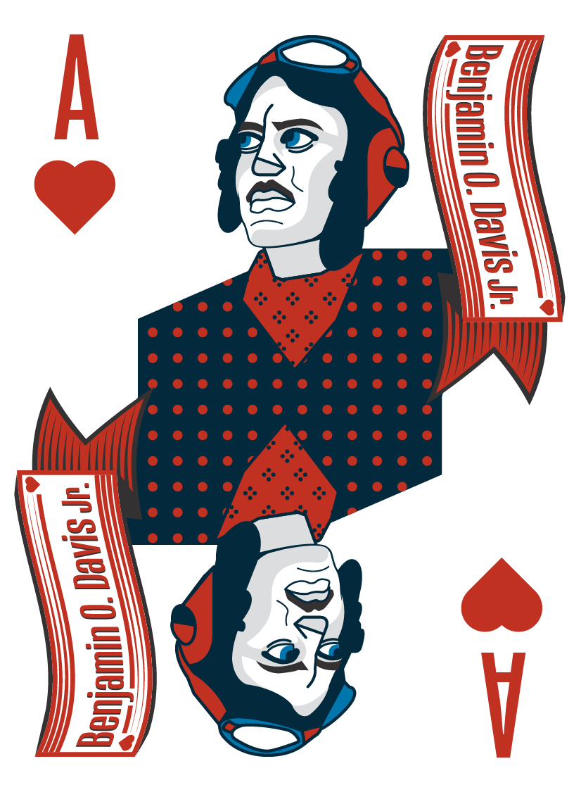
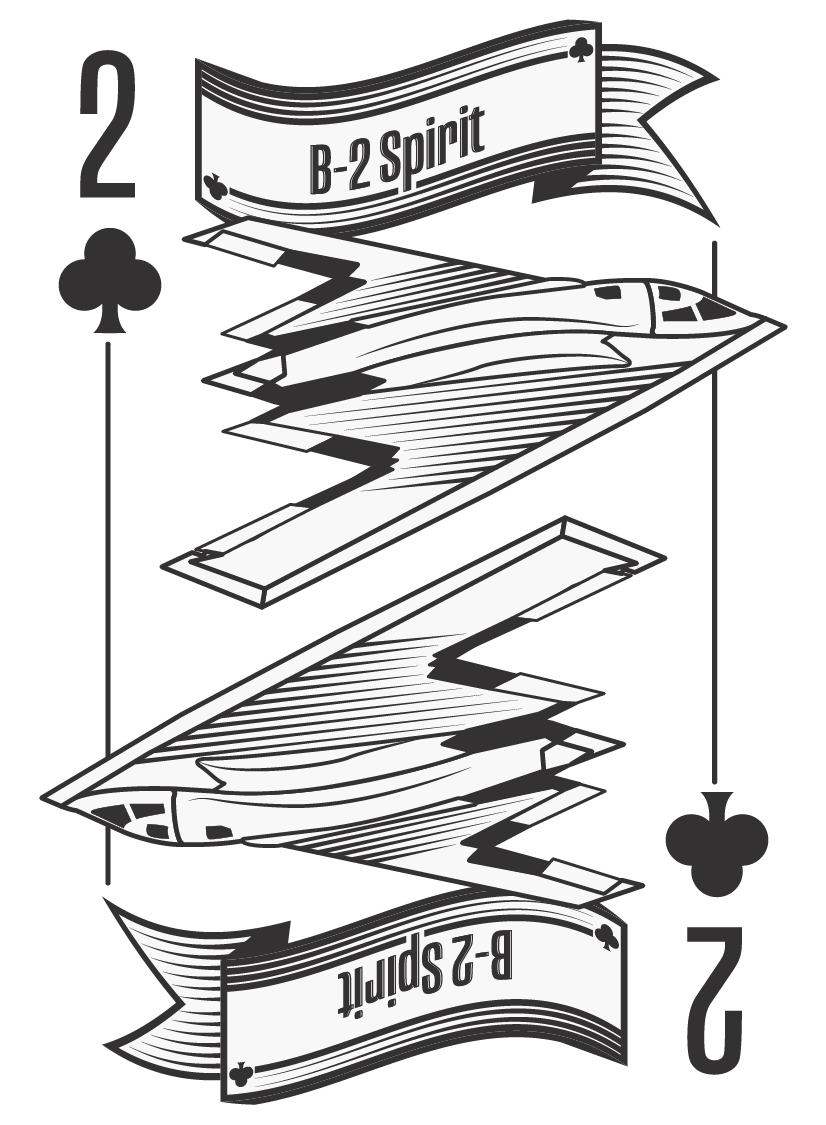
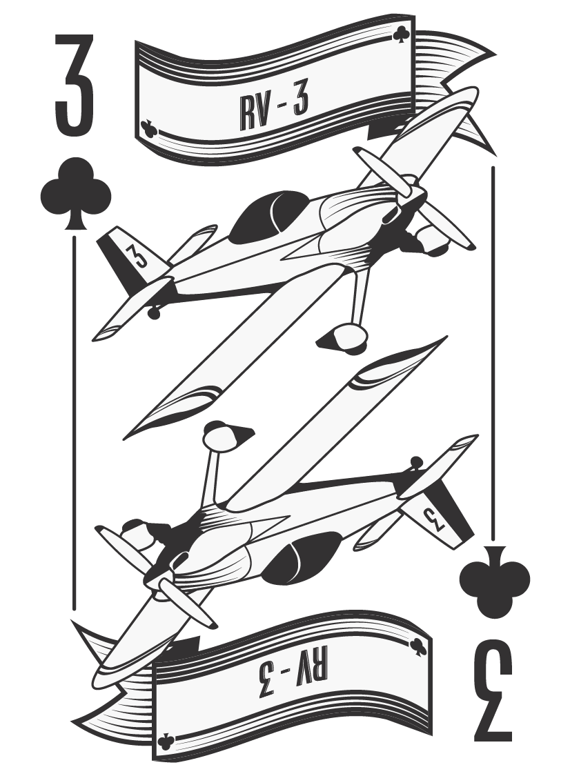
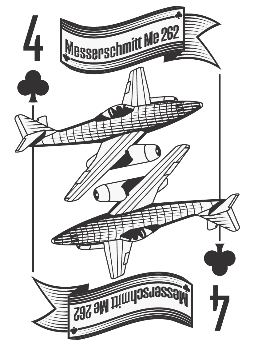
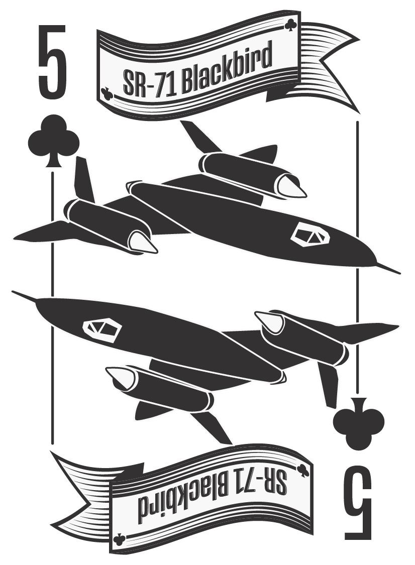
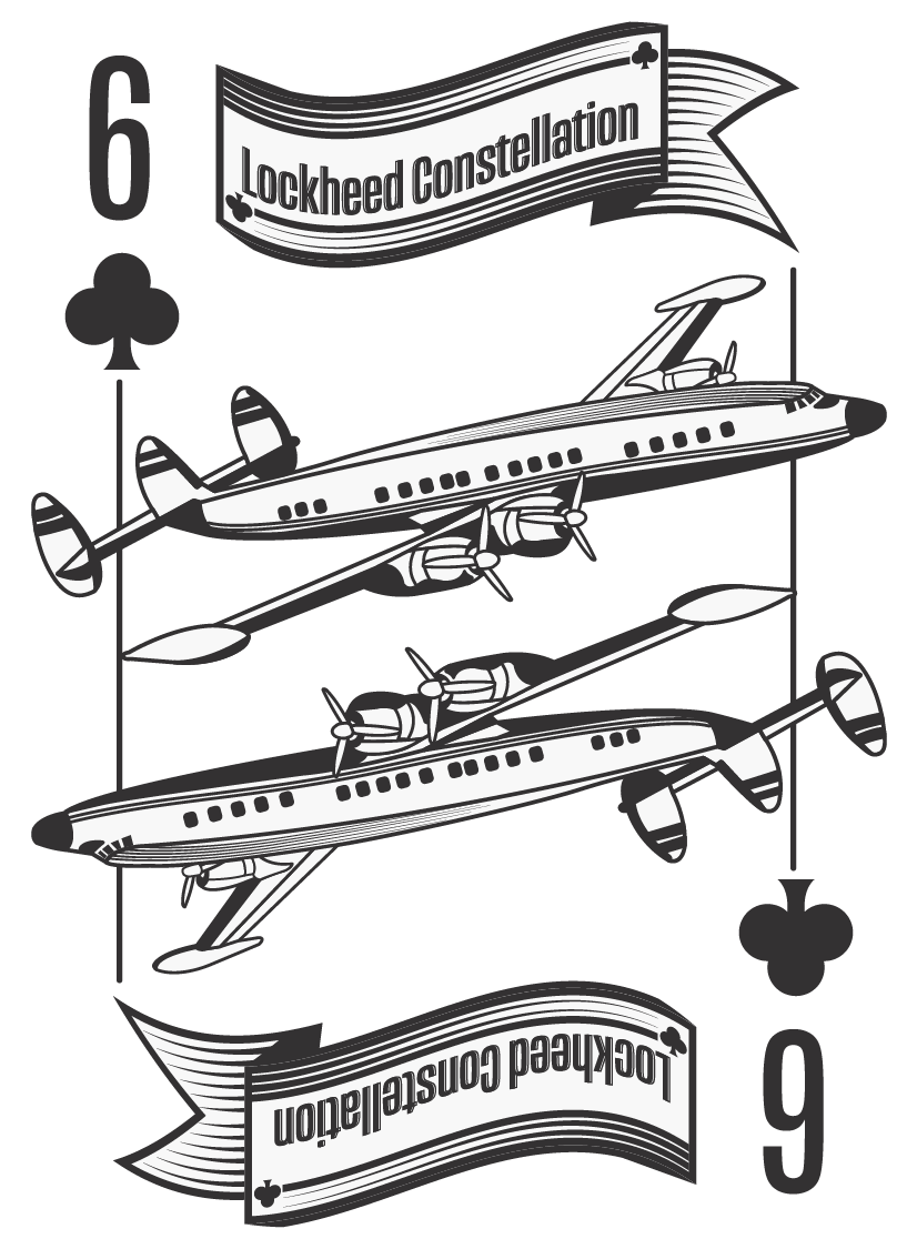
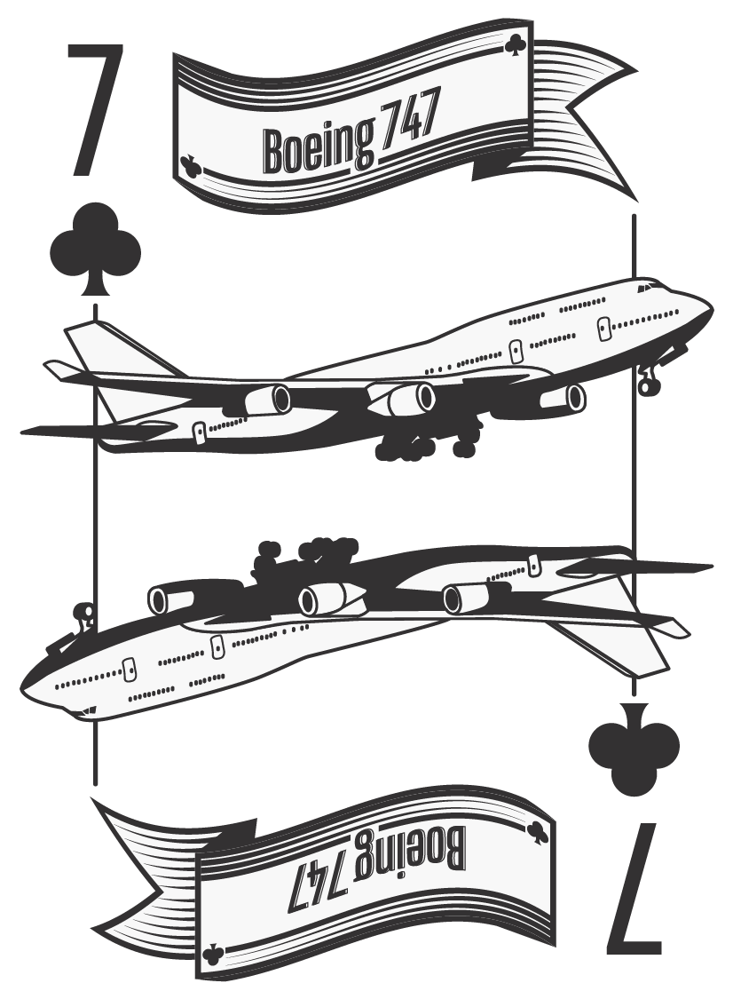
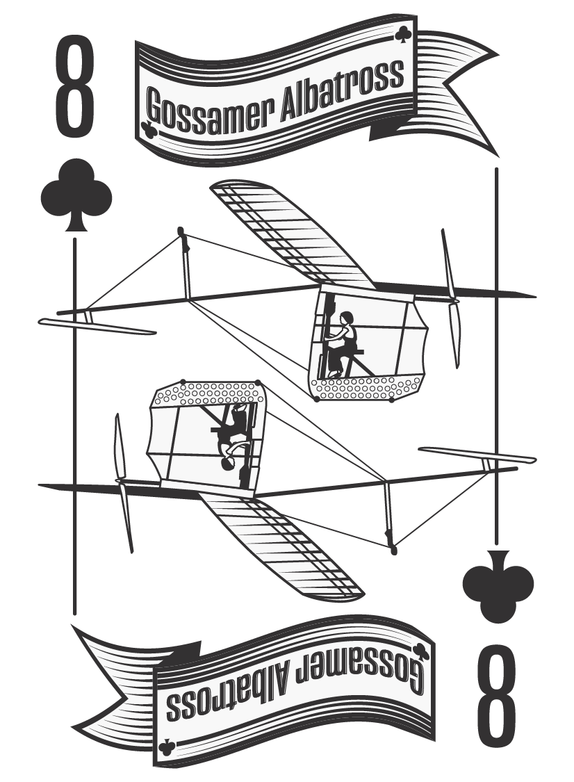
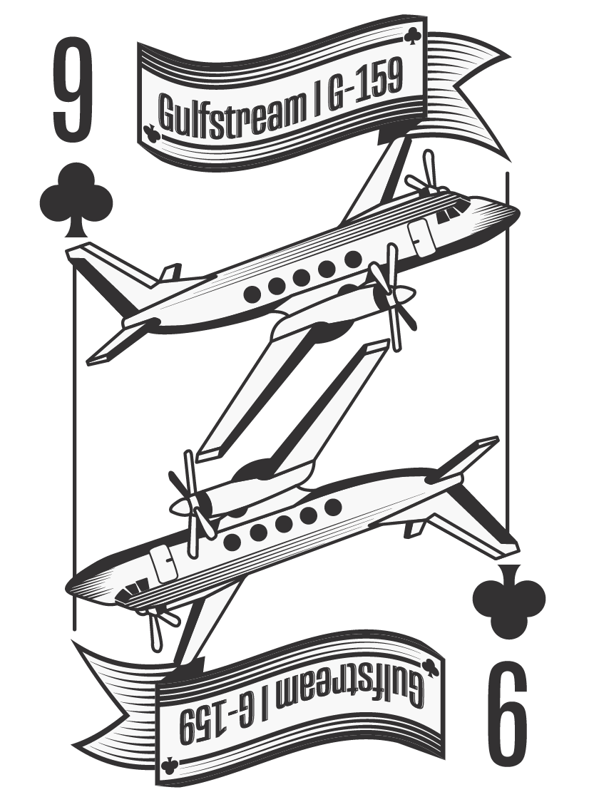
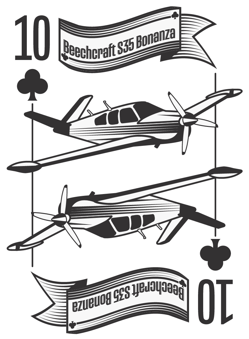
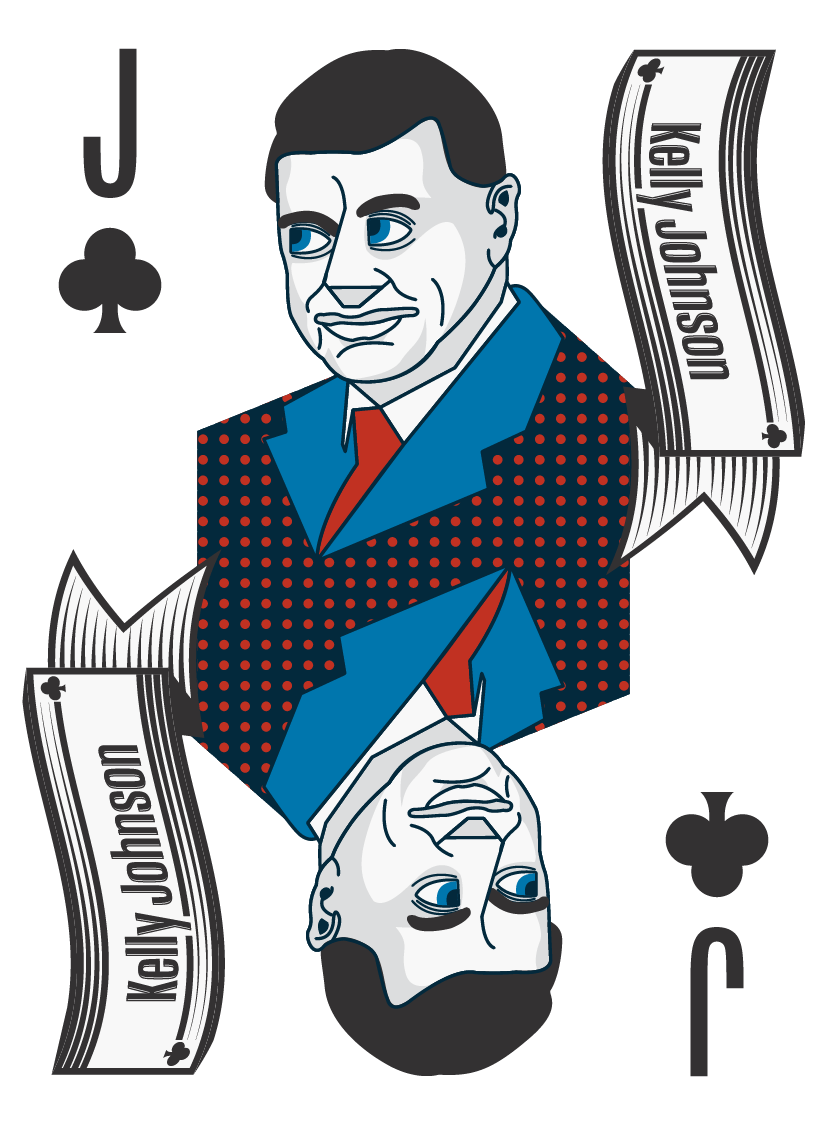
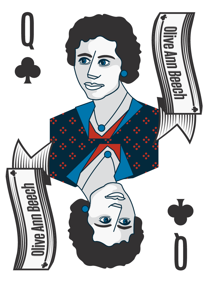
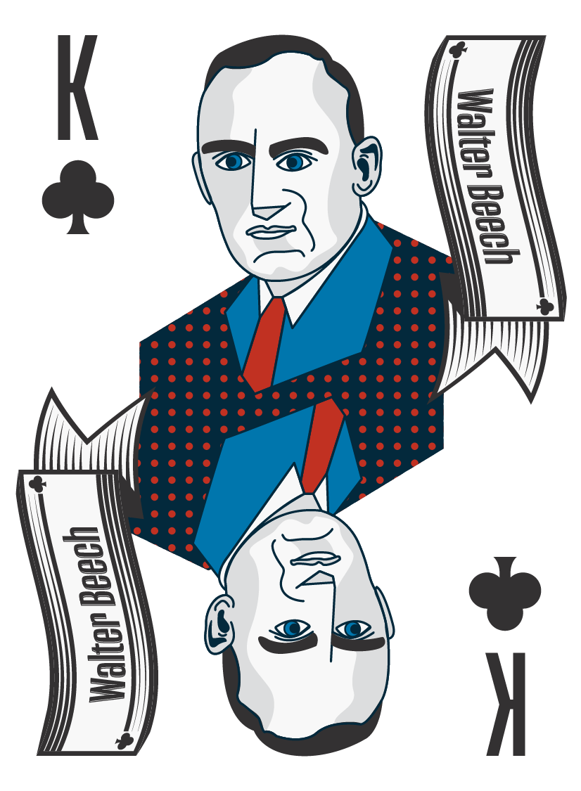
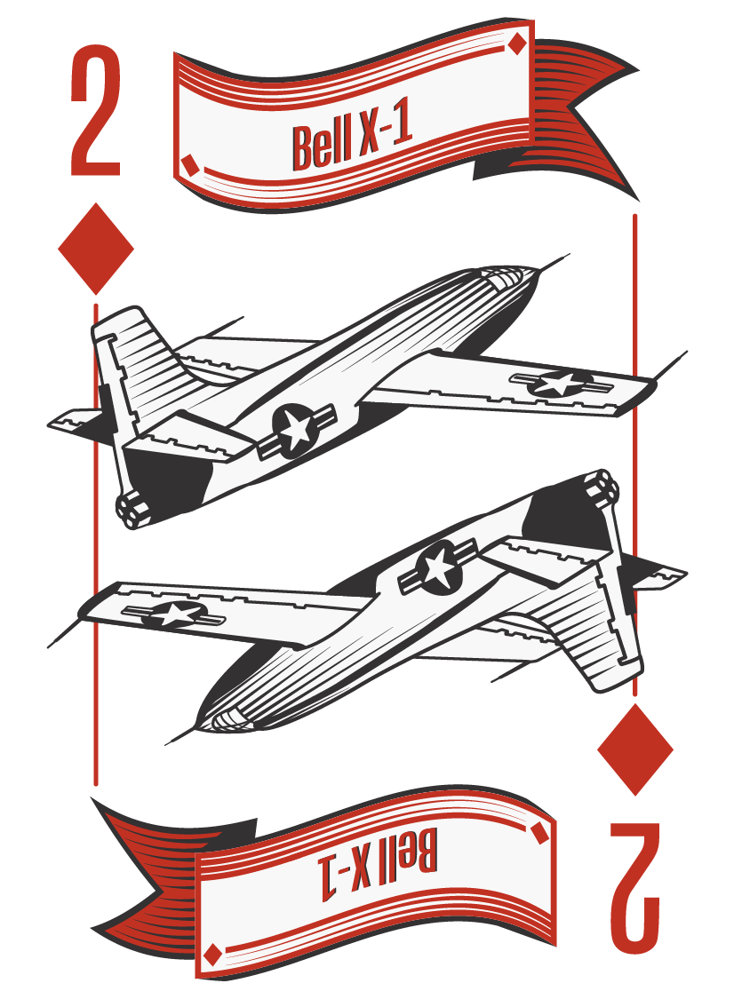
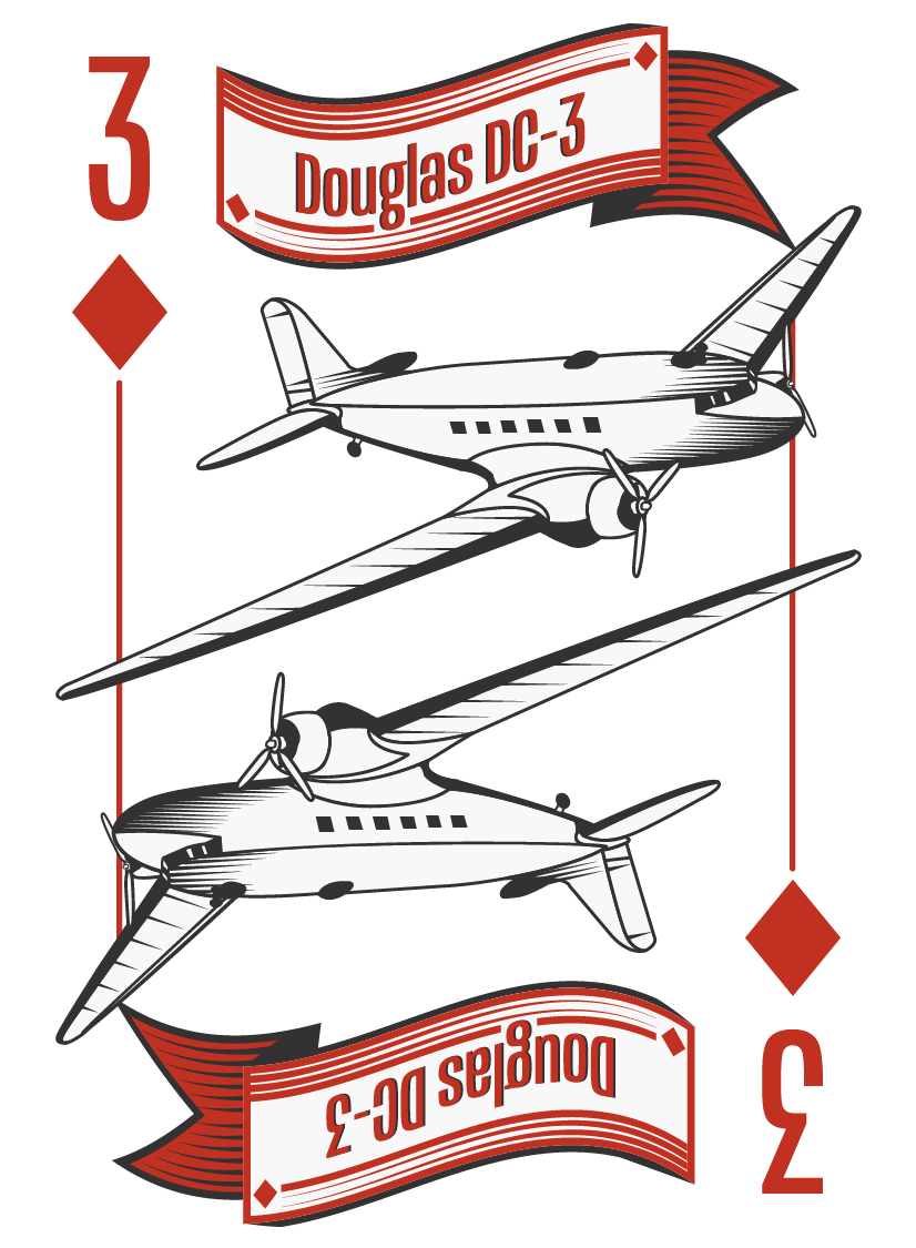
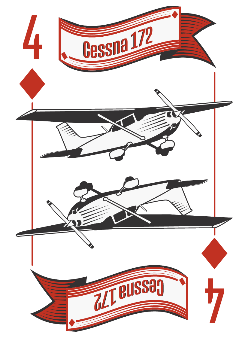
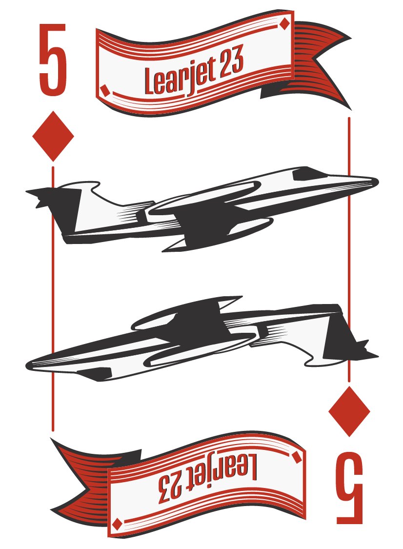
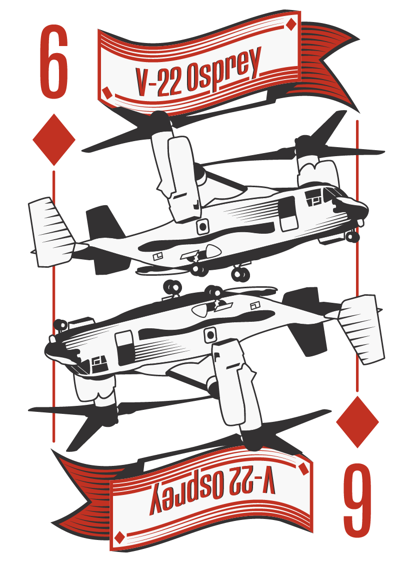
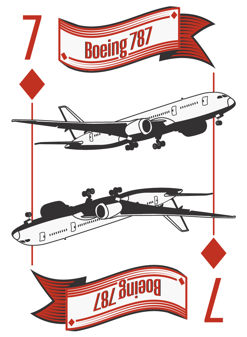
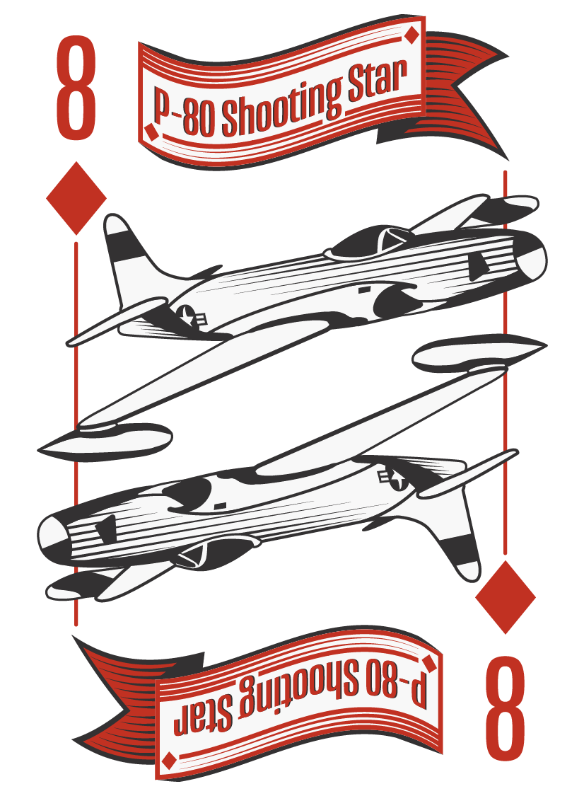
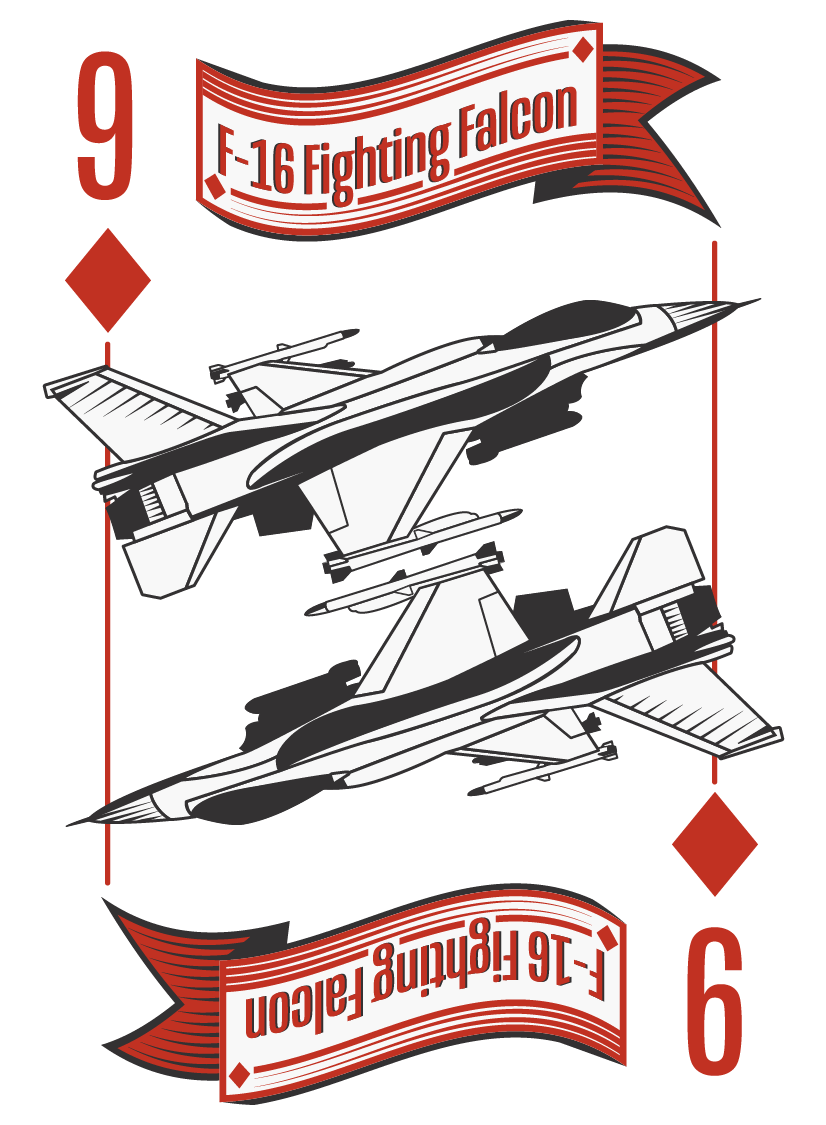
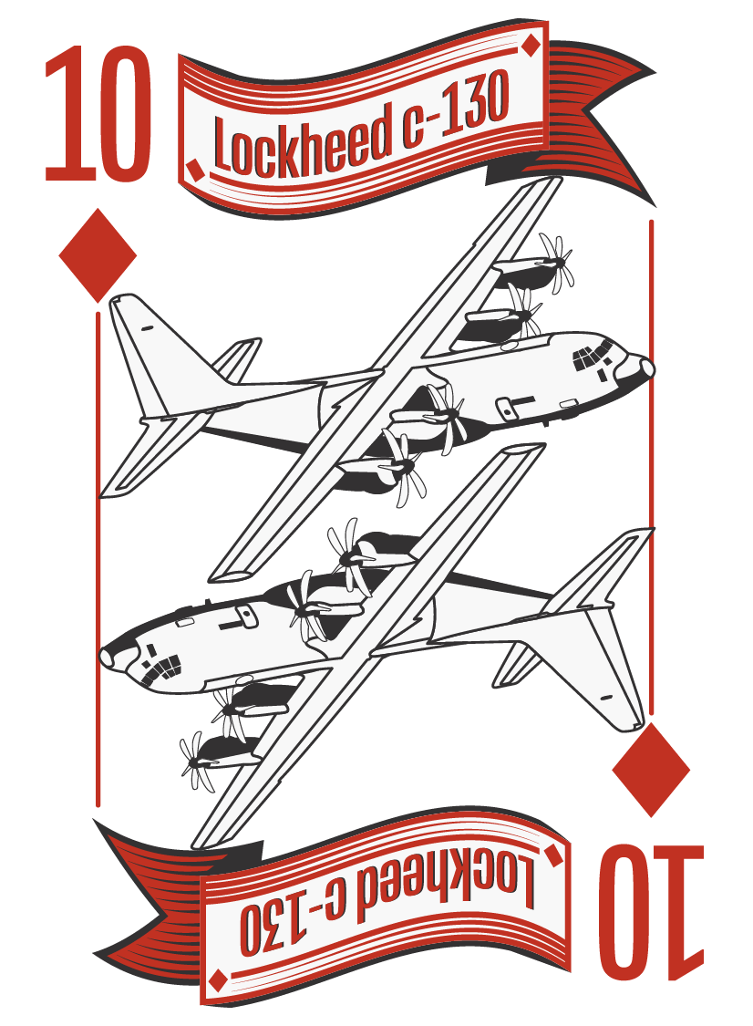
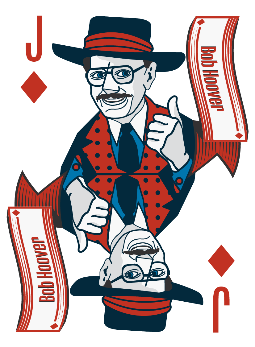
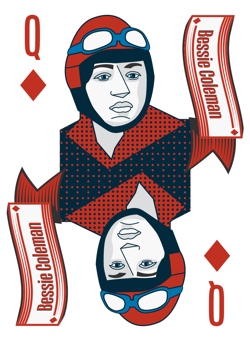
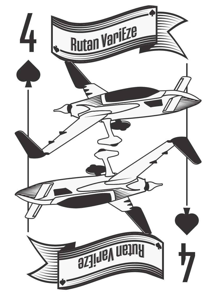
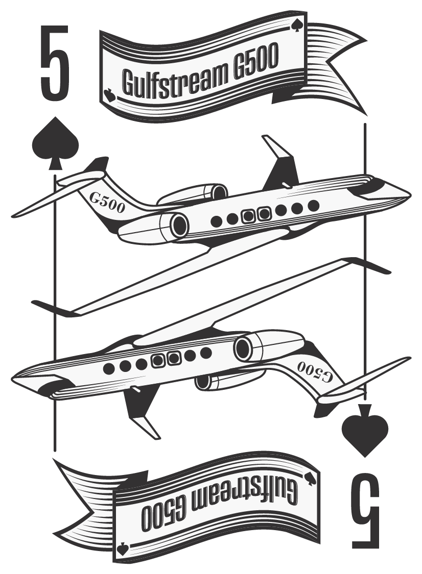
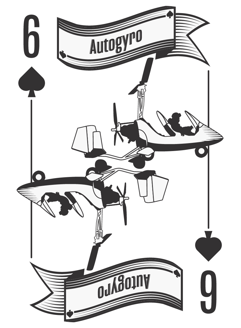
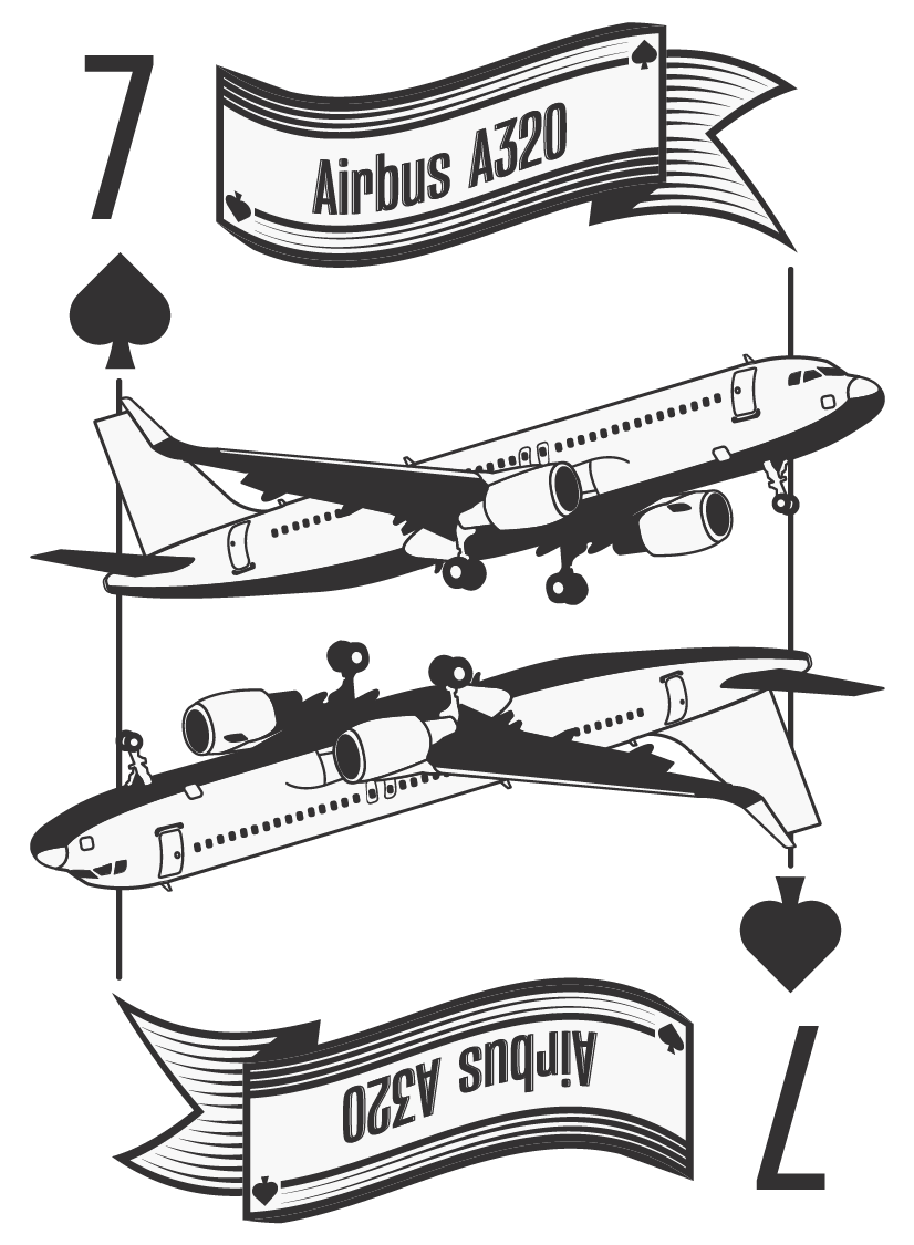
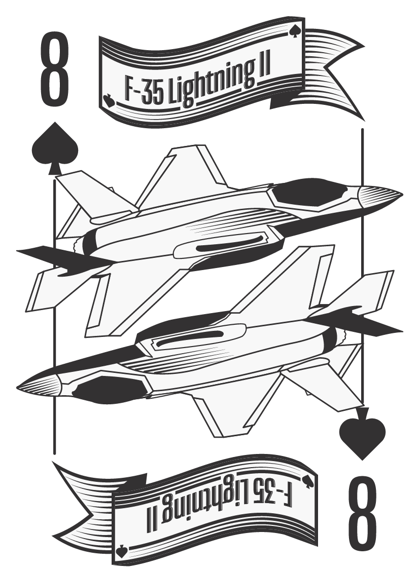
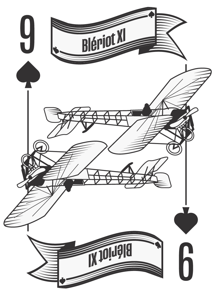
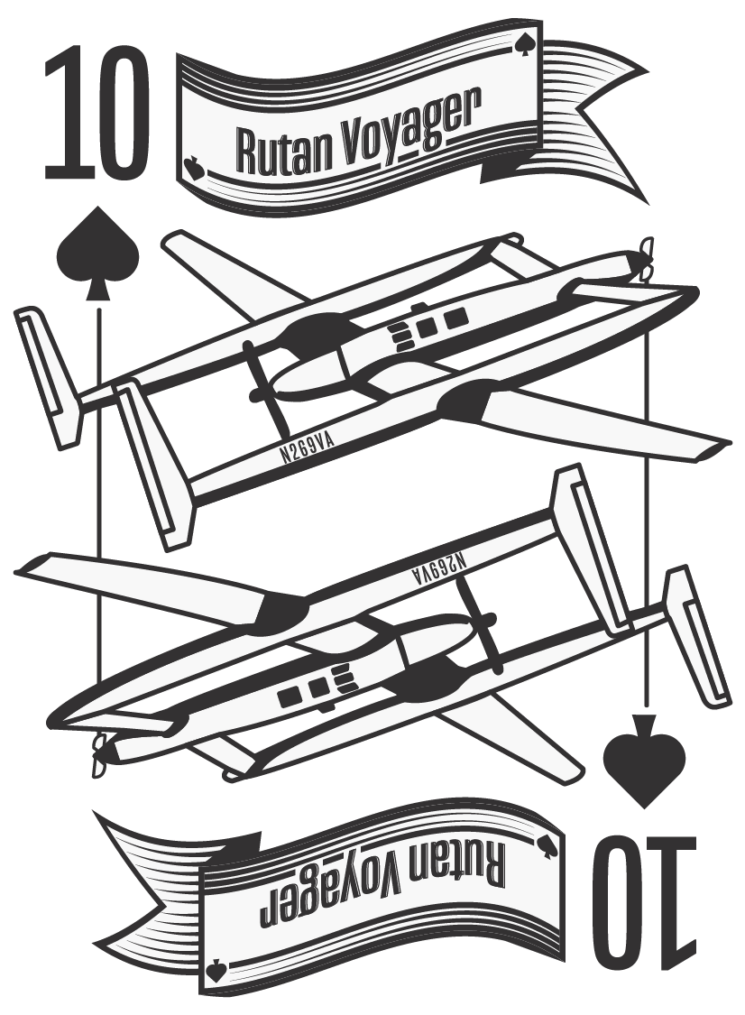
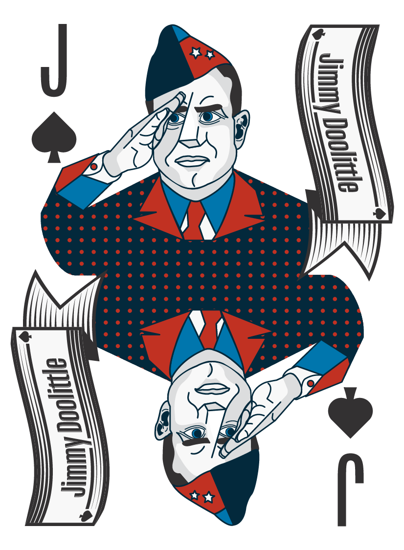
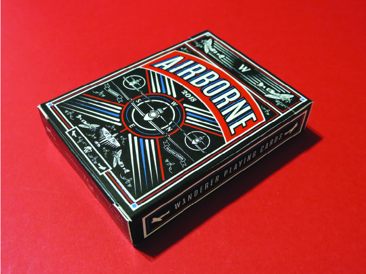
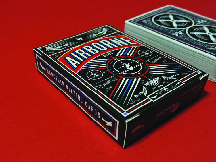
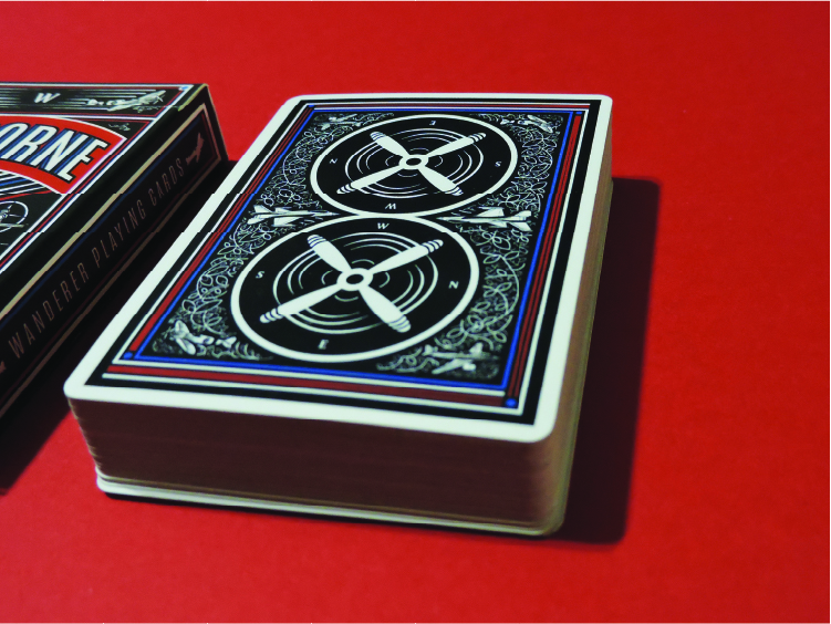
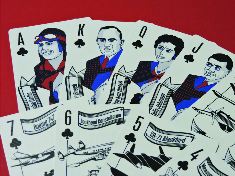
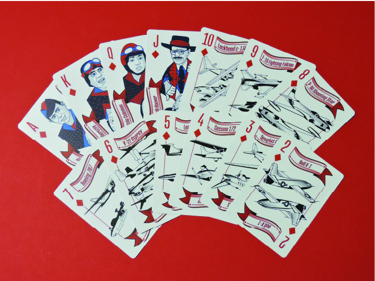
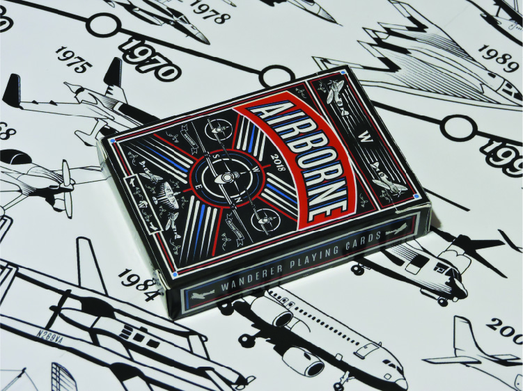
In most of the designs I did I used iconic aviation features that people would easily recognize. I included things like propellers and planes. I also decided that I would use the blue and red accent colors to complement the other black and white features on the cards. I decided it wouldn’t be bad to add some color to the backs of the cards because I also use the same red and blues on the face cards of the deck. One thing I noticed form other high-end decks are how they use lines and rectangles to frame the contents in the middle of the card.
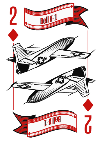
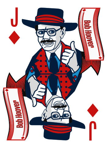
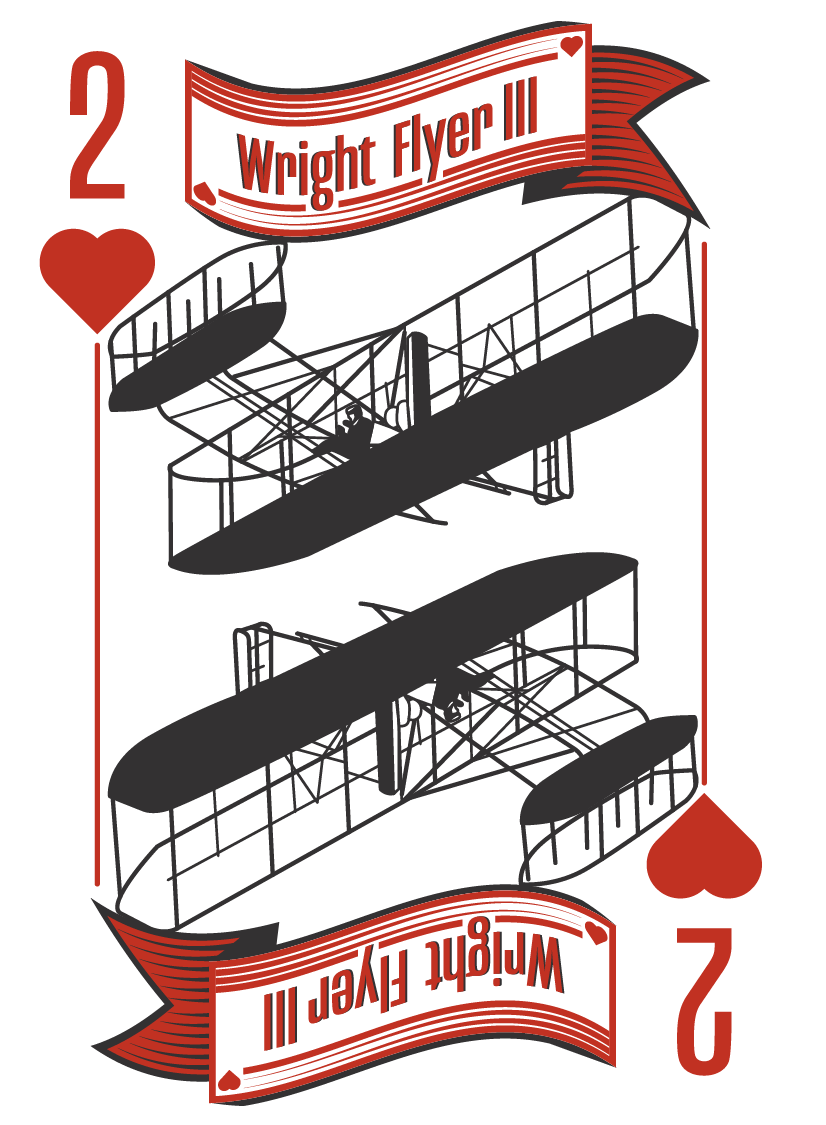
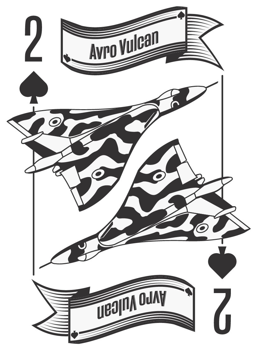
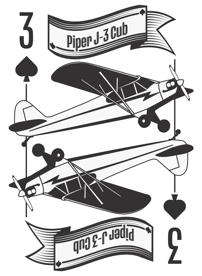
Final Designs
Hearts
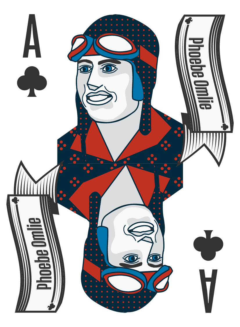
Clubs
Diamonds
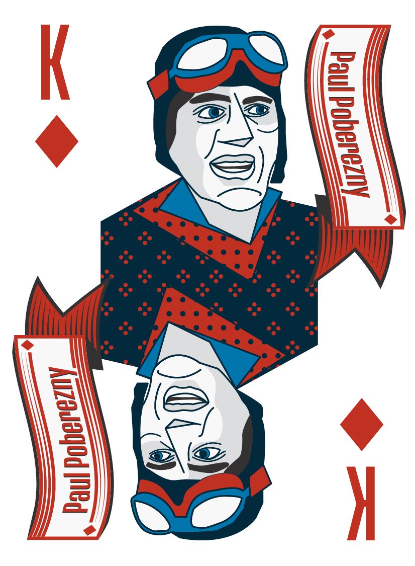
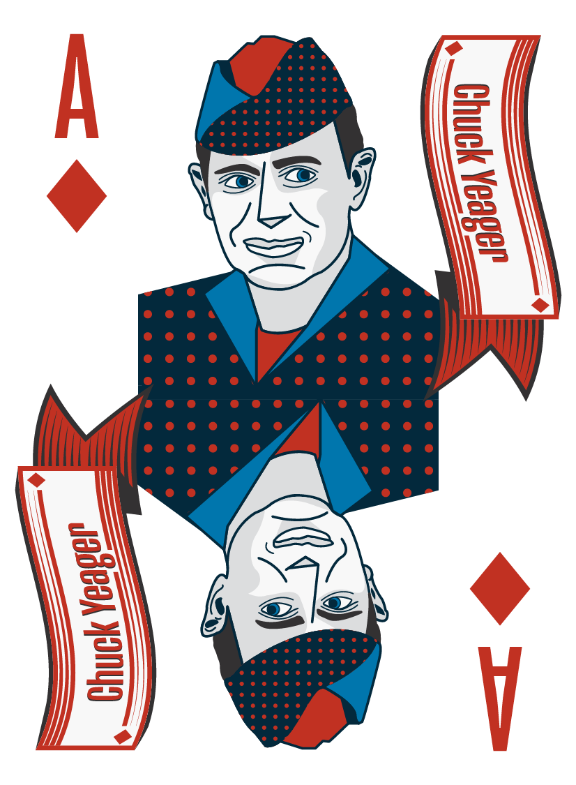
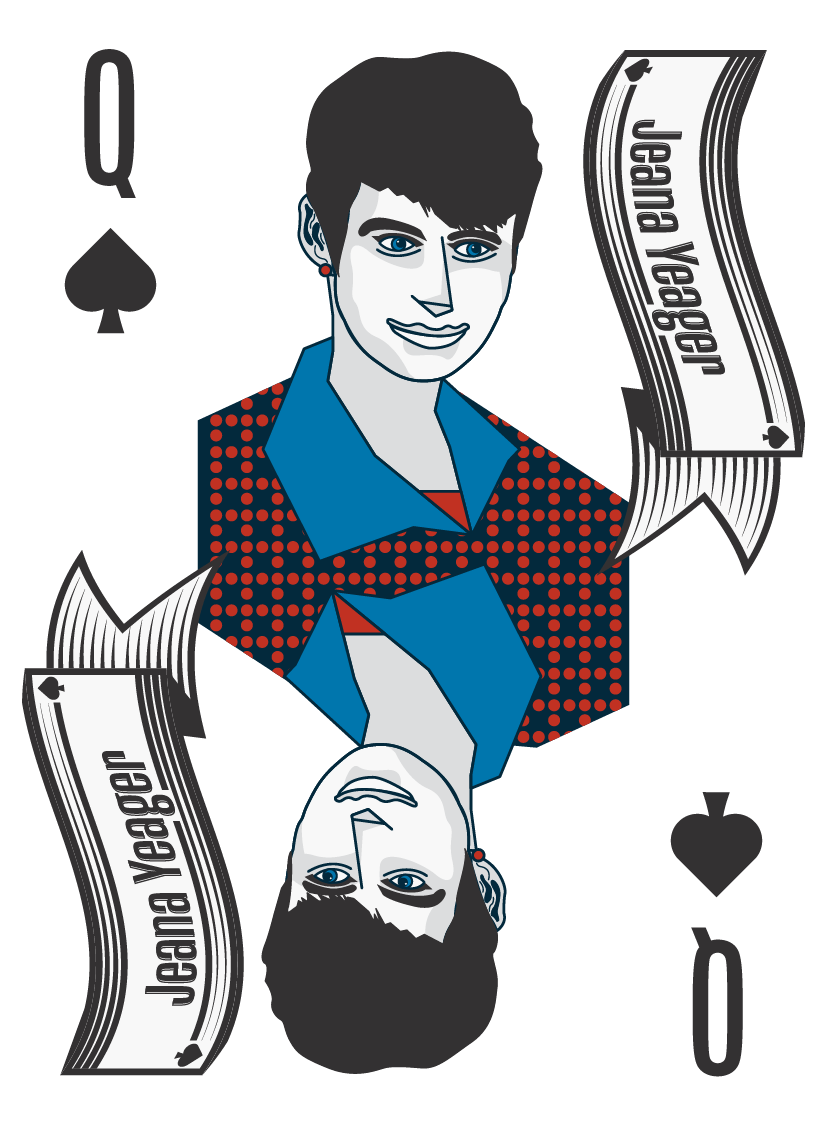
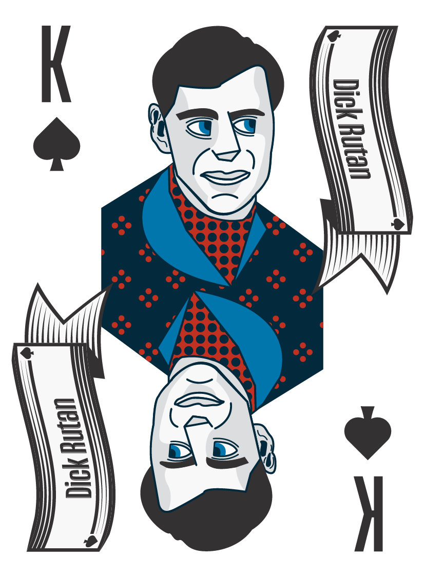
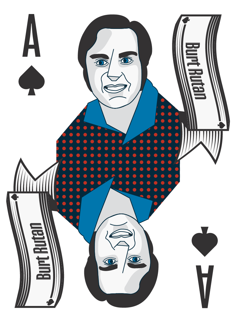
Spades
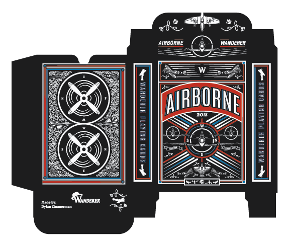
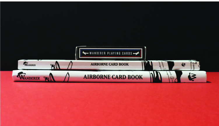
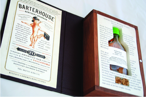
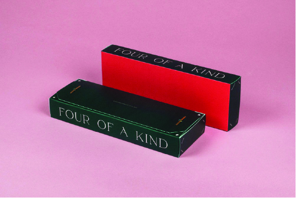
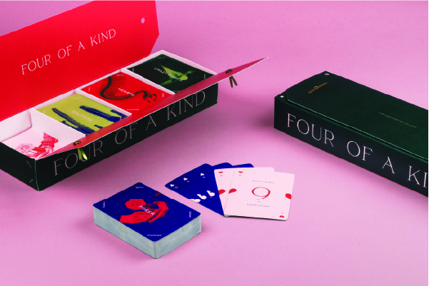
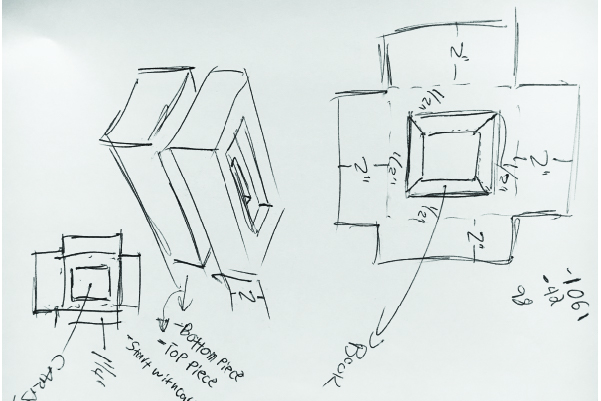
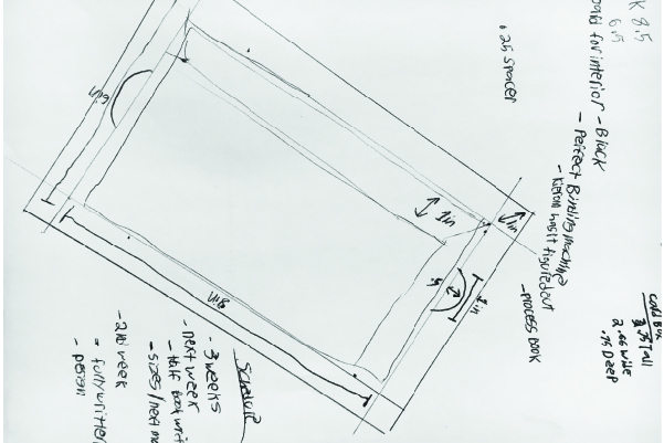
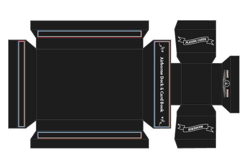
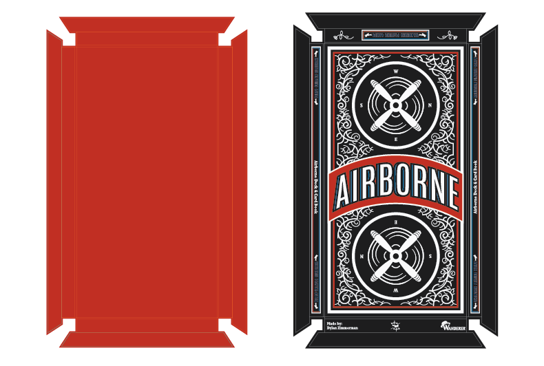
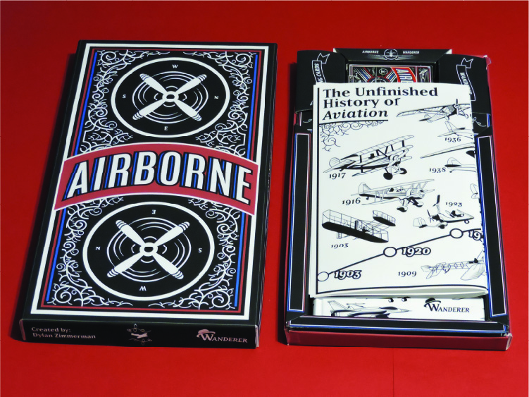
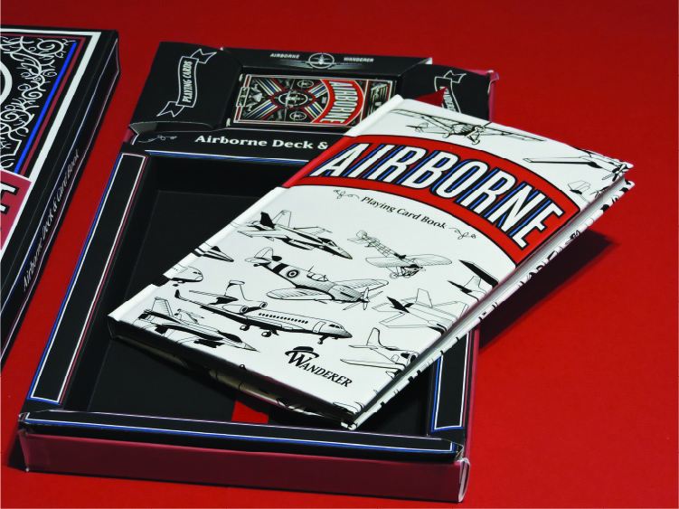
Tuckbox Dieline
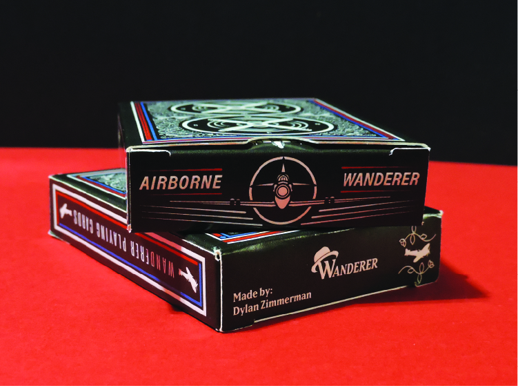
I used the website MakePlayingCards.com to actually produce the deck, they were helpful in supplying the dieline for the tuckbox. I also added a high gloss effect to some parts of the box to give it a nice touch and feel aspect. The high gloss makes some parts shinier. The gloss gives off a slight high-end feeling.
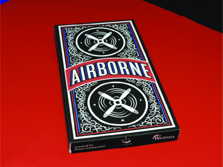
Final Deck
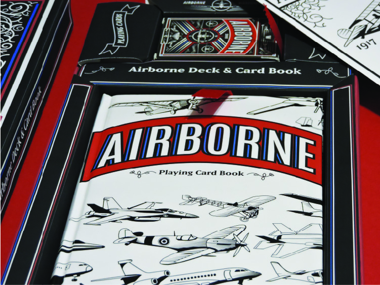
Card Book
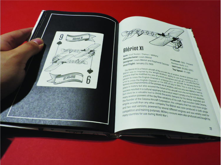
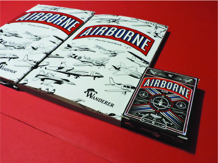
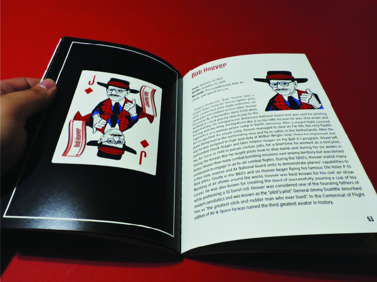
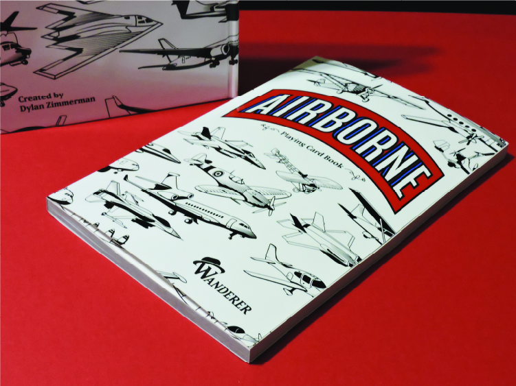
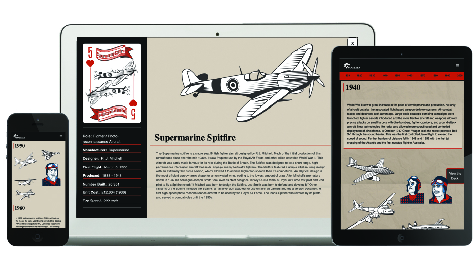
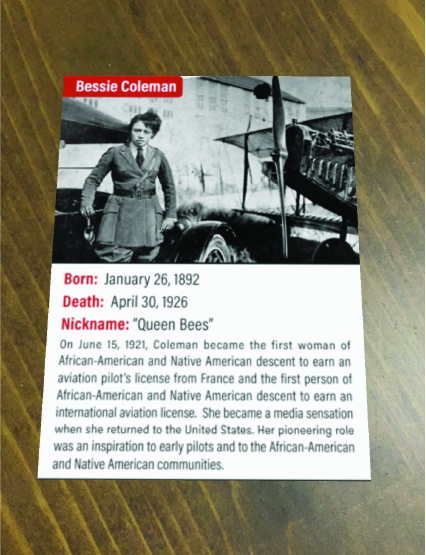
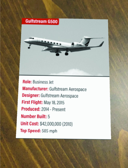
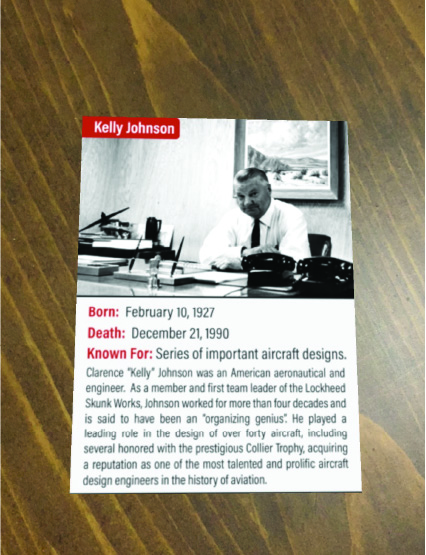
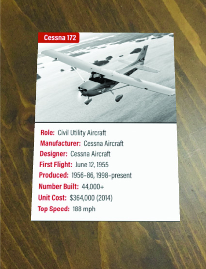
The final book, despite its flaws turned out nice and certainty demonstrates the way the medium can be used to educate someone about the topic. The cover has all of the illustrations of the aircrafts throughout it. Each spread is dedicated to a card. The left page displays the card on a black background. The right page contains a bigger illustration of the subject and a detailed list of other stats about the planes. Also Included is a 200-word paragraph about the history and significance of the plane or aviator. The plane pages also list things like, top speed, cost per unit, date it was made & who designed the plane. The sections are arranged by card suits and each section has an intro spread with the illustrations laid out. In the end I had the books made by Lulu.com in a hardcover version and a paperback version. However, all the features from the book I made myself are present in the books I had printed by Lulu.com.
Airborne Package Design
Research
Sketches
Dielines
Final Packaging
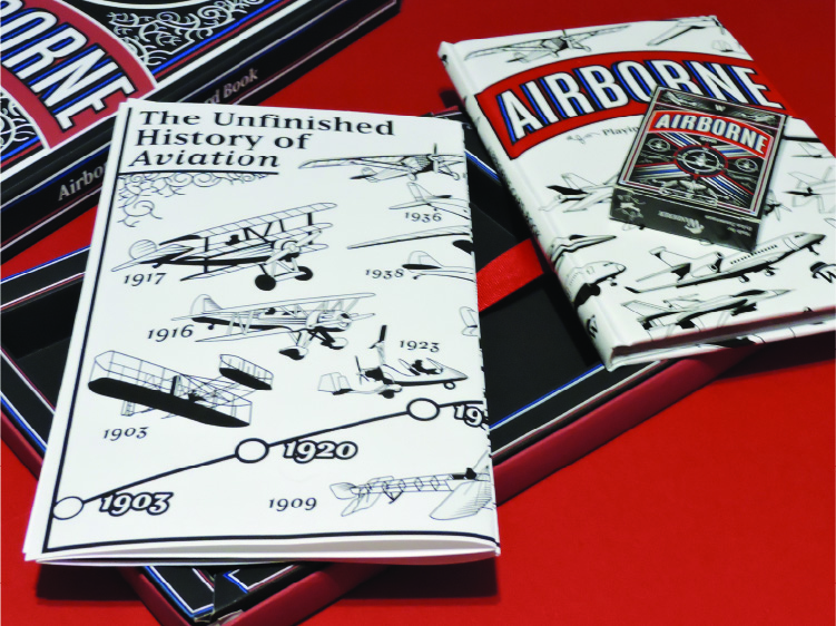
Airborne Timeline
Research & Sketches
Airborne Timeline
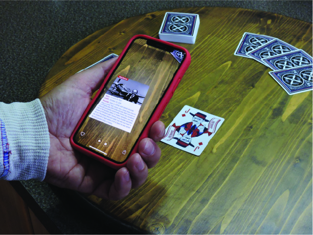
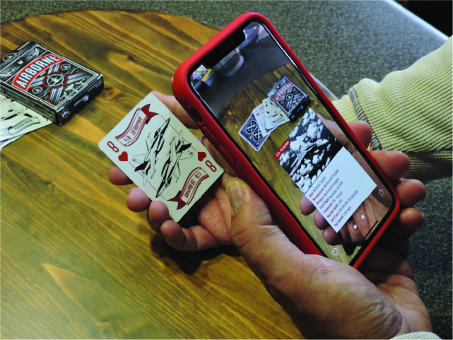
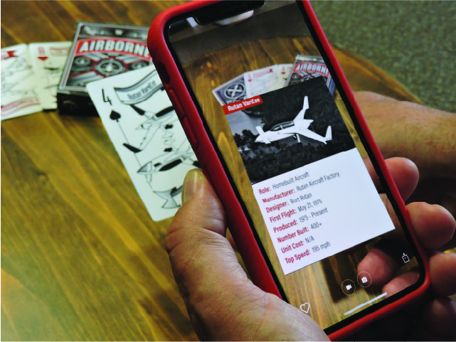
Airborne Augmented Reality
Research
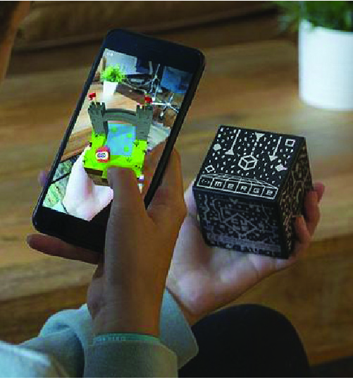
Final Overlays
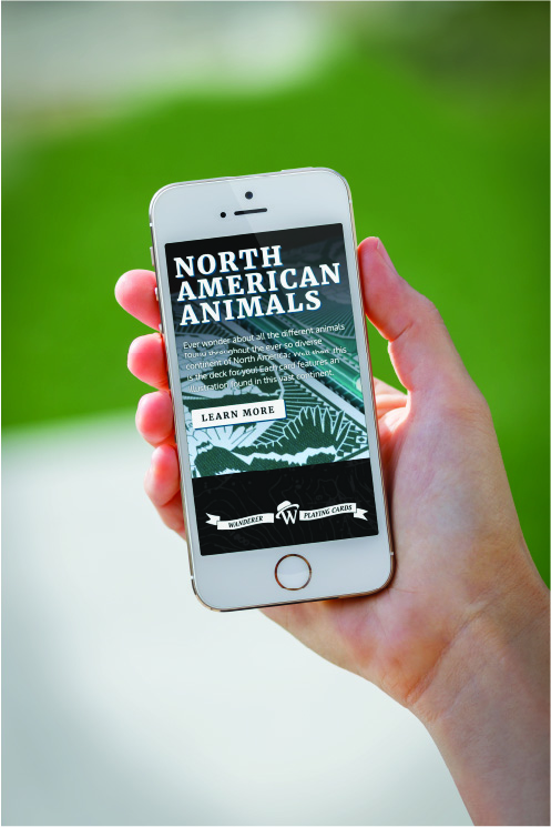
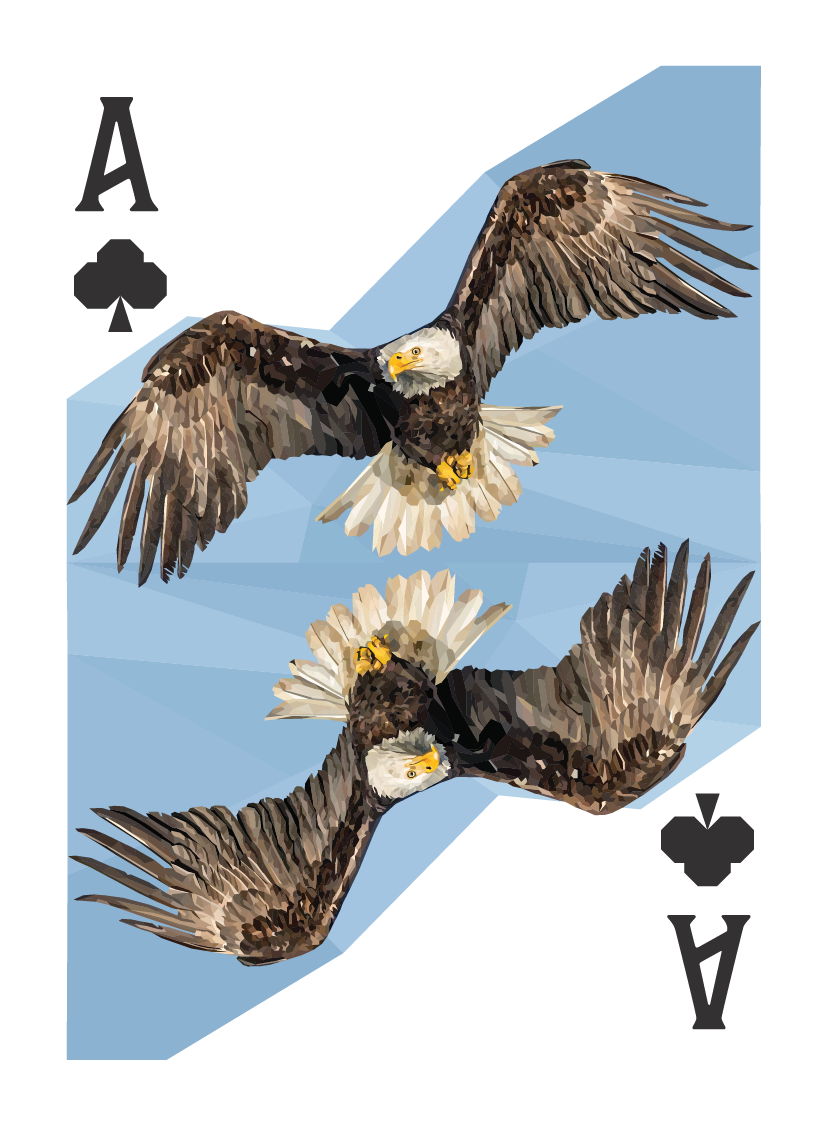
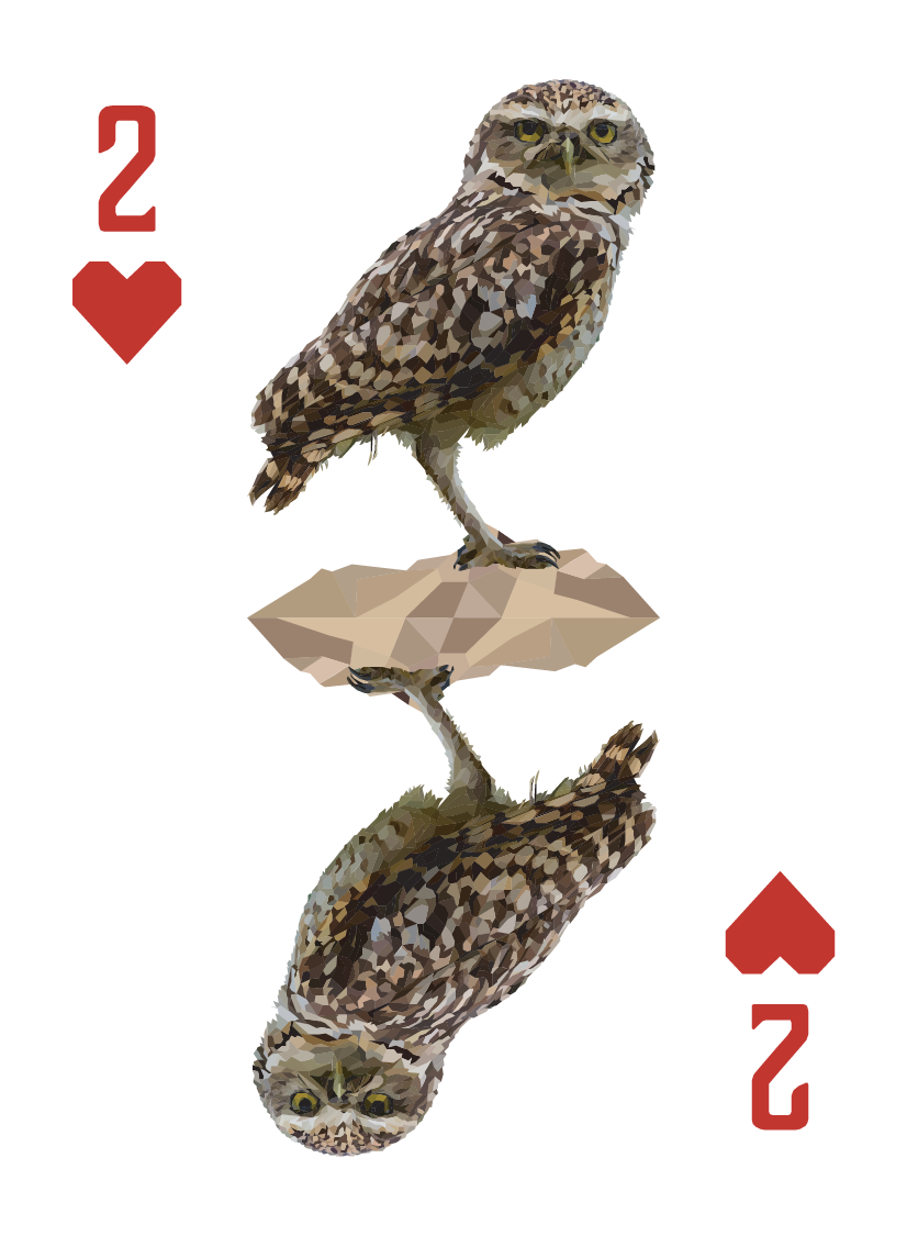
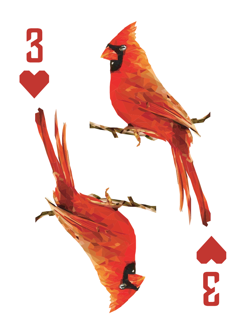
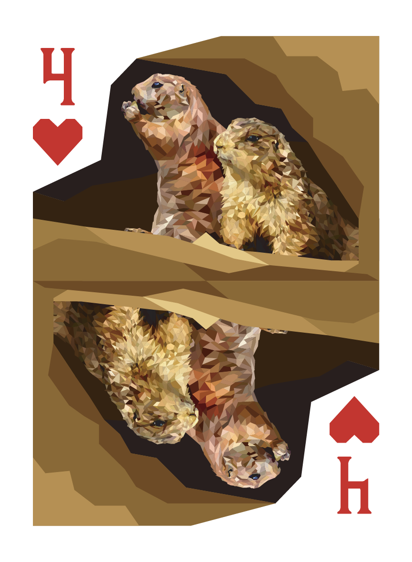
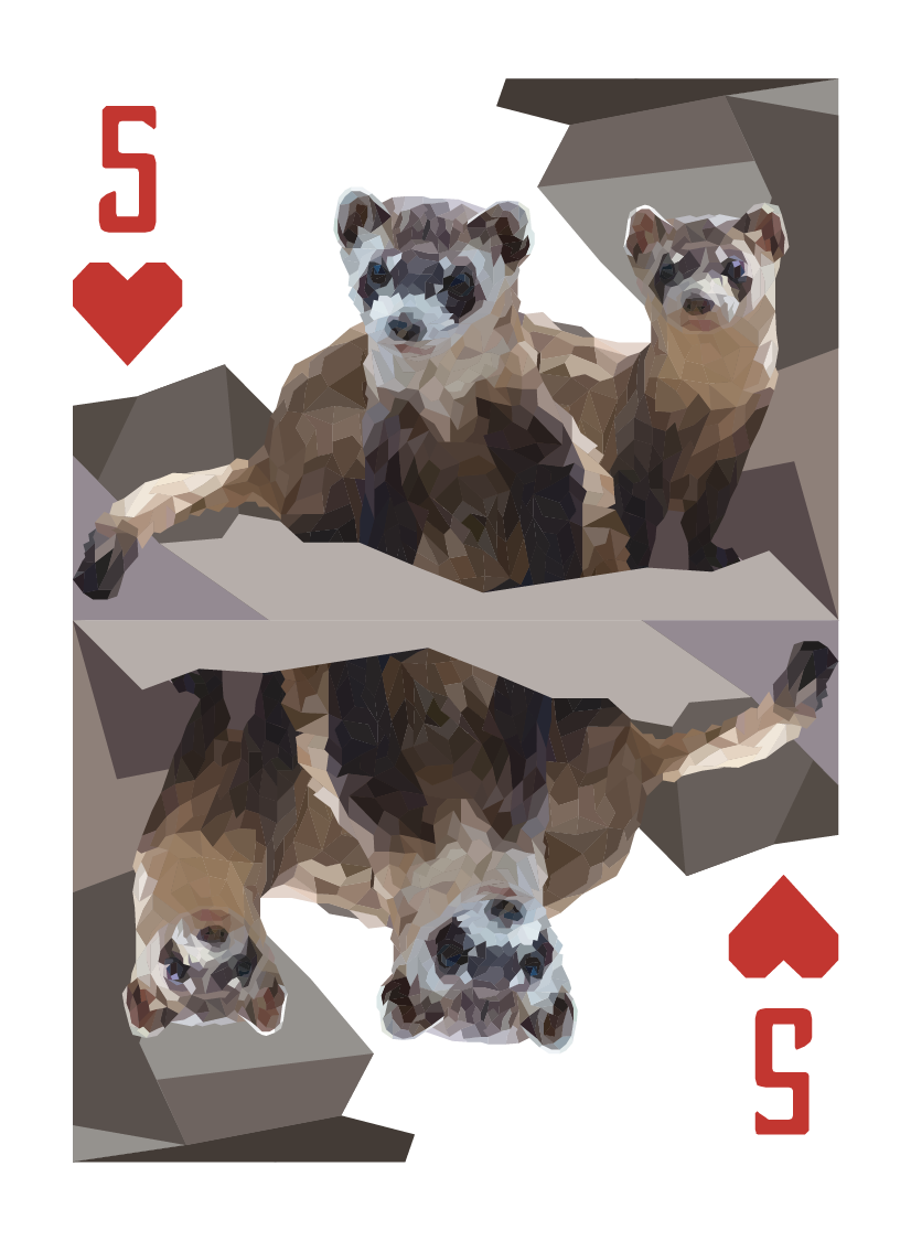
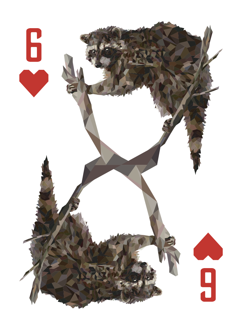
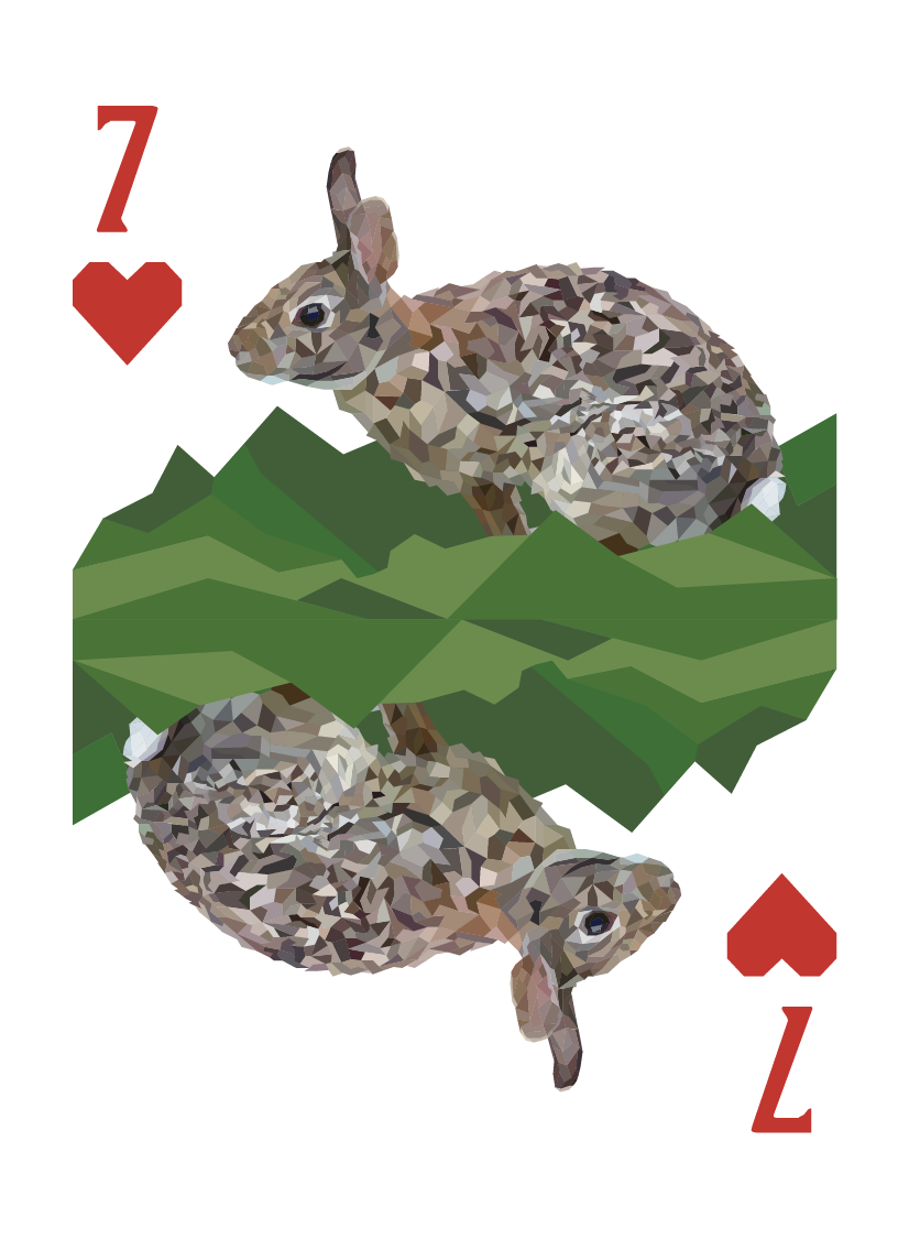
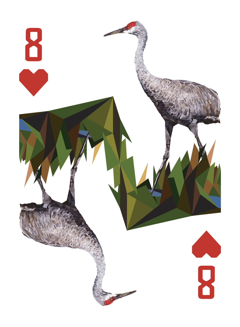
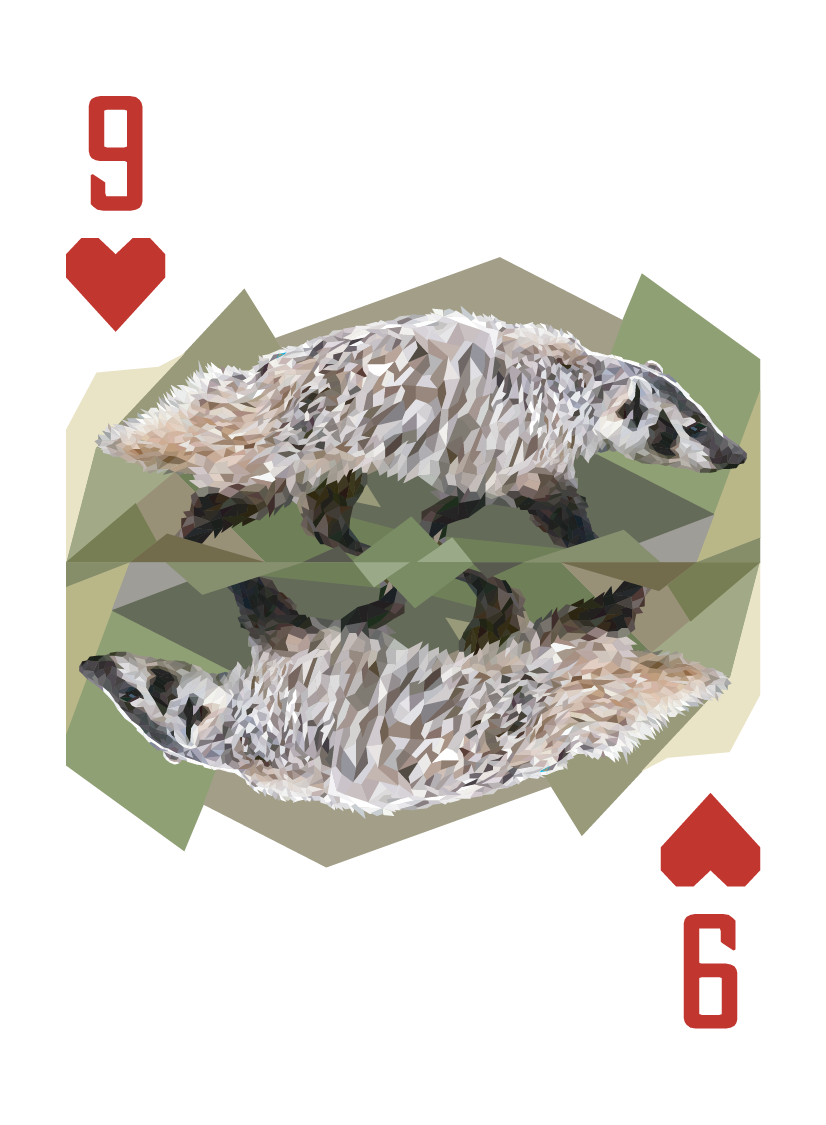
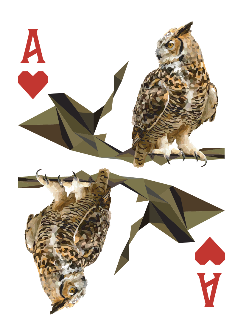
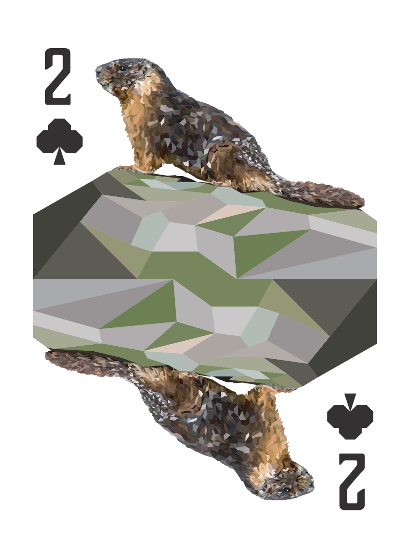
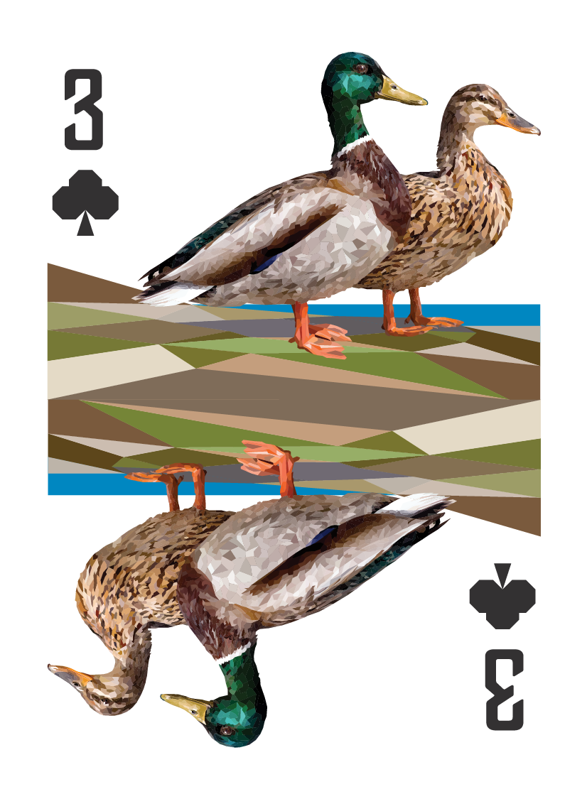
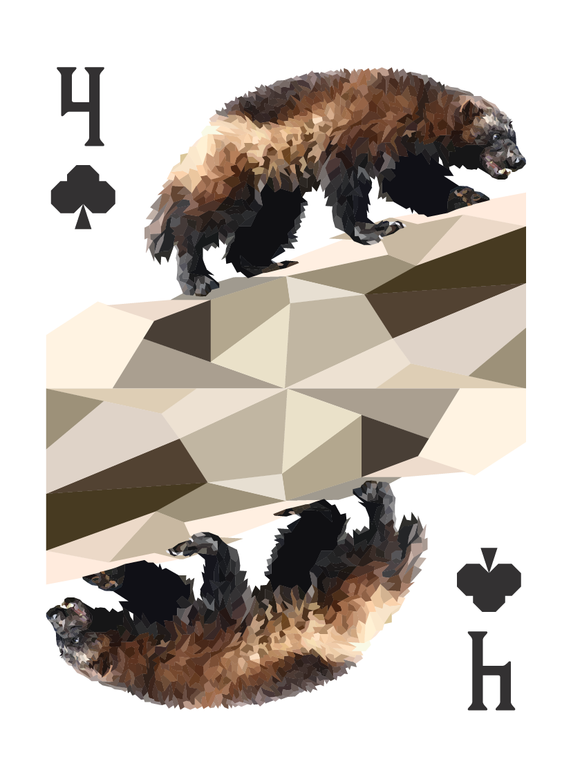
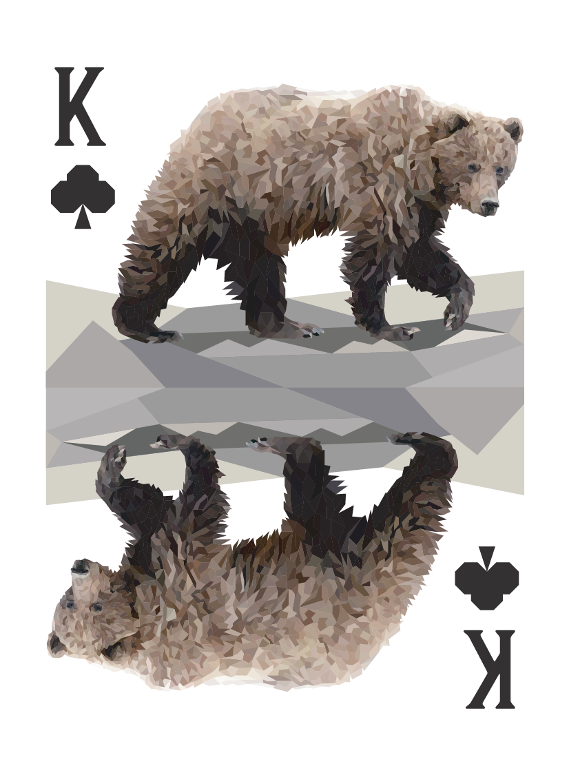
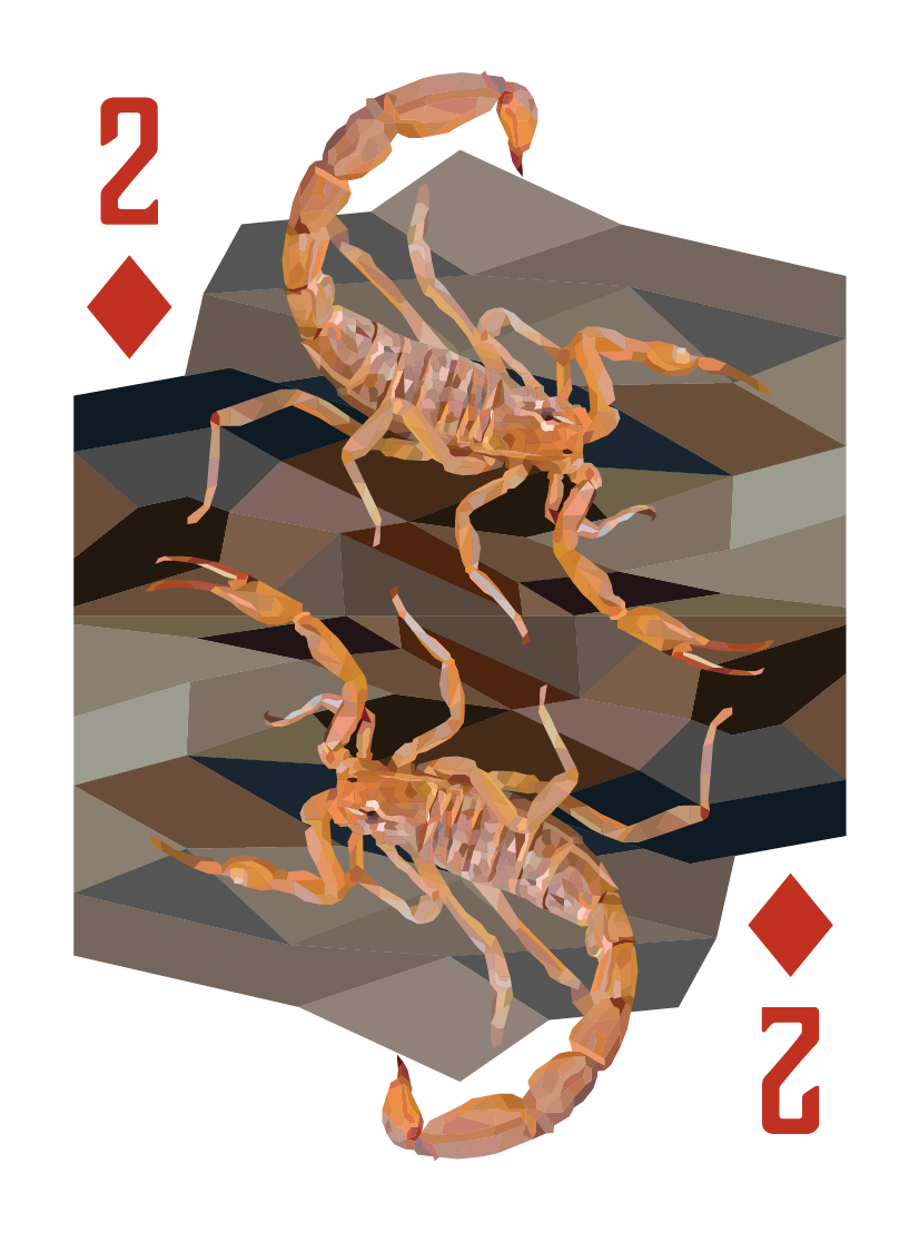
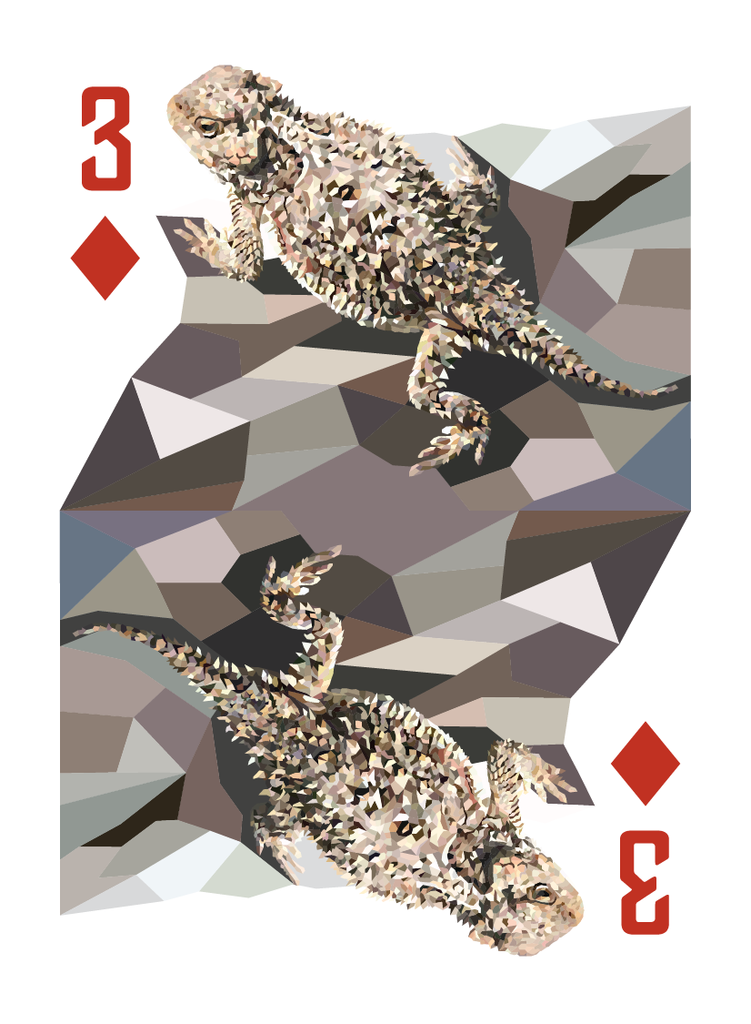
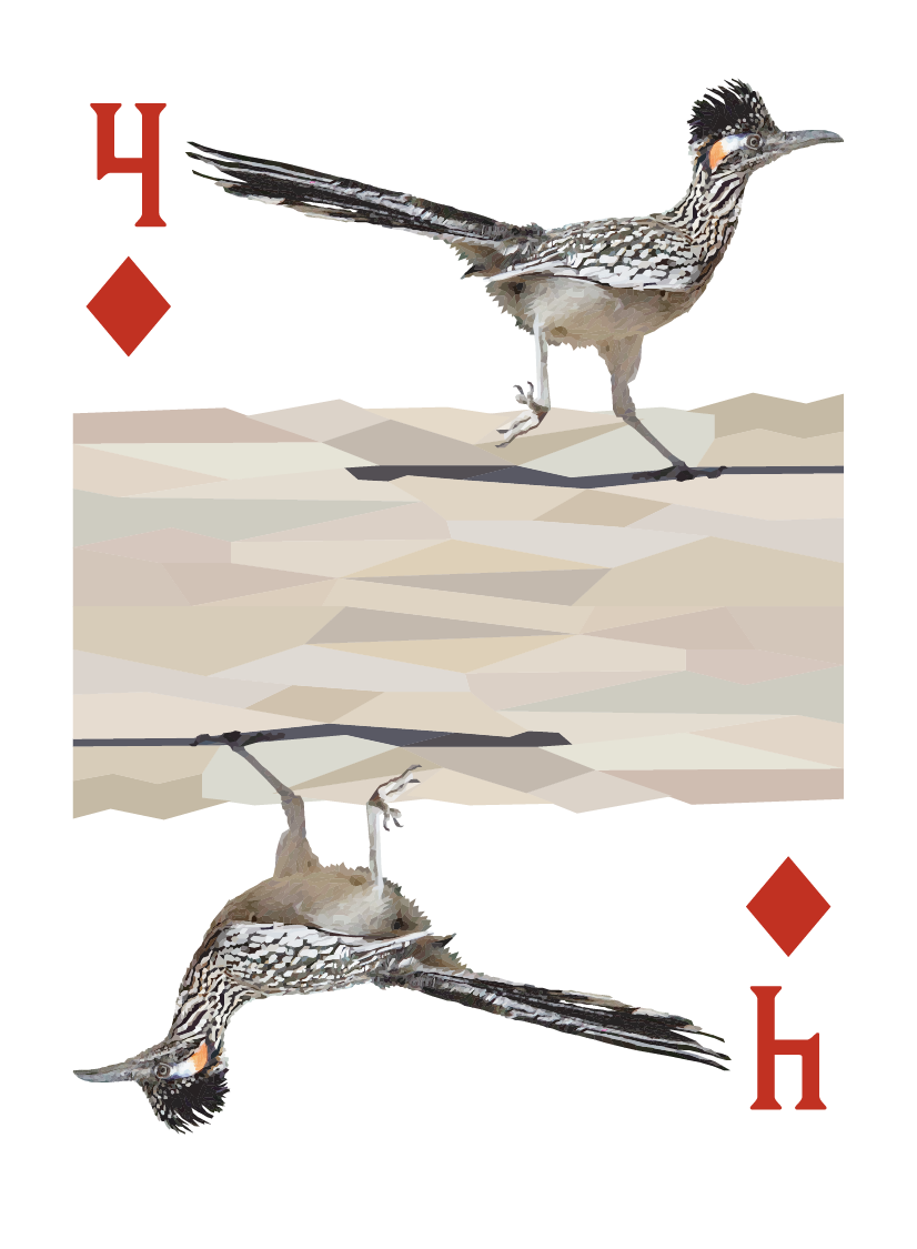
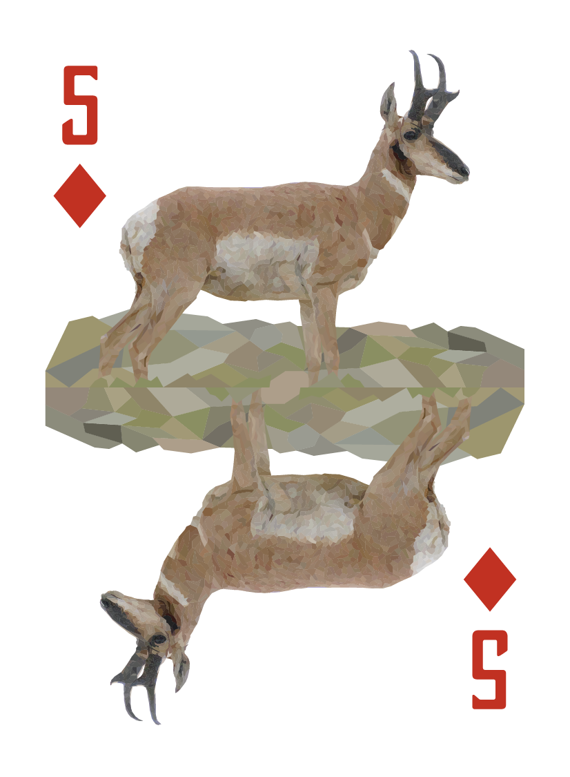
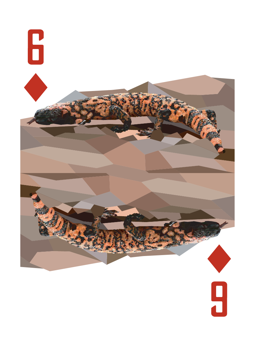
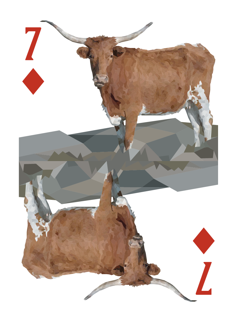
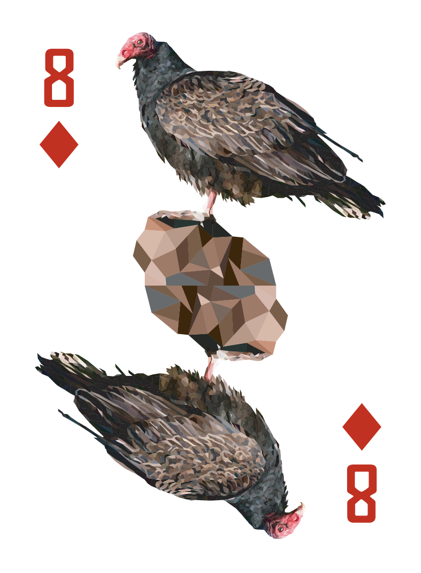
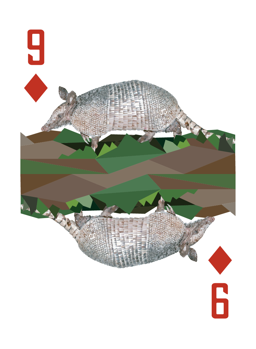
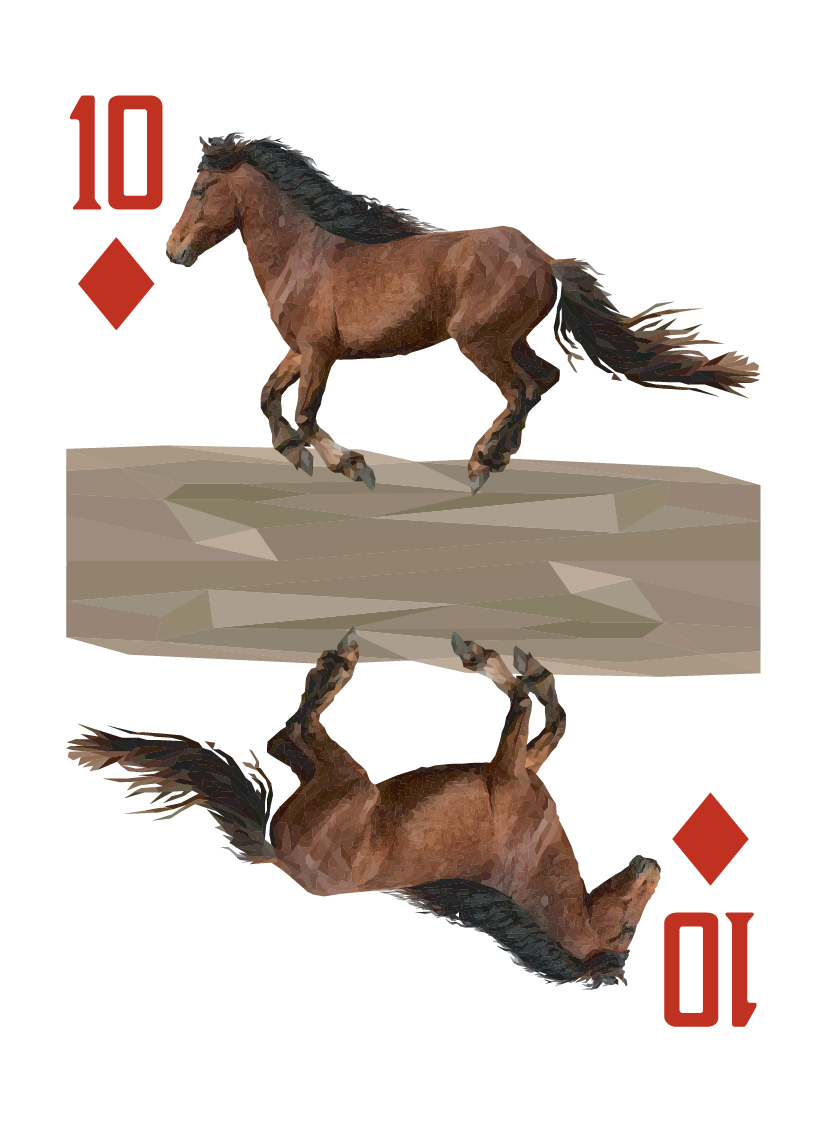
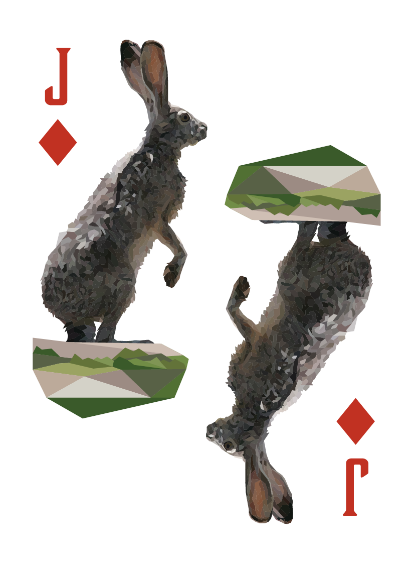
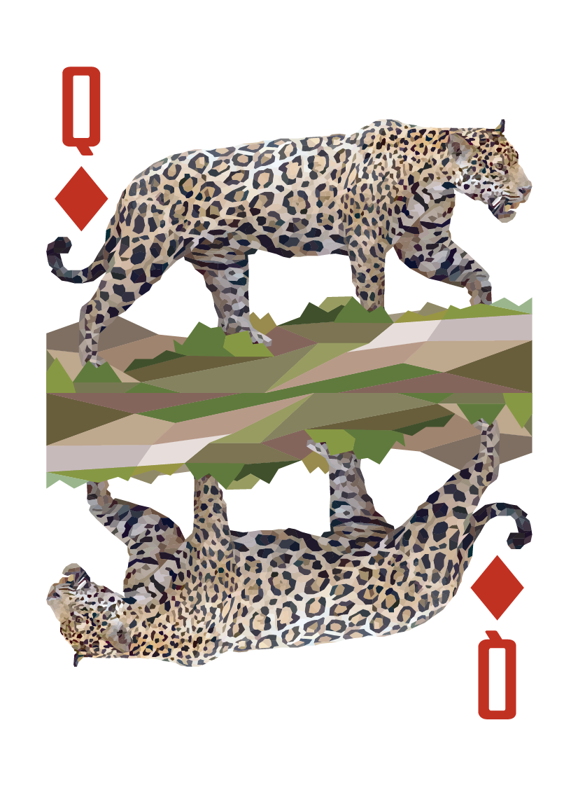
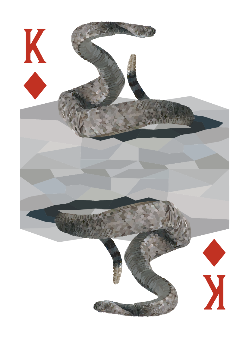
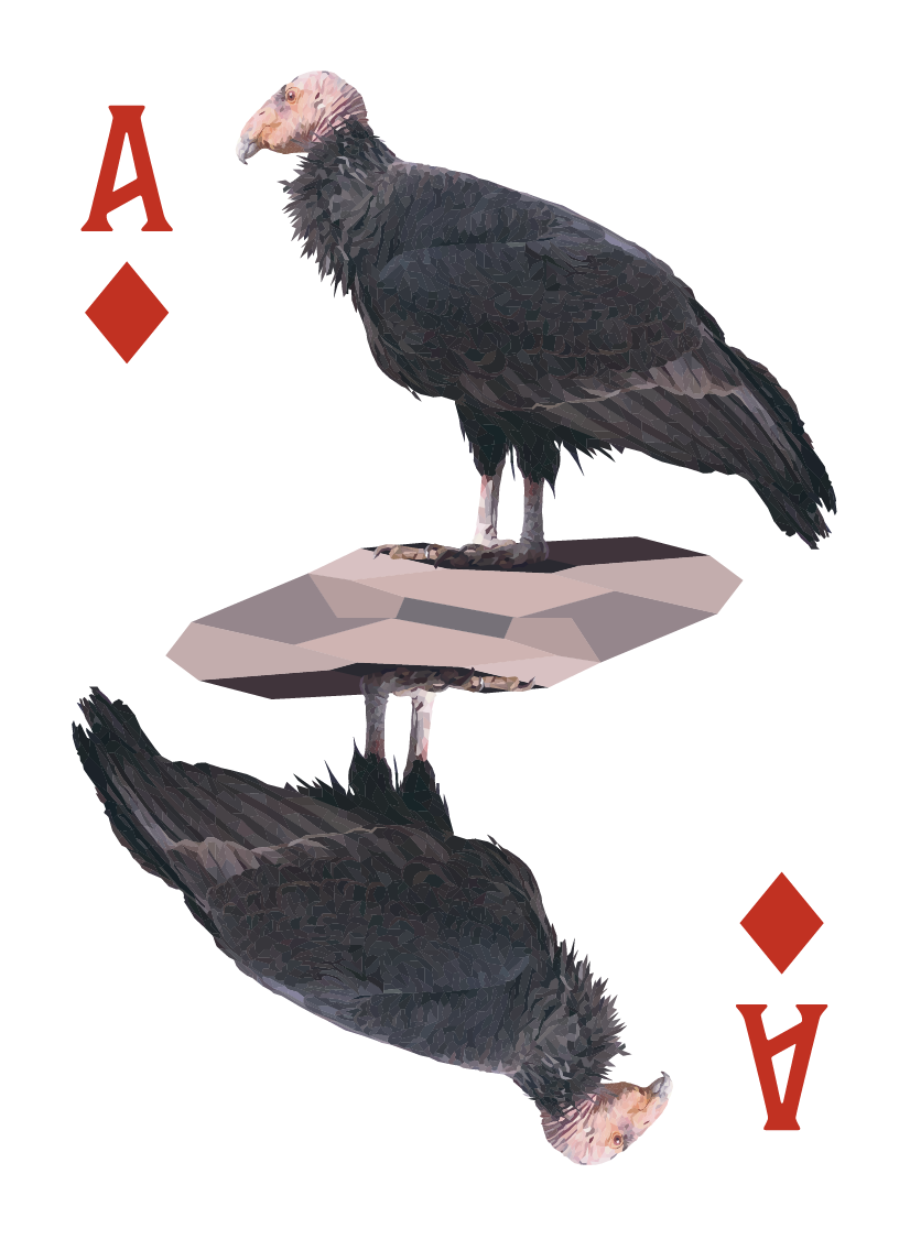
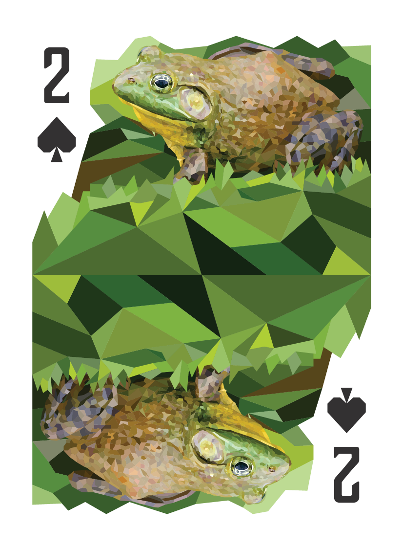
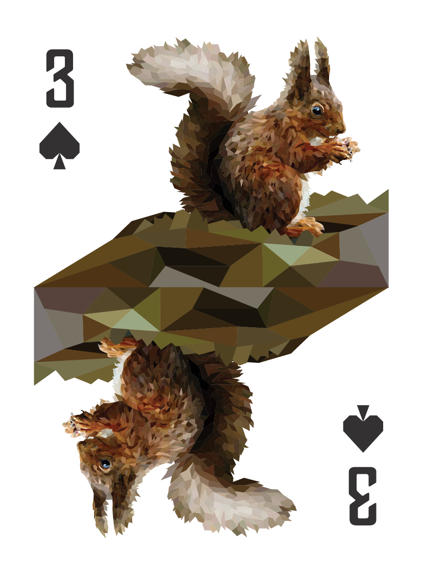
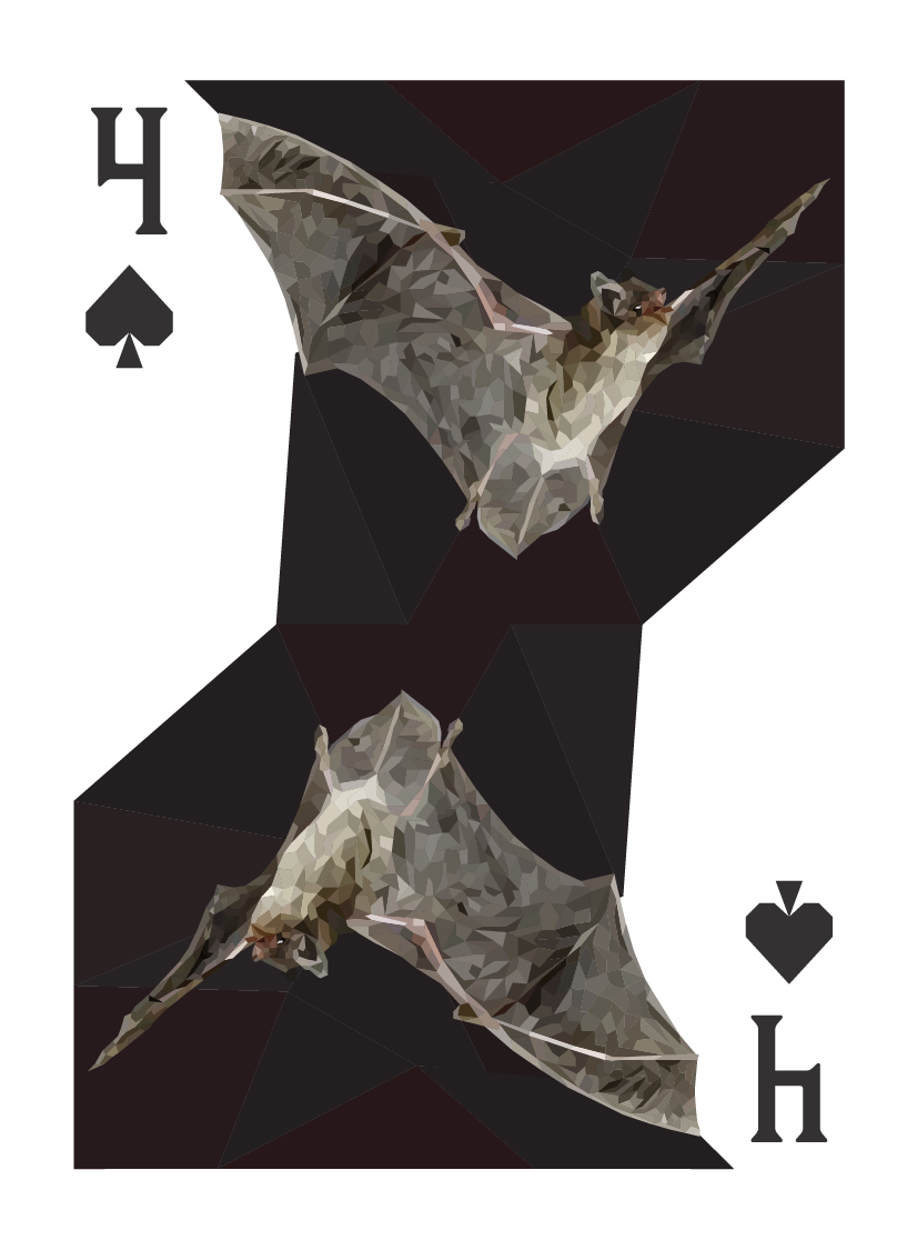
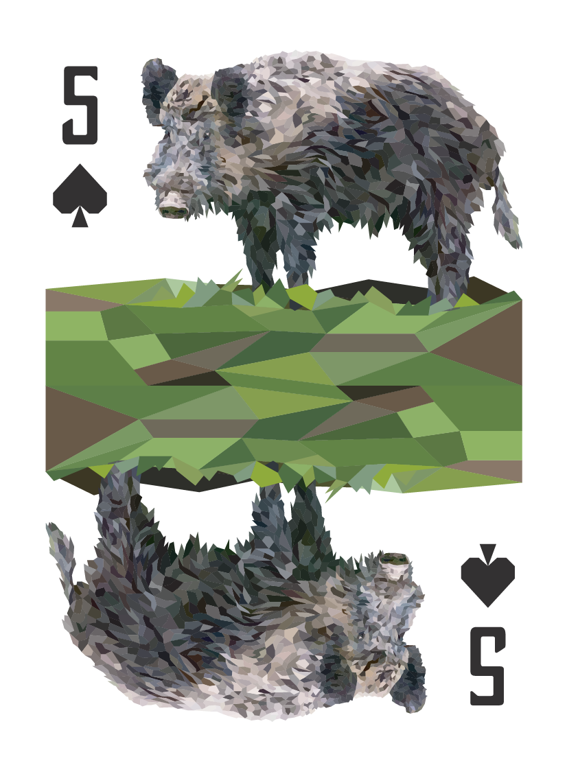
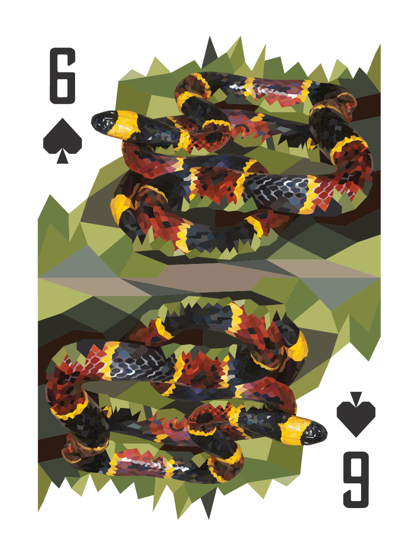
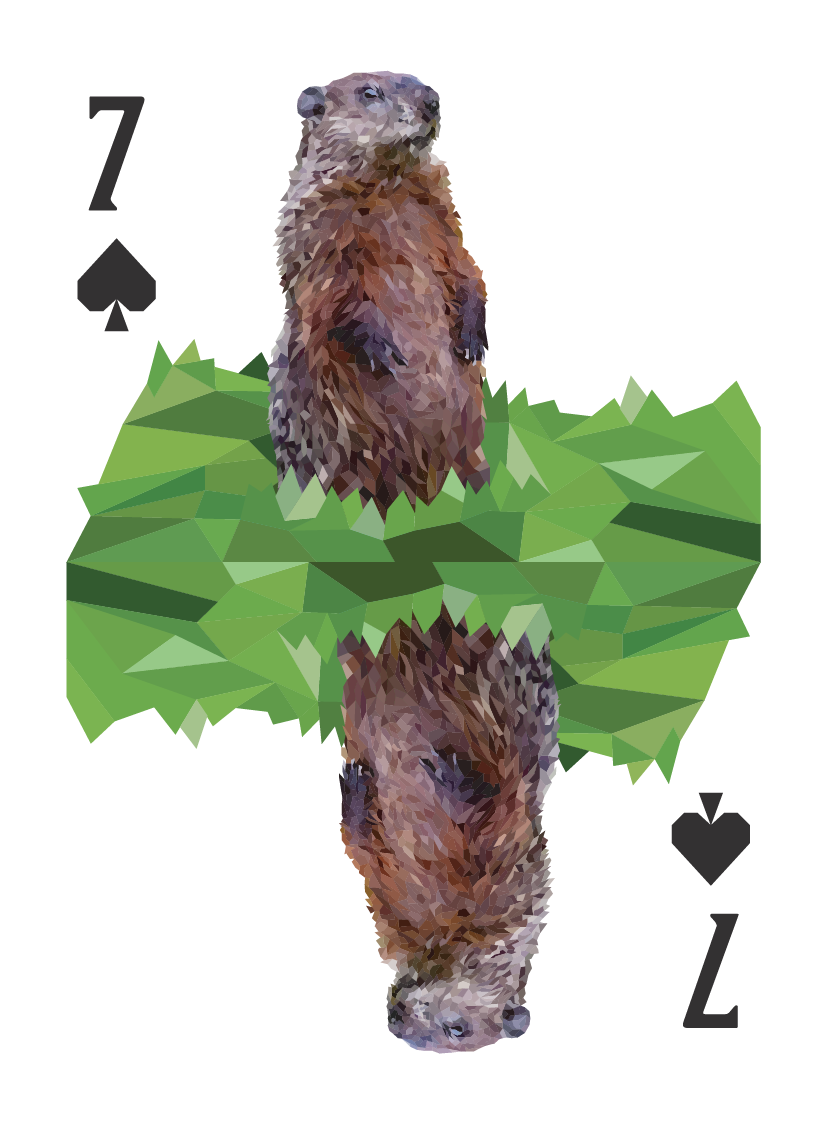
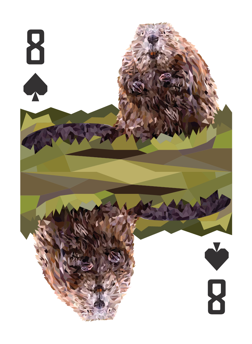
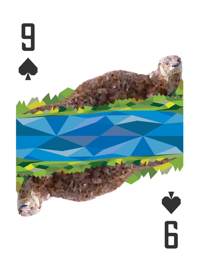
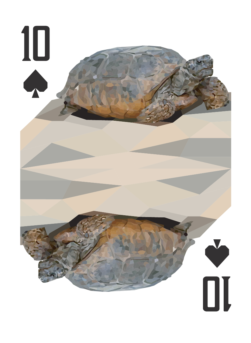
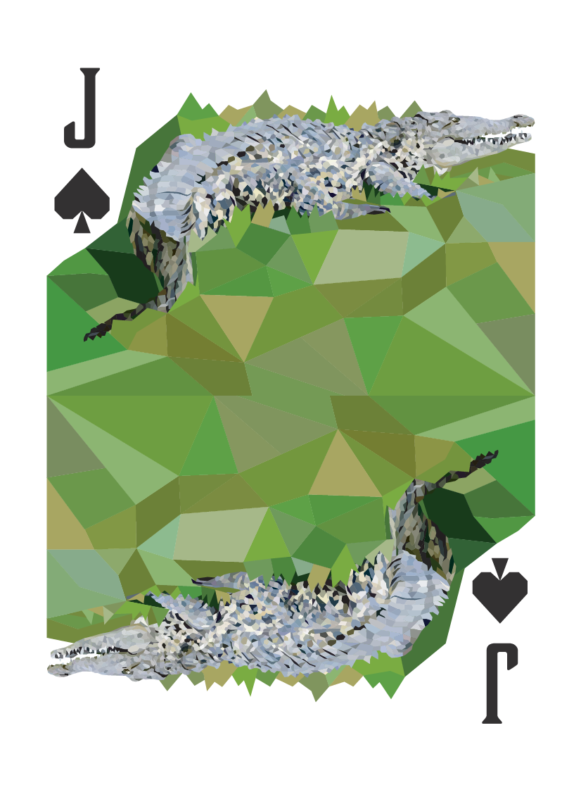
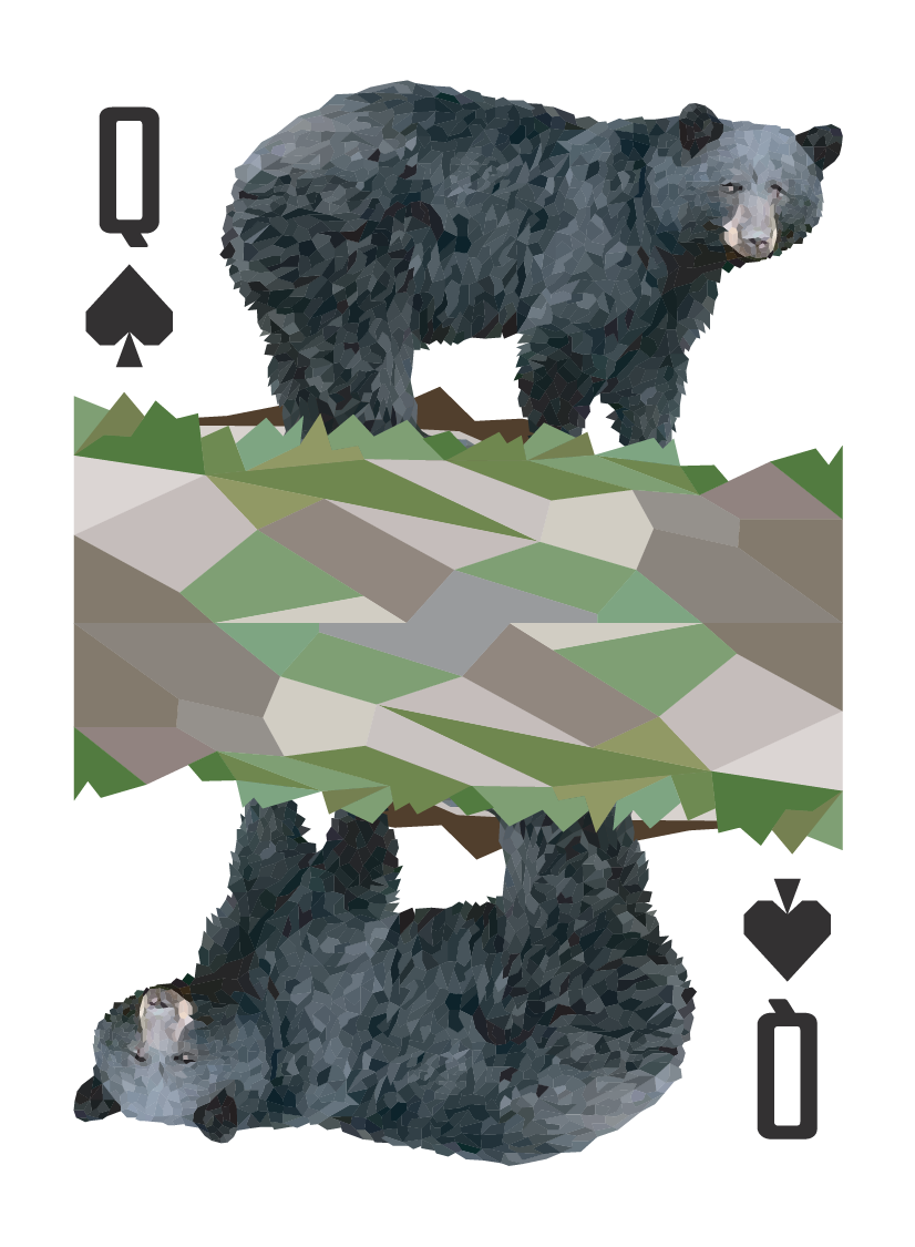
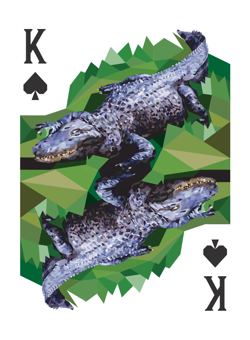
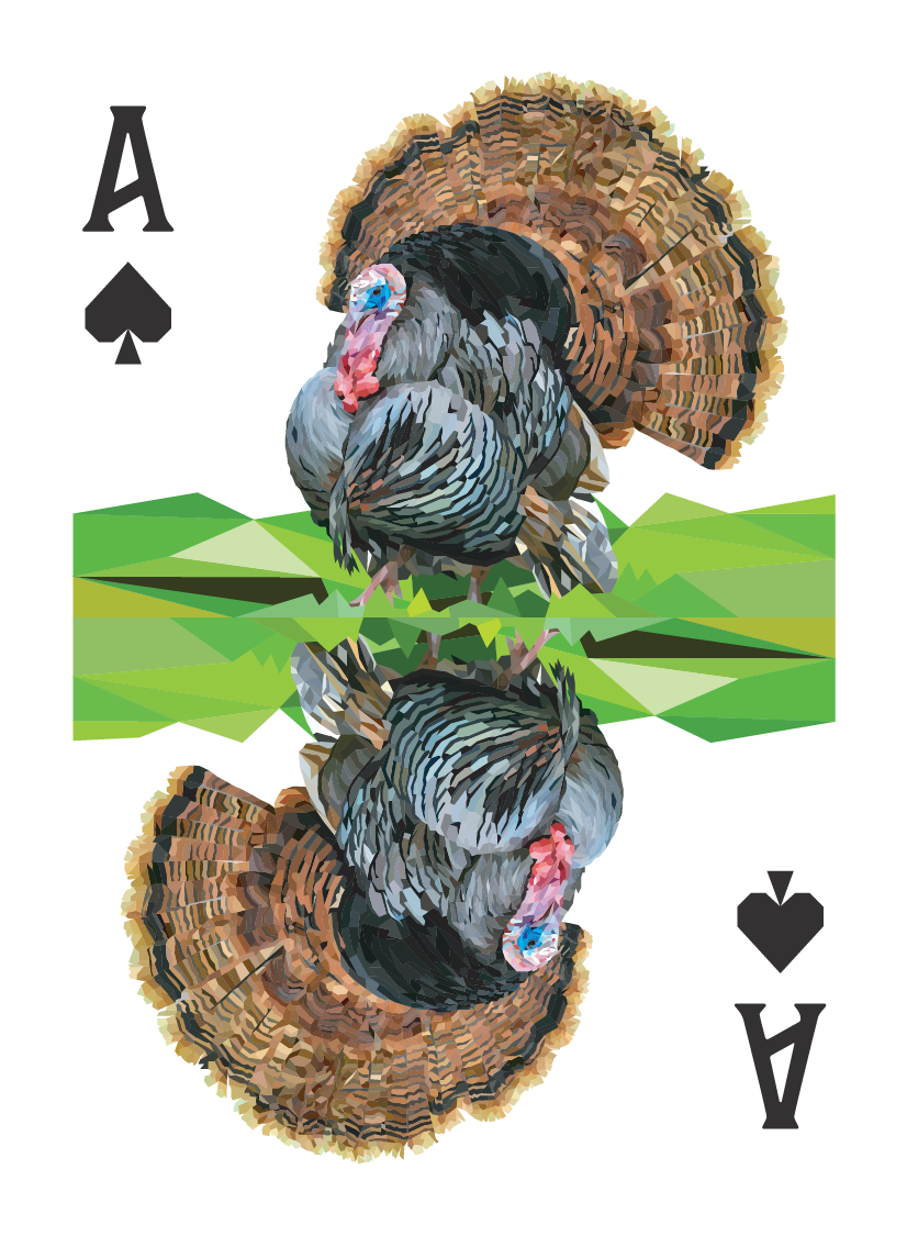
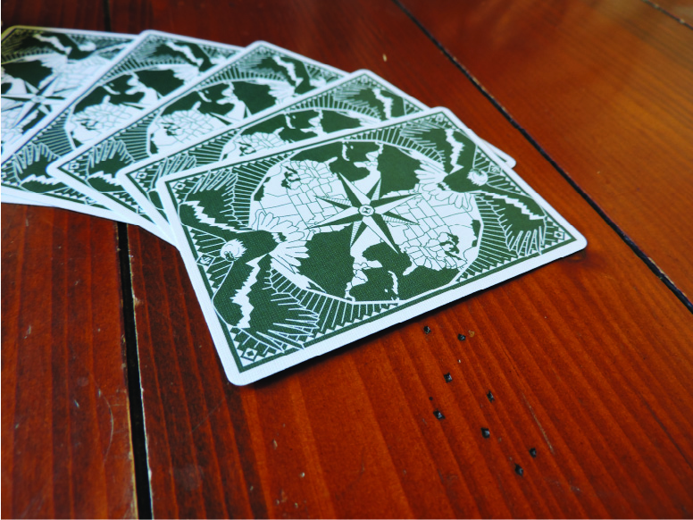
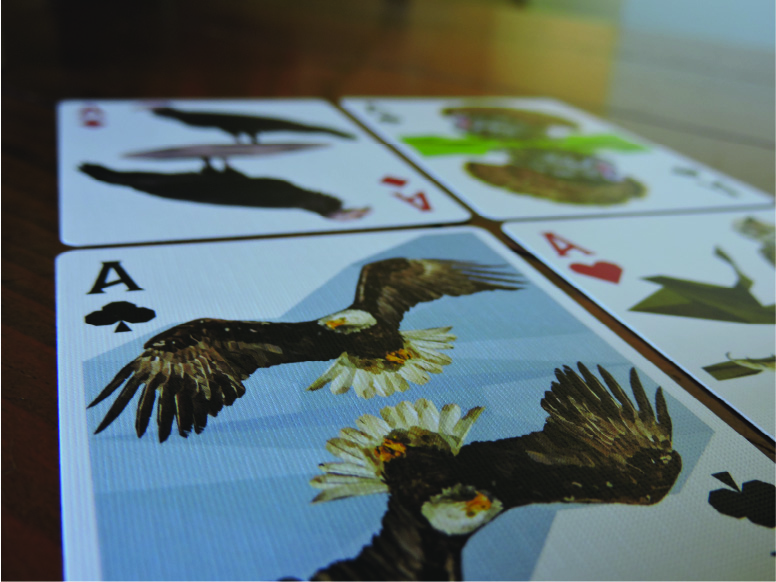
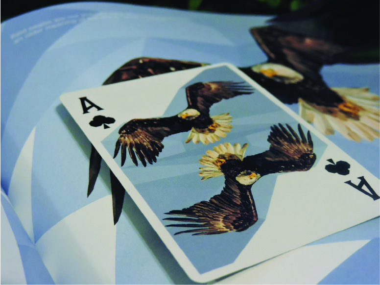
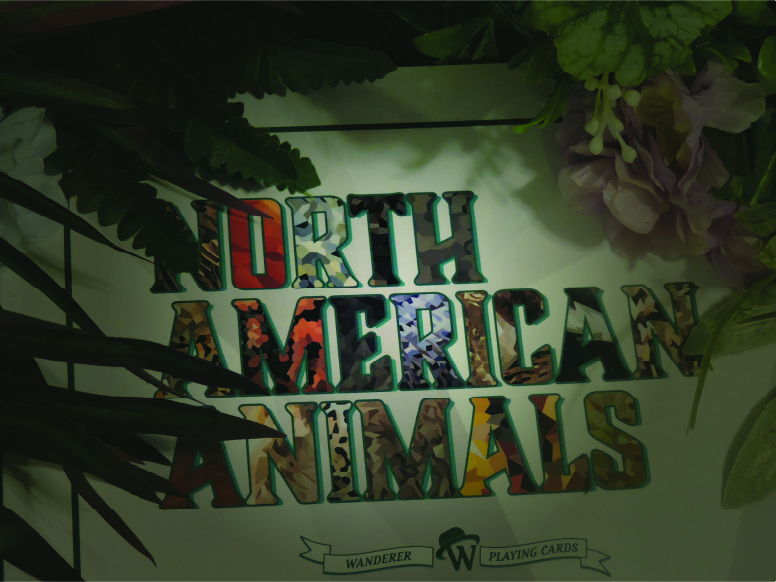
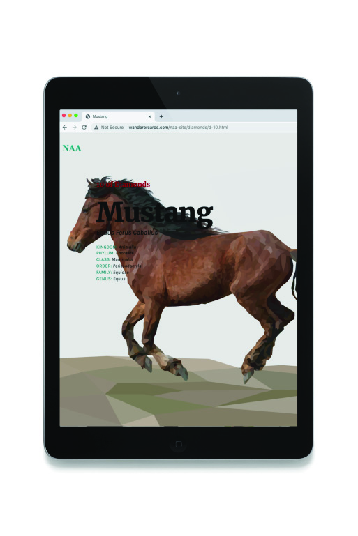
NORTH AMERICAN ANIMALS
Playing Cards
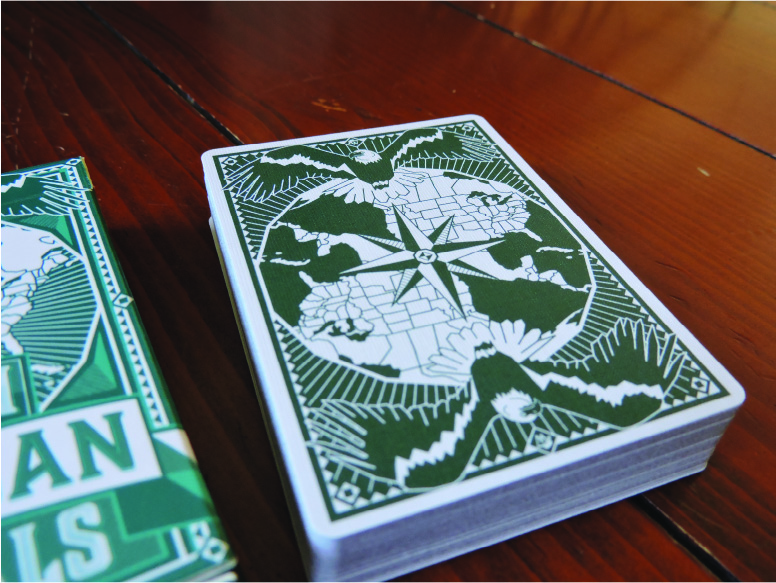
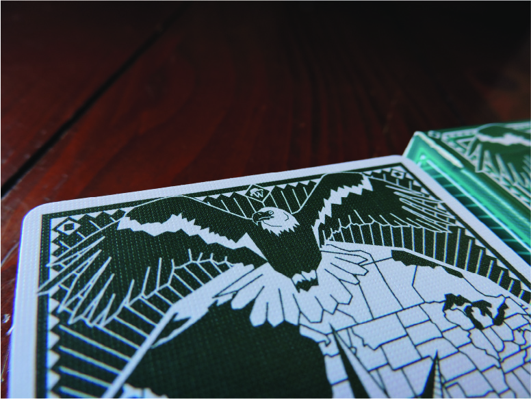
Back Interations


Back Interations
Final Designs

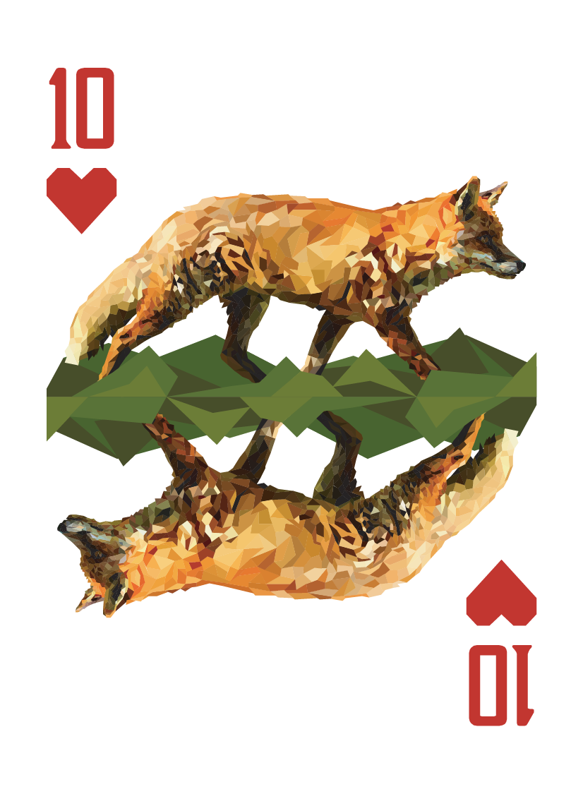
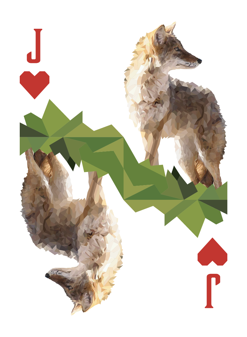
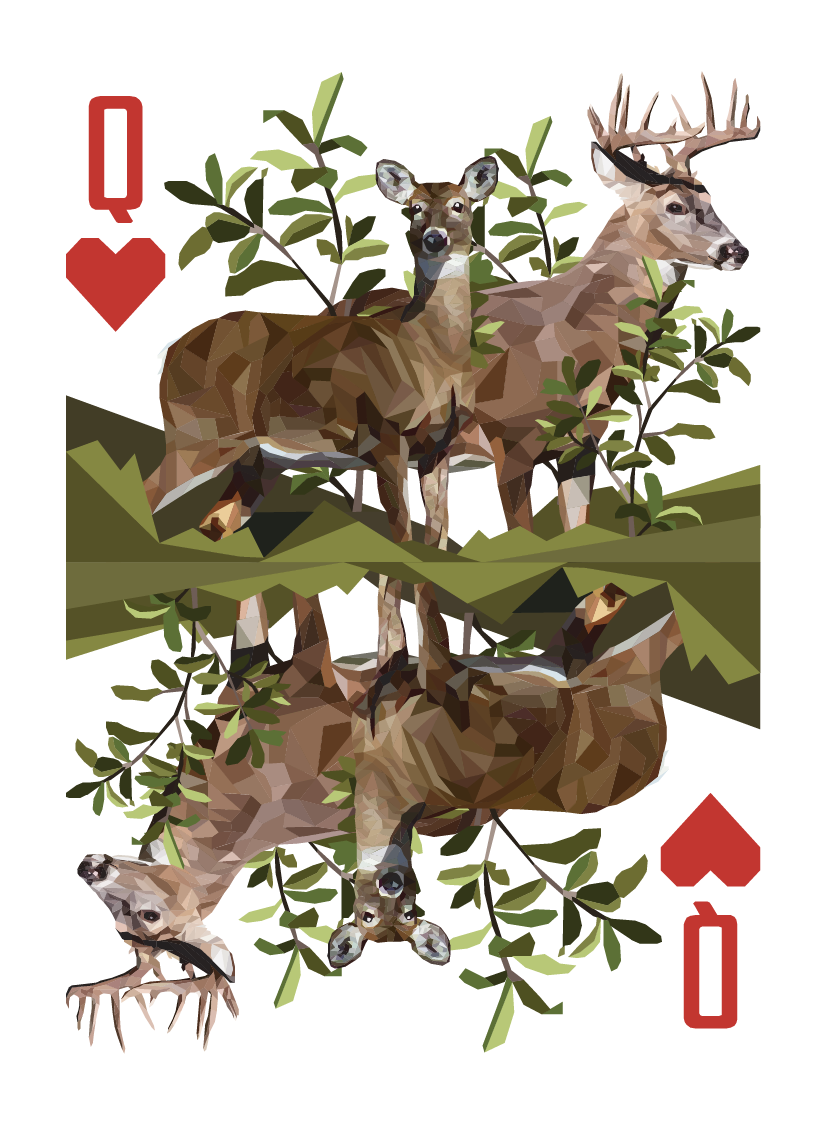
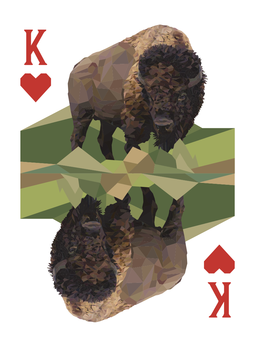
Hearts
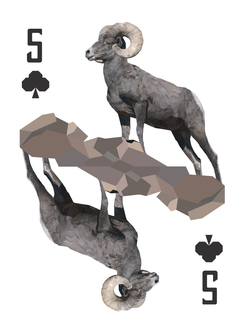
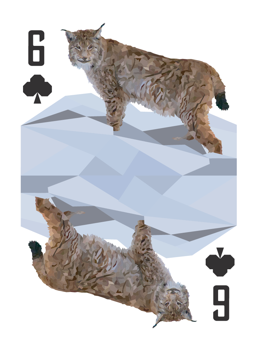
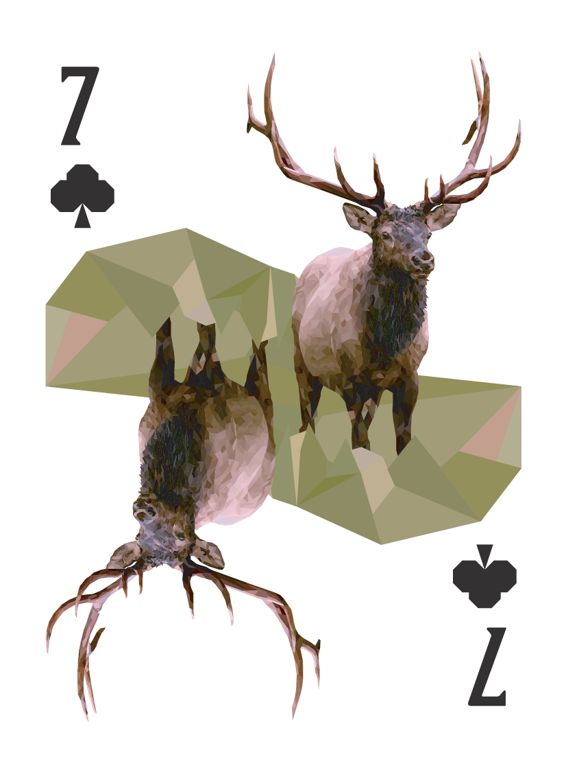
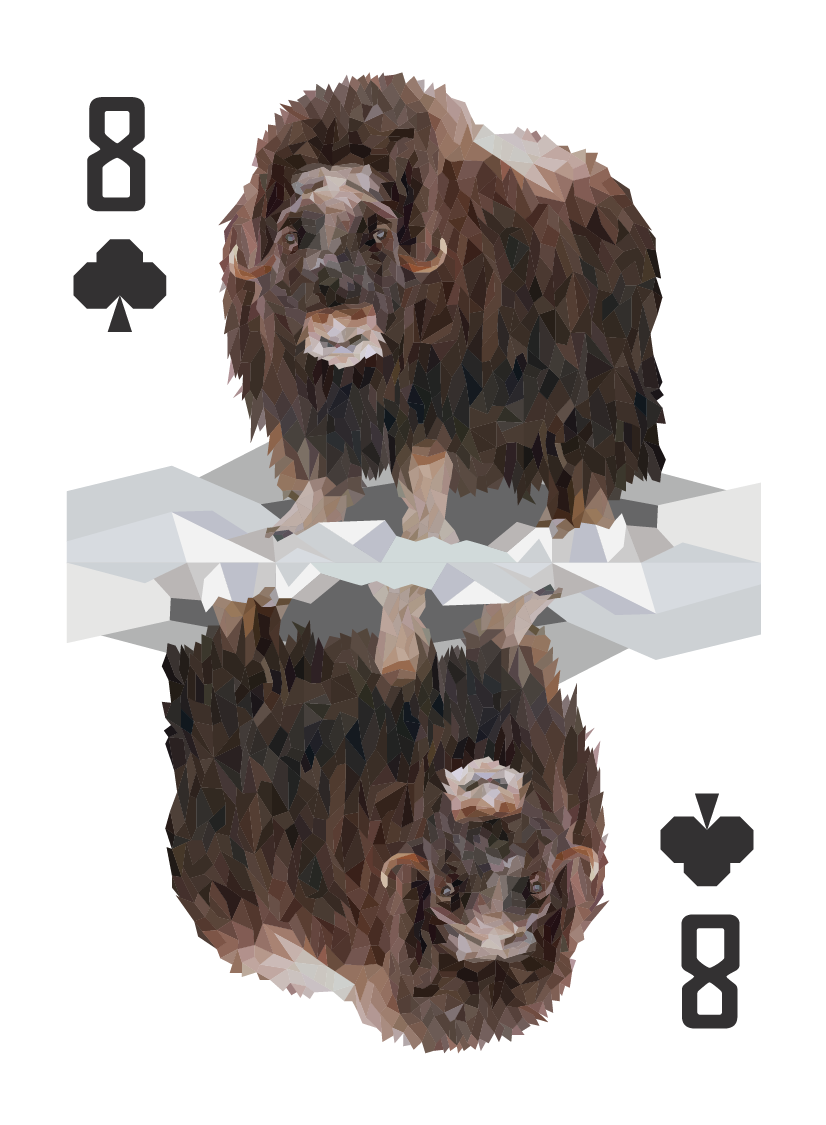
Clubs
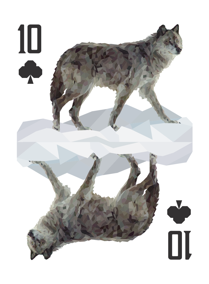
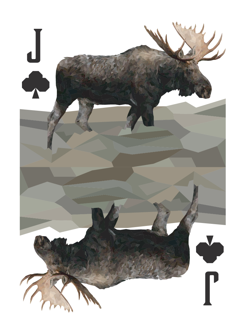
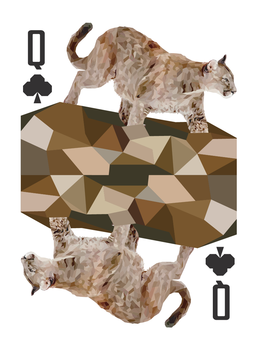
Diamonds
Spades
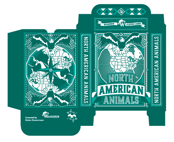
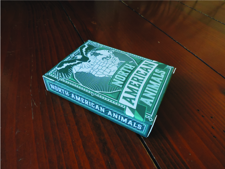
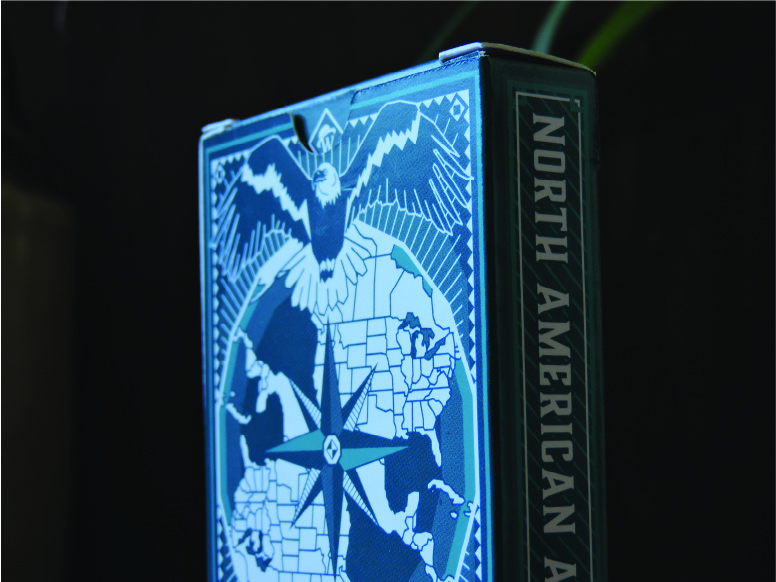
Tuckbox Dieline
For the front panel I used the same theme from the back but made it unsymmetrical and added the name of the deck to the front. I used a similar ornate border that the back of the deck features. The design puts a huge emphasis on the North America aspect of the theme. Like the previous deck, I used MakePlayingCards.com to physically produce the deck. Shied away from the high gloss this time around, deciding to keep it flat and simple.
Final Deck
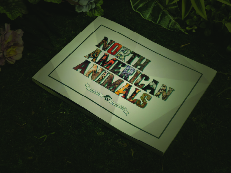
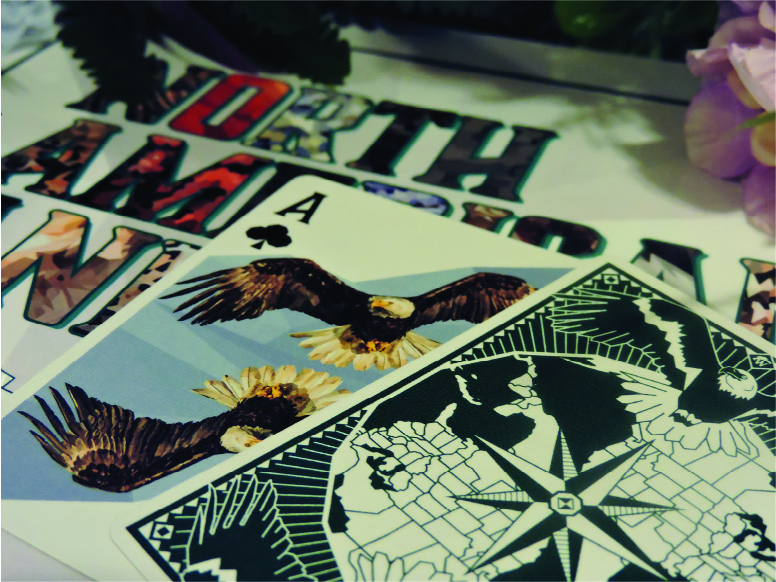
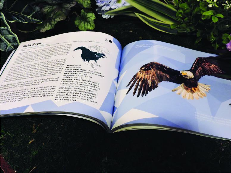
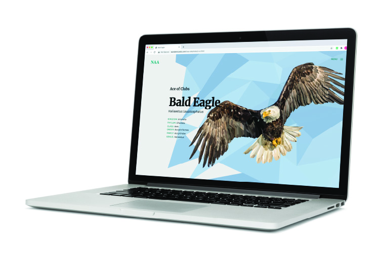
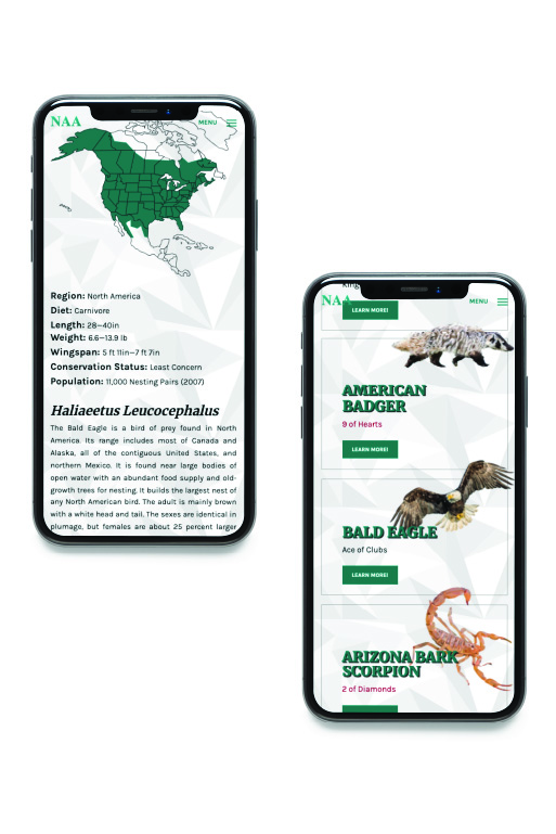
Card Book
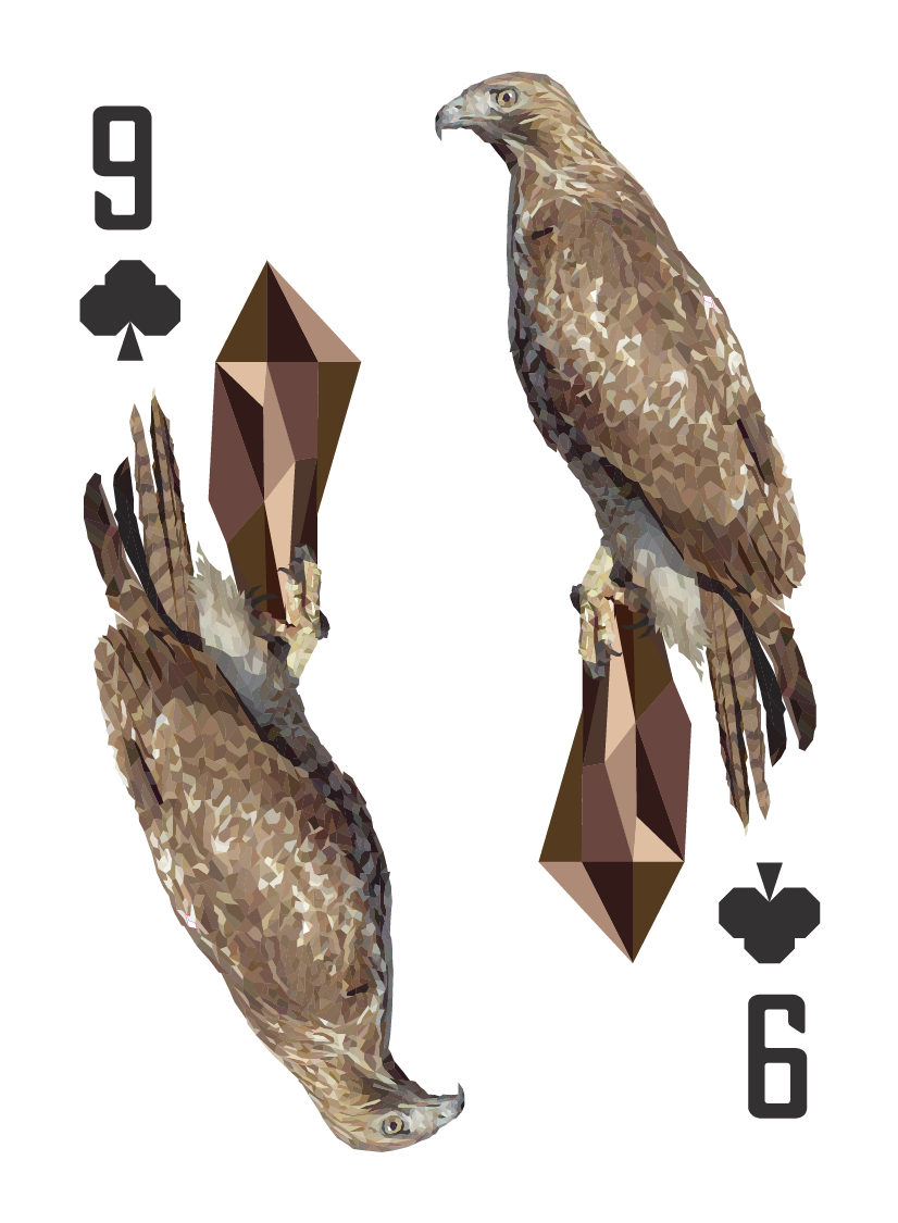
The cry of the red-tailed hawk is a two to three second hoarse, rasping scream, variously transcribed as:
“kree-eee-ar, tsee-eeee-arrr or sheeeeee”,
I’m sure your friends will love when you recite this bird call for them. Each animal has their own dedicated spread in the book. The cover of the book has a take on the typeface used on the deck design, using the texture of each illustration to make up the words. I had a blast using some fake foliage to take the photos of this book. I did a good amount of photo editing to create the shady, hidden spotlight look.
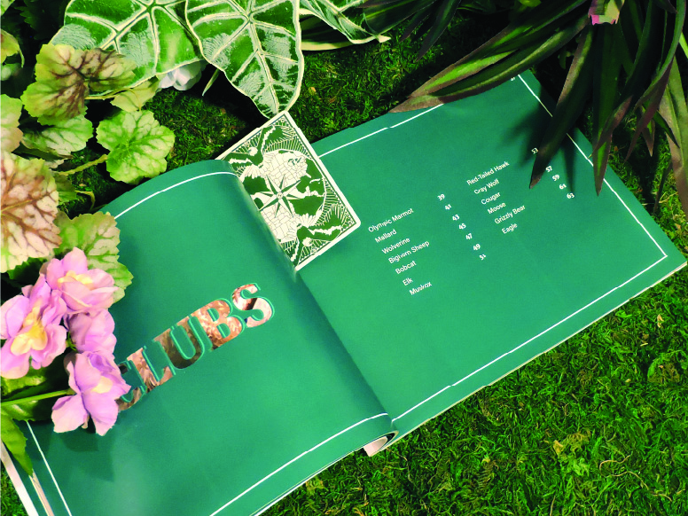
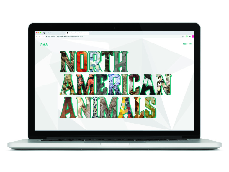
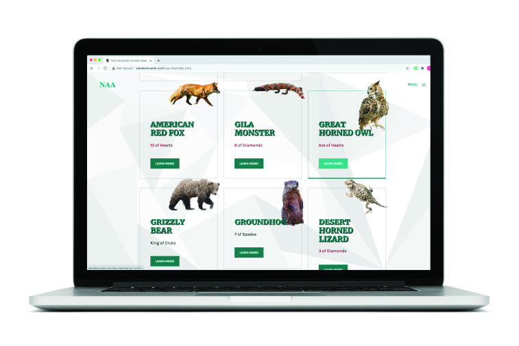
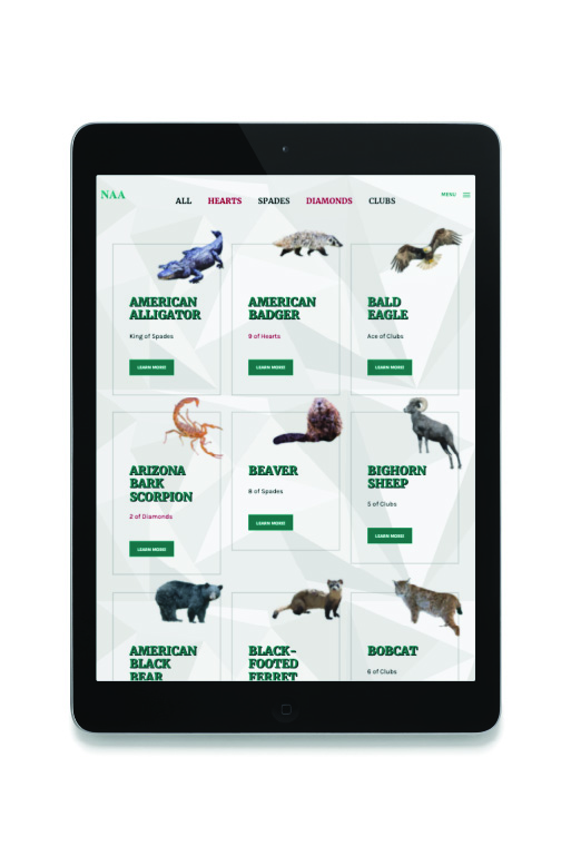
North American Animlas Index
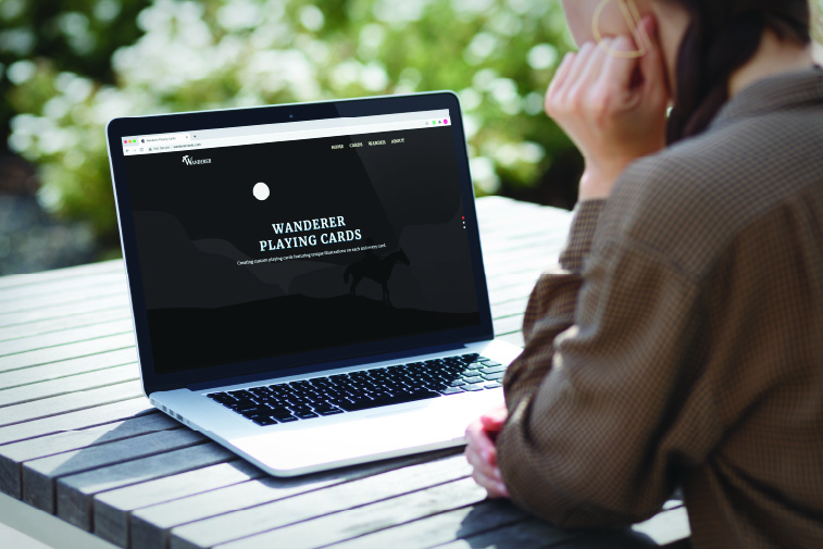
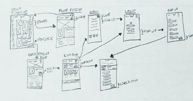
WANDERER WEBSITE
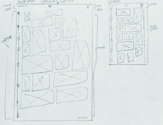
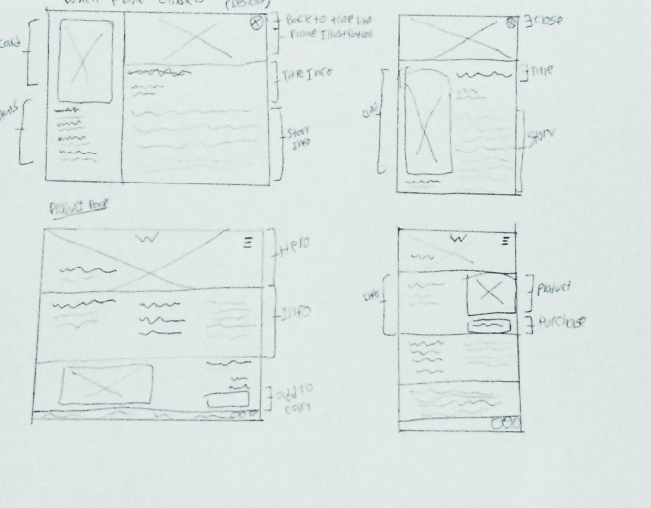
The overall design of the site can be categorized as dark and mysterious. It has a very simple layout, is easy to navigate and conveys a baseline level of info. The site maintains the black and white style of the Wanderer brand. It also uses many of the various illustrations used on the actual decks, like the roses and banners. The site functions well on all types of devices and is built with mobile in the front of the mind.