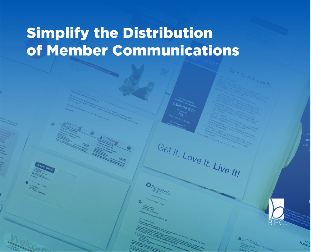
BFC
BFC was the first company I worked at full-time as a Graphic Designer. At BFC I wore many different hats, never doing the same thing each day. I primarily worked on BFC’s marketing efforts, designing corporate brochures, tradeshow graphics, sell sheets, marketing emails, the company website and everything in between. In this portion of my portfolio, I showcase some of the things I designed for BFC. In addition to working on BFC related projects I worked on a variety of client projects, some small, some larger but all more different than the last. Contained in this section are a few of the more interesting projects I worked on while at BFC. They range in the variety of mediums and scope, from small letters to billboards.
BFC
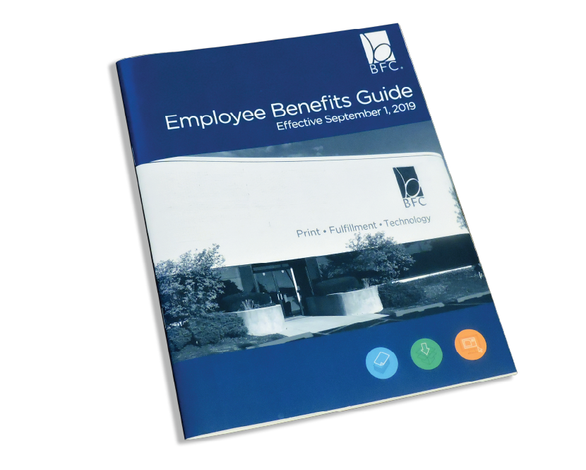
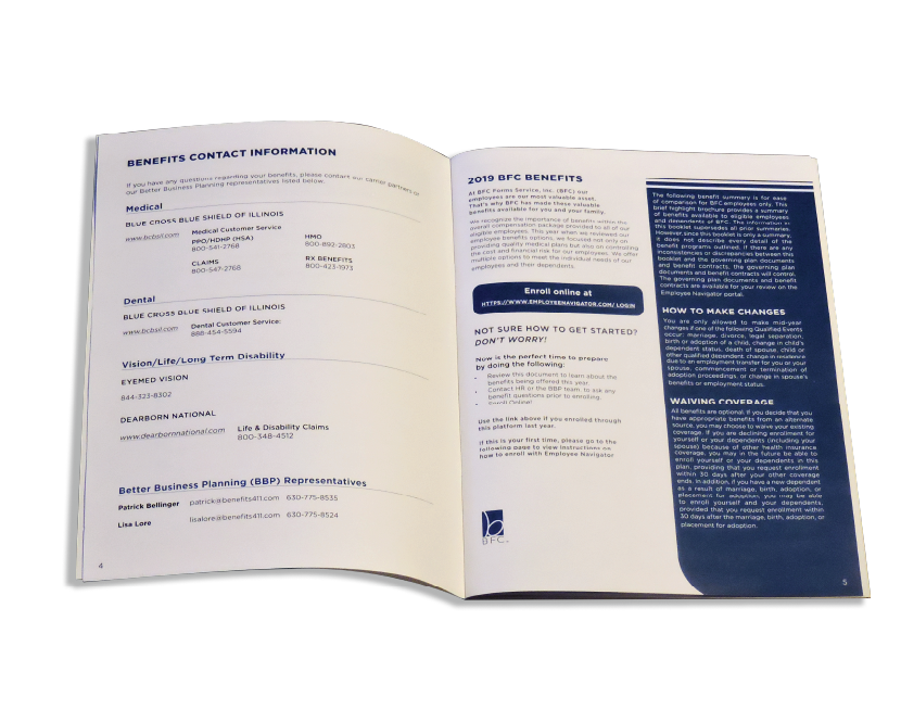
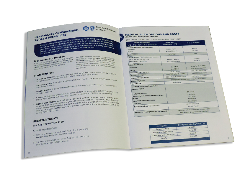
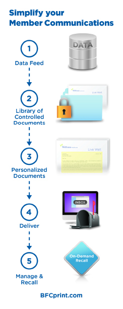
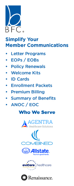
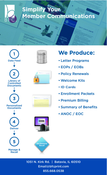
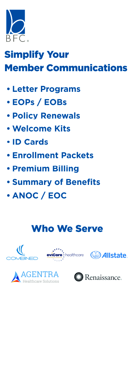
BFC Benefits Guide
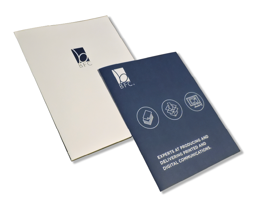
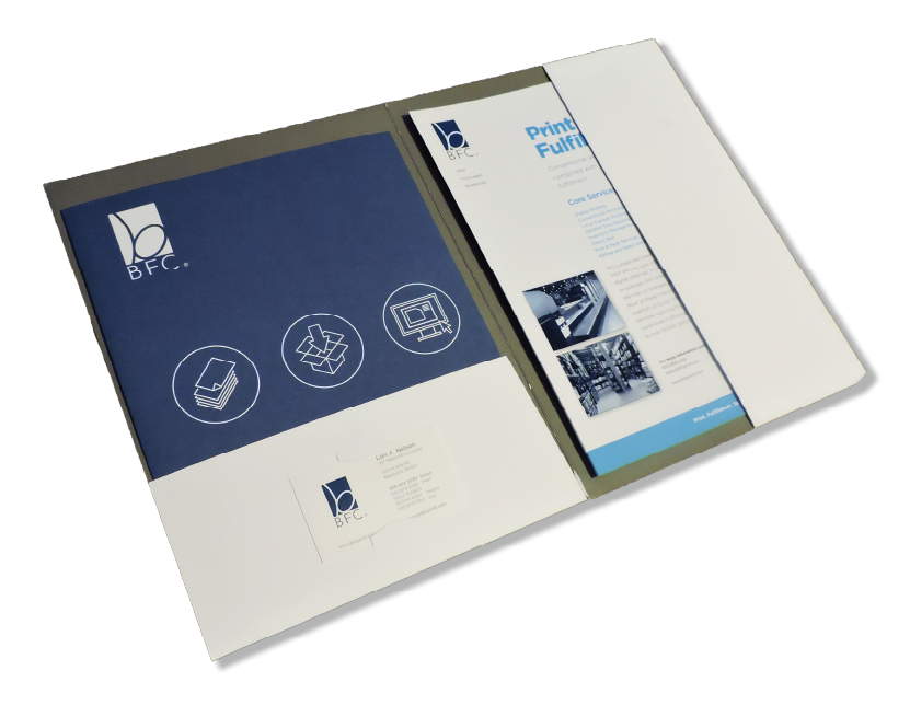
Corporate Brochure
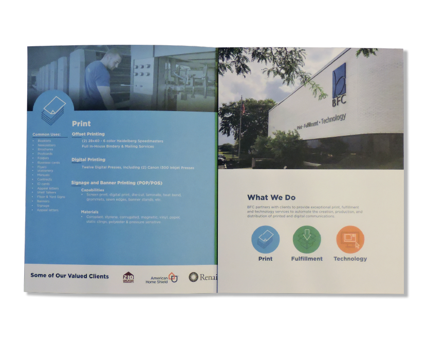
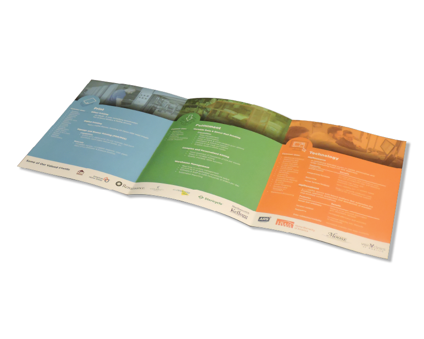
On the inside of the brochure, each page focuses on one of the capabilities. Each page showing up in the color associated with each icon, blue for print, green for fulfillment and orange for technology. Each page gives a brief view of what these capabilities mean and the services that BFC offers. Across the bottom of the inner pages are some of BFC’s valued clients. The Brochure is printed on a heavy paper with a nice texture. This was done to give a nice tactile aspect to the piece. The Full cover blue also contrasts well with the white folder.
ICMG Tradeshow
Front of Handout
Back of handout
Tradeshow Email
Bannerstand
Backdrop
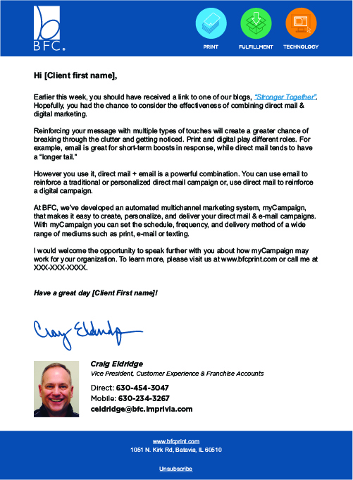
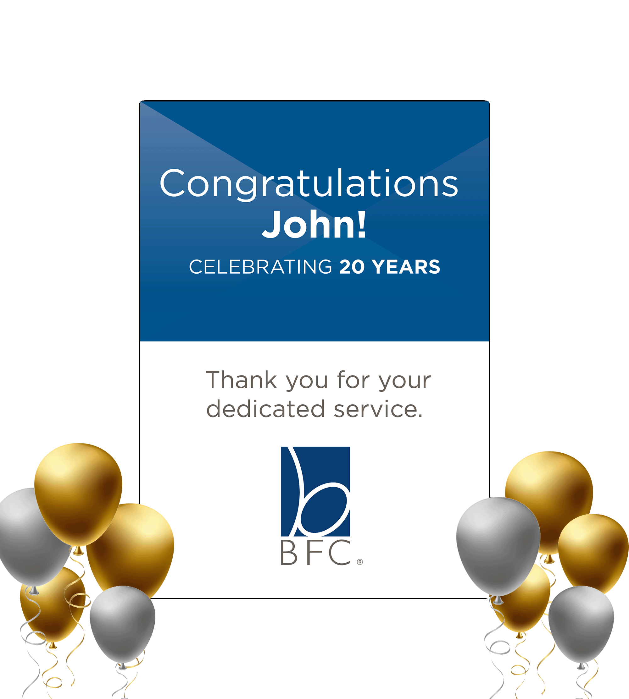
Marketing Emails & Holiday Cards
Standard Follow-Up Email
Anniversary Email
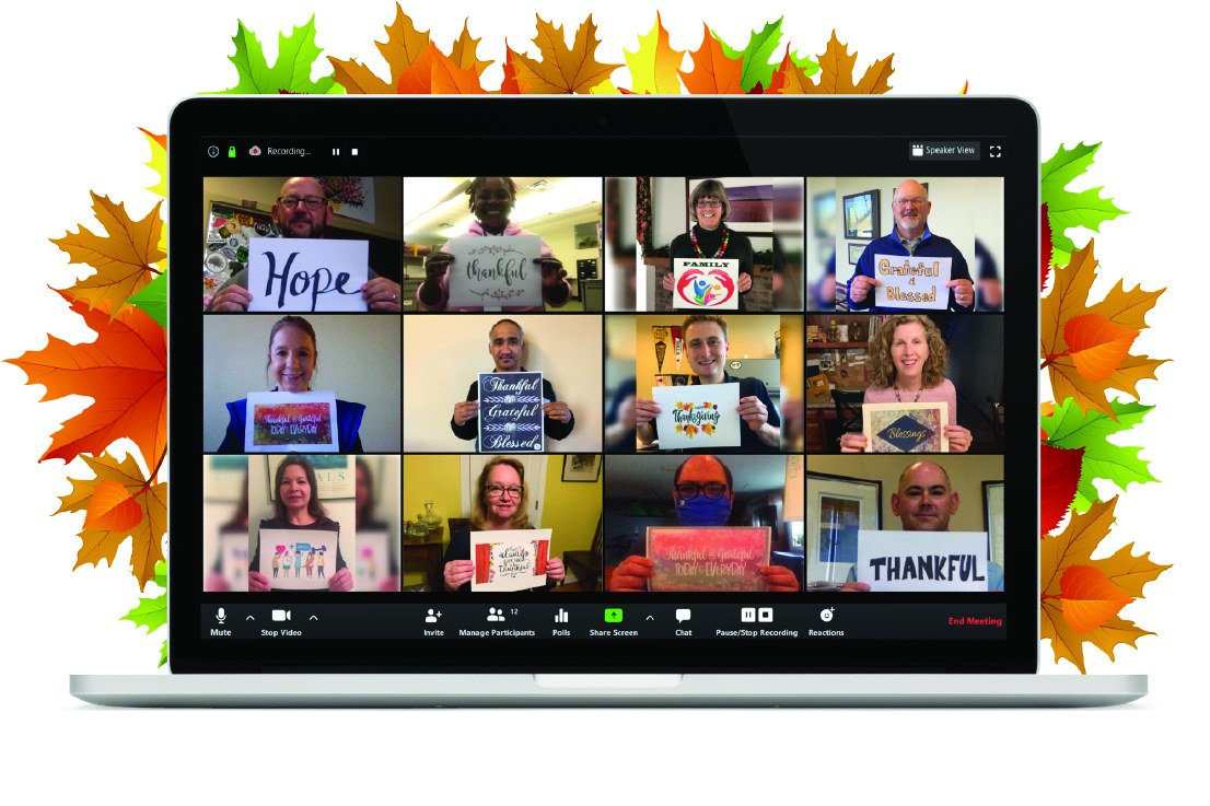
Thanksgiving Email
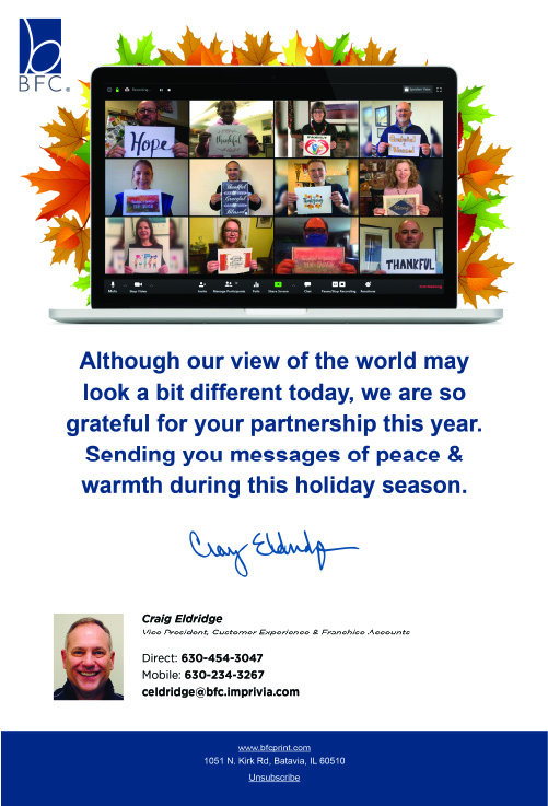
Thanksgiving Email Graphic
2019 Christmas Card

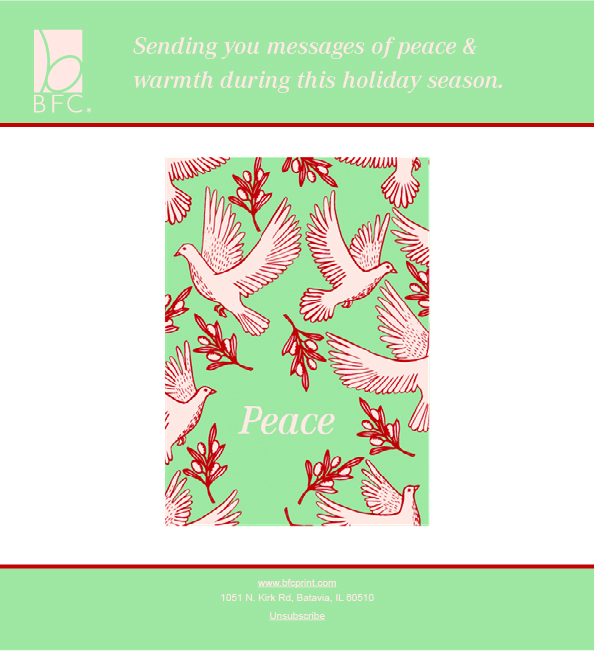
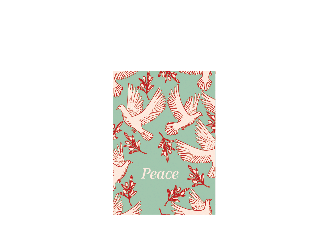
2020 Holiday Card
2019 Christmas Card
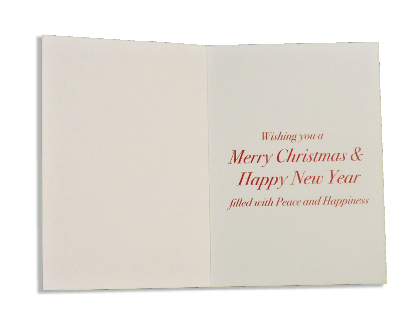
2020 Holiday Card
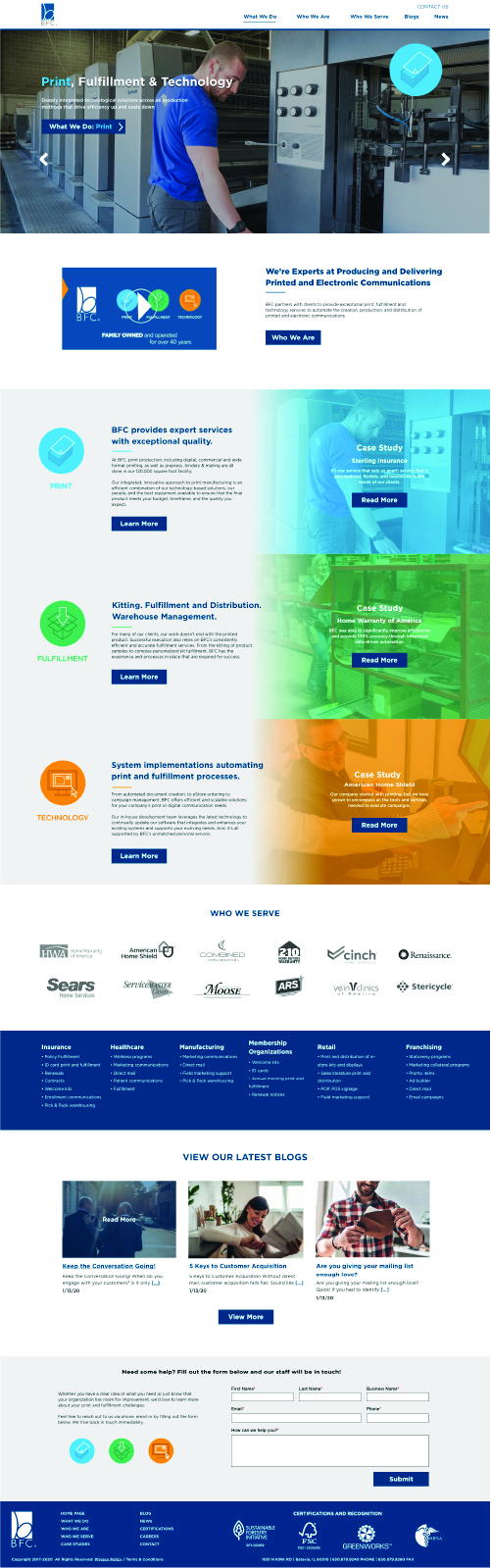
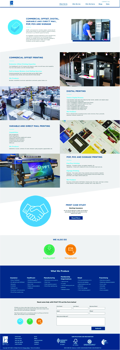
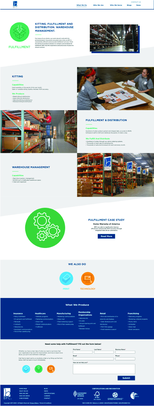
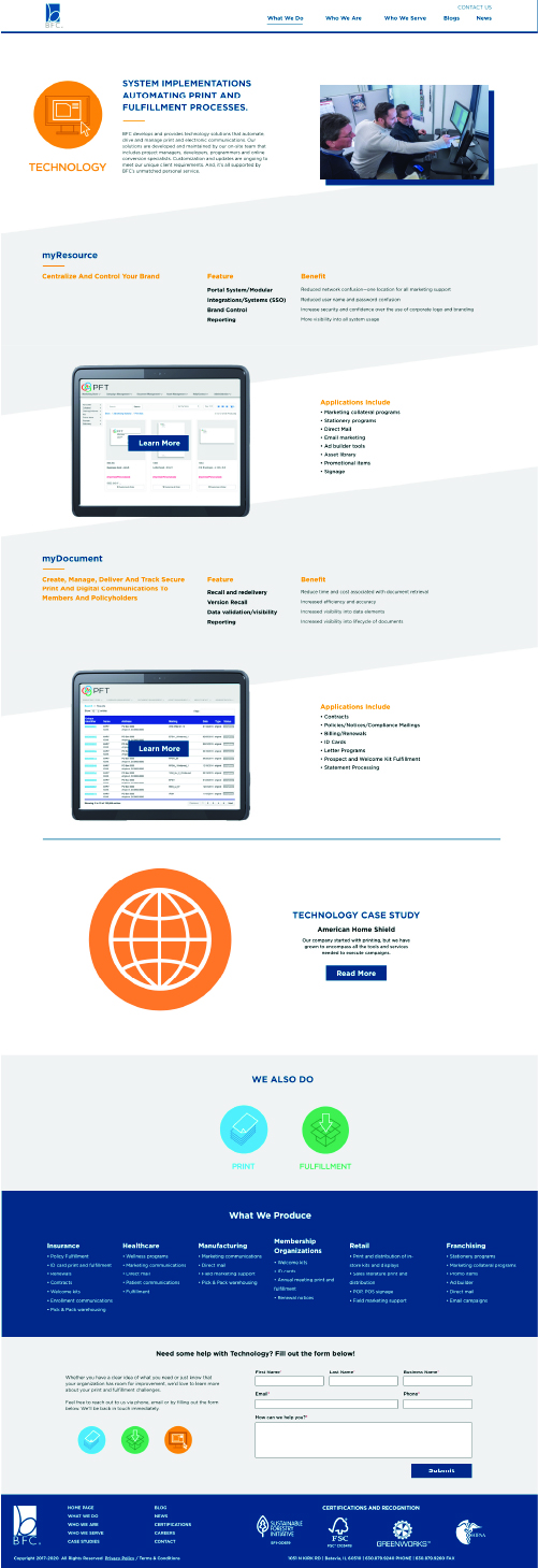
BFC Website Re-Design
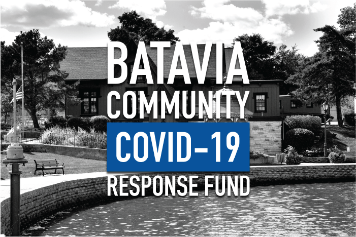
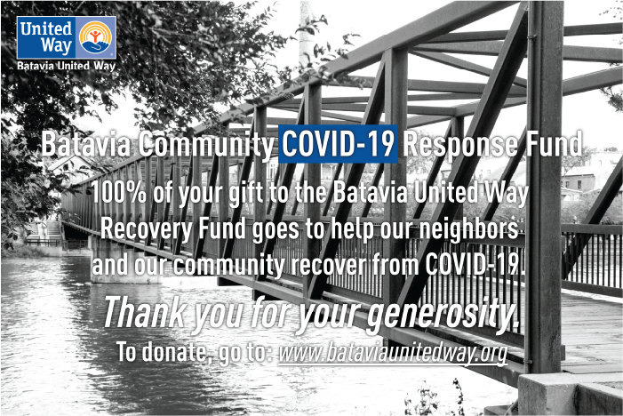
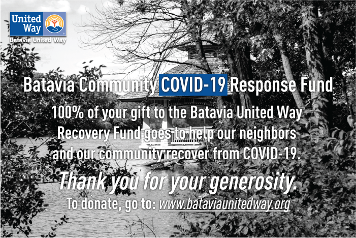
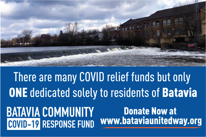
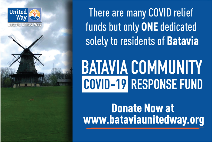
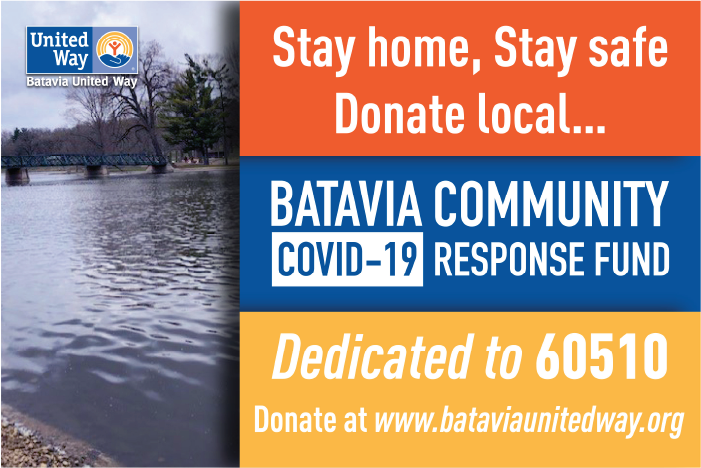
BATAVIA UNITED WAY
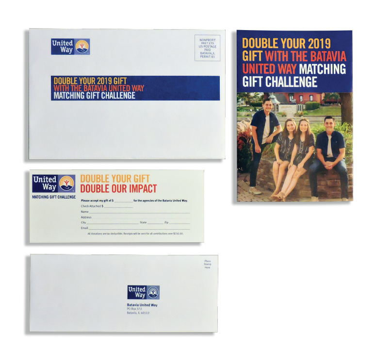
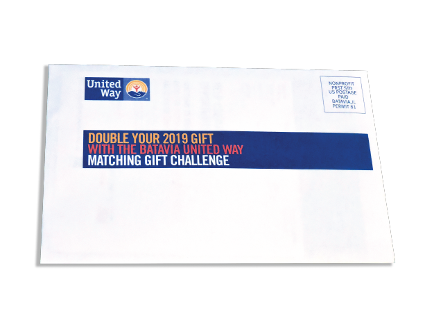
Matching Gift Challenge Package
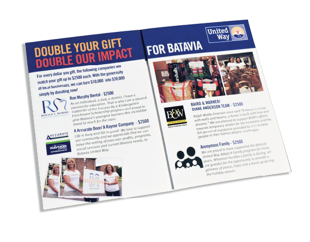
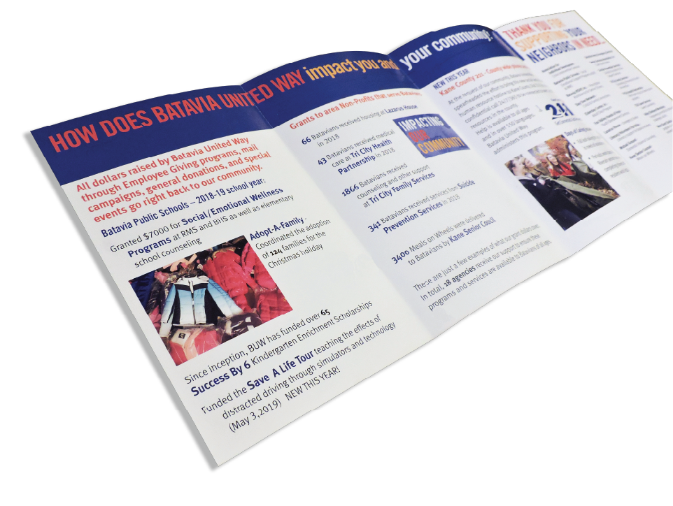
The Matching Gift Challenge is an effort to fundraise money for local initiatives. The package includes a small brochure that details some of the initiatives that donating can help fund, a donation form and lastly a return envelope for the donation slip. I designed the 2019 and 2020 brochure included in the package. It uses the red and orange company colors to create eye-popping headers across the top of the brochure pages. I designed the brochure to have a nice flow of images that help tell the story of the initiatives. Overall, the brochure falls in line with the other package pieces and uses similar features.
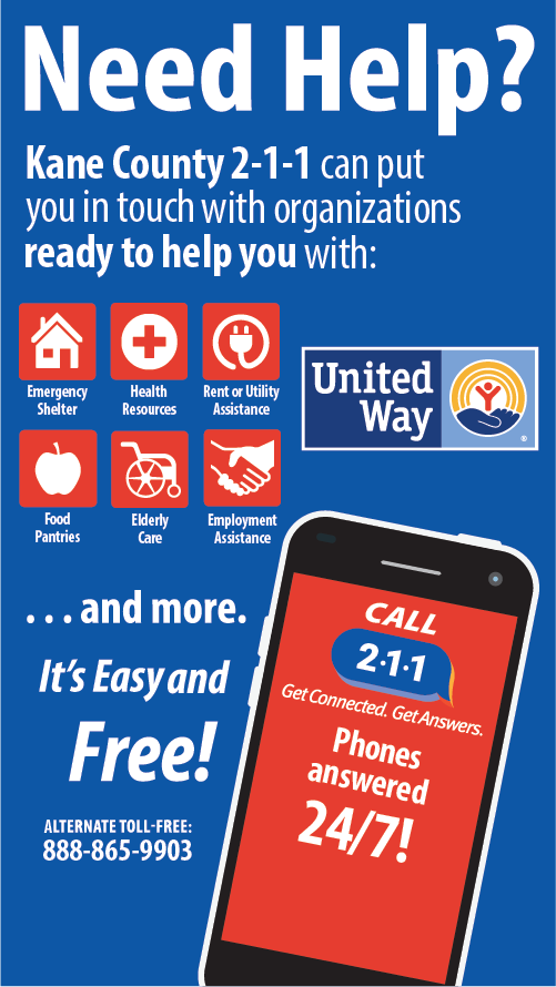
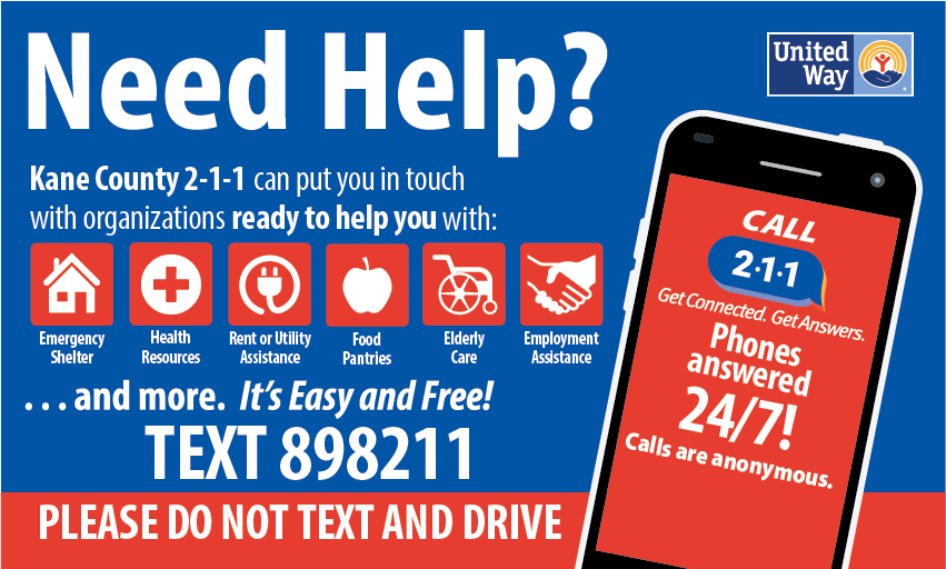
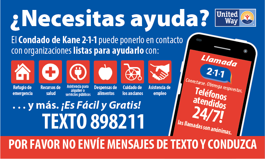
211 Posters and Billboards
Covid-19 Social Posts
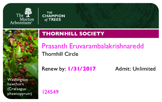
MORTON ARBORETUM
Membership Items
The Morton Arboretum is a public garden, and outdoor museum with a library, herbarium, and program in tree research including the Center for Tree Science. Its grounds, covering 1,700 acres, include cataloged collections of trees and other living plants, gardens, and restored areas, among which is a restored tallgrass prairie. The living collections include more than 4,100 different plant species. There are more than 200,000 cataloged plants.
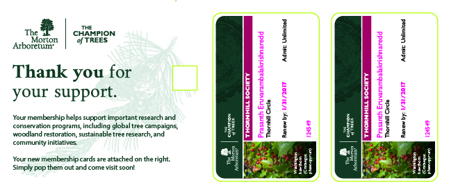
All of these pieces are dense with information, when designing them I tried to keep things as simple as possible so the member receiving these pieces would have no confusion about the updated protocols. The reminder card uses a screen of the Morton green to break up the dense copy on both sides of the piece. I made sure to incorporate the lively green color associated with the Arboretum. I also made use of some other assets like the green types of leaves found on the postcard. We also updated the design of the membership cards to include an image of the member’s favorite plant. Also added a color-coded system for the membership level, this can be seen in the red bar across the top. The cards also feature screens of different leaves, keeping with the nature vibe Morton is so famous for.
Membership Letter

Reminder Card Front

Reminder Card Back

Membership Postcard

Membership Card
Front of Membership Card Holder
Back of Membership Card Holder

WEBER GRILL
Store Posters
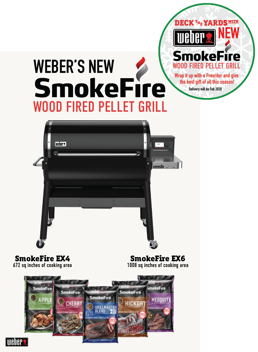
The second poster mentions the different versions of the grill and the varying types of wood pellets that go into the grill. This poster was made to be put up during the same time as the holiday poster, but it also came with an attachable foamboard circle that has the same holiday related info as the other poster. We designed the circle to have a Velcro strip on the back side that would attach to another strip on the upper right side of the poster.
Holiday Poster
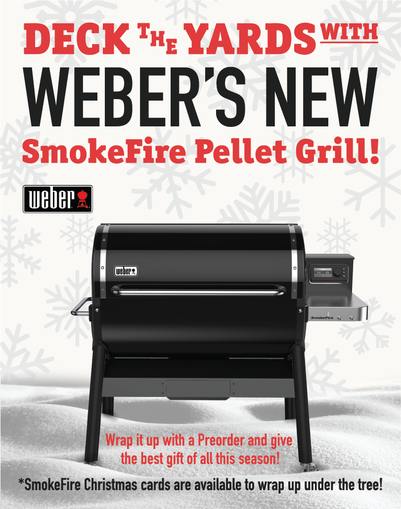
New Grill Poster
GLOBAL GUARDIANS
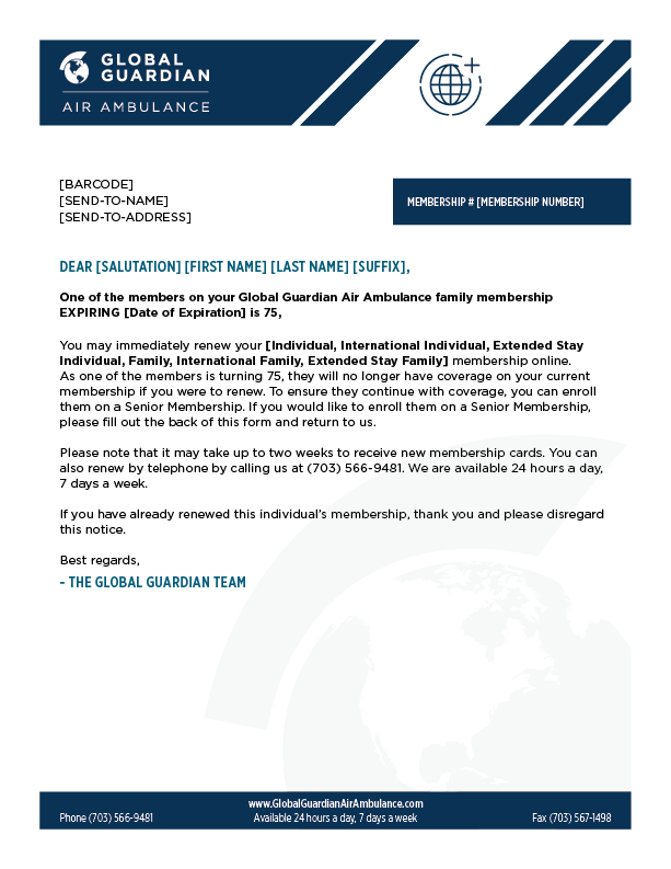
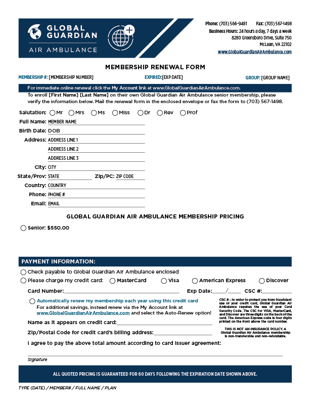
Letter Template
Front of Letter
Back of Letter
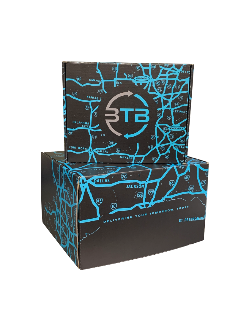
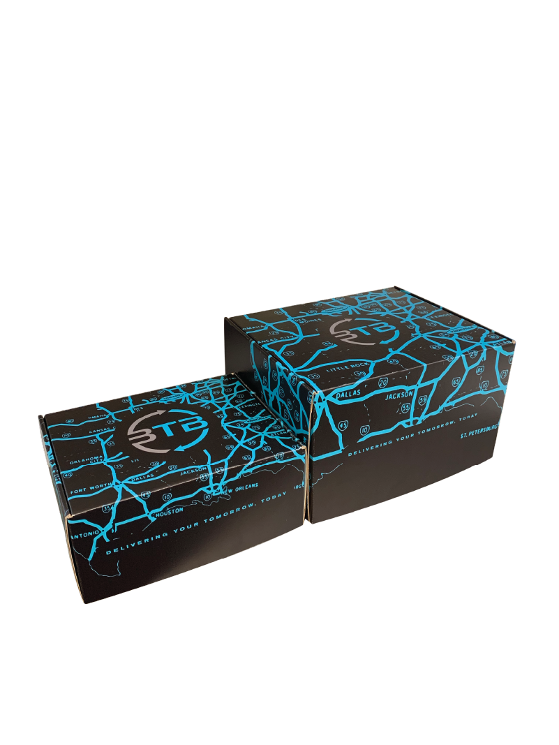
BTB Logistics
Customer & Employee Packages
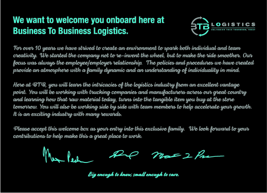
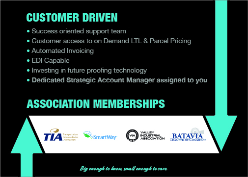
I also designed both postcards that are found in each box. The employee on being a rather simple one-sided piece. It contains a simple message from the owners of the company. I manipulated the owner signatures to appear bolder and made them blue. The customer note on the other hand is double sided, the back highlights more of the capabilities and associations the company has. It also makes use of some of the elements BTB has, like the icons and the blue arrows.

Front of Customer Note

Back of Customer Note
Employee Note