SpeedPro Imaging
Jump to:
This is a collection of various things I worked on while at Speedpro Imaging. Speedpro specializes in large format printing; I started working there in the summer of 2017 part time while I was finishing up my last two years in college. In a typical week I would work 20 hours there and commute to Chicago for another 12-15 hours of class. These various sections cover specific work I've designed for a wide range of clients. The designs cover everything from simple posters to vehicle wraps to outdoor signage.
SPEEDPRO IMAGING
Business Cards
This work includes a variety of marketing material I made for Speedpro Imaging. It includes things like business cards, web ads, sales items and nametags. All of the designs are made with the already deep reaching brand in mind. Consulting the brand guidelines, I created all of these materials. The business cards utilize the SpeedPro black and red color. The back of the business cards use many different typefaces and mention a lot of different types of things they do. The combo of different typefaces helps promote the diversity of services that the company does.


Web Ads
All of the ads make use of assets that are frequently used by Speedpro Imaging. The bulk of this section consists of things that help promote the company. Like the business cards they use the red and black primarily and the combo of different typefaces and services.

Proven Process
The Proven Process sheet was a template that I created that explains the way SpeedPro Imaging goes about doing all of their jobs. The sheet is given to potential customers to show what sets SpeedPro apart from their competitors. I created Illustrations that reinforce what the 4 sections of the proven process are.

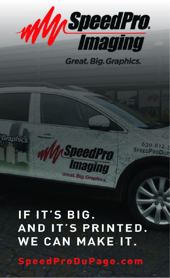
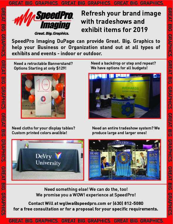
Tradeshow Ad
This is a one-page print ad that I made for a tradeshow that SpeedPro Imaging was attending. It utilizes the SpeedPro tagline in a repeated fashion, draped in the vibrant red. It shows a few images of tradeshow specific things that SpeedPro produces and makes.
UNIVERSAL CONSTRUCTION
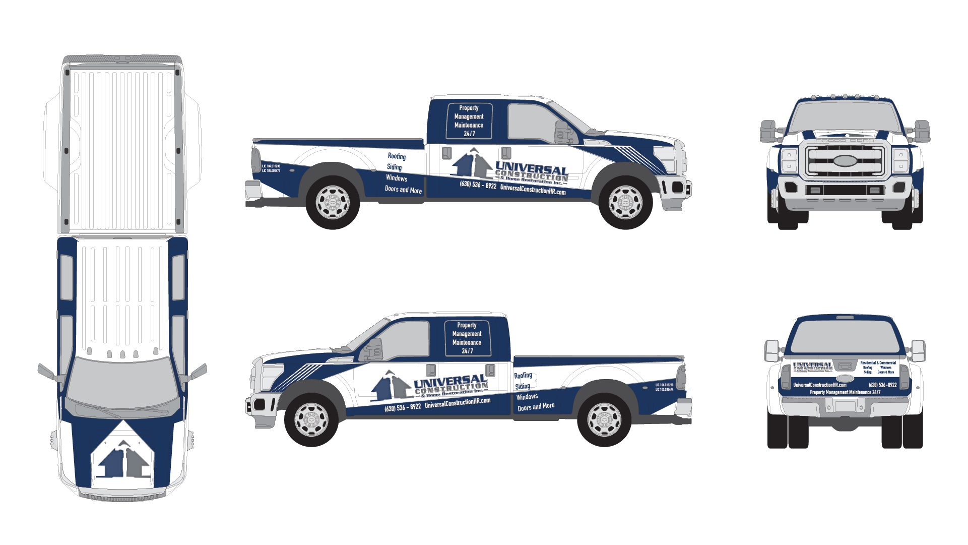
Truck Wrap
During my first month working at SpeedPro Imaging I was tasked with developing a few items for a construction company called Universal Construction. I made a design for a company pickup truck. The truck wrap makes mention of all the services that Universal Construction offers. The design uses hard, sharp lines that mimic the hard lines found in the logo.
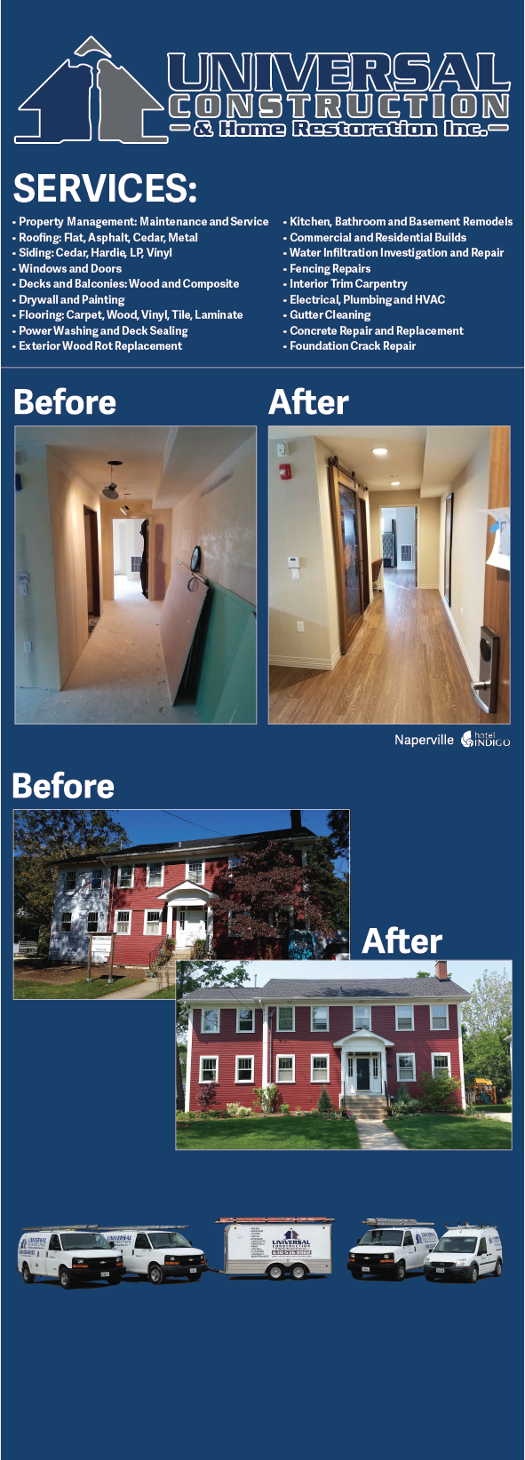
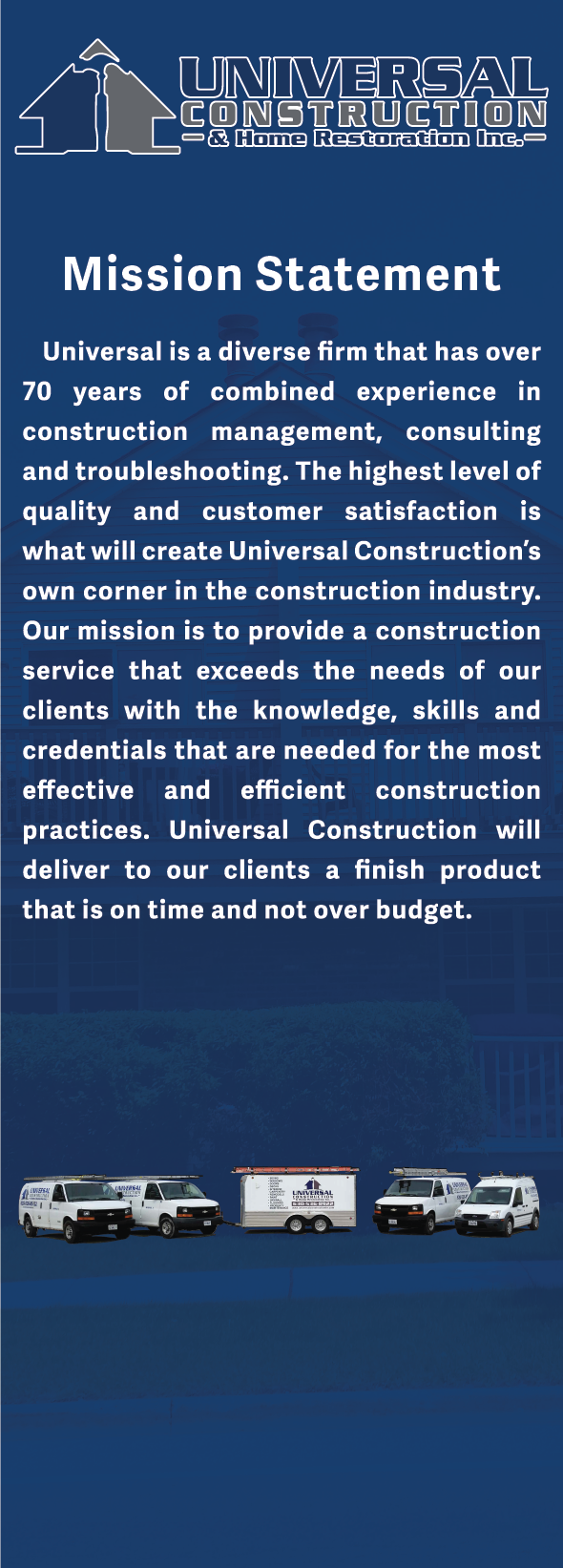
Bannerstands
There are two different banner stands that I designed. The first one shows Universal Construction’s Mission statement with a ghosted image in the background. The image reinforces the services that they do. The fleet of vehicles found at the bottom of both banners shows the versatility in the services that the company offers. The second banner stand shows before and after pictures of work that the company has done. It also lists all of the services the company offers.
TWO BOSTONS
Store Posters
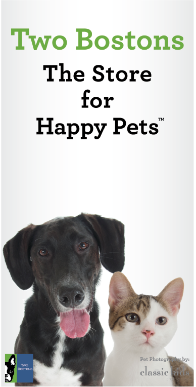
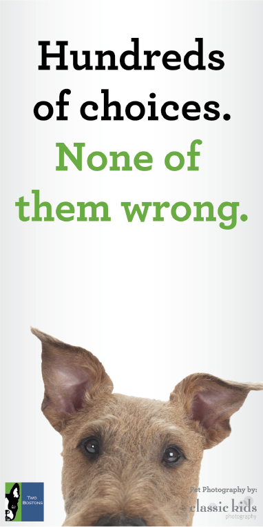
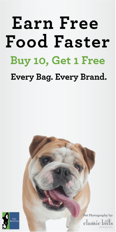
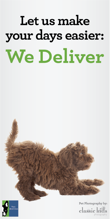
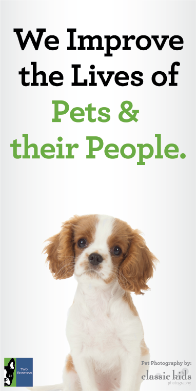
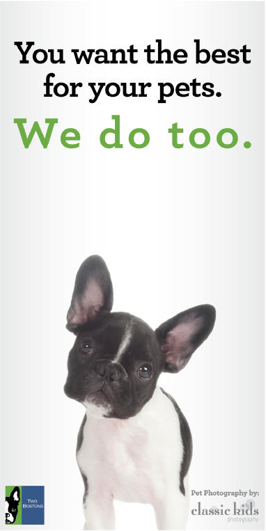
The designs I did for Two Bostons, a pet store, consist of posters for the store fronts and aisle signs for the interior of the stores. I used photos of pets they provided to create the posters. I had to crop out the dogs and cats from the photos and place them on these posters in ways that play well with the copy of the posters. The posters came in many different sizes to fit in each different sized storefront window, this made arranging the text a challenge. All the text on the posters makes reference to the things that make Two Bostons unique.
Aisle Signs
The Store aisle signs are similar to the posters, in the fact that they have the same taglines that the posters have. Unlike the posters, they’re all the same size. Some layouts are different, depending on the complex nature of the copy that is found on the sign.


HILL MIDDLE SCHOOL
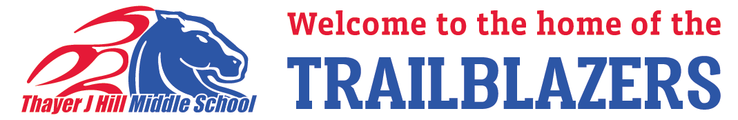
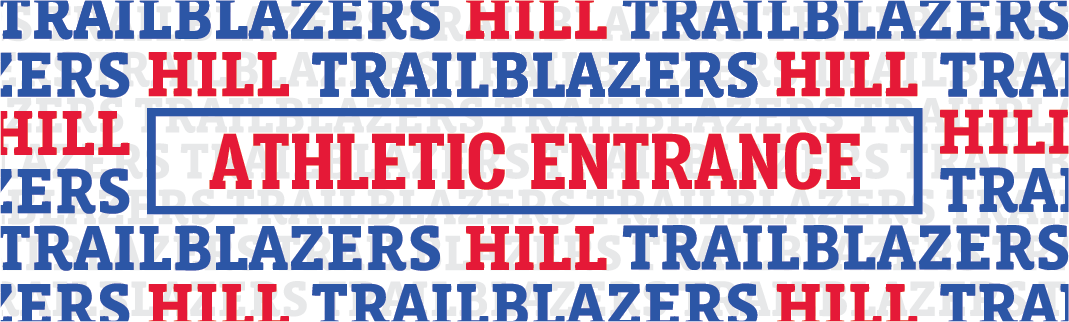
Entrance Signs
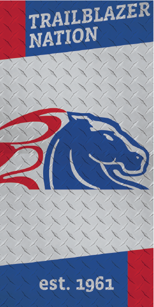
For Hill Middle School I made a series of large wall designs and vinyl covers for a few doors inside the school. The wall graphics make use of the name of the school in the school’s colors. The door graphics help add a level of flare inside the building. The Entrance signs use the school colors and their typeface. The Athletic Entrance sign uses a repeated pattern of the name of the school mascot, “Hill Trailblazers”.
Door Graphics
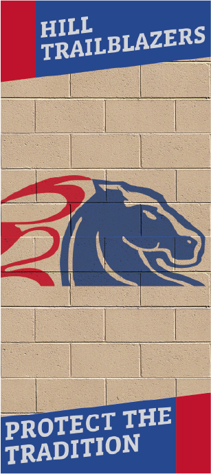
The other door graphics make use of patterns that are meant to blend in with their surroundings. I took photos of the school walls and a sheet of metal they had in their garage to use as the background for the door wraps. On top of that went the school logo and some other lines of text at the top and bottom.
HIGH SCHOOL WINDOW GRAPHICS
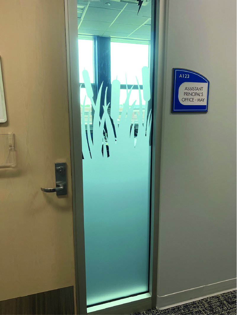
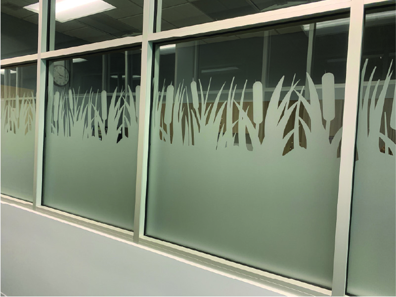
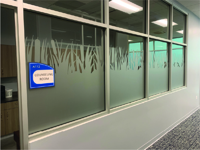
Frosted Window Graphic
This was a series of designs I did for a local high school. It was a series of floral designs that was made to look like pond foliage, near the building was a pretty big pond and they wanted to mimic that feeling. The frosted material and design helps add a level of privacy to the rooms.


B2SMB
Outdoor Wall Graphics
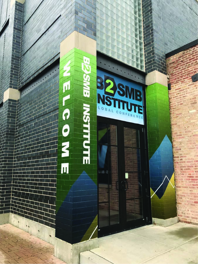
The work I did for B2SMB consisted of creating graphics for the entrance of a convention that they were hosting. I gave the pillars a technology feel by making the shapes look like they were moving upward or progressing. The color scheme of the pillars replicates the logo colors from B2SMB.
SHINTO
Restaurant Window Signs
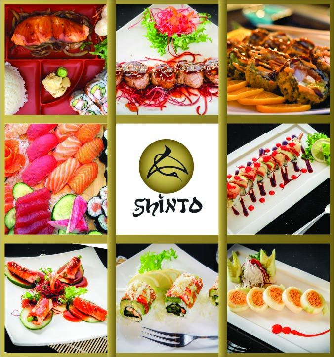
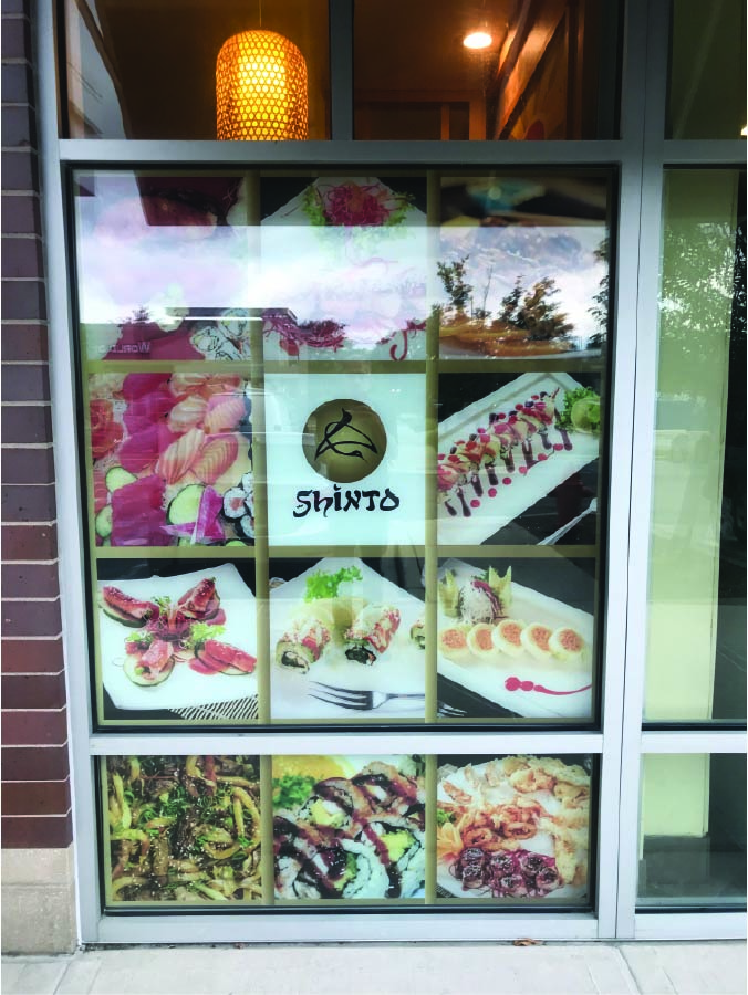
I made designs for the windows in the front of the restaurant, they utilize photos of food that the restaurant provided. I made gold bars to separate the photos and act as a traditional Chinese design. The gold colors also mimic the logo of the restaurant.
SANDHILL COFFEE
Bannerstand Graphic
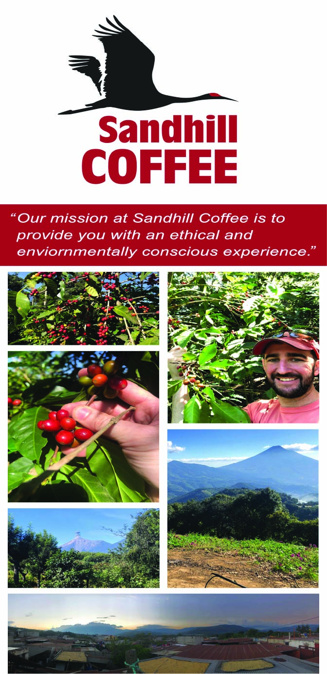
This is a banner stand I made for Sandhill Coffee, it utilizes photos of the place that the coffee is harvested and grown. This is a banner stand that is meant to stand inside the store to educate customers about the origin of the company and provide context into the ethical way the coffee is harvested.
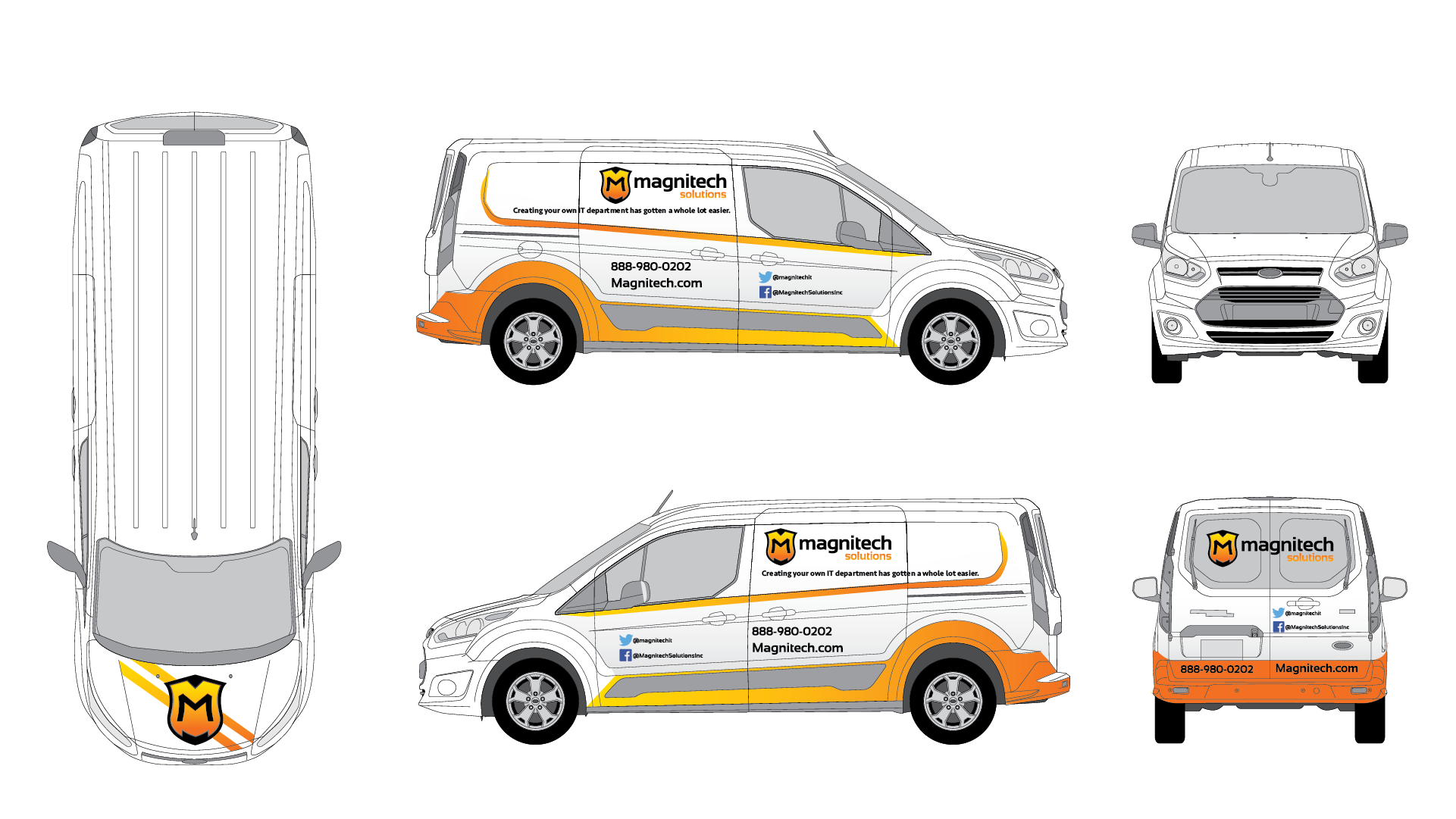
MAGNITECH SOLUTIONS
Vehicle Wrap
This is a vehicle wrap for a company called Magnitech Solutions. The design tries to take a more simplistic approach to the creation of the vehicle wrap. It makes use of the vibrant gradient found in the logo of the company. The gradient design elements contour to the shapes of the van and help create a sharp look that appealed to the principles of the company.
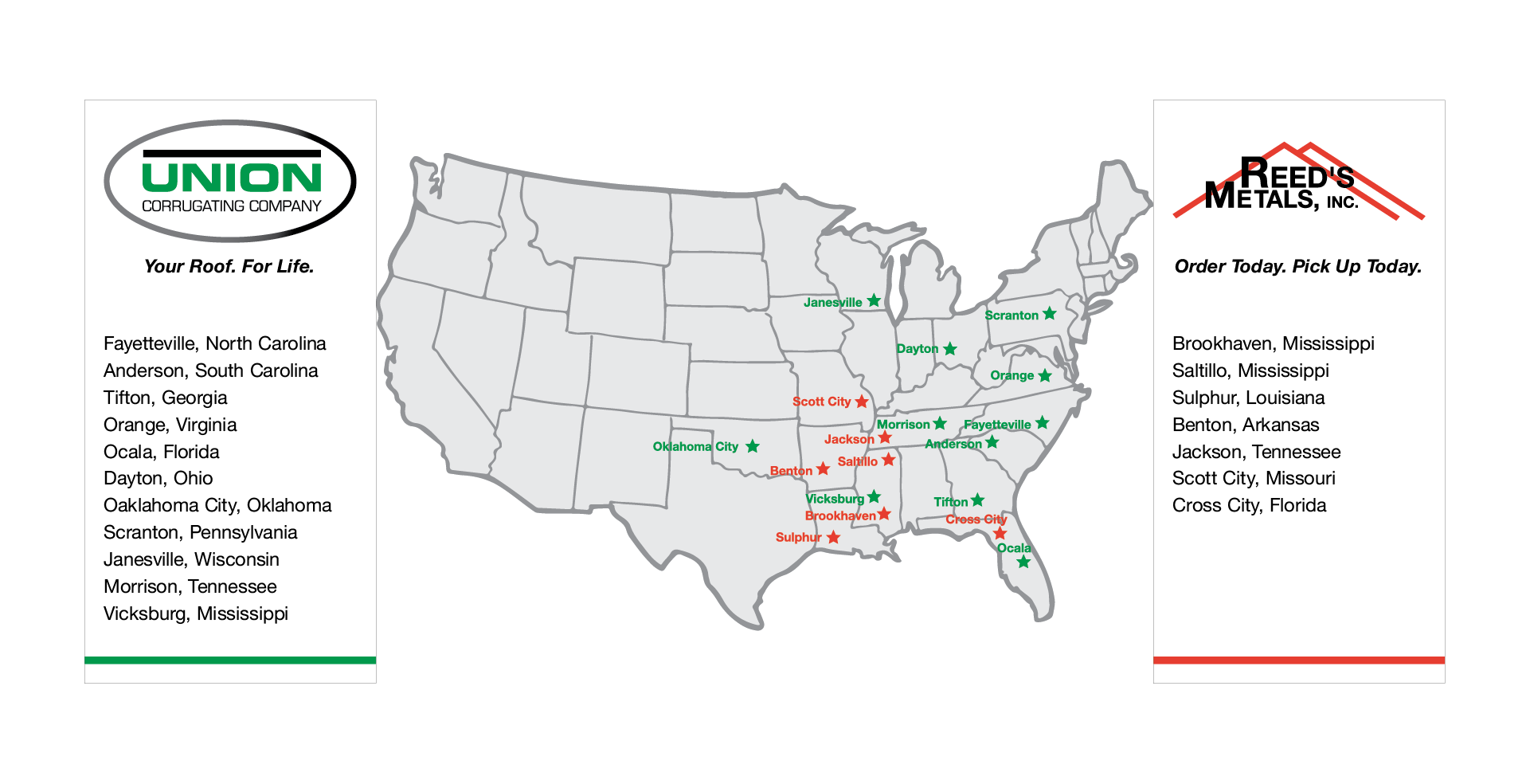
UNION CORRUGATION
Map Wall Graphic
This is a design of a map that shows the locations of the company’s offices throughout the United States. It shows two different companies locations because they were merging at the time and needed to visualize the reach they have across the country. It also has panels on each side that shows the name of each location, acting as a legend.
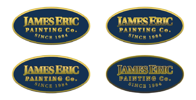
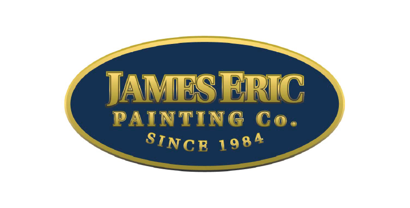
JAMES ERIC PAINTING
Company Logo
During my time at SpeedPro Imaging I was tasked with developing the logo for a old local painting company. They came to us with a few ideas of what they wanted in a logo. We knew they wanted something that had a regal feeling but also something a little modern, so I did some iterations with the more modern silver layout to the right. They also liked the layout with the gold trim because it makes use of the old shade of blue they use. In the end they liked that one best because it was a refreshed version of what they’ve had.