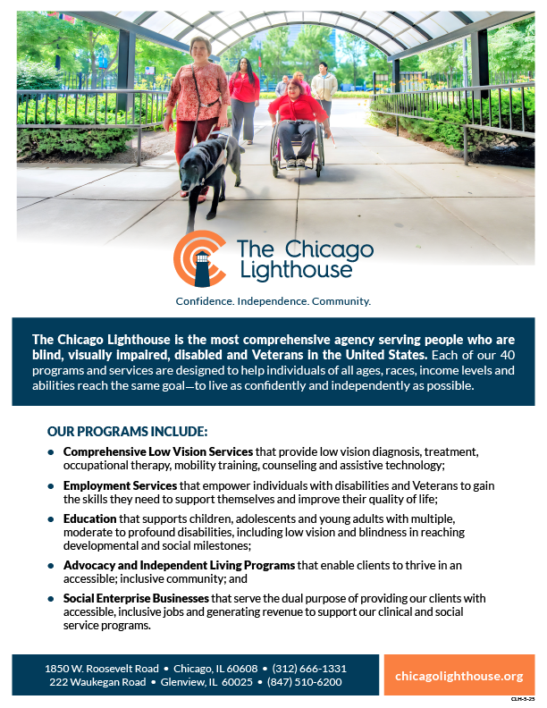
The Chicago Lighthouse
The Chicago Lighthouse serves people who are blind, visually impaired, disabled, and Veterans, in order for each to reach their full personal potential. Their programs build enduring success for their target populations and employees with lifelong knowledge, skills, and employment opportunities. I started to work at The Lighthouse in 2021 as a Creative Assistant, working on a vast variety of projects that ranged from brochures for programs to upkeep on the company website. After two years and lots of hard work I was promoted to Manager of creative services, taking on many more responsibilities. This is a small collection of the numerous projects I worked on while at the Lighthouse. It is broken down into four sections, Collateral Assets, Programs, Events and Fundraising.
Collateral Assets
One-pager
One-Pager
Corporate Packet
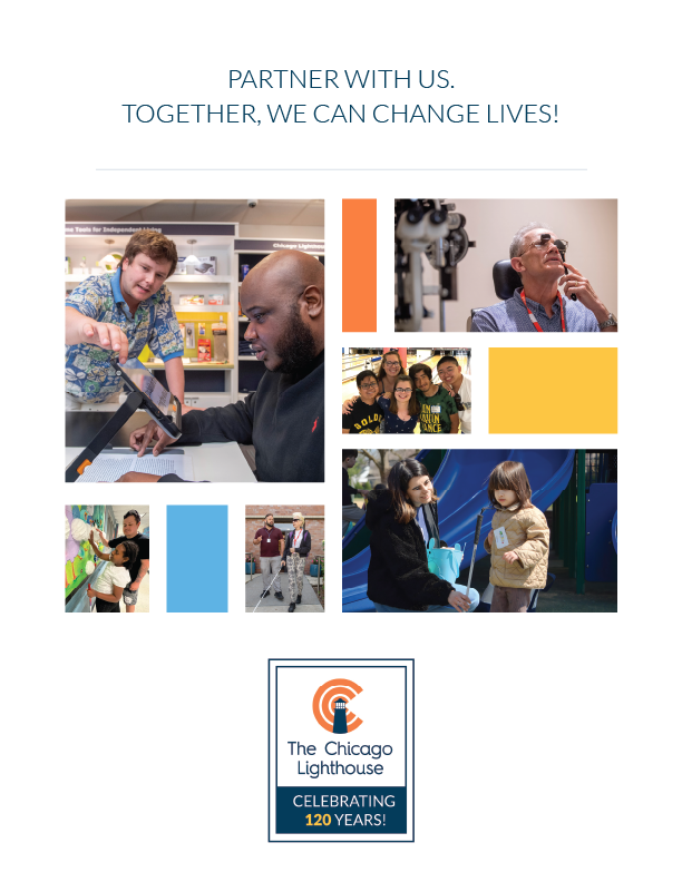
Corporate Packet Cover
Inside Spread
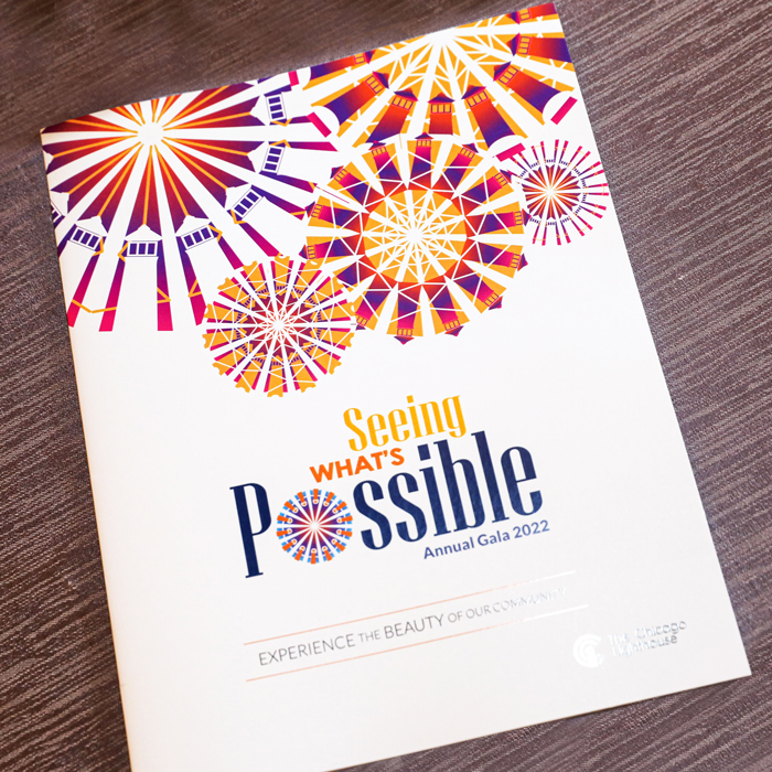
Annual Reports
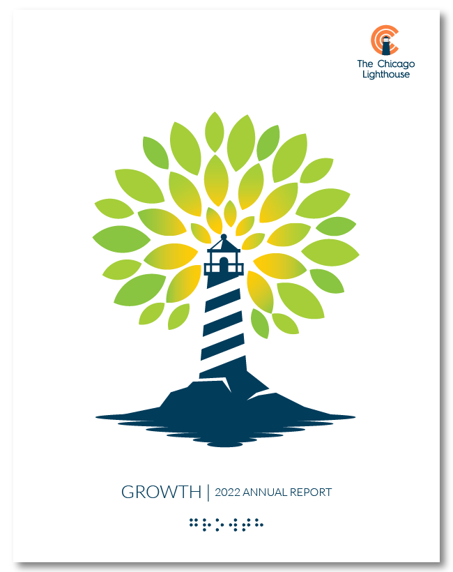
Every year I’d help contribute to the overall design of the report and in 2022 and 2023 I was tasked with designing the cover of the books. In 2022 the theme of the report was growth. I created a lighthouse illustration with bright green leaves radiating out of the lighthouse. It features the word “Growth” in embossed braille at the bottom of the cover.
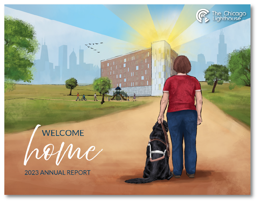
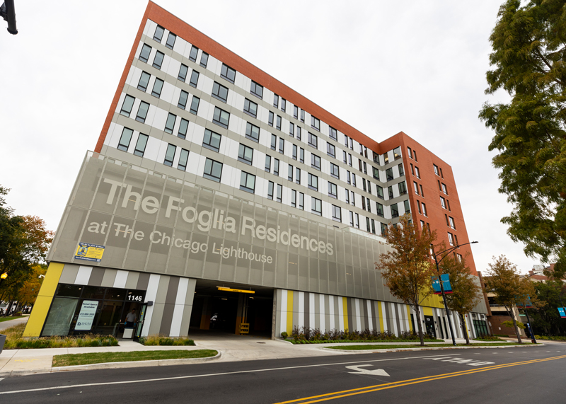
The 2023 book cover is made in a landscape version. It features a digital painting I made of someone with a guide dog looking at the newly built Foglia Residences. In the background you can see people playing at a park near the building and the Chicago Skyline faded into the background behind the main building that has lights shining out of the top. The main building meant to resemble a lighthouse, shining a beacon guiding people home.
FUNDRAISING
The Beam
It is important that the designs of our publications all have high contrast and large text. This makes it easier for our population of visually impaired readers to navigate. After producing the print version of the piece we typically make an accessible version of the publication and feature it on our website.
Featured here is the Fall 2023 Beam. On the cover we have a photo of one of the participants of The Rise to Shine Run and walk.
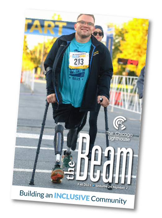
Cover of 2023 Beam
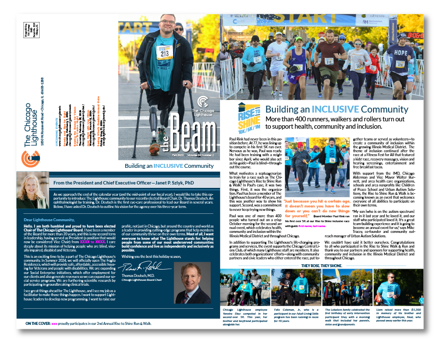
Unfolded layout of Beam publication
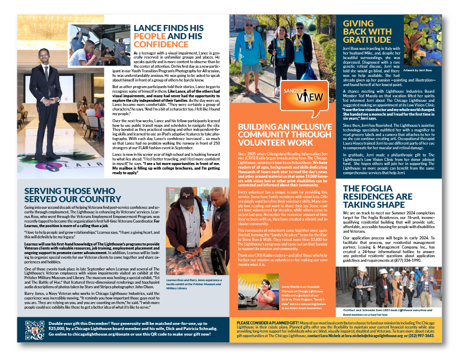
Unfolded layout of Beam publication
The Legacy
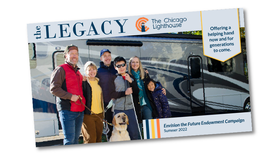
Cover of 2022 Legacy and inside pages
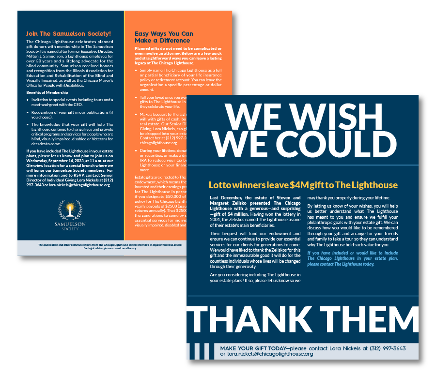
Cover of 2023 Legacy and inside pages
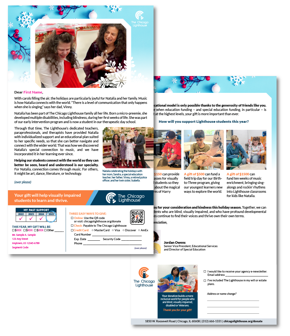
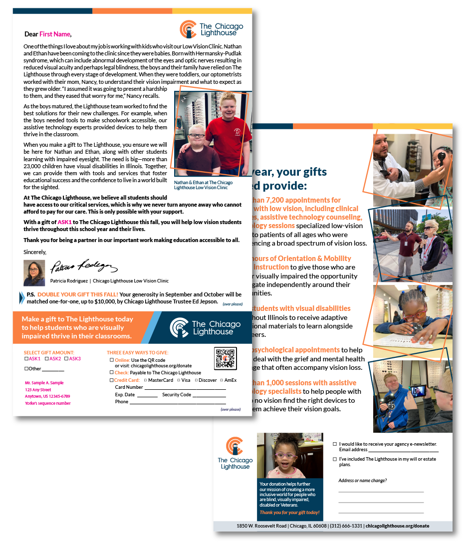
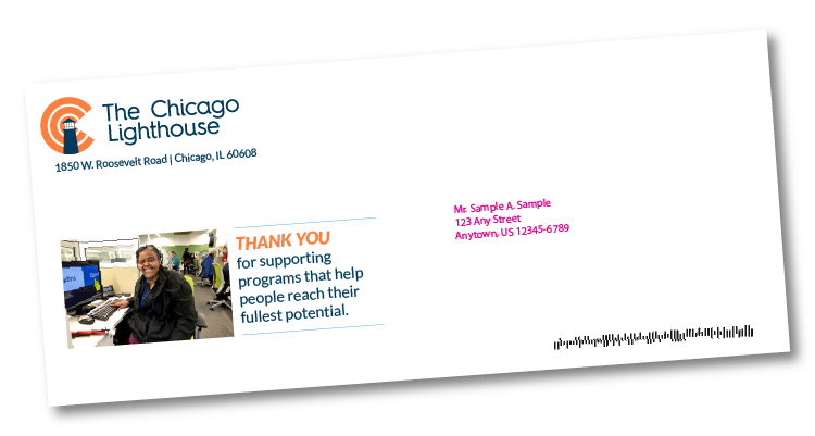
Direct Mail
Throughout my time at The Lighthouse I have worked on a number of these letters. The overall layout of the designs are similar from letter to letter. The design differences come from things like the program being featured and the overall message we want to get across. For example in the end of year letter we like to use holiday and winter visuals. All of the letters feature larger text so those with low vision can easily read them and the bright-contrasting colors of The Lighthouse brand.
Front and Back of Direct Mail Letter
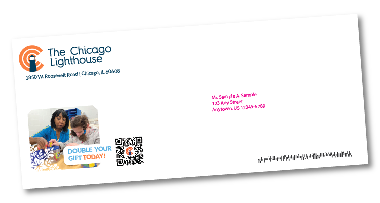
Outer Envelope
Front and Back of Direct Mail Letter
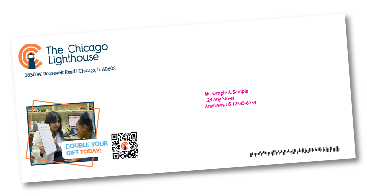
Outer Envelope
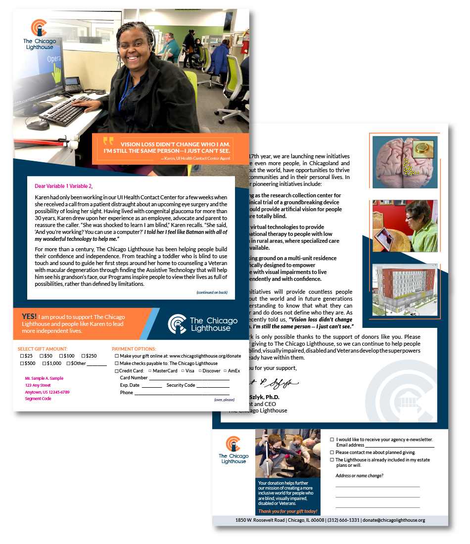
Front and Back of Direct Mail Letter
Outer Envelope
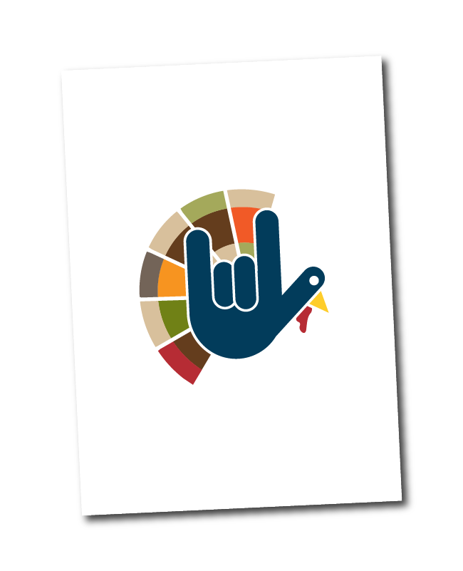
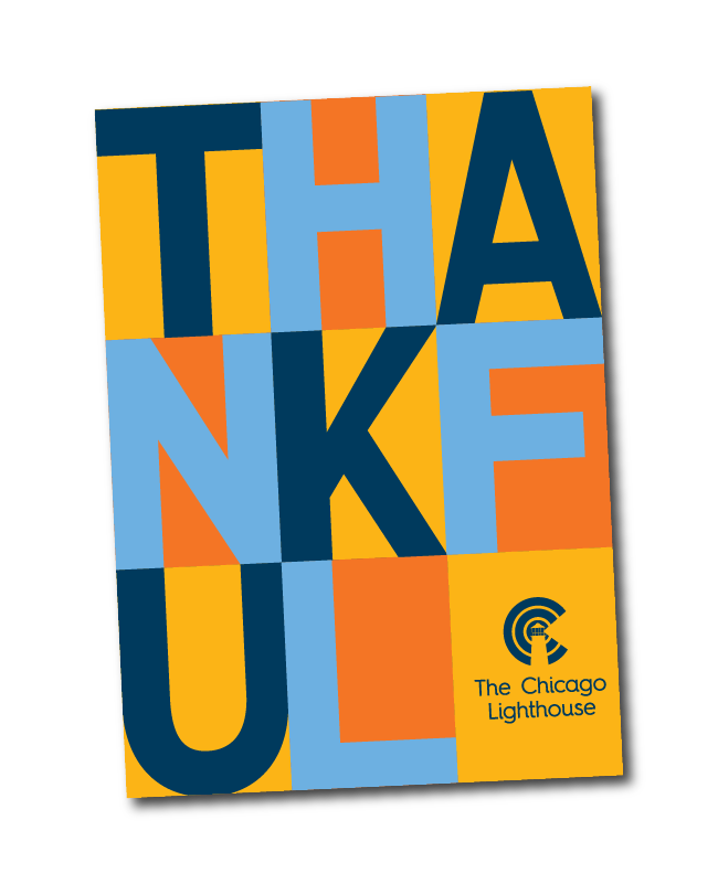
Holiday Thank You Cards
2022 Thanksgiving Card
2023 Thanksgiving Card
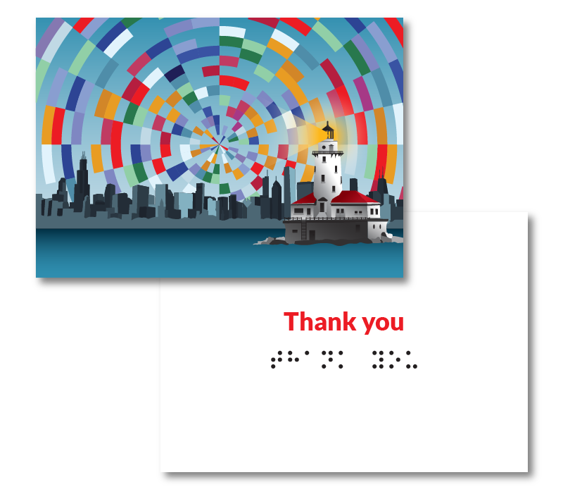
Donor Cards
The Thank you cards are used to send as a token of our gratitude for donations, featuring the most colorful fun design. The in Your Honor Cards feature a solitary lighthouse standing strong, shining its light. Lastly, the In-Memory cards feature a sunsetting on a lighthouse and a dove flying by.
Thank You Card
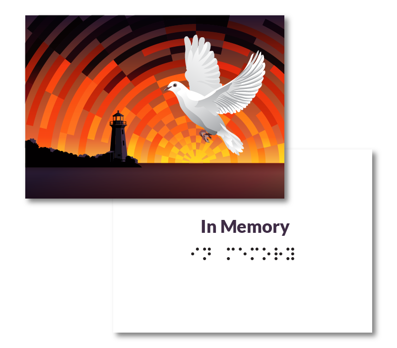
In Memory Card
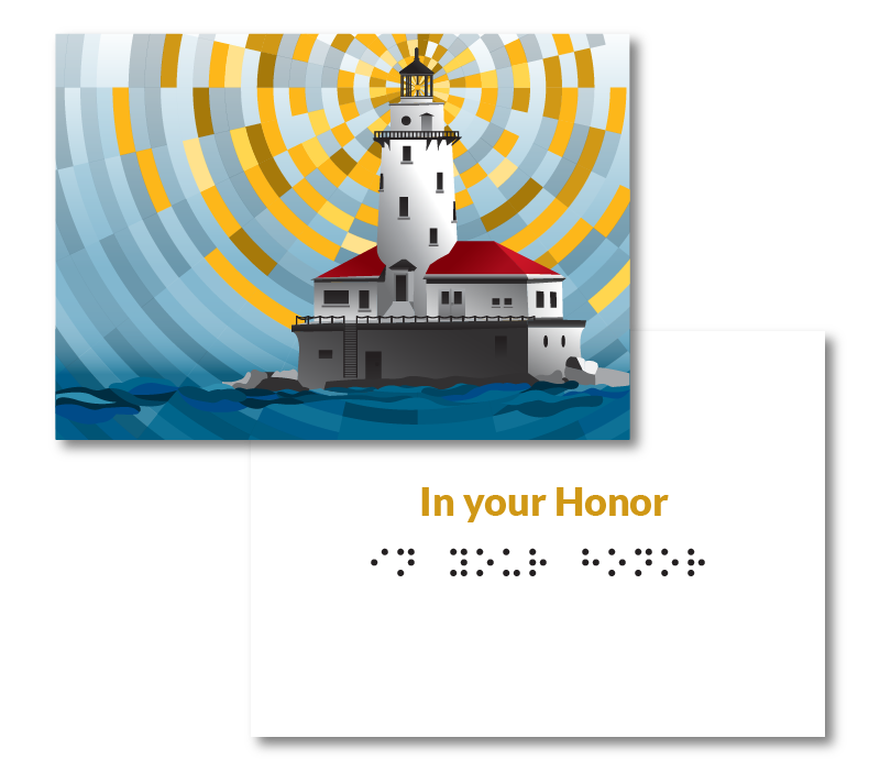
In Your Honor Card
EVENTS
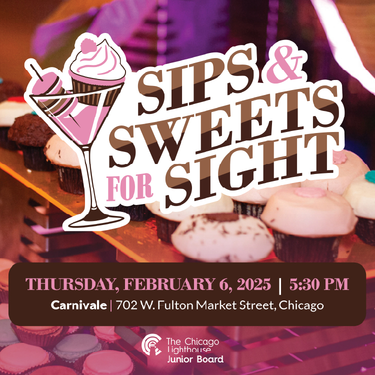
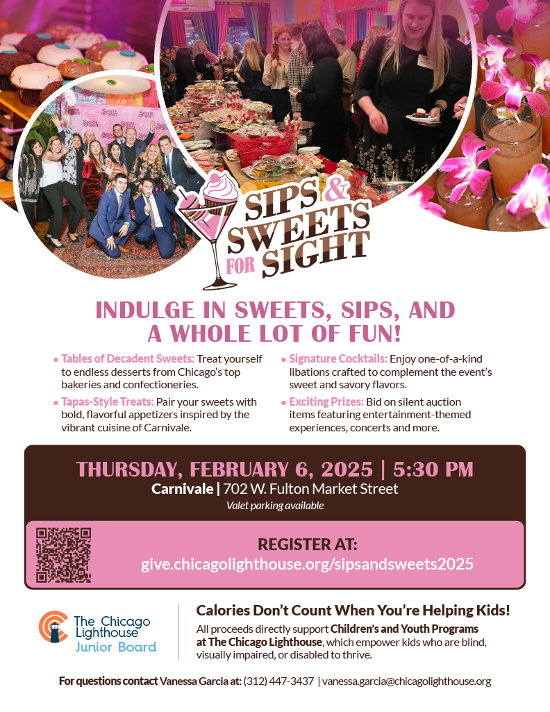
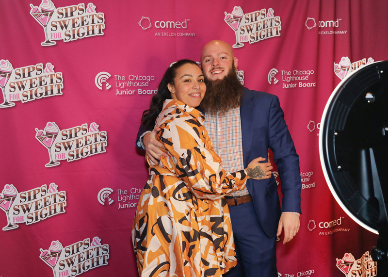
Sips & Sweets for Sight
Adverts and Event Signage
This is a simple social media post I made to advertise the event. It features the logo on top of an image of the sweets table with a pink screen of the image that fits into the brand of the event.
The Flyer
Keeping with the same whimsical design that the logo captures. I decided to use some typefaces that are outside of our normal brand standards. I used a much softer and rounder typeface that feels like it belongs on a candy bar.
Social Media Post
Flyer
The backdrop also follows suit and uses the hot pink color and has the presenting partner logo on it.
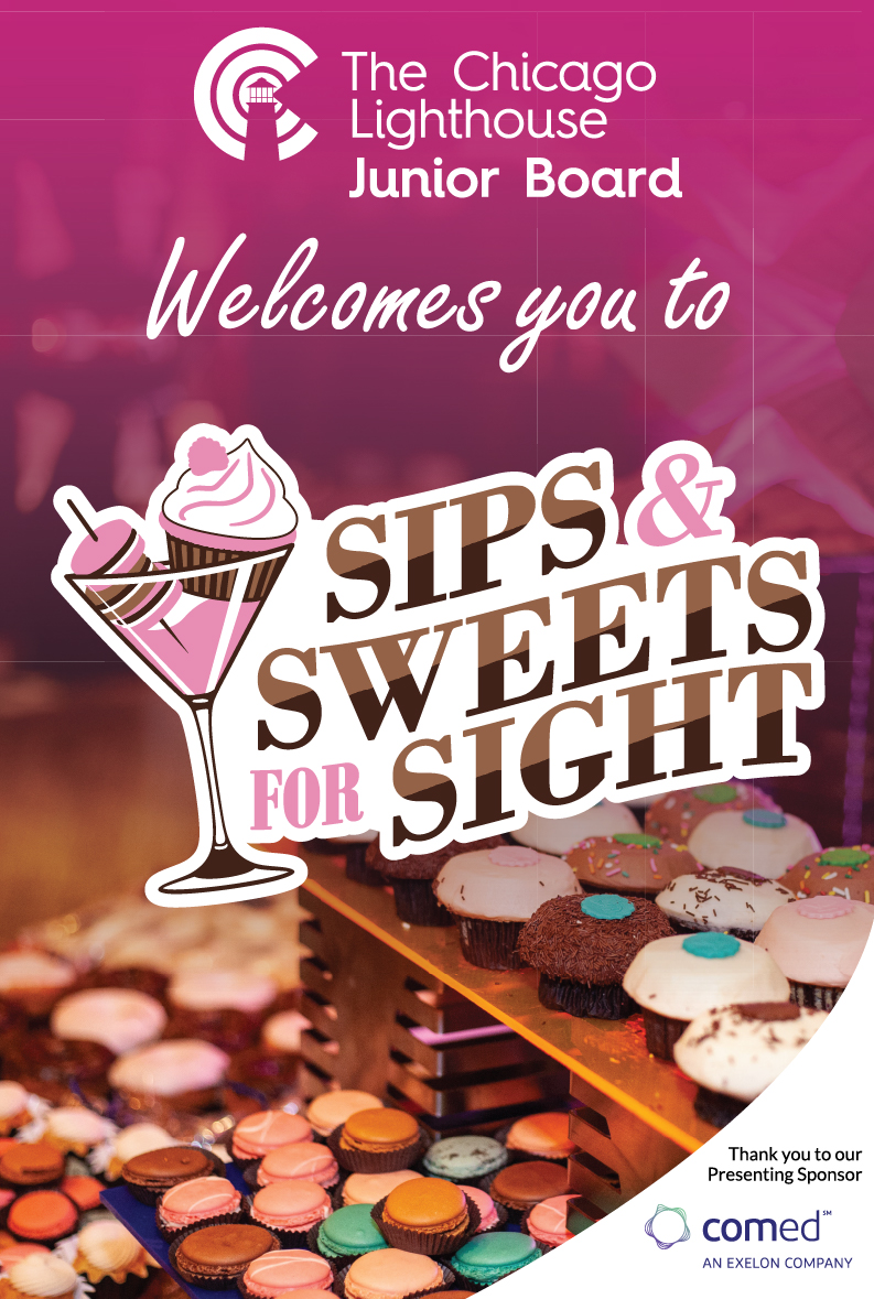
Like the social media post and the backdrop, this welcome poster makes use of the fun logo, the variety of colors from the sweets table image and a pink screen to tie a delicious bow on the design.
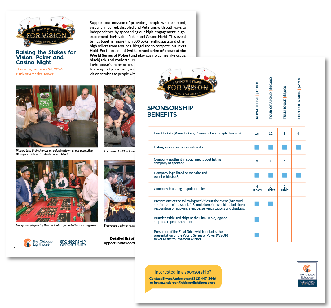
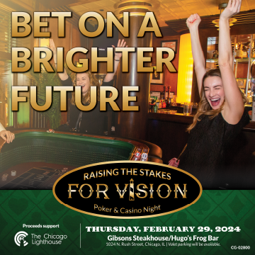
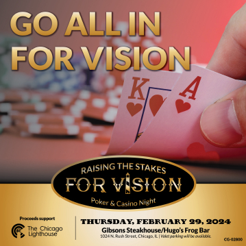
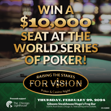
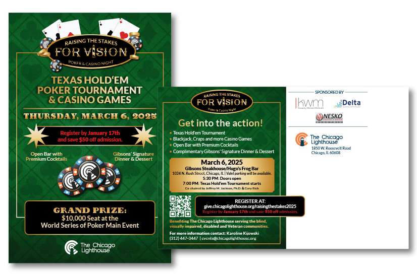
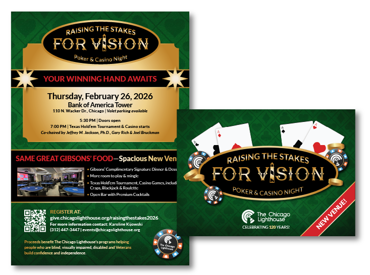
Raising the Stakes for Vision
Poker & Casino Night
Social Media
Event Invites
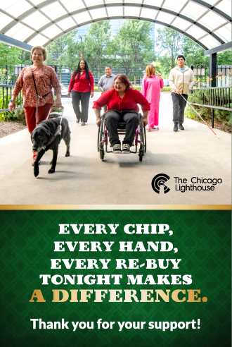
Event Signage
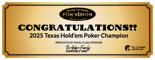
Winner Check
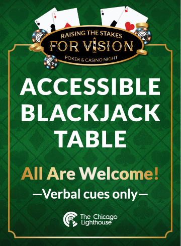
Blackjack Table Poster
Welcome Sign
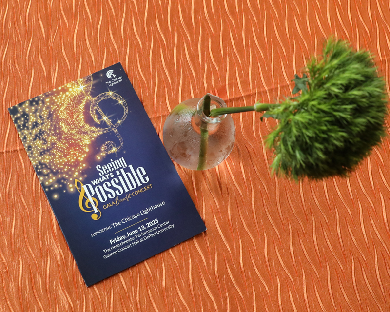
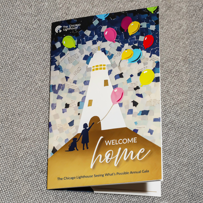
Seeing What's Possible
Annual Gala
Event Invite
Invite Trifold

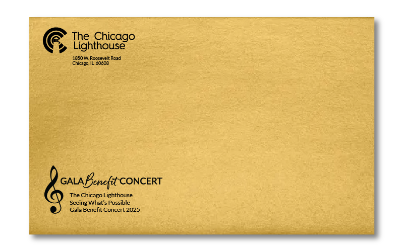
Outer Envelope
Event Signage, Social Media Post and Playbill
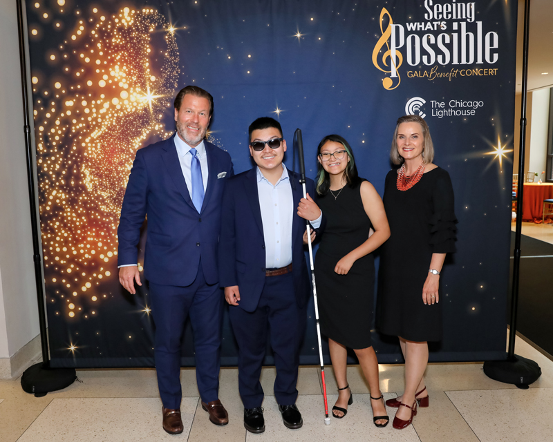
The backdrop for the event features the shiny golden treble clef made from stars and a deep blue background that makes the music note and logo pop.
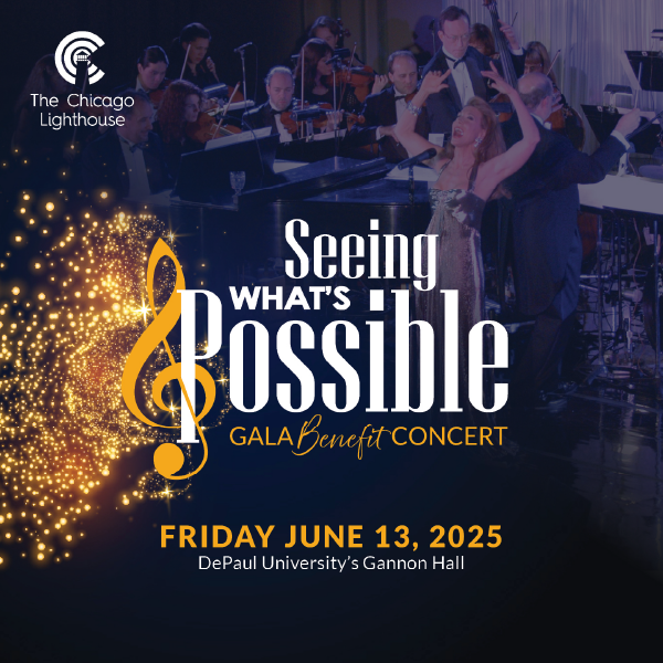
Like the main cover of the invite, this post makes use of the screened image of the singer and the artful treble clef.
For this event I was also tasked with creating a playbill that goes over the run of show and has info about The Lighthouse. Stop me if you’ve heard this before but the cover resembles the main design from the invite.
Past Program Books
2022 Program Book

2023 Program Book
2024 Program Book
Custom Take-home Canvas
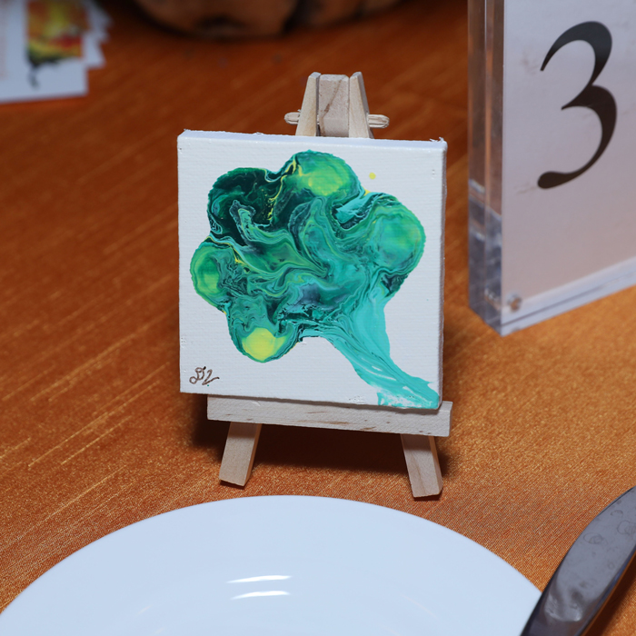
FLAIR Fashion Show
Event Invite
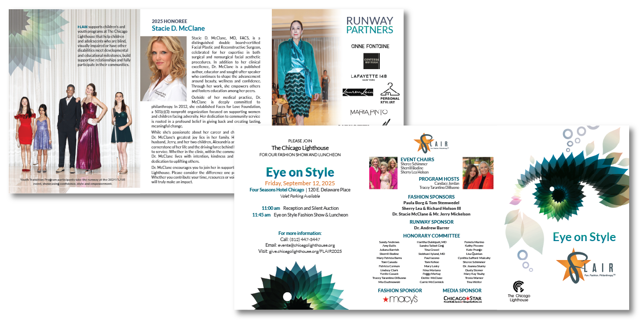
Mailed Invite
Event Programs
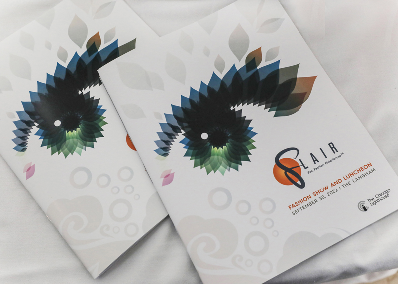
2023 Program

2024 Program
Event Signage
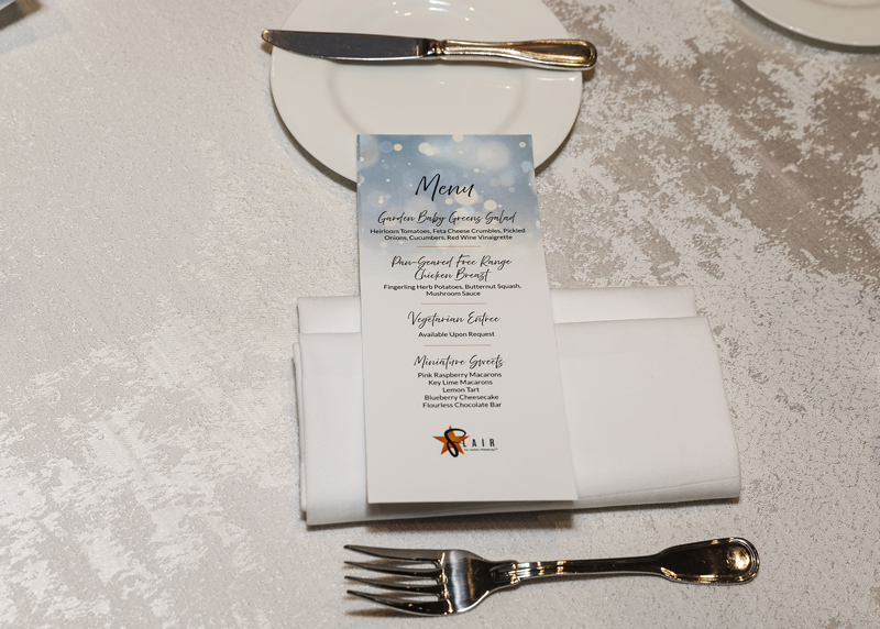
FLAIR Menu
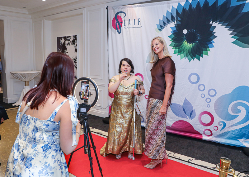
FLAIR Backdrop
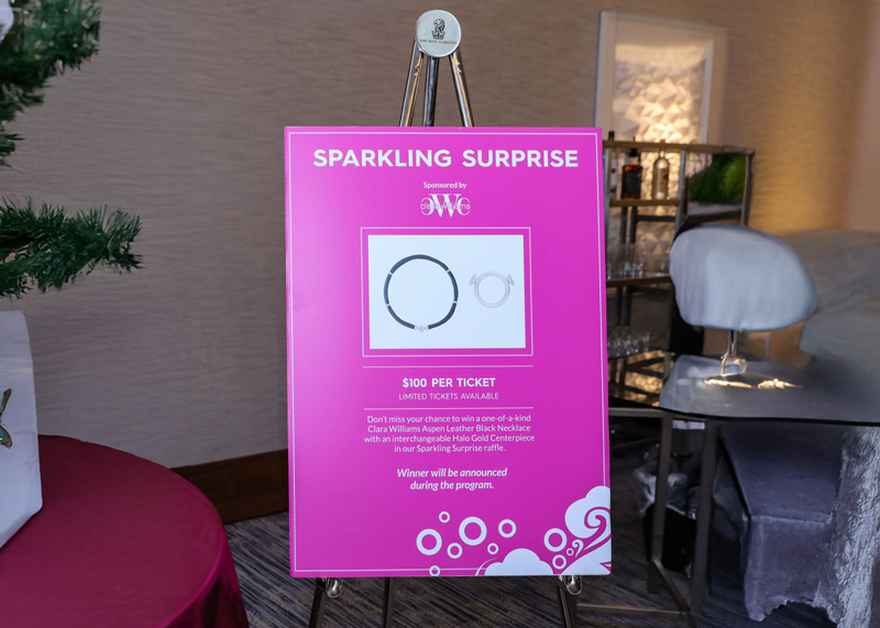
FLAIR Raffle Poster
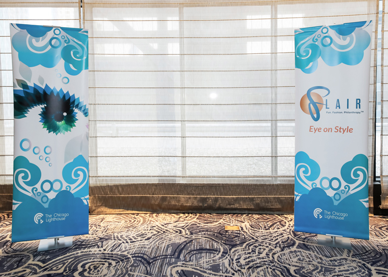
Bannerstands
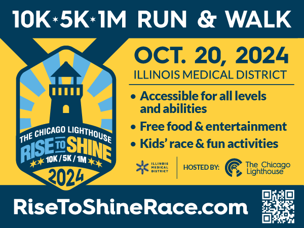
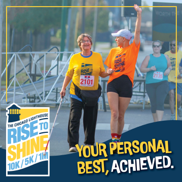
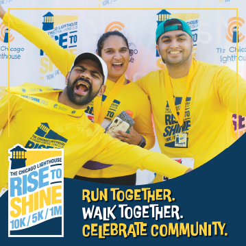
Rise to Shine Run and Walk
Signage
Yard Sign and Banners
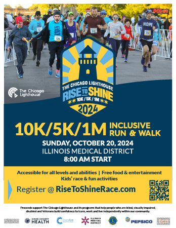
Flyer
Social Media Posts
Race Cards
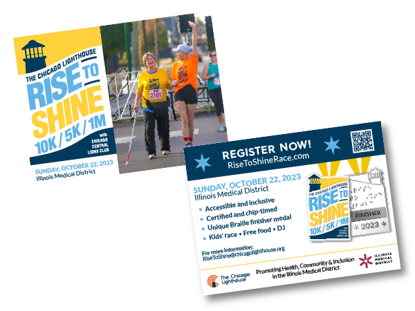
2023 Race Cards
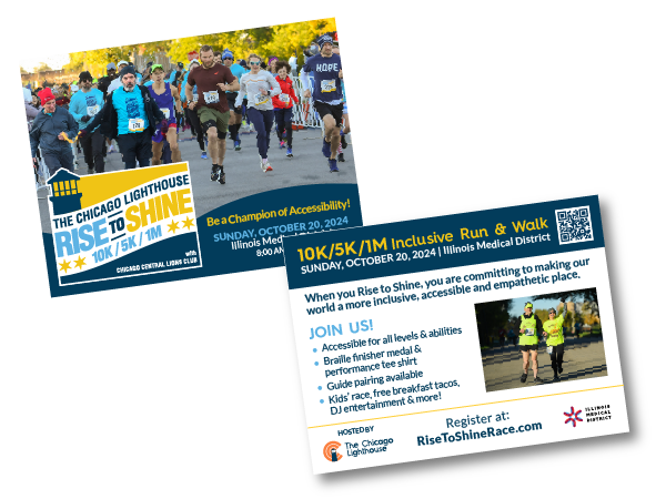
2024 Race Cards
Race Day Signage
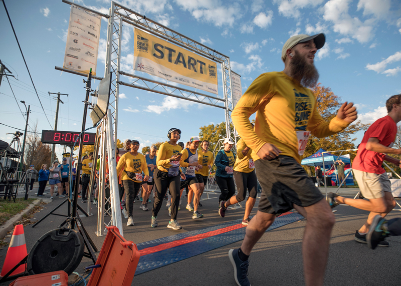
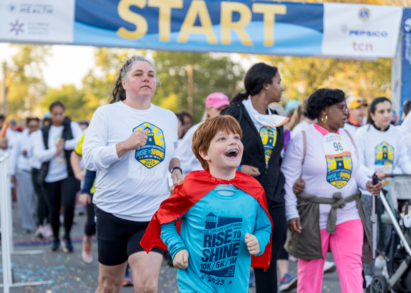
Start Banner and Race Shirts
Race Finish Banner
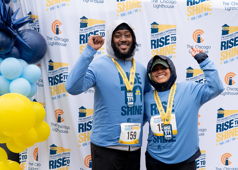
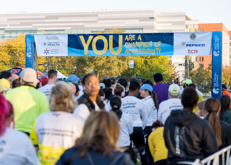
Backdrop, Race Shirts and Brailler Finisher Medals
Start Banner and Race Shirts
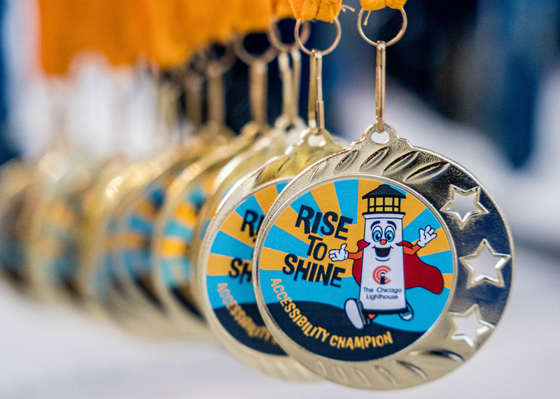
Kid's Finisher Medals
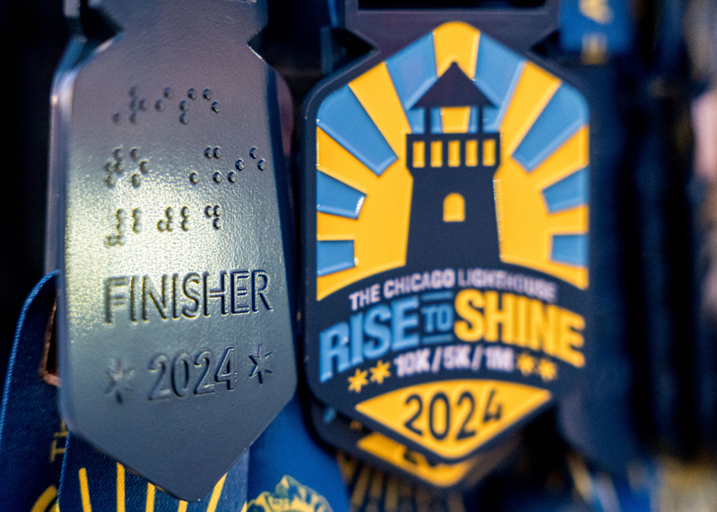
Braille Finisher Medal
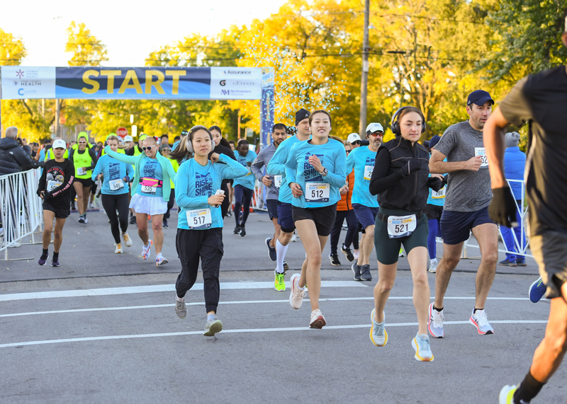
Start Banner and Race Shirts

Braille Finisher Medal
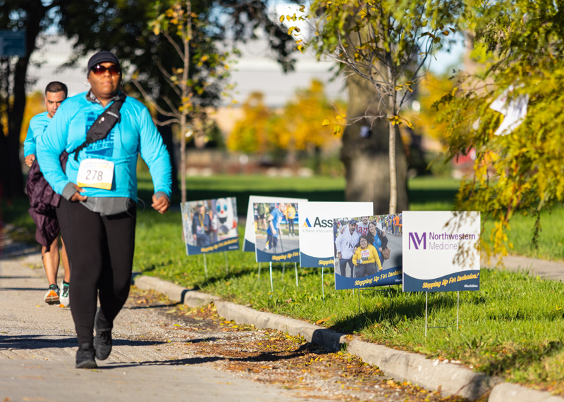
Sponsor Yard Signs
PROGRAMS
Children and Youth Programs
Flyers
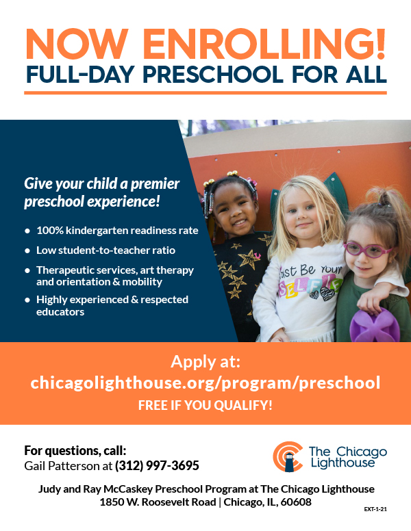
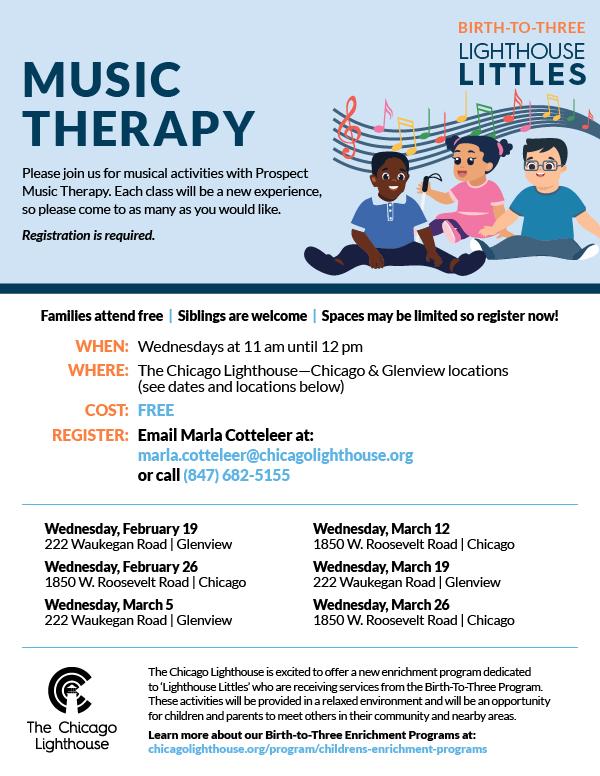
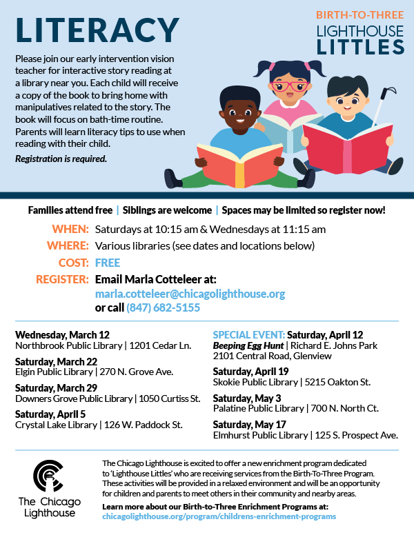
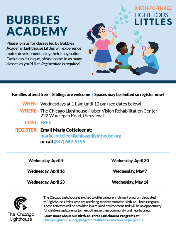
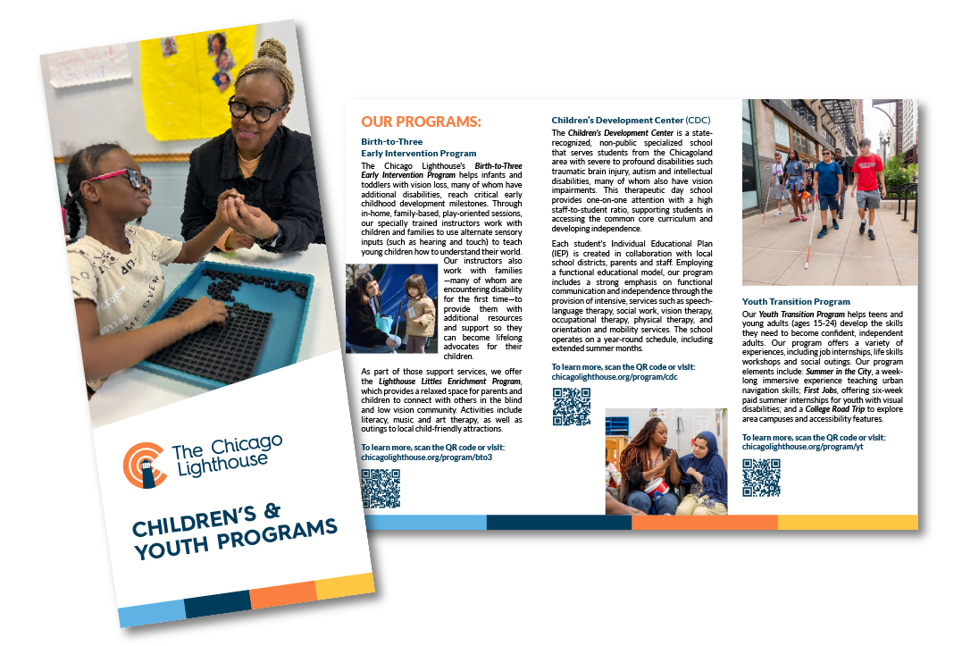
One of the first projects I worked on at The Lighthouse was the Preschool flyer. This is where I really got an appreciation for The Lighthouse’s brand guidelines. Making sure designs had high contrast and large text. The Lighthouse Littles series for Birth-to-Three all feature similar illustrations of visually impaired children engaging in an activity.
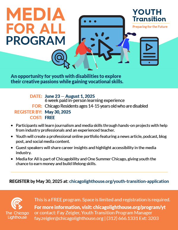
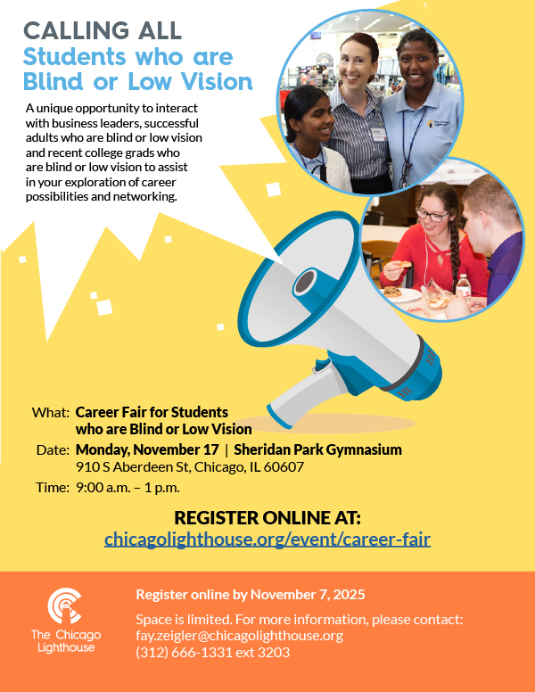
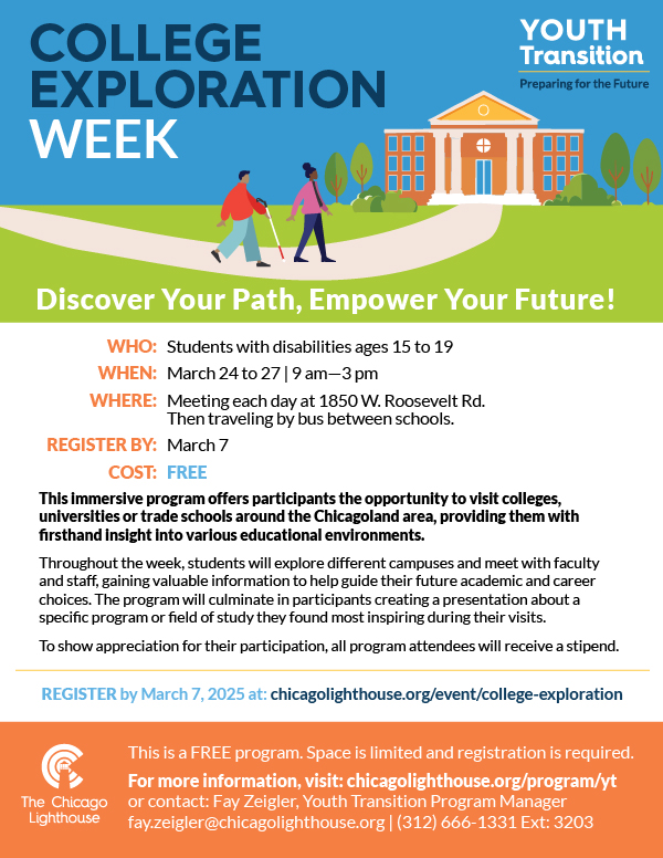
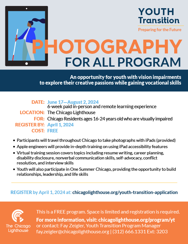
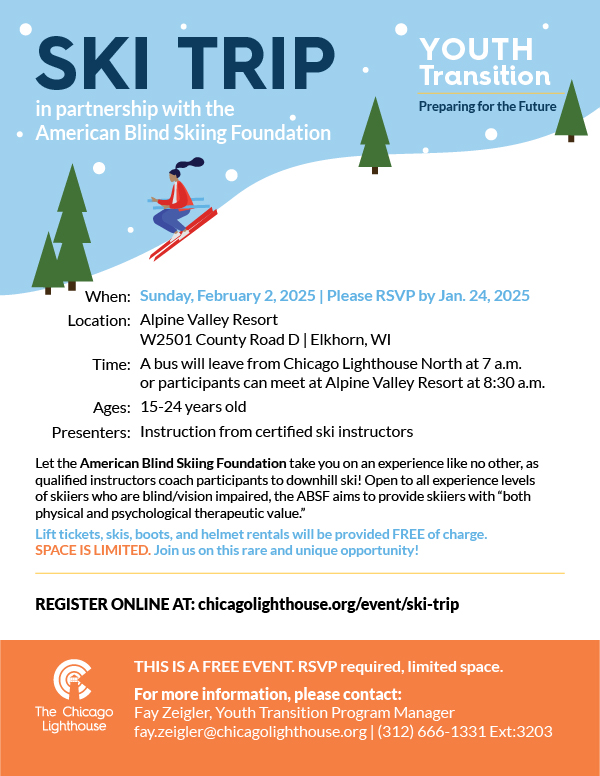
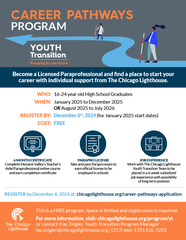
The Youth Transition program flyers also feature illustrations in the header that lend themselves to what the event is. They tend to be a more sophisticated illustration than the Littles because the programs are in support of older teens transitioning to college or the workforce. All of the flyers follow a similar layout.
Brochure
The Foglia Residences
Stronger Together
The flyer uses the blues from The Chicago Lighthouse Brand, creating a calm, relaxed design that puts the mind at ease while reading about the importance of mental health.
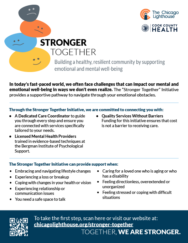
Stronger Together Flyer
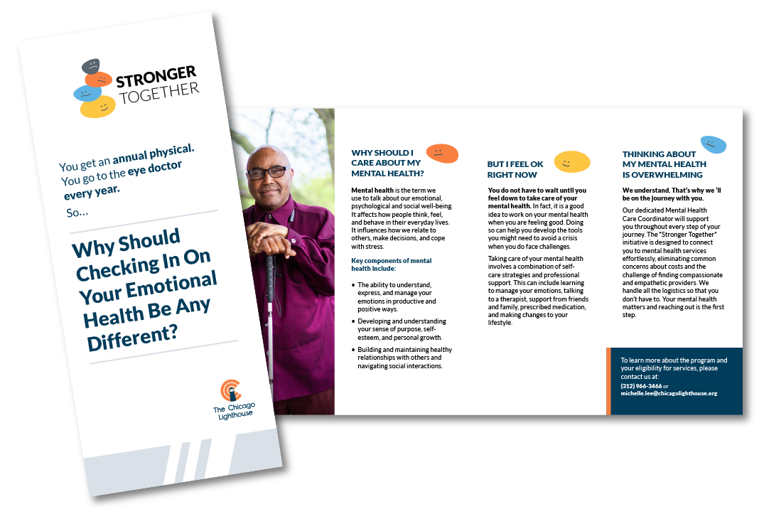
Stronger Together Brochure
Photography
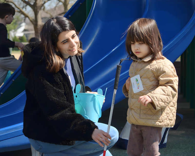
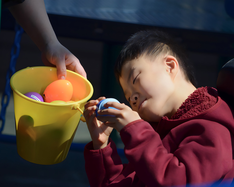
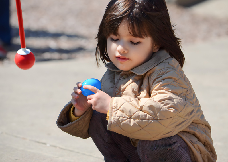
Beeping Egg Hunt
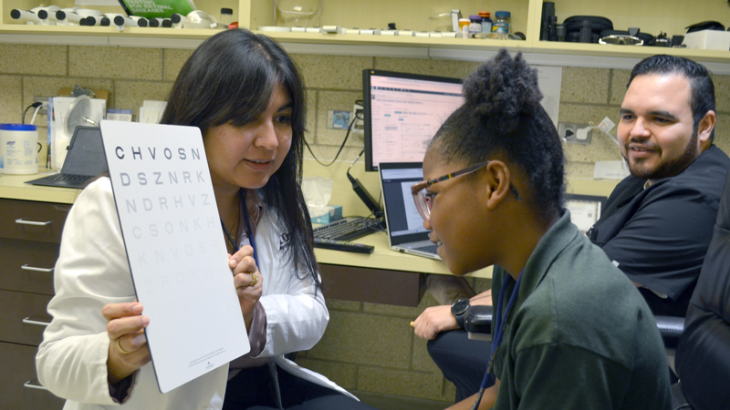
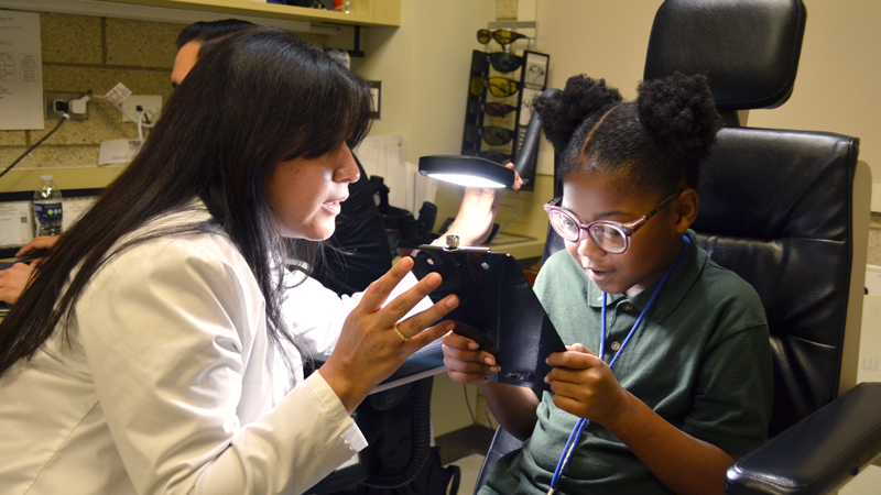
Low Vision Clinic Exam
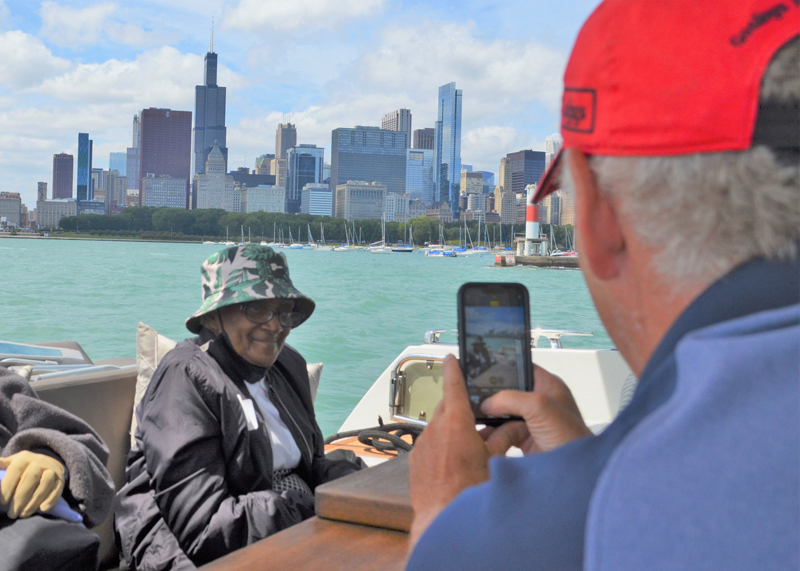
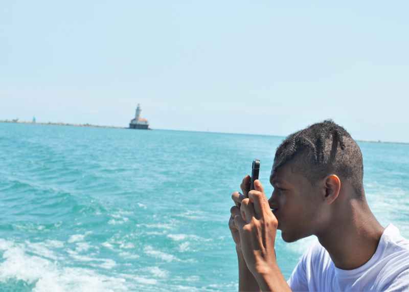
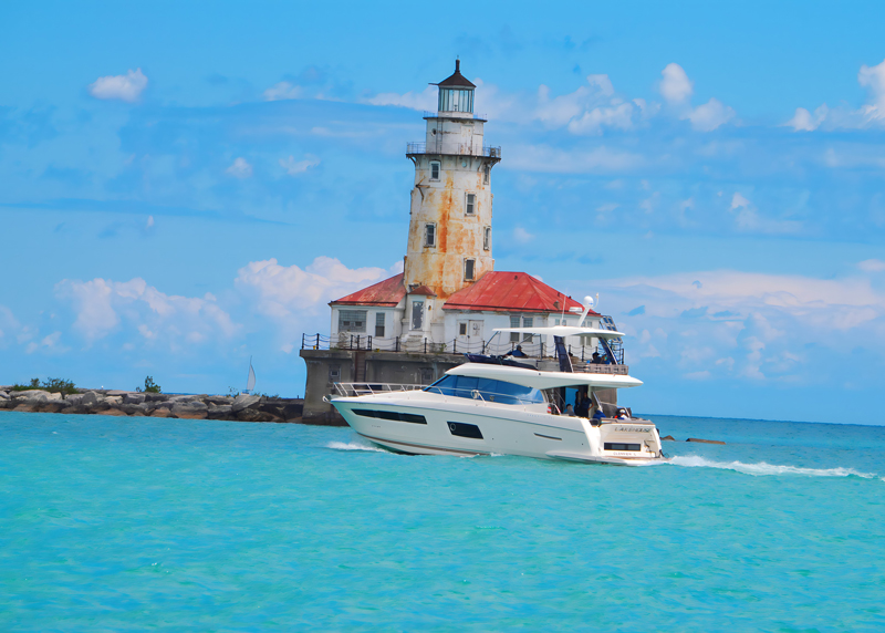
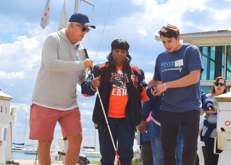
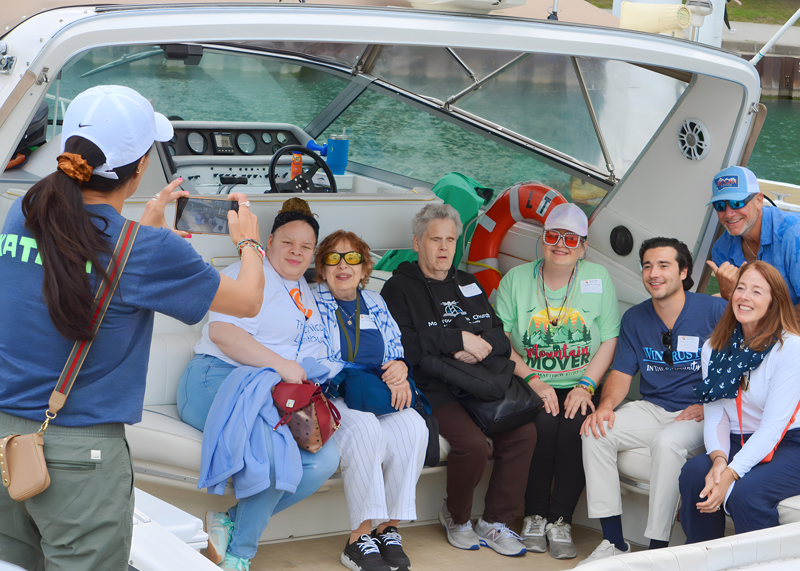
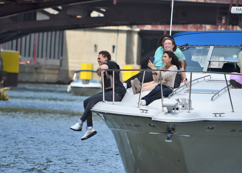
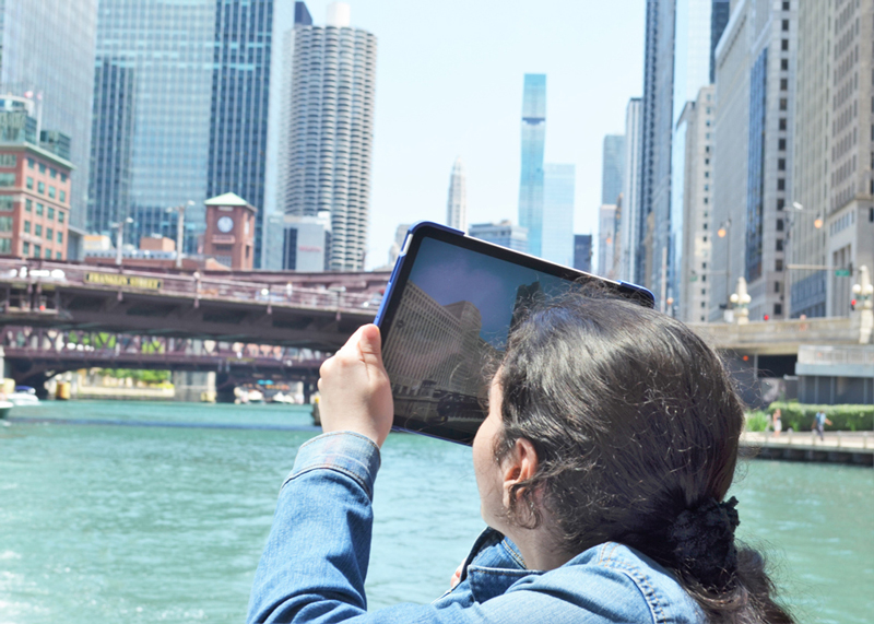
Senior Boat Cruise
Senior Boat Cruise
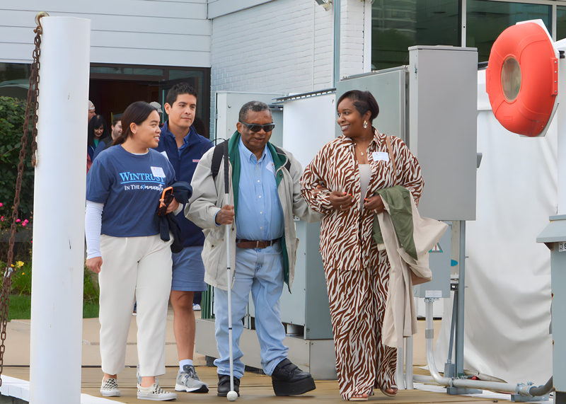
Senior Boat Cruise
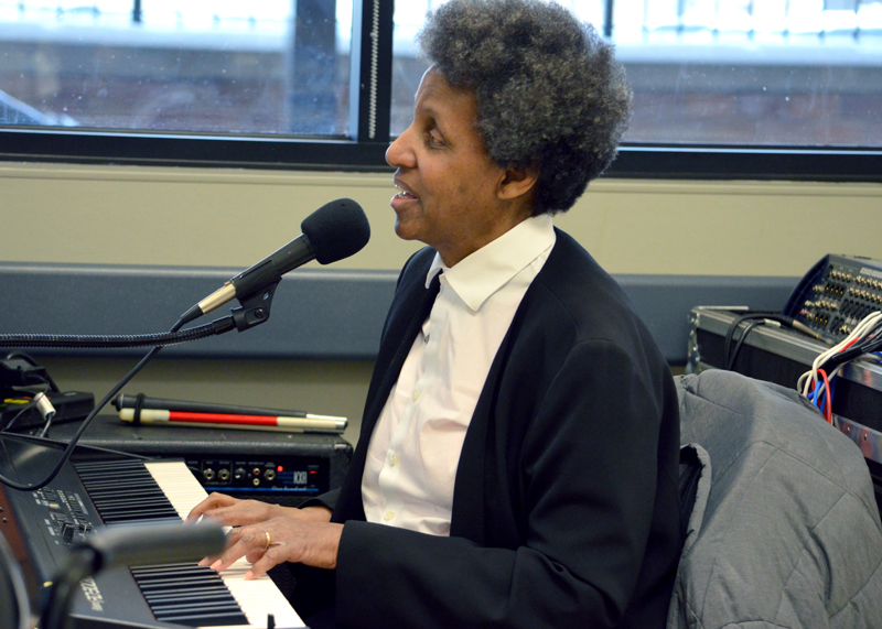
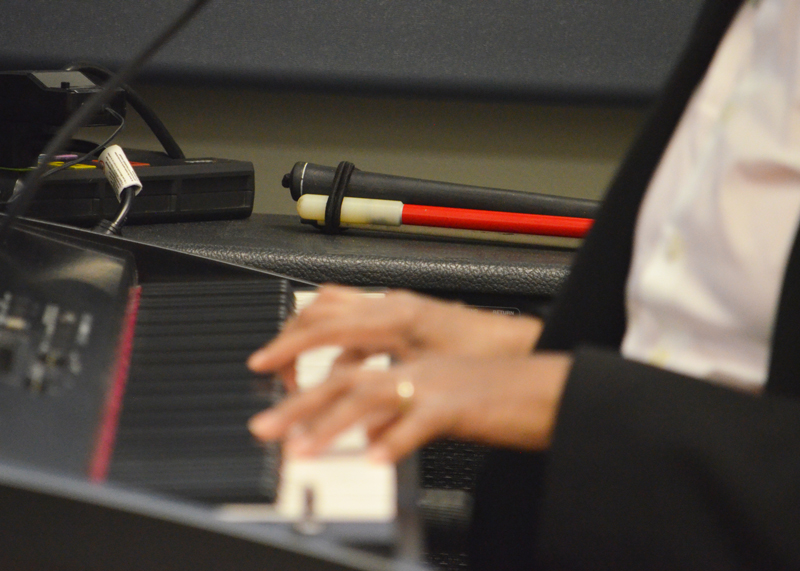
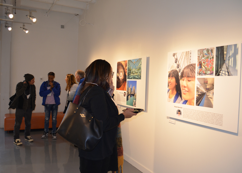
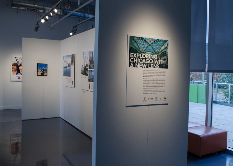
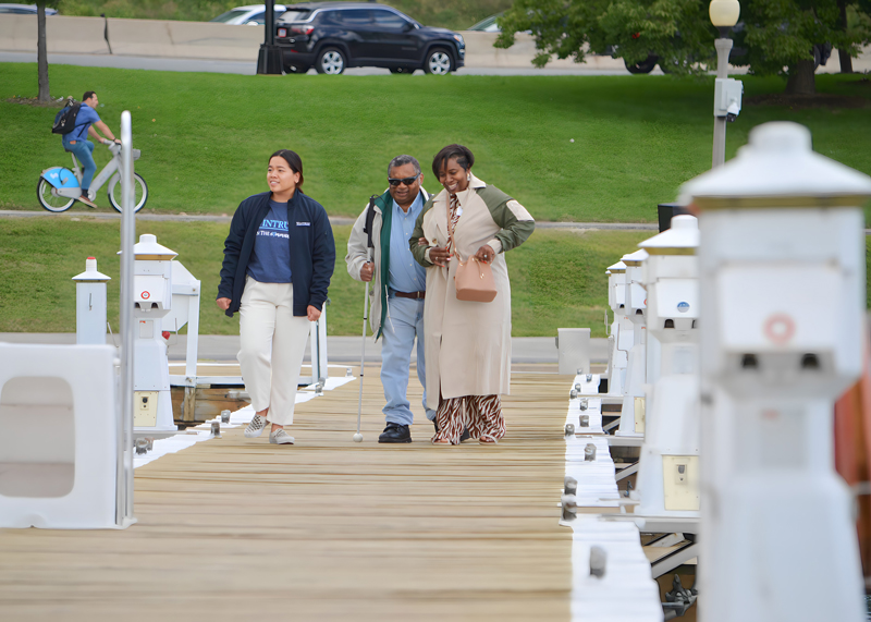
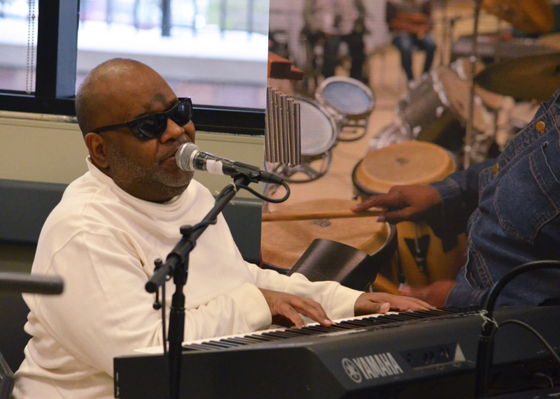
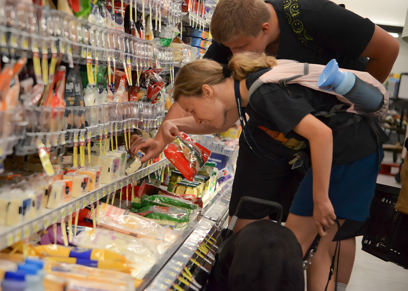
Vision Quest Program
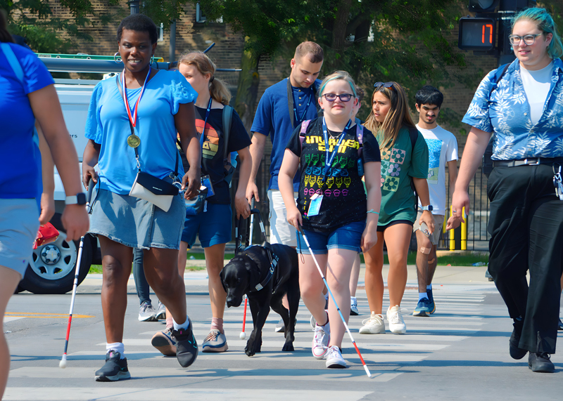
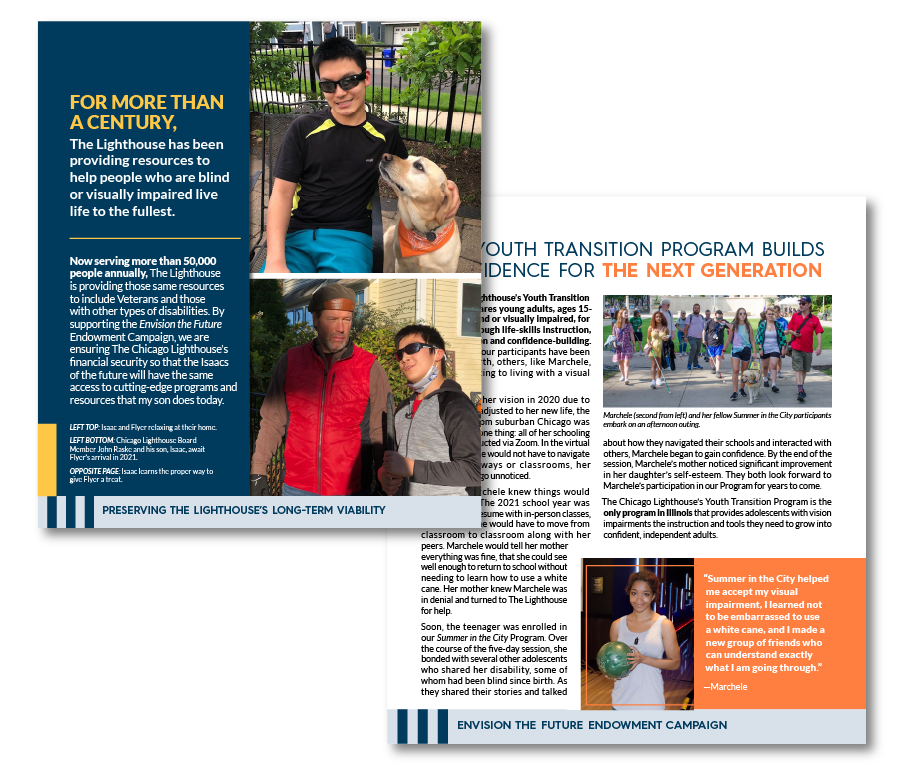
Youth Transition Program